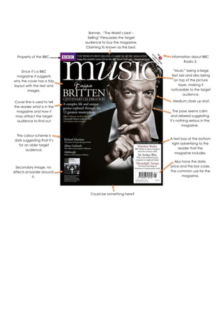
1. Banner. “The World’s best –
Selling” Persuades the target
audience to buy the magazine.
Claiming its known as the best.
Property of the BBC.
Information about BBC
Radio 3.
Since it’s a BBC
magazine it suggests
why the cover has a tidy
layout with the text and
images.
“Music” being a large
text size and also being
on top of the picture
layer, making it
noticeable to the target
audience.
Cover line is used to tell
the reader what is in the
magazine and how it
may attract the target
audience to find out
more.
Medium close up shot.
The pose seems calm
and relaxed suggesting
it’s nothing serious in the
magazine.
The colour scheme is
dark suggesting that it’s
for an older target
audience.
A text box at the bottom
right advertising to the
reader that the
magazine includes.
Also have the date,
price and the bar code.
The common use for the
magazine.
Secondary image, no
effects or border around
it.
Could be something here?