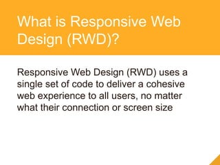
DITA and Information
Architecture for
Responsive Web Design
Why DITA and RWD are made for
each other.
Sponsored By:
Experience the
DCL Difference
DCL blends years of conversion experience with cutting-
edge technology and the infrastructure to make the
process easy and efficient.
• World-Class Services
• Leading-Edge Technology
• Unparalleled Infrastructure
• US-Based Management
• Complex-Content Expertise
• 24/7 Online Project Tracking
• Automated Quality Control
• Global Capabilities
Valuable Content
Transformed
• Document Digitization
• XML and HTML Conversion
• eBook Production
• Hosted Solutions
• Big Data Automation
• Conversion Management
• Editorial Services
• Harmonizer
We Serve a Very
Broad Client Base
• Periodicals
• Professional
• Publishing
• Reference
• Research
• Societies
• Software
• STM
• Technology
• Telecommunications
• Universities
• Utilities
…Spanning all Industries
• Aerospace
• Associations
• Defense
• Distribution
• Education
• Financial
• Government
• Libraries
• Life Sciences
• Manufacturing
• Medical
• Museums
Keith Schengili-Roberts
• Senior Content Strategist at Yellow Pencil
• Lecturer on Information Architecture at University of
Toronto
• Runs www.DITAWriter.com
• DITA XML training/consulting
Phil Kneer
• User Experience Designer at Yellow Pencil
• 15+ years of experience in communication design,
branding, responsive web design and coding
• Self-professed “design geek” with a passion for
creating usable things that solve real problems
Who Are These Guys?
The DITA GuyThe Responsive Guy
Who Are These Guys?
We are a web design agency that
focuses on content first, responsive
design projects.
We work with large Enterprise CMS
driven sites and solve large, messy,
complex content and usability issues.
Who is Yellow Pencil
We make clients with big
messy web problems better at
communicating on the web.
What that Really Means
A Short Story: Going Back
to My Roots
The First Professional
Website I Worked On
The Most Recent Website I
Helped Launch
Yellow Pencil Specializes in
Making Responsive Websites
Phil the Responsive Guy
Web + IBM + Responsive
=
That DITA stuff sounds familiar
The Web is Not Just
on the Desktop
Slide Title
Slide content goes here
image concept courtesy of Brad Frost (bradfrostweb.com)
Slide Title
Slide content goes here
image concept courtesy of Brad Frost (bradfrostweb.com)
The Web Comes First
81% of Canadians use
the web first
when looking for
services.
We’re at the Tipping Point
50% of smartphone
owners primarily use
their phone to
access the internet.
Keep it Consistent
90% of consumers who
own more than one
device use multiple
devices to accomplish
a goal.
Information Development
Trends 2014 (Hackos)
Information Development
Trends 2014 (Hackos)
What is Responsive Web Design (RWD)?
Responsive Web Design (RWD) uses a
single set of code to deliver a cohesive
web experience to all users, no matter
what their connection or screen size
What is Responsive Web
Design (RWD)?
Media Queries
+
CSS
=
Fluid Layouts
customized for
screen size
How Does it Work?
Everything resizes (including images and
video) to fit the size of the display
Flexible Layouts & Images
Navigation
adapts for
screen size &
touch
Appropriate Navigation
Are Tricky
And there are
some interesting
approaches.
Responsive Tables
RWD = Standards Based & Device Agnostic,
Works on All Modern Browsers.
Cross-browser/Device
Support
Benefits of Responsive
Web Design
• Reduces long-term costs of ownership
• Streamlines authoring/content management
• Reach a wider audience/universal access to your
content
• The RWD process should focus on the needs
of your audience
• IA considerations come into play dependent
on how/when/why users are viewing your
content and content priority
RWD is Simple – not easy
RWD can be combined with DITA content
• Create a RWD framework and templates
• Generate HTML based on your current
workflow
RWD and DITA HTML
Understanding and Designing
for User Priorities
RWD in action
“Structuring” Content
Before After
“Structuring” Content
• Good content
should be concise
• Reuse content &
structures where
possible
Do Cattlemen Need Mobile?
RWD and Content Priority
Desktop
design:
Call to action
priority #1
Content elements
not prioritized:
Call to action is
lost
Content elements
prioritized: Call to
action remains
priority #1
<DITA> + RWD = ?
What You Need to Consider
• Content quality
• Design and user-experience quality
• Your CMS’ build efficiency
• Content needs to be well-written and focused
on user’s needs
• Think in terms of re-usable “chunks” (content
modelling)
• Think of prioritization in terms of what is
displayed
Content Quality
• User Centered Design
• Design for mobile first + Progressive
Enhancement
• Design For Content First
Design and
User-experience Quality
• Content Models and Wireframes
express the same concepts differently
• Collaboration is key
Content and UX Go Hand in
Hand
Examples of How DITA
+ RWD Can Work
Together
An Example Most of You
Will Know…
DITA + RWD Demo
http://yellowpencil.com/dita-demo/
DITA + RWD combines structured
content with user centered
experience across
all devices.
Talk to us to get the best
of both worlds.
Questions?
Phil Kneer:
phil@yellowpencil.com
Twitter: @pkneer
Keith Schengili-Roberts:
keith@yellowpencil.com
www.DITAWriter.com
Twitter: @ditawriter
www.yellowpencil.com
Get in Touch to Find Out
More

DITA and Information Architecture for Responsive Web Design

  • 1.
    DITA and Information Architecturefor Responsive Web Design Why DITA and RWD are made for each other. Sponsored By:
  • 2.
    Experience the DCL Difference DCLblends years of conversion experience with cutting- edge technology and the infrastructure to make the process easy and efficient. • World-Class Services • Leading-Edge Technology • Unparalleled Infrastructure • US-Based Management • Complex-Content Expertise • 24/7 Online Project Tracking • Automated Quality Control • Global Capabilities
  • 3.
    Valuable Content Transformed • DocumentDigitization • XML and HTML Conversion • eBook Production • Hosted Solutions • Big Data Automation • Conversion Management • Editorial Services • Harmonizer
  • 4.
    We Serve aVery Broad Client Base
  • 5.
    • Periodicals • Professional •Publishing • Reference • Research • Societies • Software • STM • Technology • Telecommunications • Universities • Utilities …Spanning all Industries • Aerospace • Associations • Defense • Distribution • Education • Financial • Government • Libraries • Life Sciences • Manufacturing • Medical • Museums
  • 6.
    Keith Schengili-Roberts • SeniorContent Strategist at Yellow Pencil • Lecturer on Information Architecture at University of Toronto • Runs www.DITAWriter.com • DITA XML training/consulting Phil Kneer • User Experience Designer at Yellow Pencil • 15+ years of experience in communication design, branding, responsive web design and coding • Self-professed “design geek” with a passion for creating usable things that solve real problems Who Are These Guys?
  • 7.
    The DITA GuyTheResponsive Guy Who Are These Guys?
  • 8.
    We are aweb design agency that focuses on content first, responsive design projects. We work with large Enterprise CMS driven sites and solve large, messy, complex content and usability issues. Who is Yellow Pencil
  • 9.
    We make clientswith big messy web problems better at communicating on the web. What that Really Means
  • 10.
    A Short Story:Going Back to My Roots
  • 11.
  • 12.
    The Most RecentWebsite I Helped Launch
  • 13.
    Yellow Pencil Specializesin Making Responsive Websites
  • 14.
    Phil the ResponsiveGuy Web + IBM + Responsive = That DITA stuff sounds familiar
  • 15.
    The Web isNot Just on the Desktop
  • 16.
    Slide Title Slide contentgoes here image concept courtesy of Brad Frost (bradfrostweb.com)
  • 17.
    Slide Title Slide contentgoes here image concept courtesy of Brad Frost (bradfrostweb.com)
  • 18.
    The Web ComesFirst 81% of Canadians use the web first when looking for services.
  • 19.
    We’re at theTipping Point 50% of smartphone owners primarily use their phone to access the internet.
  • 20.
    Keep it Consistent 90%of consumers who own more than one device use multiple devices to accomplish a goal.
  • 21.
  • 22.
  • 23.
    What is ResponsiveWeb Design (RWD)?
  • 24.
    Responsive Web Design(RWD) uses a single set of code to deliver a cohesive web experience to all users, no matter what their connection or screen size What is Responsive Web Design (RWD)?
  • 25.
    Media Queries + CSS = Fluid Layouts customizedfor screen size How Does it Work?
  • 26.
    Everything resizes (includingimages and video) to fit the size of the display Flexible Layouts & Images
  • 27.
    Navigation adapts for screen size& touch Appropriate Navigation
  • 28.
    Are Tricky And thereare some interesting approaches. Responsive Tables
  • 29.
    RWD = StandardsBased & Device Agnostic, Works on All Modern Browsers. Cross-browser/Device Support
  • 30.
    Benefits of Responsive WebDesign • Reduces long-term costs of ownership • Streamlines authoring/content management • Reach a wider audience/universal access to your content
  • 31.
    • The RWDprocess should focus on the needs of your audience • IA considerations come into play dependent on how/when/why users are viewing your content and content priority RWD is Simple – not easy
  • 32.
    RWD can becombined with DITA content • Create a RWD framework and templates • Generate HTML based on your current workflow RWD and DITA HTML
  • 33.
  • 34.
  • 35.
  • 36.
    “Structuring” Content • Goodcontent should be concise • Reuse content & structures where possible
  • 37.
  • 38.
    RWD and ContentPriority Desktop design: Call to action priority #1 Content elements not prioritized: Call to action is lost Content elements prioritized: Call to action remains priority #1
  • 39.
  • 40.
    What You Needto Consider • Content quality • Design and user-experience quality • Your CMS’ build efficiency
  • 41.
    • Content needsto be well-written and focused on user’s needs • Think in terms of re-usable “chunks” (content modelling) • Think of prioritization in terms of what is displayed Content Quality
  • 42.
    • User CenteredDesign • Design for mobile first + Progressive Enhancement • Design For Content First Design and User-experience Quality
  • 43.
    • Content Modelsand Wireframes express the same concepts differently • Collaboration is key Content and UX Go Hand in Hand
  • 44.
    Examples of HowDITA + RWD Can Work Together
  • 45.
    An Example Mostof You Will Know…
  • 46.
    DITA + RWDDemo http://yellowpencil.com/dita-demo/
  • 47.
    DITA + RWDcombines structured content with user centered experience across all devices. Talk to us to get the best of both worlds.
  • 48.
  • 49.
    Phil Kneer: phil@yellowpencil.com Twitter: @pkneer KeithSchengili-Roberts: keith@yellowpencil.com www.DITAWriter.com Twitter: @ditawriter www.yellowpencil.com Get in Touch to Find Out More

Editor's Notes

  • #11 So what’s a DITA IA/consultant doing becoming a Web Content Strategist? Realization that many of the problems facing typical websites are common to most tech docs
  • #12 - Circa 1995, soon after the Web became available to commercial interests - Started out as a Technical Writer, then a Webmaster - Evolved into an Information Architect, grappling with issues relating to transforming websites - Adding structure to content, always being an advocate for the end-user
  • #13 - Most recent website I worked on; hopefully showing that I have learned a few things over the years ;-) - Much of the issues I dealt with while working on this website were structural - While the info here is not “structured”, same IA processes put to work here as for tech docs - Focus is still/always on the customer, focusing on what info they need when and where they need it
  • #14 - This was one of the other things that appealed to me; this is clearly the way web development is going, and YP has expertise in this area - Challenges may seem different between web and tech docs, but the issues they face are fundamentally the same: - Focus on the user - Deliver info to user where and when needed - “Chunk” information into bite-sized pieces
  • #15 DITA? I have been working on the web for a while (yes also a dinoasaur) Worked with similar structured content designing Learning tools & working on Large scale CMS projects Our approach to Responsive & content strategy
  • #16 You can no longer afford to assume that your customers only access the web from their desktop computers.
  • #19 People are using the web. Excuse our Canuck-centric stats, but comparable numbers apply to the US. According to the Institute for Citizen Centered Services (2013), the three primary drivers of service satisfaction overall are: timeliness, ease of access, and positive outcome. Being able to complete a transaction through a single channel is the primary means to delivering customer satisfaction. The same study found that only 38% of participants could complete their transaction through a single channel.
  • #20 People are using mobile. ! People don’t use mobile as a stop gap until they get to a desktop. It’s their first choice. ! says supermonitoring.com
  • #21 People expect to do everything across multiple devices. ! It’s critical to provide a congruent experience between all devices a customer may use to research or complete a transaction. ! Stat by Google, 2012: http://services.google.com/fh/files/misc/multiscreenworld_final.pdf
  • #24 So what is this responsive design stuff anyway?
  • #25 This is a definition I like to use.
  • #26 Talk about what’s going on with this single page design You probably know media queries from the good old days of print stylesheets. Extended for width, height, resolution, portrait vs landscape etc.
  • #27 This is reminiscent of the good old days of table based – proportional layouts and yes I am more than old enough to remember some of the awesome hacky nested table approaches to designing on the web. The key differences is that now everything including images scales, we can optimize layouts for readability and focus and we can scale images And we can adjust things to optimize the layouts for each screen width to optimize usability and readability
  • #28 Mobile navigation has lots of options and which you choose depends on your needs and content Footer list Expanding top level Off canvas Top, right, left Accordion There is no one solution that fits all needs
  • #29 Tables are tricky… Different approaches Scrolling tables Scrolling table with fixed column Pick and choose Set which columns appear by default and which are mandatory Flip rows and columns. Stack rows Which one you choose depends a lot on your content (we have a project that uses multiple approaches for different types of tables)
  • #30 Responsive is part of the HTML 5 and modern standards based approach – basically means: IE 9 & newer Most mobile phones Caveat for everything Use of JS frameworks to ensure usability for older browsers: Modernizer Hammer..js Etc Progressive enhanceent
  • #31 The Foundation of Responsive design is Semantic structured HTML Good for users Good for technology Good for accessibility
  • #34 Move away from large doc sets to smaller, more focused docs Minimalism Structured content There is a greater drive away from generic, all-purpose and more towards personalization Focusing more on the situational needs of the user Delivering docs “on the go” Web is now the first place people turn to
  • #38 You bet they do! Wireless broadband is being increasingly delivered to rural communities There are few scenarios where broadband wireless access is not the norm
  • #41 To understand why we think this, need to consider issues typically facing our usual clients: Content quality Design and user-experience quality Existing CMS build efficiency
  • #42 Most existing web-content is not well-written or focused DITA + minimalism + end-user focus = ideal Best web content needs to be built around re-usable “chunks” rather than locked in long-form “pages” This concept ought to be familiar to DITA users In RWD “chunks” can also be prioritized in terms of what is displayed
  • #43 Responsive is not a one size fits all approach – it is at it’s core a philosophy that can include many other aspects Use the right approach for the right reasons. Mobile first and progressive enhancement allow focus Design for content first allows allows us to ensure we are designing for the right stuff UX Design is about appropriateness and effectiveness. RWD requires a well-thought-out, holistic design system. You have one design for all devices and contexts. Most older web properties were designed for desktop only. Again, DITA + minimalism + end-user focus = ideal RWD can also be used to solve non-DITA specific issues, including: Accessibility Location-based content
  • #44 Responsive is not a one size fits all approach – it is at it’s core a philosophy that can include many other aspects Use the right approach for the right reasons. Mobile first and progressive enhancement allow focus Design for content first allows allows us to ensure we are designing for the right stuff UX Design is about appropriateness and effectiveness. RWD requires a well-thought-out, holistic design system. You have one design for all devices and contexts. Most older web properties were designed for desktop only. Again, DITA + minimalism + end-user focus = ideal RWD can also be used to solve non-DITA specific issues, including: Accessibility Location-based content
  • #45 The following examples/demos illustrate how DITA and RWD can work with each other to deliver the best user experience for technical documentation
  • #48 Need to tighten up the call to action