Digipak Analysis
Analysing Existing Digipaks for ideas
          and inspiration.
In order to get a clear idea of how I would
like to design my own digipak, I have done
some research into existing digipaks of the
same or a similar genre to the song that I
used for my final product. I can thereby get
an idea of the type of conventions that go
with the genre of which I should be trying to
convey through my own digipak.
The Genre: R&B
I think that the song ‘leaving’ would come under the
genre of ‘R&B’ more than any other genre, and so I
have been focussing my digipak research and
analysis on other artists who are of this genre, for
example, Rihanna and Beyonce.
R&B albums usually display a close up, airbrushed
image of the artists face as the main focus of the     Contrasting Album
digipaks for this genre, which contrasts to other      covers by R&B
genres such as heavy metal, where the artists faces    singer, Alicia Keys
are usually covered or hidden. A good example of       and Heavy Metal
this would be the band ‘Slipknot’ who always wear      band, Slipknot.
masks to hide their identity, particularly on album
covers and videos.
The contrast between these two genres highlights
the importance of personal image for the genre of
R&B in regards to product promotion, and so my
Digipak should also convey this message and
display my artist as the main image of the album.
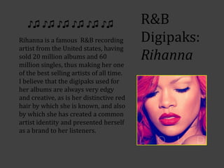
♪♫ ♪♫ ♪♫ ♪♫ ♪♫ ♪♫                       R&B
Rihanna is a famous R&B recording          Digipaks:
artist from the United states, having
sold 20 million albums and 60
million singles, thus making her one
                                           Rihanna
of the best selling artists of all time.
I believe that the digipaks used for
her albums are always very edgy
and creative, as is her distinctive red
hair by which she is known, and also
by which she has created a common
artist identity and presented herself
as a brand to her listeners.
Another noticeable feature of           R&B Digipaks:
Rihannas albums is the fact that
the front cover of the digipak is         Rihanna
always a picture of herself –
usually her face which
accentuates her edgy and
innovative hairstyles and tattoos.
For example, the artwork for the
single ‘take a bow’ (right) which
shows her new (at the time it was
taken) short, boyish haircut and
star tattoo on her ear.
I think this album cover is very
similar to how I would like my own
digipak to turn out like, as I have
many edgy, eye-catching and
colourful pictures of my actress that
would have the same effect, and
create a recognisable artist identity
for the genre.
Rihanna
Another album cover which
reflects Rihannas edgy and daring
brand would be the digipak cover
for her album ‘Rated R’. Although
it is darker and a tad anti
stereotypical of the R&B genre as
it has a rock-ish feeling to it, it is
still recognisable by her fans as
something she has produced
simply for the reason that it is
unusual and striking. Her hair in
this also reflects the ‘shock factor’
element that comes with her artist
identity.
Rihanna
One piece of album artwork produced by
Rihanna which quite strongly reminds
me of ‘leaving’ would be the album
artwork for the song ‘Russian Roulette’
as it shows Rihanna tied up in chains,
suggesting that she is trapped. The idea
of this is very similar to my own idea for
my album cover which I had considered
when acquiring my digipak pictures,
although Rihannas version is rather
more sexual, as my own actress was tied
up in the metaphorical sense of being
trapped by her relationship.
Again, Rihanna seems to go against the
conventions of the Genre of R&B that are
set by other artists such as Beyonce and
Alicia Keys, who take more of a softer
approach to their artist identity.
Rihannas Intertextuality
           Another interesting thing about
           Rihannas albums is the fact
           that, as her brand identity has
           developed over time, she has
           ceased to display her name on
           her album covers (as can be
           seen on ‘Loud’, and ‘Rated R’)
           and if anything she has just
           placed an ‘R’ In the top corner
           of the cover. This is because she
           is so immediately recognisable
           by her fans through her
           innovative and distinctive style
           that she her self has become
           intertextual and can promote
           her products through her
           images.
Beyonce
An R&B singer that takes a very
different approach to the genre and
the way that she displays herself
and her artist identity would be
Beyonce, who comes across as
more natural and softer in contrast
to Rihanna.
The album artwork for ‘If I Were A
Boy’ is much more simple, but just
as striking as Rihannas hard hitting
‘Rated R’ as it is almost ‘angelic’ and
this therefore creates associations
with the softness and
wholesomeness of her personality
and music by which her fans are
familiar with. Therefore creating an
artist identity.

Digipak analysis

  • 1.
    Digipak Analysis Analysing ExistingDigipaks for ideas and inspiration.
  • 2.
    In order toget a clear idea of how I would like to design my own digipak, I have done some research into existing digipaks of the same or a similar genre to the song that I used for my final product. I can thereby get an idea of the type of conventions that go with the genre of which I should be trying to convey through my own digipak.
  • 3.
    The Genre: R&B Ithink that the song ‘leaving’ would come under the genre of ‘R&B’ more than any other genre, and so I have been focussing my digipak research and analysis on other artists who are of this genre, for example, Rihanna and Beyonce. R&B albums usually display a close up, airbrushed image of the artists face as the main focus of the Contrasting Album digipaks for this genre, which contrasts to other covers by R&B genres such as heavy metal, where the artists faces singer, Alicia Keys are usually covered or hidden. A good example of and Heavy Metal this would be the band ‘Slipknot’ who always wear band, Slipknot. masks to hide their identity, particularly on album covers and videos. The contrast between these two genres highlights the importance of personal image for the genre of R&B in regards to product promotion, and so my Digipak should also convey this message and display my artist as the main image of the album.
  • 4.
    ♪♫ ♪♫ ♪♫♪♫ ♪♫ ♪♫ R&B Rihanna is a famous R&B recording Digipaks: artist from the United states, having sold 20 million albums and 60 million singles, thus making her one Rihanna of the best selling artists of all time. I believe that the digipaks used for her albums are always very edgy and creative, as is her distinctive red hair by which she is known, and also by which she has created a common artist identity and presented herself as a brand to her listeners.
  • 5.
    Another noticeable featureof R&B Digipaks: Rihannas albums is the fact that the front cover of the digipak is Rihanna always a picture of herself – usually her face which accentuates her edgy and innovative hairstyles and tattoos. For example, the artwork for the single ‘take a bow’ (right) which shows her new (at the time it was taken) short, boyish haircut and star tattoo on her ear. I think this album cover is very similar to how I would like my own digipak to turn out like, as I have many edgy, eye-catching and colourful pictures of my actress that would have the same effect, and create a recognisable artist identity for the genre.
  • 6.
    Rihanna Another album coverwhich reflects Rihannas edgy and daring brand would be the digipak cover for her album ‘Rated R’. Although it is darker and a tad anti stereotypical of the R&B genre as it has a rock-ish feeling to it, it is still recognisable by her fans as something she has produced simply for the reason that it is unusual and striking. Her hair in this also reflects the ‘shock factor’ element that comes with her artist identity.
  • 7.
    Rihanna One piece ofalbum artwork produced by Rihanna which quite strongly reminds me of ‘leaving’ would be the album artwork for the song ‘Russian Roulette’ as it shows Rihanna tied up in chains, suggesting that she is trapped. The idea of this is very similar to my own idea for my album cover which I had considered when acquiring my digipak pictures, although Rihannas version is rather more sexual, as my own actress was tied up in the metaphorical sense of being trapped by her relationship. Again, Rihanna seems to go against the conventions of the Genre of R&B that are set by other artists such as Beyonce and Alicia Keys, who take more of a softer approach to their artist identity.
  • 8.
    Rihannas Intertextuality Another interesting thing about Rihannas albums is the fact that, as her brand identity has developed over time, she has ceased to display her name on her album covers (as can be seen on ‘Loud’, and ‘Rated R’) and if anything she has just placed an ‘R’ In the top corner of the cover. This is because she is so immediately recognisable by her fans through her innovative and distinctive style that she her self has become intertextual and can promote her products through her images.
  • 9.
    Beyonce An R&B singerthat takes a very different approach to the genre and the way that she displays herself and her artist identity would be Beyonce, who comes across as more natural and softer in contrast to Rihanna. The album artwork for ‘If I Were A Boy’ is much more simple, but just as striking as Rihannas hard hitting ‘Rated R’ as it is almost ‘angelic’ and this therefore creates associations with the softness and wholesomeness of her personality and music by which her fans are familiar with. Therefore creating an artist identity.