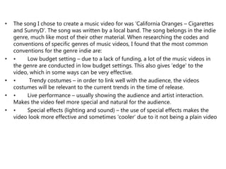
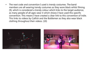
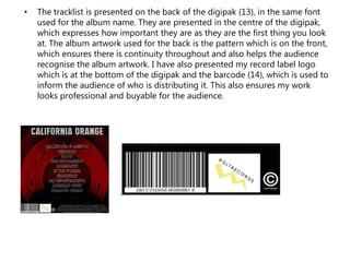
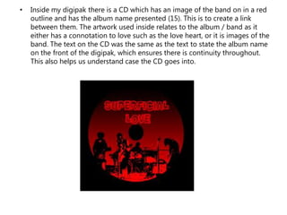
The document discusses how a student's media products for a band called "California Oranges" follow codes and conventions of indie music videos and album packaging.
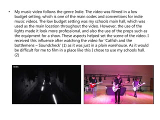
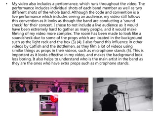
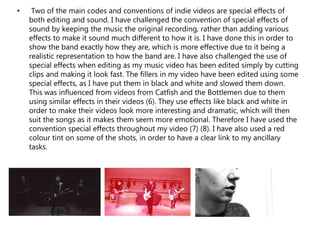
The student filmed a low-budget music video at their school using props and lighting to mimic a live performance setting. Special effects like black and white were used on filler shots. The band wore trendy black costumes.
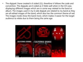
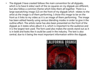
The designed 6-sided digipak contained large eye-catching artwork of the band. It displayed the tracklist, artist name, and record label as required. The CD inside coordinated with the digipak design.
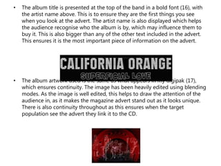
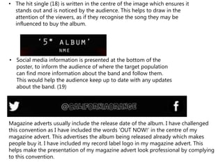
The magazine ad for the album prominently featured the artist name, hit single title, and social media in bold