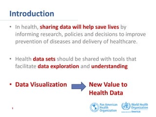
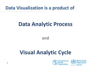
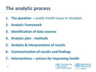
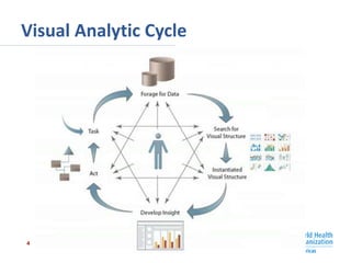
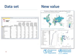
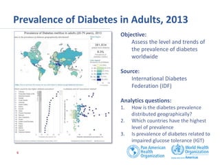
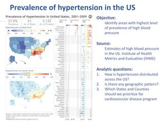
Data Visualization: New Health Data Value
Old School Data Set, Rebooted, Repurposed and Creating Killer New Value
Health Datapalooza, June 2, 2015
Ramon Martinez
Adviser in Health Metrics, Pan American Health Organization (PAHO)
martiner@paho.org @HlthAnalysis
Introduction
• In health, sharing data will help save lives by
informing research, policies and decisions to improve
prevention of diseases and delivery of healthcare.
• Health data sets should be shared with tools that
facilitate data exploration and understanding
• Data Visualization New Value to
Health Data
1
Data Visualization is a product of
Data Analytic Process
and
Visual Analytic Cycle
2
The analytic process
1. The question – public health issue or situation
2. Analytic framework
3. Identification of data sources
4. Analytic plan - methods
5. Analysis & interpretation of results
6. Communication of results and findings
7. Interventions – actions for improving health
3
Visual Analytic Cycle
4
Data set New value
5
Prevalence of Diabetes in Adults, 2013
6
Objective:
Assess the level and trends of
the prevalence of diabetes
worldwide
Source:
International Diabetes
Federation (IDF)
Analytics questions:
1. How is the diabetes prevalence
distributed geographically?
2. Which countries have the highest
level of prevalence
3. Is prevalence of diabetes related to
impaired glucose tolerance (IGT)
Prevalence of hypertension in the US
Objective:
Identify areas with highest level
of prevalence of high blood
pressure
Source:
Estimates of high blood pressure
in the US. Institute of Health
Metrics and Evaluation (IHME)
Analytic questions:
1. How is hypertension distributed
across the US?
2. Is there any geographic pattern?
3. Which States and Counties
should we prioritize for
cardiovascular disease program
Some points to conclude
• In health, sharing data will help save lives by informing
research, policies and decisions to improve prevention of
diseases and delivery of healthcare.
• Share data sets and information visualizations for impact on
a broader audience
• Interactive visualizations can encourage and enable people to
explore underlying or contextual data to broaden
understanding
• An interactive data visualization can tell a story or enable
users to explore and find stories.
8

Data Visualization: New Health Data Value

  • 1.
    Data Visualization: NewHealth Data Value Old School Data Set, Rebooted, Repurposed and Creating Killer New Value Health Datapalooza, June 2, 2015 Ramon Martinez Adviser in Health Metrics, Pan American Health Organization (PAHO) martiner@paho.org @HlthAnalysis
  • 2.
    Introduction • In health,sharing data will help save lives by informing research, policies and decisions to improve prevention of diseases and delivery of healthcare. • Health data sets should be shared with tools that facilitate data exploration and understanding • Data Visualization New Value to Health Data 1
  • 3.
    Data Visualization isa product of Data Analytic Process and Visual Analytic Cycle 2
  • 4.
    The analytic process 1.The question – public health issue or situation 2. Analytic framework 3. Identification of data sources 4. Analytic plan - methods 5. Analysis & interpretation of results 6. Communication of results and findings 7. Interventions – actions for improving health 3
  • 5.
  • 6.
    Data set Newvalue 5
  • 7.
    Prevalence of Diabetesin Adults, 2013 6 Objective: Assess the level and trends of the prevalence of diabetes worldwide Source: International Diabetes Federation (IDF) Analytics questions: 1. How is the diabetes prevalence distributed geographically? 2. Which countries have the highest level of prevalence 3. Is prevalence of diabetes related to impaired glucose tolerance (IGT)
  • 8.
    Prevalence of hypertensionin the US Objective: Identify areas with highest level of prevalence of high blood pressure Source: Estimates of high blood pressure in the US. Institute of Health Metrics and Evaluation (IHME) Analytic questions: 1. How is hypertension distributed across the US? 2. Is there any geographic pattern? 3. Which States and Counties should we prioritize for cardiovascular disease program
  • 9.
    Some points toconclude • In health, sharing data will help save lives by informing research, policies and decisions to improve prevention of diseases and delivery of healthcare. • Share data sets and information visualizations for impact on a broader audience • Interactive visualizations can encourage and enable people to explore underlying or contextual data to broaden understanding • An interactive data visualization can tell a story or enable users to explore and find stories. 8

Editor's Notes