Download as PDF, PPTX

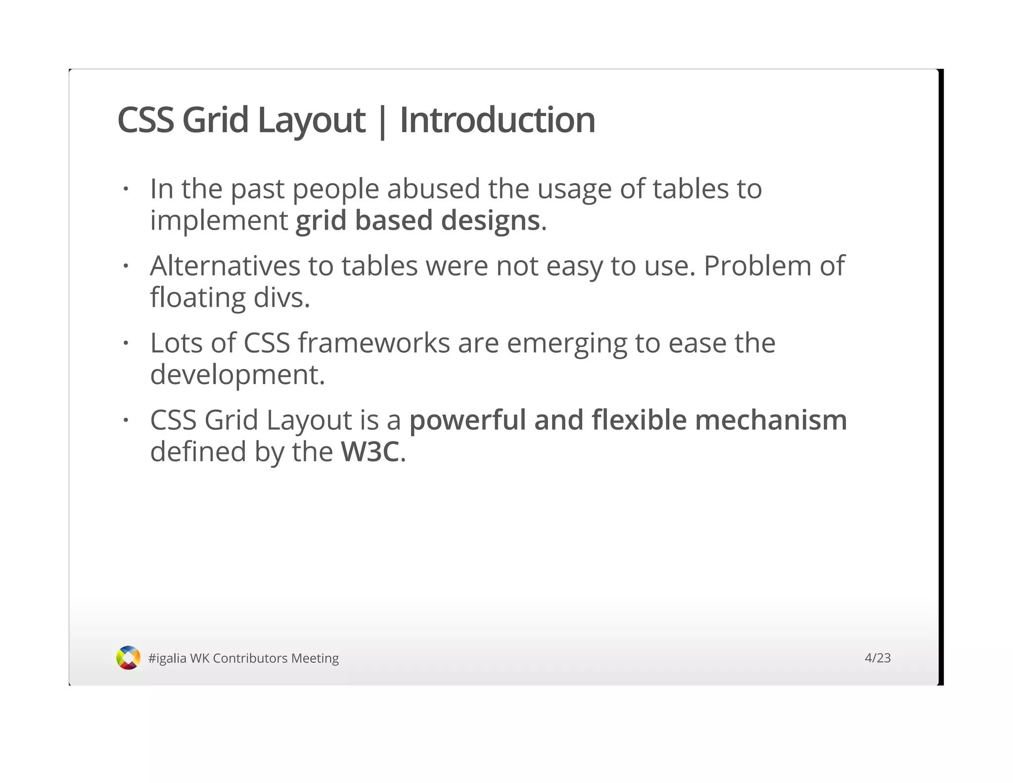
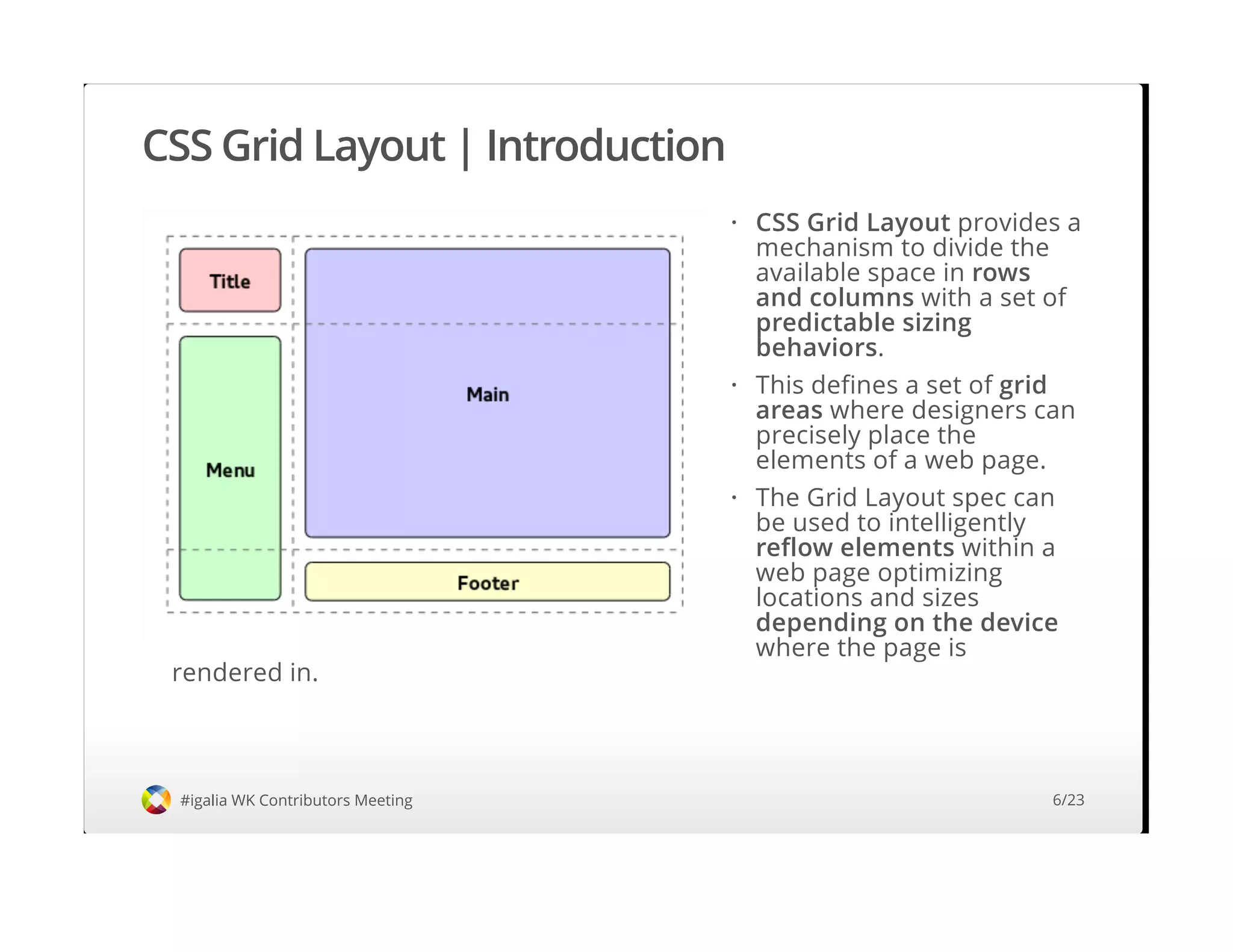
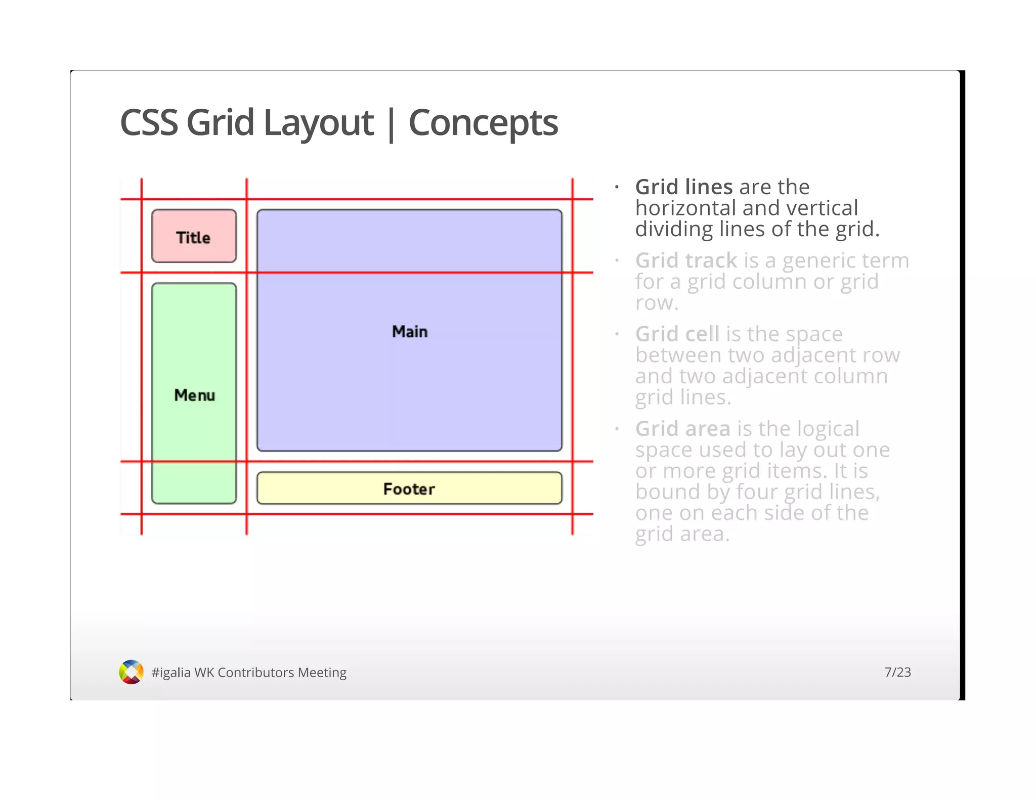
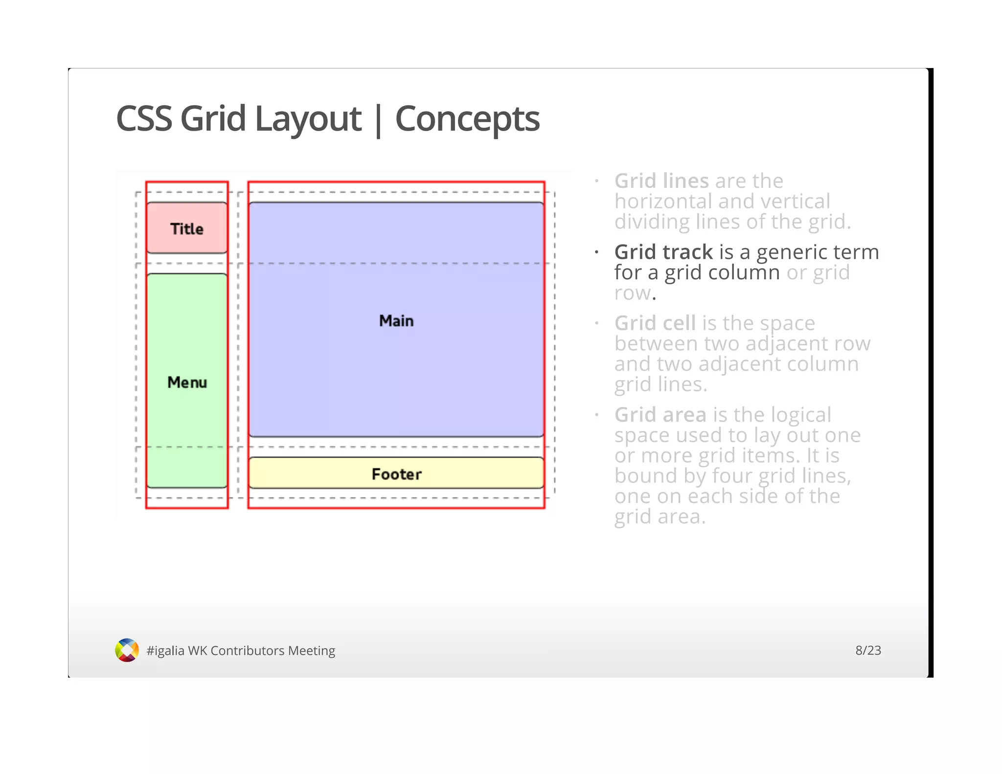
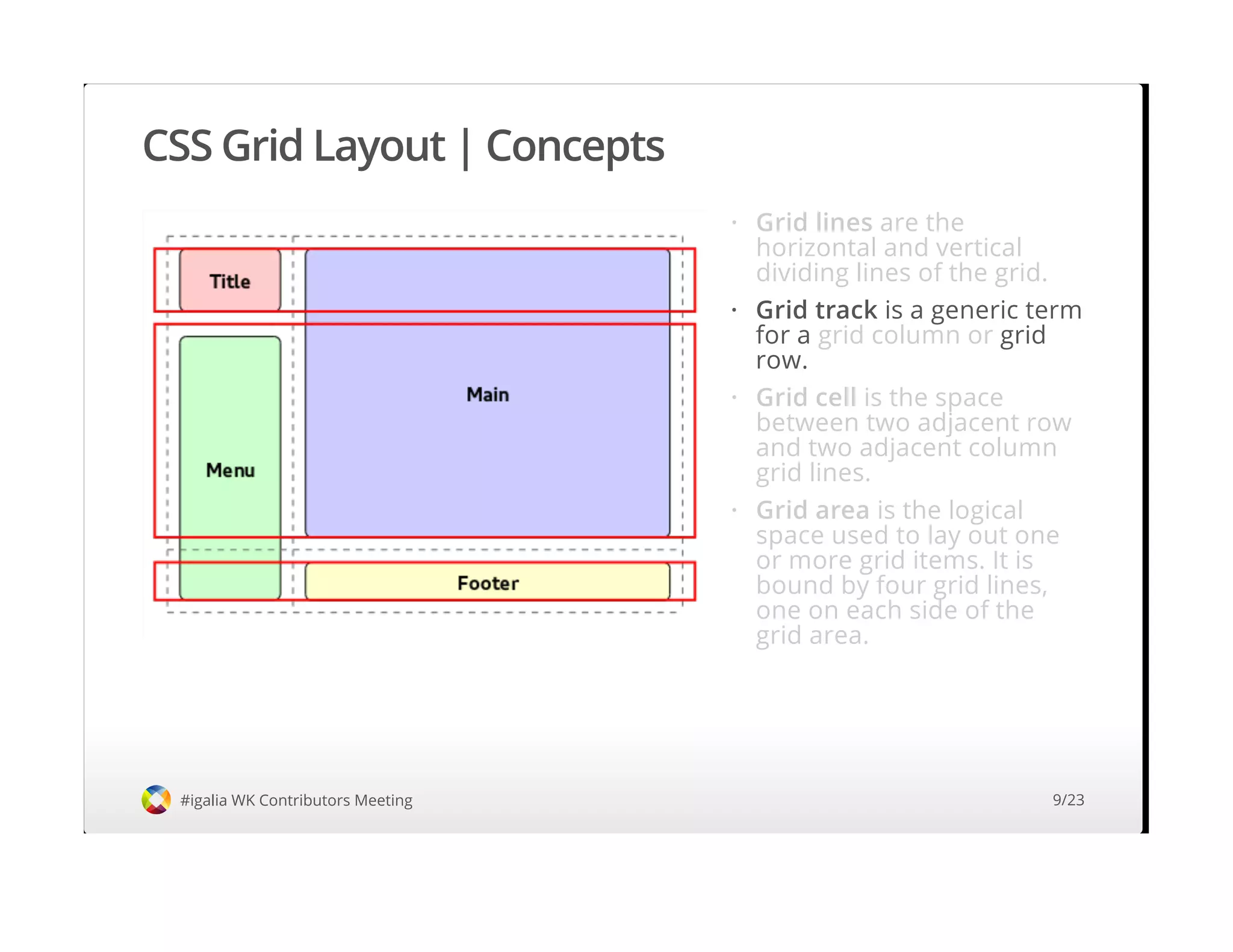
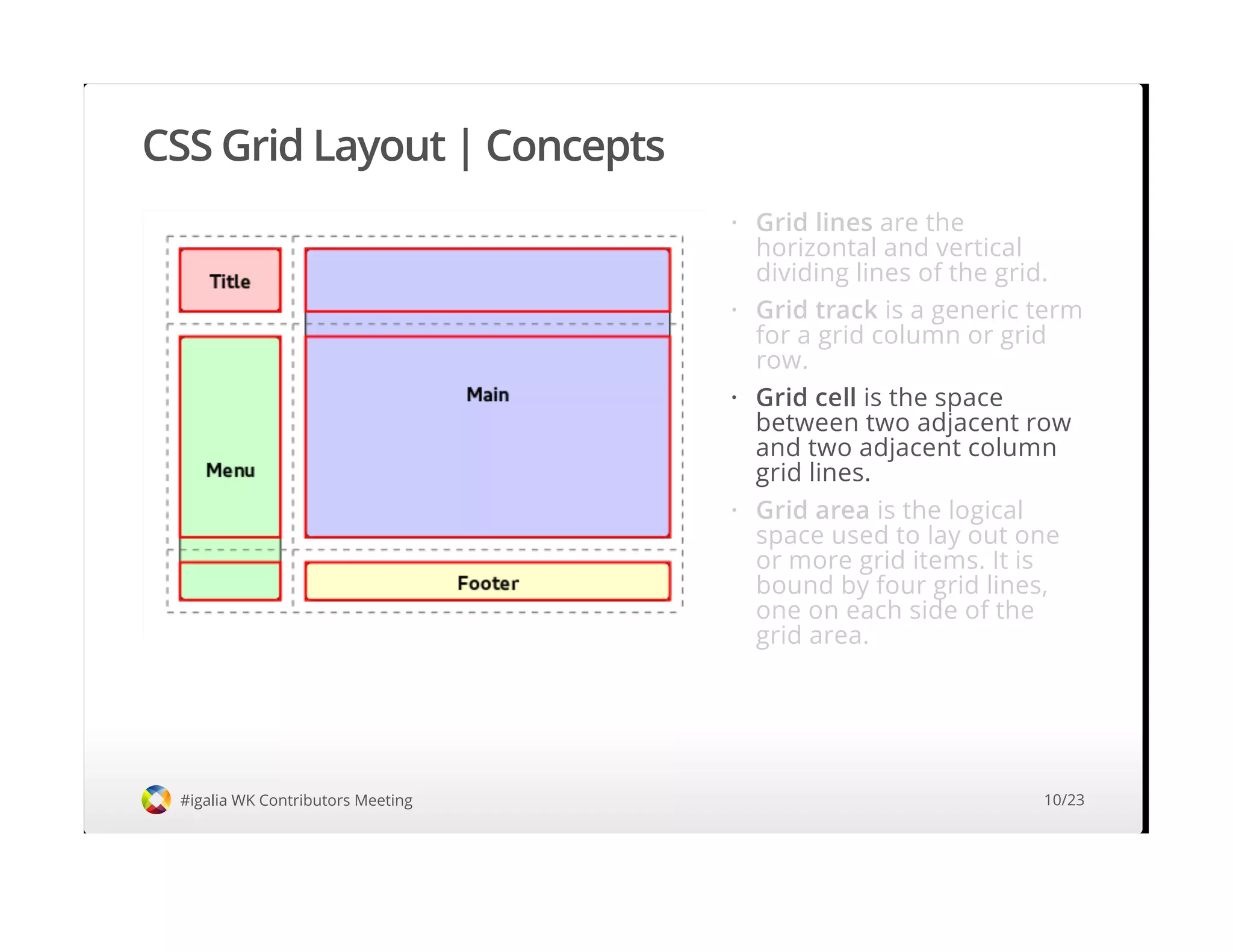
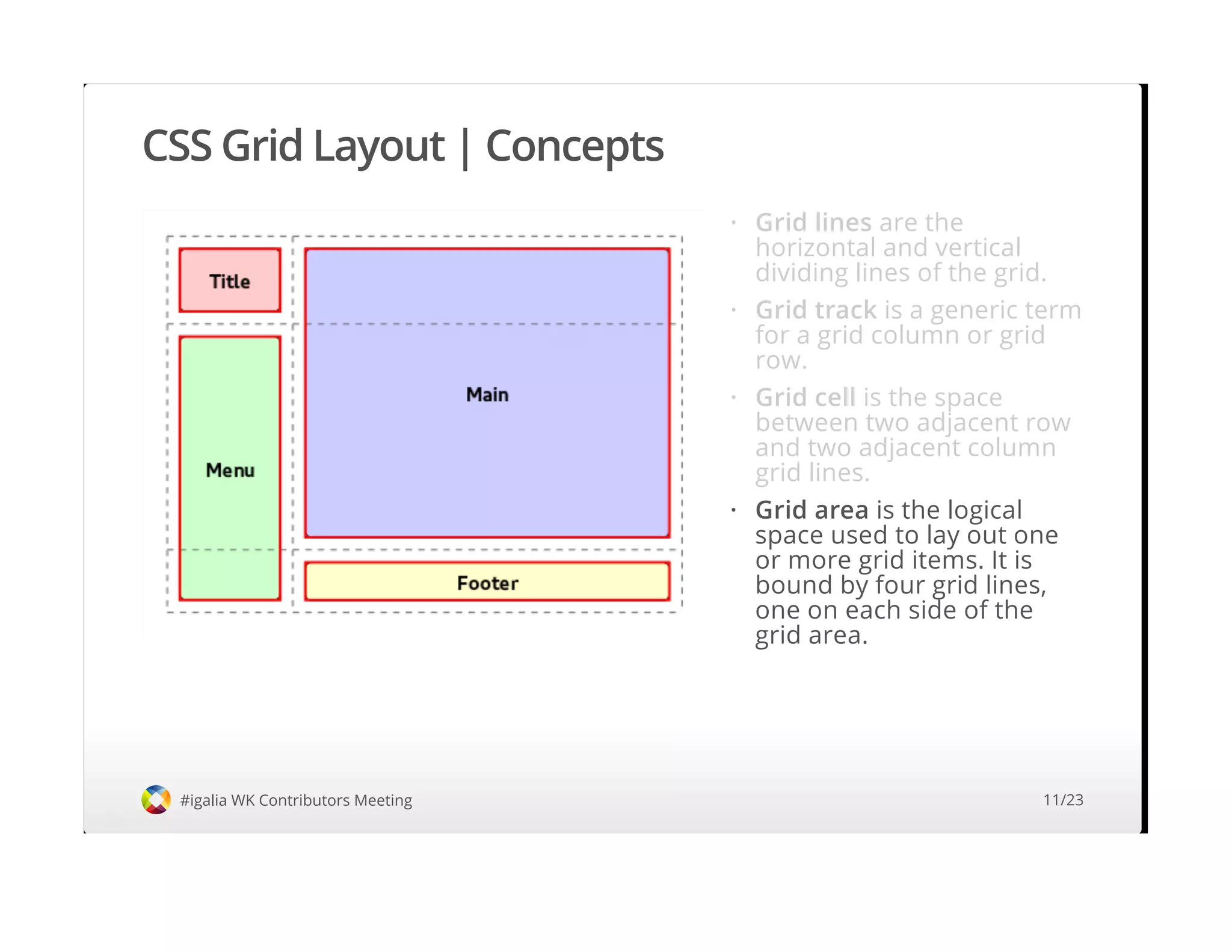
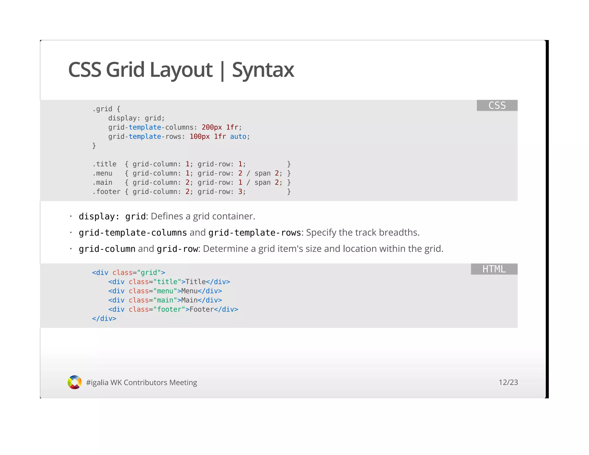
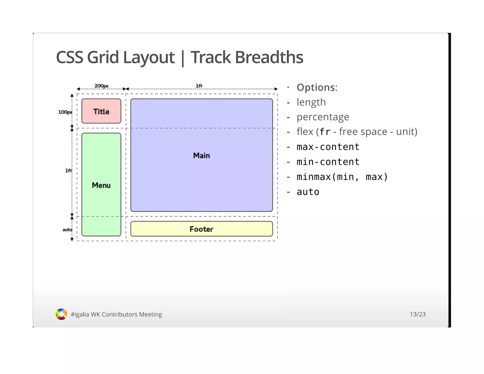
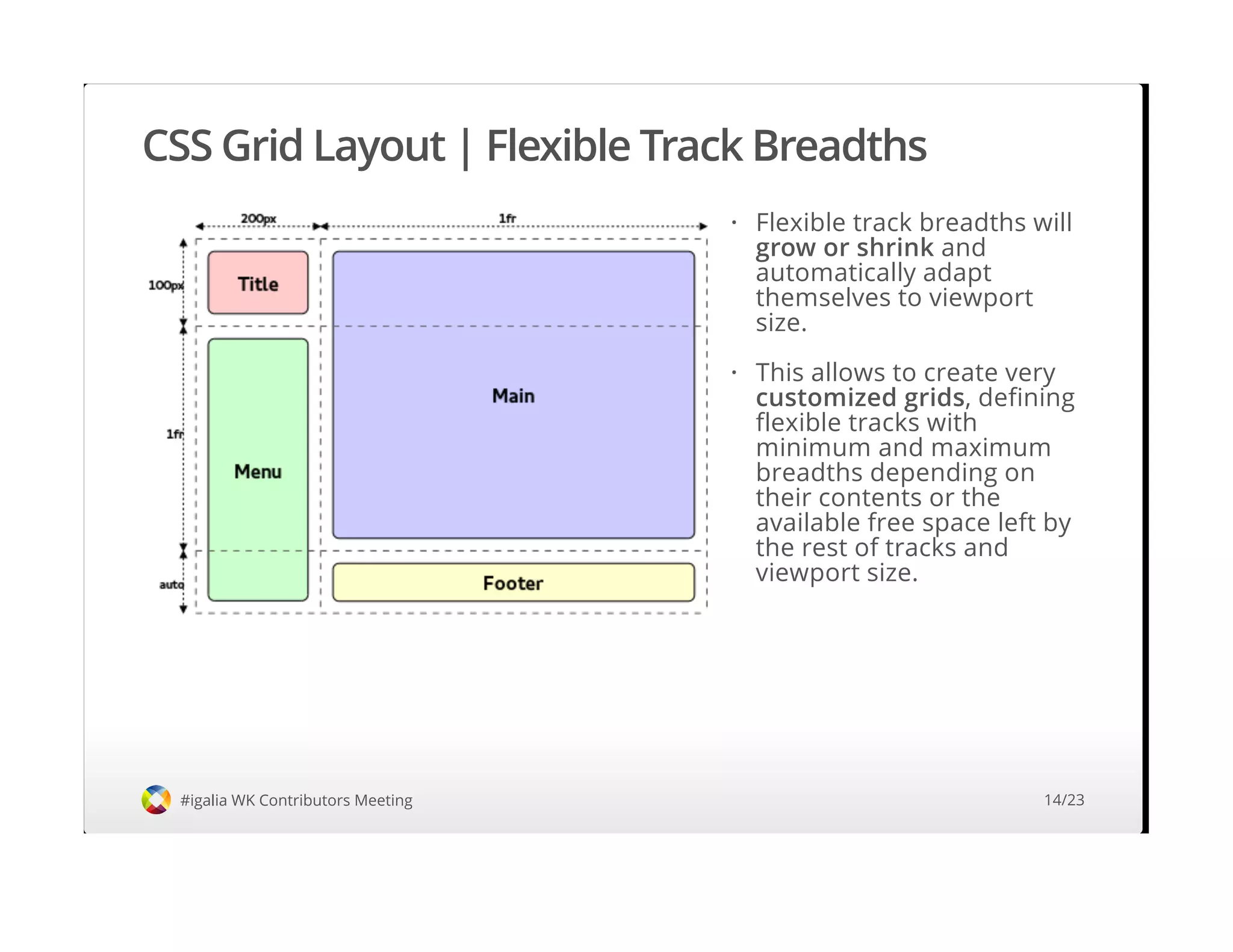
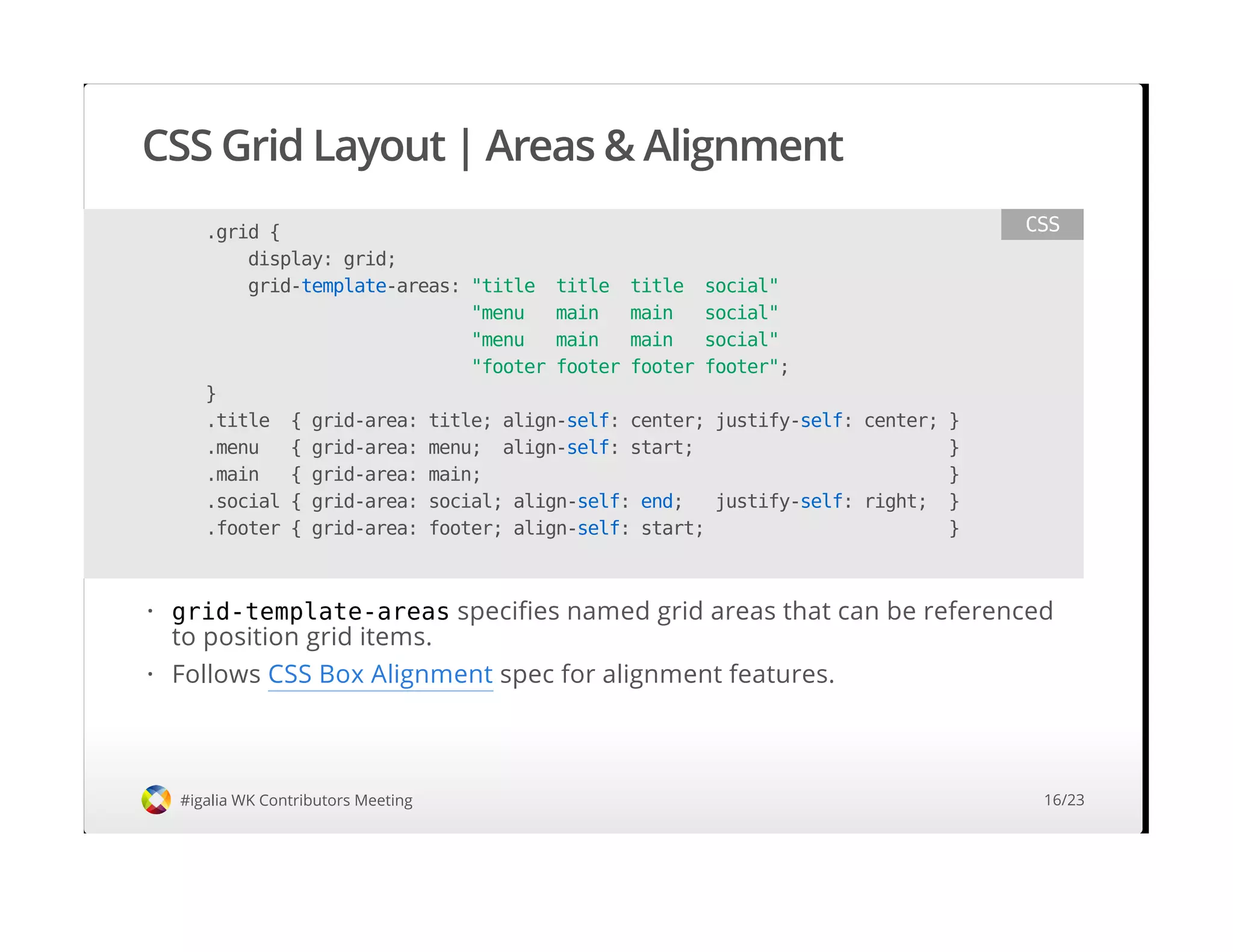
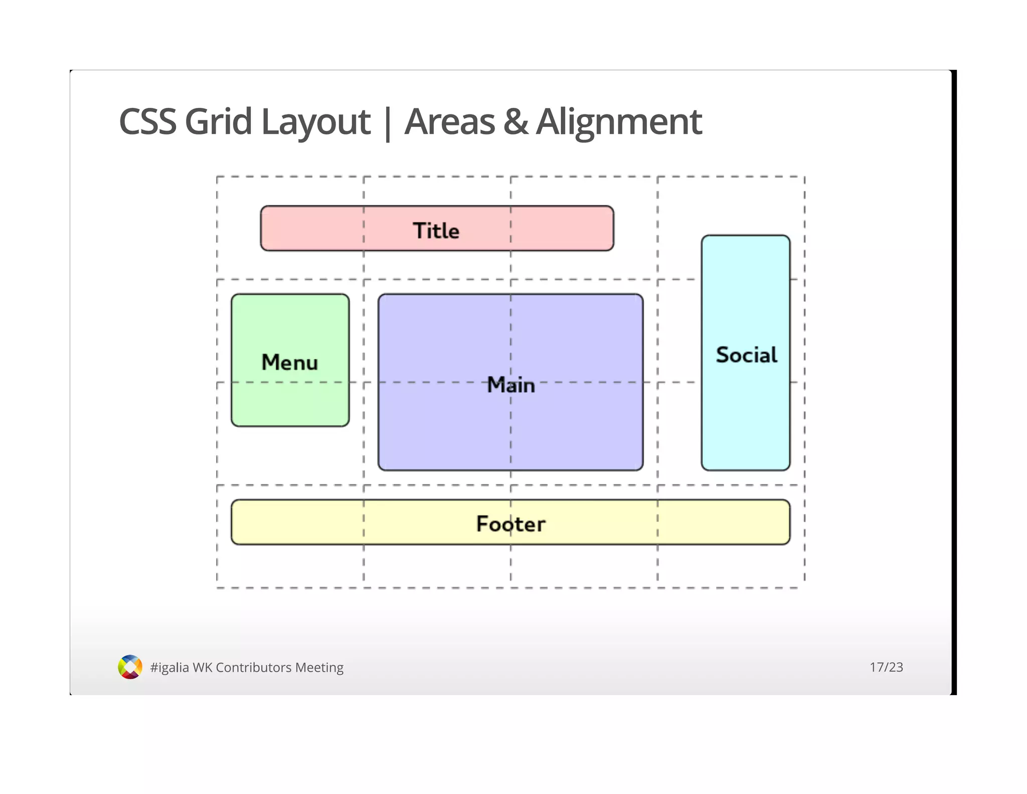
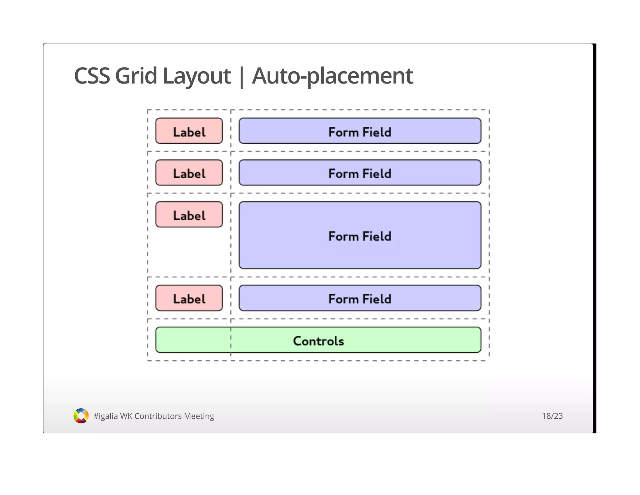
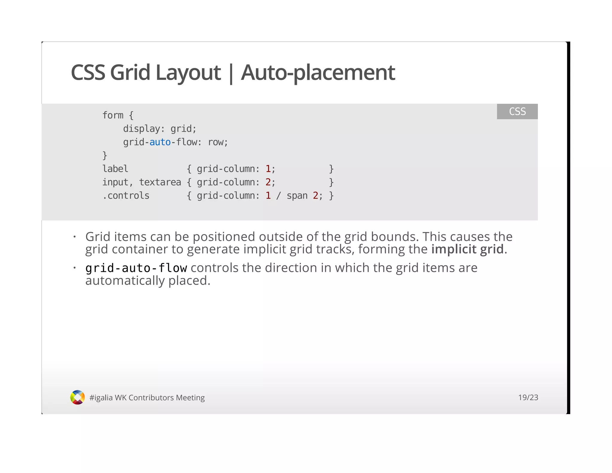


The document discusses CSS Grid Layout, which provides a mechanism for dividing space into rows and columns to define a grid-based layout. It allows precise placement of elements, reflowing optimally for different devices. The document covers grid concepts like lines, tracks, cells and areas. It also describes the syntax for defining track breadths and placing items in the grid. Implementation status is provided, with grid layout already shipped in IE and work ongoing in Blink and WebKit.