
Download to read offline


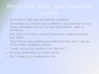


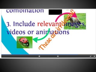


The document provides guidelines for creating effective presentations, emphasizing the importance of knowing your audience, choosing appropriate colors and fonts, and ensuring readability of text. It discusses various elements like text size, background appropriateness, and avoiding overwhelming slides with bullet points. The focus is on enhancing audience engagement while maintaining clarity and professionalism in presentation design.


