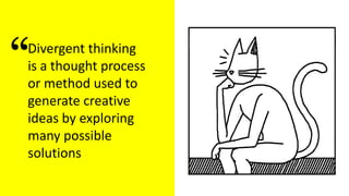
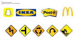
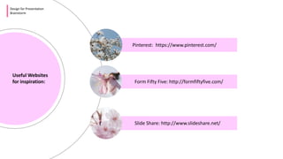
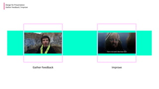
Design for
Presentations
By Eileen Walsh
James Hardiman Library, NUI Galway
Design for Presentation
What will be covered
2 Exercises Design Thinking Process
Design for Presentation
Divergent Thinking Exercise
Exercise 1
Divergent Thinking
Divergent Thinking Exercise
Divergent thinking
is a thought process
or method used to
generate creative
ideas by exploring
many possible
solutions
“
Design for Presentation
Define the Problem
What am I doing?
Who is my audience?
What is the goal?
Images
Icons
Colour Palettes
Typography
Inspirations
GIFS
MEMES
Design for Presentation
Collect Information
What information can
you collect for a
presentation?
IMAGES
Design for Presentation
Collect Information – Images
Where to find images
Stocksnap.io – Free to use images
Openclipart.org – Free to use clipart
flickr.com – Images*
pixabay.com – Free to use images
pexels.com – Free to use images
What is a Creative Commons License?
A Creative Commons (CC) license is one of several public
copyright licenses that enable the free distribution of an
otherwise copyrighted work. A CC license is used when
an author wants to give people the right to share, use,
and build upon a work that he/she has created.
* You may need to include a link to the image source
?
Design for Presentation
Collect Information - Icons
Design for Presentation
Collect Information – MEME
MEME
an element of a culture or system of behaviour passed from one individual to another by
imitation or other non-genetic means.
an image, video, piece of text, etc., typically humorous in nature, that is copied and spread
rapidly by Internet users, often with slight variations.
Browse popular memes or create your own at memegenerator.net
Design for Presentation
Collect Information – GIF
GIF
a format for image files that supports both animated and static images.
Browse popular memes or create your own At giphy.com
Design for Presentation
Collect Information - Typography
To make a point keep text per slide to a minimum or it can end up looking crowded
and people will spend more time reading the slides than listening to you
• To make a point keep text per slide to a minimum or it can
end up looking crowded and people will spend more time
reading the slides than listening to you
• To make a point keep text per slide to a minimum or it can
end up looking crowded and people will spend more time
reading the slides than listening to you
• To make a point keep text per slide to a minimum or it can
end up looking crowded and people will spend more time
reading the slides than listening to you
• To make a point keep text per slide to a minimum or it can
end up looking crowded and people will spend more time
reading the slides than listening to you
• To make a point keep text per slide to a minimum or it can
end up looking crowded and people will spend more time
reading the slides than listening to you
• To make a point keep text per slide to a minimum or it can
end up looking crowded and people will spend more time
reading the slides than listening to you
• To make a point keep text per slide to a minimum or it can
end up looking crowded and people will spend more time
reading the slides than listening to you
• To make a point keep text per slide to a minimum or it can
end up looking crowded and people will spend more time
reading the slides than listening to you
• To make a point keep text per slide to a minimum or it can
end up looking crowded and people will spend more time
reading the slides than listening to you
• To make a point keep text per slide to a minimum or it can
end up looking crowded and people will spend more time
reading the slides than listening to you
• To make a point keep text per slide to a minimum or it can
end up looking crowded and people will spend more time
reading the slides than listening to you
• To make a point keep text per slide to a minimum or it can
end up looking crowded and people will spend more time
reading the slides than listening to you
• To make a point keep text per slide to a minimum or it can
end up looking crowded and people will spend more time
reading the slides than listening to you
• To make a point keep text per slide to a minimum or it can
end up looking crowded and people will spend more time
reading the slides than listening to you
To make a point ,
keep text per slide to a minimum
Make it Interesting
Design for Presentation
Collect Information - Typography
Make it
Interesting
Use Contrast to make
something stand out
Use Contrast to make
something stand out
Use fonts that
are easy to read
Design for Presentation
Collect Information - Typography
Design for Presentation
Collect Information - Typography
Use fonts that are easy to read
Think about size.
People at the back need to be able to read your slides
Design for Presentation
Collect Information - Typography
Design for Presentation
Collect Information - Typography
Think about size.
People at the back need to
be able to read your slides
Design for Presentation
Collect Information - Colour
Colour Top Tip: Colourzilla
A good add on for Chrome. Allows
you to discover the RGB number or
hex number of a colour
Colour is an important part of a
presentation. Decide on a palate for your
presentation and stick to it.
- Use the Pantone website
- Google colour palate to choose one.
- coolors.co - generate and create a palate
- color.adobe.com - generate and create a
palate
People can make
62% to 90% of their
snap decisions about
products based on
colour alone *
* 2006 study in the journal Management Decision
RED
Design for Presentation
Collect Information – Colour Theory Exercise
BLUE
Design for Presentation
Collect Information – Colour Theory Exercise
YELLOW
Design for Presentation
Collect Information – Colour Theory Exercise
Design for Presentation
Brainstorm
Presentation
Hierarchy is about
treating elements
of your presentation
according to their
importance.
“
Design for Presentation
Brainstorm
Useful Websites
for inspiration:
Pinterest: https://www.pinterest.com/
Form Fifty Five: http://formfiftyfive.com/
Slide Share: http://www.slideshare.net/
Useful
Design for Presentation
Develop Solutions
Powerpoint Tools
Design for Presentation
Gather Feedback / Improve
Gather Feedback Improve
@eilz2000
Eilz2000
@EileenWalsh101
eileen.walsh@nuigalway.ie
Find Me on Social Media

Design for presentations

  • 1.
    Design for Presentations By EileenWalsh James Hardiman Library, NUI Galway
  • 2.
    Design for Presentation Whatwill be covered 2 Exercises Design Thinking Process
  • 3.
    Design for Presentation DivergentThinking Exercise Exercise 1 Divergent Thinking
  • 4.
    Divergent Thinking Exercise Divergentthinking is a thought process or method used to generate creative ideas by exploring many possible solutions “
  • 5.
    Design for Presentation Definethe Problem What am I doing? Who is my audience? What is the goal?
  • 6.
    Images Icons Colour Palettes Typography Inspirations GIFS MEMES Design forPresentation Collect Information What information can you collect for a presentation?
  • 7.
    IMAGES Design for Presentation CollectInformation – Images Where to find images Stocksnap.io – Free to use images Openclipart.org – Free to use clipart flickr.com – Images* pixabay.com – Free to use images pexels.com – Free to use images What is a Creative Commons License? A Creative Commons (CC) license is one of several public copyright licenses that enable the free distribution of an otherwise copyrighted work. A CC license is used when an author wants to give people the right to share, use, and build upon a work that he/she has created. * You may need to include a link to the image source ?
  • 8.
  • 9.
    Design for Presentation CollectInformation – MEME MEME an element of a culture or system of behaviour passed from one individual to another by imitation or other non-genetic means. an image, video, piece of text, etc., typically humorous in nature, that is copied and spread rapidly by Internet users, often with slight variations. Browse popular memes or create your own at memegenerator.net
  • 10.
    Design for Presentation CollectInformation – GIF GIF a format for image files that supports both animated and static images. Browse popular memes or create your own At giphy.com
  • 11.
    Design for Presentation CollectInformation - Typography
  • 12.
    To make apoint keep text per slide to a minimum or it can end up looking crowded and people will spend more time reading the slides than listening to you • To make a point keep text per slide to a minimum or it can end up looking crowded and people will spend more time reading the slides than listening to you • To make a point keep text per slide to a minimum or it can end up looking crowded and people will spend more time reading the slides than listening to you • To make a point keep text per slide to a minimum or it can end up looking crowded and people will spend more time reading the slides than listening to you • To make a point keep text per slide to a minimum or it can end up looking crowded and people will spend more time reading the slides than listening to you • To make a point keep text per slide to a minimum or it can end up looking crowded and people will spend more time reading the slides than listening to you • To make a point keep text per slide to a minimum or it can end up looking crowded and people will spend more time reading the slides than listening to you • To make a point keep text per slide to a minimum or it can end up looking crowded and people will spend more time reading the slides than listening to you • To make a point keep text per slide to a minimum or it can end up looking crowded and people will spend more time reading the slides than listening to you • To make a point keep text per slide to a minimum or it can end up looking crowded and people will spend more time reading the slides than listening to you • To make a point keep text per slide to a minimum or it can end up looking crowded and people will spend more time reading the slides than listening to you • To make a point keep text per slide to a minimum or it can end up looking crowded and people will spend more time reading the slides than listening to you • To make a point keep text per slide to a minimum or it can end up looking crowded and people will spend more time reading the slides than listening to you • To make a point keep text per slide to a minimum or it can end up looking crowded and people will spend more time reading the slides than listening to you • To make a point keep text per slide to a minimum or it can end up looking crowded and people will spend more time reading the slides than listening to you
  • 13.
    To make apoint , keep text per slide to a minimum
  • 14.
    Make it Interesting Designfor Presentation Collect Information - Typography
  • 15.
  • 16.
    Use Contrast tomake something stand out
  • 17.
    Use Contrast tomake something stand out
  • 18.
    Use fonts that areeasy to read Design for Presentation Collect Information - Typography
  • 19.
    Design for Presentation CollectInformation - Typography Use fonts that are easy to read
  • 20.
    Think about size. Peopleat the back need to be able to read your slides Design for Presentation Collect Information - Typography
  • 21.
    Design for Presentation CollectInformation - Typography Think about size. People at the back need to be able to read your slides
  • 22.
    Design for Presentation CollectInformation - Colour Colour Top Tip: Colourzilla A good add on for Chrome. Allows you to discover the RGB number or hex number of a colour Colour is an important part of a presentation. Decide on a palate for your presentation and stick to it. - Use the Pantone website - Google colour palate to choose one. - coolors.co - generate and create a palate - color.adobe.com - generate and create a palate
  • 23.
    People can make 62%to 90% of their snap decisions about products based on colour alone * * 2006 study in the journal Management Decision
  • 24.
  • 25.
    Design for Presentation CollectInformation – Colour Theory Exercise
  • 26.
  • 27.
    Design for Presentation CollectInformation – Colour Theory Exercise
  • 28.
  • 29.
    Design for Presentation CollectInformation – Colour Theory Exercise
  • 30.
    Design for Presentation Brainstorm Presentation Hierarchyis about treating elements of your presentation according to their importance. “
  • 31.
    Design for Presentation Brainstorm UsefulWebsites for inspiration: Pinterest: https://www.pinterest.com/ Form Fifty Five: http://formfiftyfive.com/ Slide Share: http://www.slideshare.net/
  • 32.
    Useful Design for Presentation DevelopSolutions Powerpoint Tools
  • 33.
    Design for Presentation GatherFeedback / Improve Gather Feedback Improve
  • 34.

Editor's Notes

  • #27 Across cultures we see red portrayed in a variety of different associations. In China, red is a symbol of good luck. In South Africa, red is symbolic of mourning. If you’re “in the red” on Wall Street, you’re losing money. In Jamaica, if you’re red, you’re drunk. In U.S. politics, Red is the Republican Party. Worldwide, red is the color communism. As we can see in these few examples, even though the color itself does not change, the emotional impact that it creates does. Remember, red’s meaning is often dependent on its cultural, historical, and political context.