Call Girls Agency In Goa 💚 9316020077 💚 Call Girl Goa By Russian Call Girl ...
Kerrang! Cover Shows Rock Artists Crushing UK
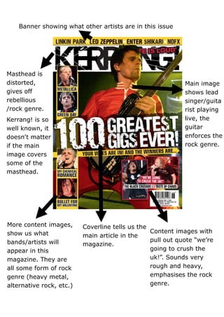
1. Banner showing what other artists are in this issue
Masthead is
distorted, Main image
gives off shows lead
rebellious singer/guita
/rock genre. rist playing
Kerrang! is so live, the
well known, it guitar
doesn't matter enforces the
if the main rock genre.
image covers
some of the
masthead.
More content images, Coverline tells us the
show us what Content images with
main article in the
bands/artists will pull out quote “we’re
magazine.
appear in this going to crush the
magazine. They are uk!”. Sounds very
all some form of rock rough and heavy,
genre (heavy metal, emphasises the rock
alternative rock, etc.) genre.
2. Typography
All letters are in bold with most having some sort of effect (mostly
distorted). This jumps out at us and is somewhat aggressive; showing us
the magazine is loud and in your face. This emphasises the rock genre.
Not many taglines/cover lines are used, keeps it simplistic but effective.
A pull out quote is used; “We’re going to crush the UK!” This sounds
aggressive and loud, again emphasising the rock genre.
Layout/Images
The masthead takes up the top centre part of the cover and the
central image blocks a part of it, but because Kerrang! is such a well-
known magazine, it doesn’t need the whole Masthead showing for people
to recognise it.
The Coverline “100 Greatest Gigs Ever!” is slightly slanted in the
middle of the page, covering the central image. This makes the cover not
look so simplistic and boring; it makes it a little different and the slanted
style could stand for the magazine being heavy or uneven.
The central image takes up the background of the whole page and
is of the lead singer of the band Muse playing guitar live. This shows the
magazine is of rock genre because 1. The picture is of a member of a rock
band 2. The electric guitar is a symbol of rock.
Along the left side column of the cover are more small content
images of rock bands that will appear in this particular magazine.
Colour
The colour scheme of this magazine is red, yellow, black and white.
The red and yellow could be seen as loud, in your face, while the black
and white are neutral which counter out any debate whether the
magazine is purely for girls or boys.
Mise-en-scene
Props used are things such as guitars, make-up and in your face
clothes. All of these props emphasise the rock genre.