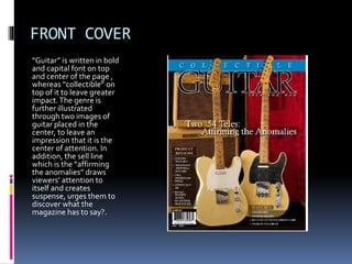
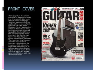
MAGAZINE ANALYSIS
MEDIA STUDIES
FRONT COVER
Firstly, the title is written in bold and
capital font on the top and at the
center of the page. It is in white color
to make it more prominent. Moreover,
portraits of artists have been used
along with the same instrument
repeatedly shown from different
positions , to make the magazine
appear more classical and continue
the genre which has been successfully
represented to the viewers.This may
also convey that these instruments
might be the speciality of those
unique figures
FRONT COVER
“Guitar” is written in bold
and capital font on top
and center of the page ,
whereas “collectible” on
top of it to leave greater
impact.The genre is
further illustrated
through two images of
guitar placed in the
center, to leave an
impression that it is the
center of attention. In
addition, the sell line
which is the “affirming
the anomalies” draws
viewers’ attention to
itself and creates
suspense, urges them to
discover what the
magazine has to say?.
FRONT COVER
There is a picture of a guitar in
the center of the page to convey
it to viewers that it is the center
of focus. On top of the page,
“GUITAR” is written in bold and
capital so that we know what the
magazine is actually about.
Moreover, “Buyer” is also written
in front of the masthead in red,
but consuming much less space
to establish the clear difference
that it is comparatively of less
importance and that the main
focus is still the guitar, even
though it’s part of the masthead.
There are many strap lines used
across the page to reveal
important contents about the
magazine , which ,otherwise,
might have been unnoticed. In
addition, a decent combination
of grey and black is used. Most
strap lines are in back whereas,
some in red.This is to catch more
attention of viewers .

Prees tt (2)

  • 1.
  • 2.
    FRONT COVER Firstly, thetitle is written in bold and capital font on the top and at the center of the page. It is in white color to make it more prominent. Moreover, portraits of artists have been used along with the same instrument repeatedly shown from different positions , to make the magazine appear more classical and continue the genre which has been successfully represented to the viewers.This may also convey that these instruments might be the speciality of those unique figures
  • 3.
    FRONT COVER “Guitar” iswritten in bold and capital font on top and center of the page , whereas “collectible” on top of it to leave greater impact.The genre is further illustrated through two images of guitar placed in the center, to leave an impression that it is the center of attention. In addition, the sell line which is the “affirming the anomalies” draws viewers’ attention to itself and creates suspense, urges them to discover what the magazine has to say?.
  • 4.
    FRONT COVER There isa picture of a guitar in the center of the page to convey it to viewers that it is the center of focus. On top of the page, “GUITAR” is written in bold and capital so that we know what the magazine is actually about. Moreover, “Buyer” is also written in front of the masthead in red, but consuming much less space to establish the clear difference that it is comparatively of less importance and that the main focus is still the guitar, even though it’s part of the masthead. There are many strap lines used across the page to reveal important contents about the magazine , which ,otherwise, might have been unnoticed. In addition, a decent combination of grey and black is used. Most strap lines are in back whereas, some in red.This is to catch more attention of viewers .