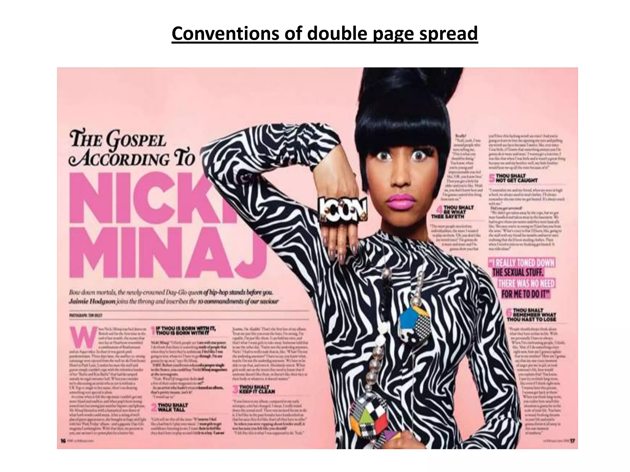
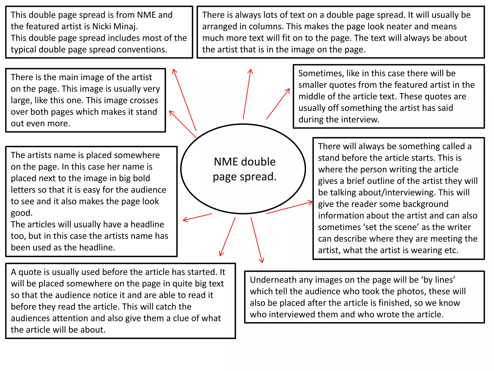
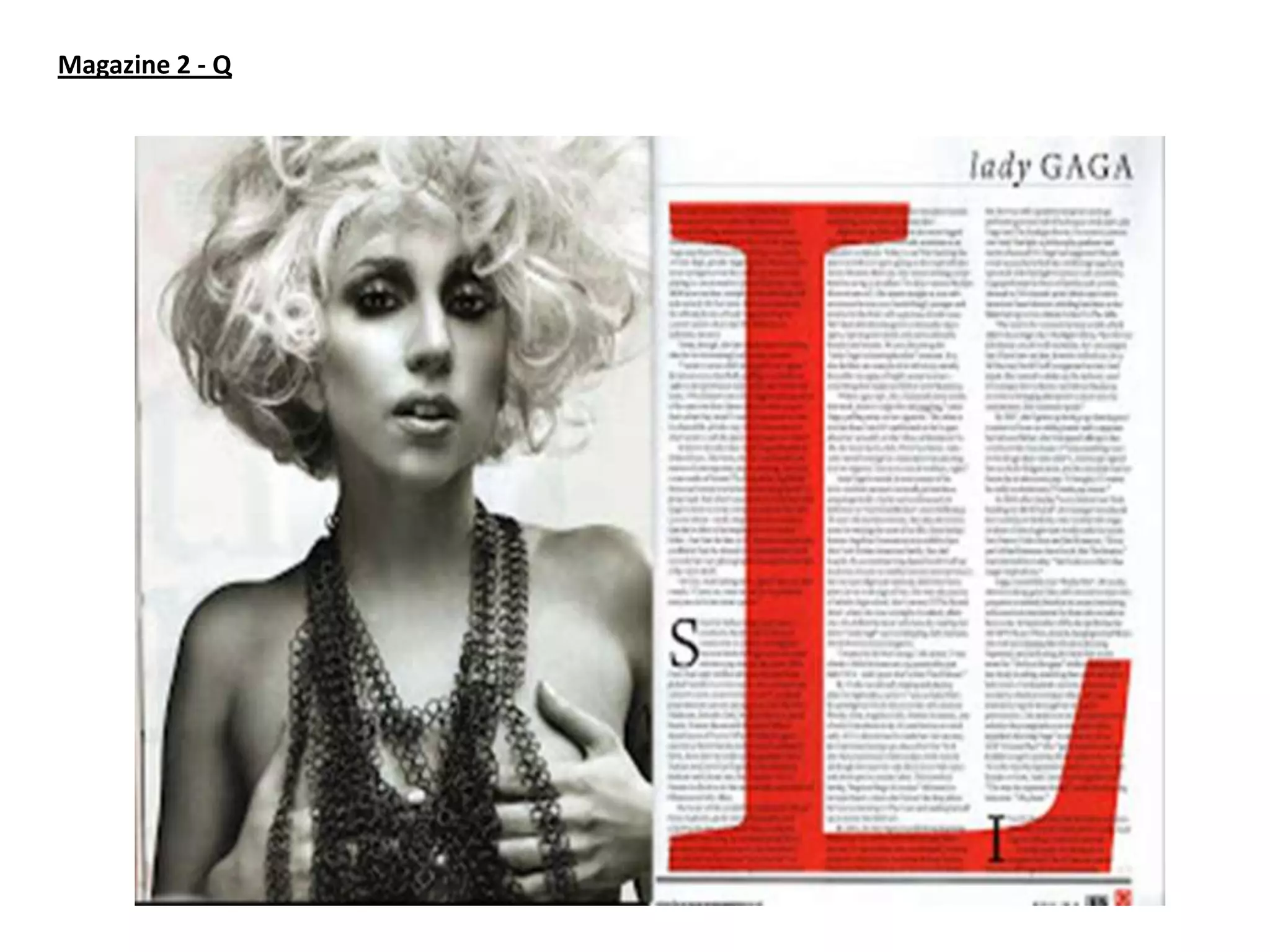
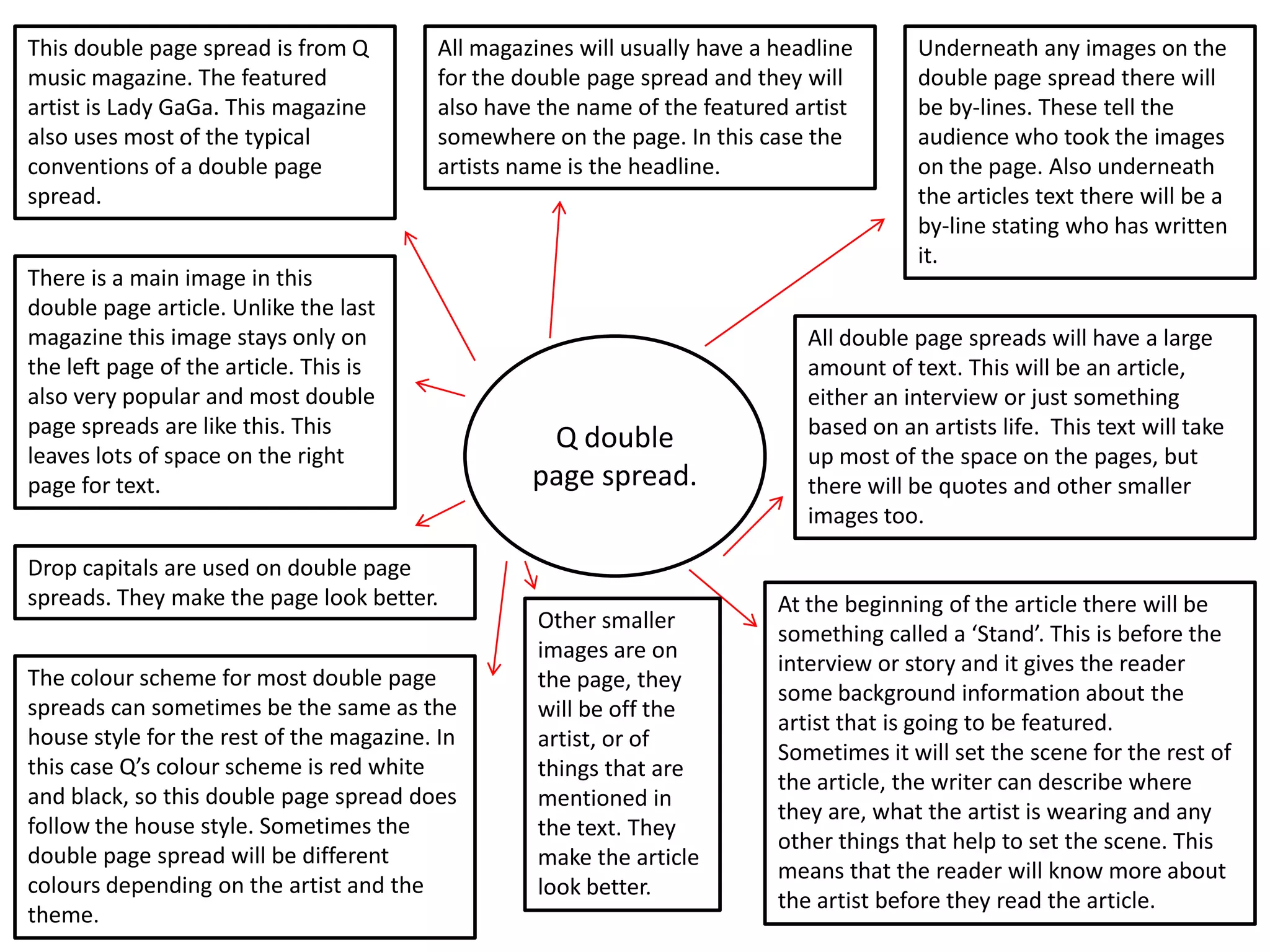
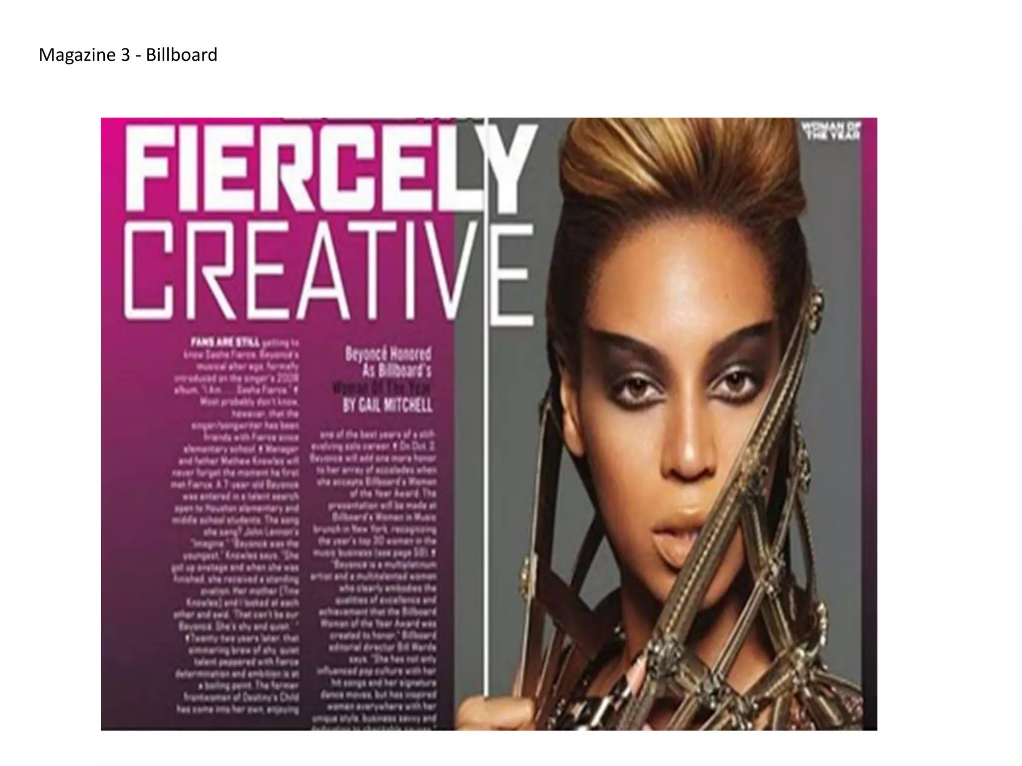
Conventions of double page spread
This double page spread is from NME and
the featured artist is Nicki Minaj.
This double page spread includes most of the
typical double page spread conventions.

There is always lots of text on a double page spread. It will usually be
arranged in columns. This makes the page look neater and means
much more text will fit on to the page. The text will always be about
the artist that is in the image on the page.
Sometimes, like in this case there will be
smaller quotes from the featured artist in the
middle of the article text. These quotes are
usually off something the artist has said
during the interview.

There is the main image of the artist
on the page. This image is usually very
large, like this one. This image crosses
over both pages which makes it stand
out even more.
The artists name is placed somewhere
on the page. In this case her name is
placed next to the image in big bold
letters so that it is easy for the audience
to see and it also makes the page look
good.
The articles will usually have a headline
too, but in this case the artists name has
been used as the headline.

NME double
page spread.

A quote is usually used before the article has started. It
will be placed somewhere on the page in quite big text
so that the audience notice it and are able to read it
before they read the article. This will catch the
audiences attention and also give them a clue of what
the article will be about.

There will always be something called a
stand before the article starts. This is
where the person writing the article
gives a brief outline of the artist they will
be talking about/interviewing. This will
give the reader some background
information about the artist and can also
sometimes ‘set the scene’ as the writer
can describe where they are meeting the
artist, what the artist is wearing etc.

Underneath any images on the page will be ‘by lines’
which tell the audience who took the photos, these will
also be placed after the article is finished, so we know
who interviewed them and who wrote the article.
Magazine 2 - Q
This double page spread is from Q
music magazine. The featured
artist is Lady GaGa. This magazine
also uses most of the typical
conventions of a double page
spread.

All magazines will usually have a headline
for the double page spread and they will
also have the name of the featured artist
somewhere on the page. In this case the
artists name is the headline.

There is a main image in this
double page article. Unlike the last
magazine this image stays only on
the left page of the article. This is
also very popular and most double
page spreads are like this. This
leaves lots of space on the right
page for text.
Drop capitals are used on double page
spreads. They make the page look better.
The colour scheme for most double page
spreads can sometimes be the same as the
house style for the rest of the magazine. In
this case Q’s colour scheme is red white
and black, so this double page spread does
follow the house style. Sometimes the
double page spread will be different
colours depending on the artist and the
theme.

Q double
page spread.

Other smaller
images are on
the page, they
will be off the
artist, or of
things that are
mentioned in
the text. They
make the article
look better.

Underneath any images on the
double page spread there will
be by-lines. These tell the
audience who took the images
on the page. Also underneath
the articles text there will be a
by-line stating who has written
it.

All double page spreads will have a large
amount of text. This will be an article,
either an interview or just something
based on an artists life. This text will take
up most of the space on the pages, but
there will be quotes and other smaller
images too.

At the beginning of the article there will be
something called a ‘Stand’. This is before the
interview or story and it gives the reader
some background information about the
artist that is going to be featured.
Sometimes it will set the scene for the rest of
the article, the writer can describe where
they are, what the artist is wearing and any
other things that help to set the scene. This
means that the reader will know more about
the artist before they read the article.
Magazine 3 - Billboard
This double page spread is from Billboard
magazine. The feature artist is Beyoncé.
This magazine also uses most of the
typical conventions of a double page
spread.
All double page spreads will have a big
main image. Sometimes the image will
be spread across both pages and some
will just take up one page. In this
magazine the image is on one side of
the spread. This is good because the
main focus of the spread is the image
which will always be of the artist being
featured. Having the image on one side
of the page there leaves lots of room
for the rest of the text.
Most articles will have a headline. The
headline for this article is ‘’Fiercely
creative’’ this obviously links to Beyoncé as
she is known as a strong independent
women. The title takes up quite a lot of
room on the page so it can catch the
readers attention.

The ‘stand’ at the beginning of the article gives
the audience some information about the
artist that the article is about. It can tell them
about what they have done but it can also be
used to set the scene of the interview. The
audience can be told what the artist is wearing
and where they are for example. This means
the reader will know all about the artist before
reading the article.

Billboard double
page spread

All articles will have text. This text will be
an interview or something based on the
artist in the image. This artist will always
be linked to the genre of the magazine, in
this case the artist is Beyoncé and the
magazine is a music magazine.

Underneath any images on the page there will
be ‘by lines’ these by lines will tell the
audience who took the images. There will also
be a by line at the end of the article, this will
tell you who has written the article and who
interviewed the artist.

Conventions of double page spread

  • 1.
  • 2.
    This double pagespread is from NME and the featured artist is Nicki Minaj. This double page spread includes most of the typical double page spread conventions. There is always lots of text on a double page spread. It will usually be arranged in columns. This makes the page look neater and means much more text will fit on to the page. The text will always be about the artist that is in the image on the page. Sometimes, like in this case there will be smaller quotes from the featured artist in the middle of the article text. These quotes are usually off something the artist has said during the interview. There is the main image of the artist on the page. This image is usually very large, like this one. This image crosses over both pages which makes it stand out even more. The artists name is placed somewhere on the page. In this case her name is placed next to the image in big bold letters so that it is easy for the audience to see and it also makes the page look good. The articles will usually have a headline too, but in this case the artists name has been used as the headline. NME double page spread. A quote is usually used before the article has started. It will be placed somewhere on the page in quite big text so that the audience notice it and are able to read it before they read the article. This will catch the audiences attention and also give them a clue of what the article will be about. There will always be something called a stand before the article starts. This is where the person writing the article gives a brief outline of the artist they will be talking about/interviewing. This will give the reader some background information about the artist and can also sometimes ‘set the scene’ as the writer can describe where they are meeting the artist, what the artist is wearing etc. Underneath any images on the page will be ‘by lines’ which tell the audience who took the photos, these will also be placed after the article is finished, so we know who interviewed them and who wrote the article.
  • 3.
  • 4.
    This double pagespread is from Q music magazine. The featured artist is Lady GaGa. This magazine also uses most of the typical conventions of a double page spread. All magazines will usually have a headline for the double page spread and they will also have the name of the featured artist somewhere on the page. In this case the artists name is the headline. There is a main image in this double page article. Unlike the last magazine this image stays only on the left page of the article. This is also very popular and most double page spreads are like this. This leaves lots of space on the right page for text. Drop capitals are used on double page spreads. They make the page look better. The colour scheme for most double page spreads can sometimes be the same as the house style for the rest of the magazine. In this case Q’s colour scheme is red white and black, so this double page spread does follow the house style. Sometimes the double page spread will be different colours depending on the artist and the theme. Q double page spread. Other smaller images are on the page, they will be off the artist, or of things that are mentioned in the text. They make the article look better. Underneath any images on the double page spread there will be by-lines. These tell the audience who took the images on the page. Also underneath the articles text there will be a by-line stating who has written it. All double page spreads will have a large amount of text. This will be an article, either an interview or just something based on an artists life. This text will take up most of the space on the pages, but there will be quotes and other smaller images too. At the beginning of the article there will be something called a ‘Stand’. This is before the interview or story and it gives the reader some background information about the artist that is going to be featured. Sometimes it will set the scene for the rest of the article, the writer can describe where they are, what the artist is wearing and any other things that help to set the scene. This means that the reader will know more about the artist before they read the article.
  • 5.
    Magazine 3 -Billboard
  • 6.
    This double pagespread is from Billboard magazine. The feature artist is Beyoncé. This magazine also uses most of the typical conventions of a double page spread. All double page spreads will have a big main image. Sometimes the image will be spread across both pages and some will just take up one page. In this magazine the image is on one side of the spread. This is good because the main focus of the spread is the image which will always be of the artist being featured. Having the image on one side of the page there leaves lots of room for the rest of the text. Most articles will have a headline. The headline for this article is ‘’Fiercely creative’’ this obviously links to Beyoncé as she is known as a strong independent women. The title takes up quite a lot of room on the page so it can catch the readers attention. The ‘stand’ at the beginning of the article gives the audience some information about the artist that the article is about. It can tell them about what they have done but it can also be used to set the scene of the interview. The audience can be told what the artist is wearing and where they are for example. This means the reader will know all about the artist before reading the article. Billboard double page spread All articles will have text. This text will be an interview or something based on the artist in the image. This artist will always be linked to the genre of the magazine, in this case the artist is Beyoncé and the magazine is a music magazine. Underneath any images on the page there will be ‘by lines’ these by lines will tell the audience who took the images. There will also be a by line at the end of the article, this will tell you who has written the article and who interviewed the artist.