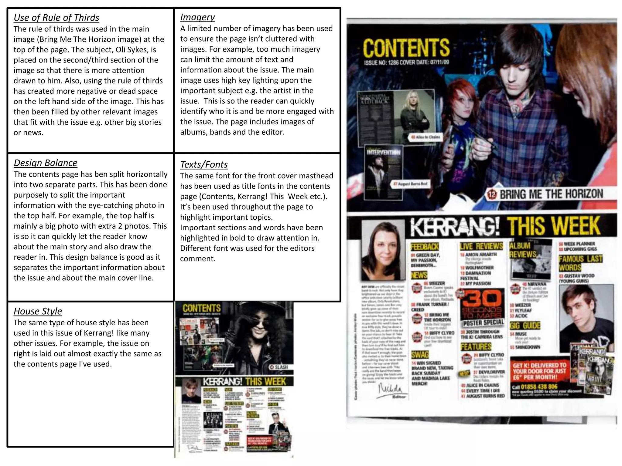
The document discusses the layout and design elements used in two different magazine issues. It notes that both issues use a consistent house style and layout to provide continuity across issues. For the first issue, it describes how the rule of thirds was applied to the cover image and how the contents page was split horizontally to separate key information. Imagery was limited to prevent clutter, and fonts were used consistently to highlight important sections. For the second issue, it summarizes how the cover image also follows the rule of thirds and how black and white colors provide balance across the page. Limited imagery and varied fonts for headings vs body text are also discussed.