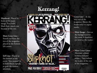
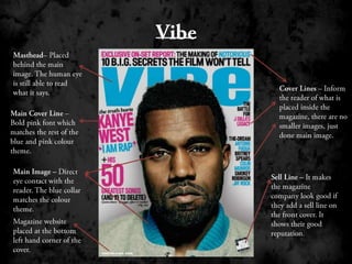
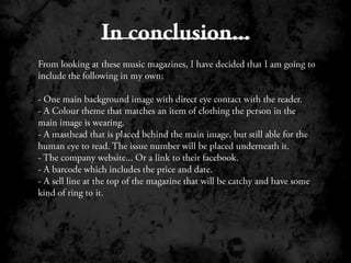
The document analyzes the cover designs of three music magazines: Q Magazine, Kerrang!, and Vibe. Some common elements identified across the magazines include the masthead placed prominently but not obscuring the cover image, cover lines providing information on stories inside, and sell lines in bold text designed to attract customers. Based on this analysis, the author decides their own magazine cover will include a large central image making eye contact with the reader, color coordination between the image and magazine theme, the masthead and issue number placed above the image, website information, a barcode with pricing and date, and an attention-grabbing sell line at the top.
