
Recommended
More Related Content
What's hot
What's hot (14)
Viewers also liked
Similar to Comparison
Similar to Comparison (20)
More from jessheap
More from jessheap (20)
Comparison
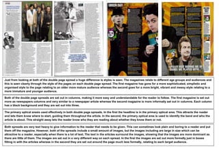
- 1. Just from looking at both of the double page spread a huge difference is styles is seen. The magazines relate to different age groups and audiences and this is seen clearly through the style of the pages on each double page spread. The first magazine has gone for a more sophisticated, simplistic and organised style to the page relating to an older more mature audience whereas the second goes for a more bright, vibrant and messy style relating to a more immature and younger audience. Both of the double page spreads are set out in columns, making it more easy and understandable for the reader to follow. The first magazine is set out more as newspapers columns and very similar to a newspaper article whereas the second magazine is more informally set out in columns. Each column has a black background and they are set out into three. The primary optical areais used effectively in both double page spreads. In the first the headline is in the primary optical area. This attracts the reader and lets them know where to start, guiding them throughout the article. In the second, the primary optical area is used to identify the band and who the article is about. This straight away lets the reader know who they are reading about whether they know them or not. Both spreads are very text heavy to give information to the reader that needs to be given. This can sometimes look plain and boring to a reader and put them off the magazine. However, both of the spreads include a small amount of images, but the images including are large in size which can be attractive to a reader, especially when there is a lot of text. The text in the articles surround the images, showing that the images are more dominant as there are little of them. The images are set out in a very different way on each spread. In the first the images are set out more formally just in boxes fitting in with the articles whereas in the second they are set out around the page much less formally, relating to each target audience.