Question 1
•Download as DOC, PDF•
1 like•145 views

The student created a documentary, radio spot, and magazine article on rising university tuition fees for a media coursework assignment. The documentary followed conventions of the expositional documentary genre through use of voiceover, interviews, and factual information. The radio spot similarly used voiceover, clips from interviews, and brief informative descriptions as is typical. However, the magazine article challenged some conventions by not including a title and instead using an attention-grabbing sub-heading, as well as featuring a quote from the documentary rather than a pull-quote. In conclusion, the documentary and radio spot closely resembled real media products while the magazine article challenged some conventions.

More Related Content
What's hot
What's hot (19)
Similar to Question 1
Similar to Question 1 (20)
Question 1
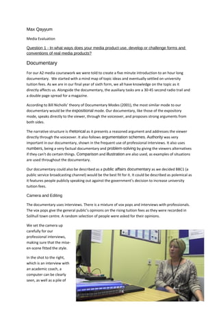
- 1. Max Qayyum Media Evaluation Question 1 - In what ways does your media product use, develop or challenge forms and conventions of real media products? Documentary For our A2 media coursework we were told to create a five minute introduction to an hour long documentary. We started with a mind map of topic ideas and eventually settled on university tuition fees. As we are in our final year of sixth form, we all have knowledge on the topic as it directly affects us. Alongside the documentary, the auxiliary tasks are a 30-45 second radio trail and a double page spread for a magazine. According to Bill Nicholls’ theory of Documentary Modes (2001), the most similar mode to our documentary would be the expositional mode. Our documentary, like those of the expository mode, speaks directly to the viewer, through the voiceover, and proposes strong arguments from both sides. The narrative structure is rhetorical as it presents a reasoned argument and addresses the viewer directly through the voiceover. It also follows argumentation schemes. Authority was very important in our documentary, shown in the frequent use of professional interviews. It also uses numbers, being a very factual documentary and problem-solving by giving the viewers alternatives if they can’t do certain things. Comparison and illustration are also used, as examples of situations are used throughout the documentary. Our documentary could also be described as a public affairs documentary as we decided BBC1 (a public service broadcasting channel) would be the best fit for it. It could be described as polemical as it features people publicly speaking out against the government’s decision to increase university tuition fees. Camera and Editing The documentary uses interviews. There is a mixture of vox pops and interviews with professionals. The vox pops give the general public’s opinions on the rising tuition fees as they were recorded in Solihull town centre. A random selection of people were asked for their opinions. We set the camera up carefully for our professional interviews, making sure that the mise- en-scene fitted the style. In the shot to the right, which is an interview with an academic coach, a computer can be clearly seen, as well as a pile of
- 2. papers and a calendar in the background on the wall. These are expected to be found in the office of an academic coach. The camera angle also provides looking room, a common convention of the documentary genre, where the interviewee does not look into the camera, but rather at the person interviewing them. The medium close up shot type is common within the documentary genre (documentaries such as “ Super Size Me” and “Airline” both frequently use it) and we replicated it in all of our interviews. A tripod was used for all of the interviews to maintain a steady shot. A similar medium close-up shot from Morgan Spurlock’s “Super Size Me” showing the concept of looking room, and also shows a lawyer with a pile of books on his desk as well as a computer, showing the careful use of mise-en-scene. The use of tripod allowed us to record a steady pan of Solihull as an establishing shot for the later vox pops, as well as a pan of Solihull Sixth Form which is where the professional interviews are filmed. We also performed focus racks on certain shots, one of which being a shot of two girls studying behind a set of bars. This should imply the lack of clarity and the feeling of being anxious, or trapped, due to confusion over the tuition fees rising.
- 3. When interviewing Owen Furnival, we recorded a shot of him walking down a yellow corridor, gradually becoming more focused. Straight after this there is a fade out and a fade into him sitting in a similarly coloured room, which was nicely set up by the previous shot. Straight cuts are primarily used throughout the documentary which is a common convention of the genre, with few effects being used. However, we did occasionally use cross dissolves when we felt the straight cut wasn’t effective, which could be seen as challenging conventions, and we also sped up a couple of clips to make them more interesting. Another convention frequently used in documentaries is the use of archive footage. In our documentary we filmed a Youtube video of the student protests in London about the rise of the tuition fees. Sound The documentary features a voiceover which is a common convention in real documentaries. Similarly to “Airline”, the voiceover speaks directly to the viewer. However, Airline doesn’t use any secondary research, it is all primary research. Our documentary features a mix of both, an example of secondary research would be “5000 fewer students applied to university in 2012,” which we During professional interviews, we always displayed their name and profession on screen, a common convention of documentaries. researched during the research and planning parts of the coursework. As well as this, the voiceover
- 4. introduces interviews from professionals and also vox pops which often provide primary research, with information being given by the interviewees. Non-diagetic background music is present throughout the documentary and was made in Garageband by our group. The background music’s purpose was to carry the documentary along, without being overpowering; a common convention of real documentaries (an example would be Morgan Spurlock’s “Super Size Me”). It is kept at a low volume level, muted during some sections when it is not appropriate, and faded down so it does not abruptly cut off. If it did abruptly cut off, or was too loud, it would draw attention away from the documentary itself, and the voiceover. Radio Trail We carried out research into other radio trails which showed that most use voiceovers and a common feature is that they often use clips of the shows they are advertising. We used clips from our own interview, specifically the first line which we thought was attention-grabbing, “fees rise to a maximum of £9000 a year in English universities.” The music used in our radio trail is the same music used in the background of our documentary. As it plays a similar role in the rail trailer as the documentary, to carry the trail along without being overpowering, it seemed like the best choice. It also adds to the professional feel and listeners will watch the documentary. For the voiceover, we had an enthusiastic narrator to excite listeners. By using language such as “we aim to answer the question, ‘degree or not degree’ once and for all” we were hoping to excite potential viewers, and by repeating the title we hoped it would stick in listeners‘ minds. Important information that we needed conveyed was a brief outline on the documentary (“Degree or Not Degree aims to find out the view of the general public as well as getting professional opinions on the increasing university fees”) to find and the date, time and TV channel (“on Friday the 18th at 8 on BBC1”). These are both common conventions of real radio trails. The radio trails that we researched were all 20-45 seconds long. We felt that a longer trail (45 seconds) was better as it allowed us to fill it with information about the documentary without becoming repetitive. Magazine Article All of the images used for the magazine article contain the Degree or Not Degree logo which was used within the documentary itself, as well as projecting the logo onto a screen for the main image. ge above.
- 5. left han e image in the text on the By doing this, we were hoping to create a clear house style and etch the logo clearly into the head of the reader so it will become familiar. Along with this, we used the same black, white and grey colour scheme throughout throughout, as well as using the same font as the logo for the headings. These are all common conventions of real media products. d on the format of th Our magazine article was based on TV & Satellite week. below image is also base placed. The le. t ic e ar th y don’t seem randomly n no a tio m or i nf f to i ll b a m as es g iv that the t i as ign D es In , related to the topic, so n xi bo s hi dt ate re ec er W to give more information We recreated this box in InDesign as it gives The a small bit of information on the article. We recreated the box which displays when magazine article could be said to challenge and where the show will be shown in InDesign have captions
- 6. b We used images which We used images which both have captions to give more information, related to the topic, so that they don’t seem randomly placed. The below image is also based on the format of the image in the text on the left hand page above. conventions of real media products as the image itself serves as a kind of masthead for the article. The use of a cross-head here breaks up the article and sets a kind of heading for the next section. We used a quote here, but one from the documentary here, rather than a pull-quote which could be said as challenging conventions.
- 7. We felt as though the logo itself said enough and another title wasn’t required, so instead we used “uni fees too high... Applicants too low” as a sub-heading, with the antithesis used in the phrasing hopefully grabbing the attention of readers. In conclusion I feel as though the documentary and radio trail closely follow the conventions of real media products, while the magazine article challenges some.
- 8. We felt as though the logo itself said enough and another title wasn’t required, so instead we used “uni fees too high... Applicants too low” as a sub-heading, with the antithesis used in the phrasing hopefully grabbing the attention of readers. In conclusion I feel as though the documentary and radio trail closely follow the conventions of real media products, while the magazine article challenges some.
- 9. We felt as though the logo itself said enough and another title wasn’t required, so instead we used “uni fees too high... Applicants too low” as a sub-heading, with the antithesis used in the phrasing hopefully grabbing the attention of readers. In conclusion I feel as though the documentary and radio trail closely follow the conventions of real media products, while the magazine article challenges some.
- 10. We felt as though the logo itself said enough and another title wasn’t required, so instead we used “uni fees too high... Applicants too low” as a sub-heading, with the antithesis used in the phrasing hopefully grabbing the attention of readers. In conclusion I feel as though the documentary and radio trail closely follow the conventions of real media products, while the magazine article challenges some.