Explore beautiful and ugly buildings. Mathematics helps us create beautiful d...
Colour wheel
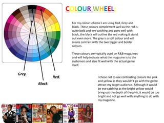
1. COLOUR WHEEL:
Grey.
Red.
Black.
For my colour scheme I am using Red, Grey and
Black. These colours complement well as the red is
quite bold and eye catching and goes well with
black, the black will outline the red making it stand
out even more. The grey is a soft colour and will
create contrast with the two bigger and bolder
colours.
These colours are typically used on R&B magazines
and will help indicate what the magazine is to the
customers and also fit well with the actual genre
itself.
I chose not to use contrasting colours like pink
and yellow as they wouldn’t go with the genre
attract my target audience. Although it would
be eye catching as the bright yellow would
bring out the depth of the pink, it would be too
bright and not go well with anything to do with
my magazine.