
Recommended
More Related Content
What's hot
What's hot (20)
Viewers also liked
Viewers also liked (20)
Similar to Own perfumes
Recently uploaded
Recently uploaded (20)
Own perfumes
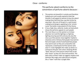
- 1. Close - conforms This perfume advert conforms to the conventions of perfume adverts because : 1. The women are beautiful in society and therefore looked up to and usually aspired to look like therefor it will appeal to women to buy the advert making them feel that they may feel similar by wearing it. Also one of the girls is a well known underground designer appealing to the ‘artistic scene’ the bottle is decorated to fit the theme. 2. It has a high class, editorial, studio-set look which shows the perfume appeals to such people 3. The main focus is on the women so it draws attention to it and the lighting is a high key lighting ensuring warmth and security also the close up of the women close together implied a closeness and a intimacy that people may want to feel and maybe a kind of sisterhood that people may want to join as they are so beautiful and represents a sisterhood of all the women who Closer wear it. It also highlights the make up which is a contrast to the girls’ skin colour showing off the “dark” that are in this picture which links to the title ‘Closer’ as they are close and secretive. The dark colour of their make up suggests mystery and darkness like magic and supernatural and gives the a “vixen” look that is sought after
- 2. Ryan and Susie's perfume – subverts This perfume DOES NOT conform to conventions of a perfume advert because : 1. They are elderly people, not conventionally pretty and people normally do not look up to or want to look or feel elderly 2. The people in the photo look tattered and poor (which contrasts to the young women who are made up in the Closer perfume) and people do not want to aspire to be that but instead usually avoid it so featuring Ryan and Susie's perfume this will not be commercially appealing However cute this picture may be people will not want to buy the product