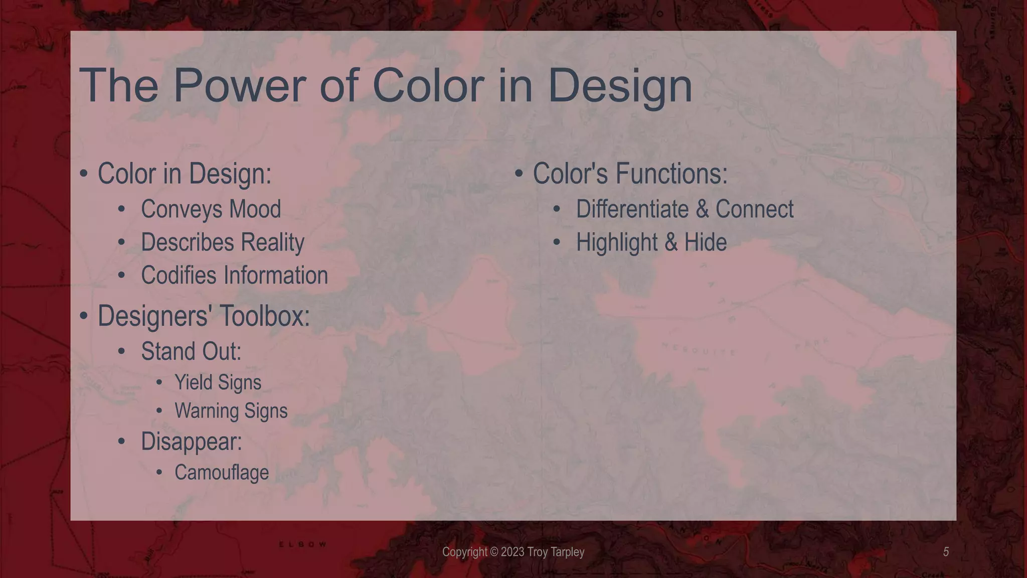
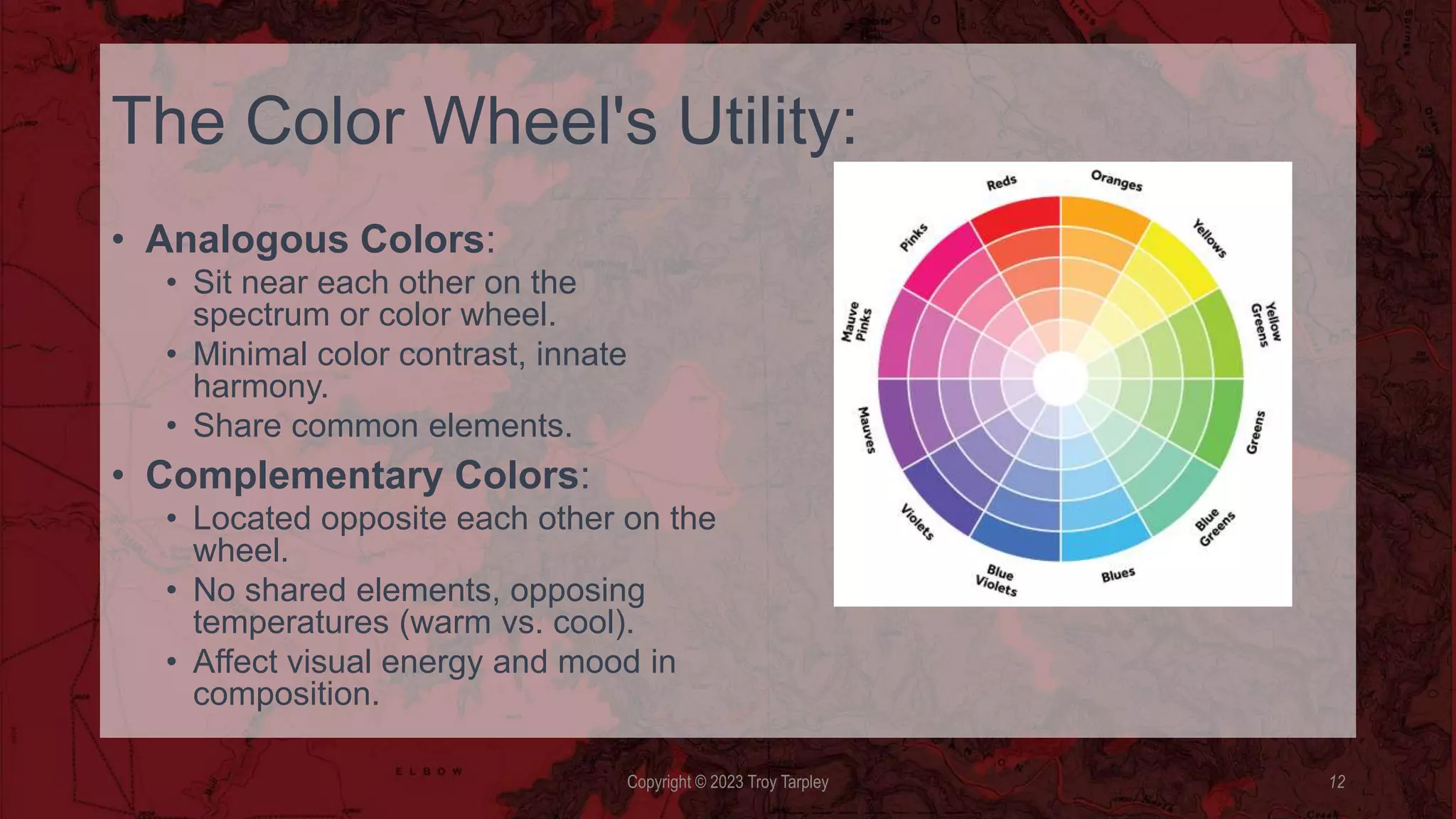
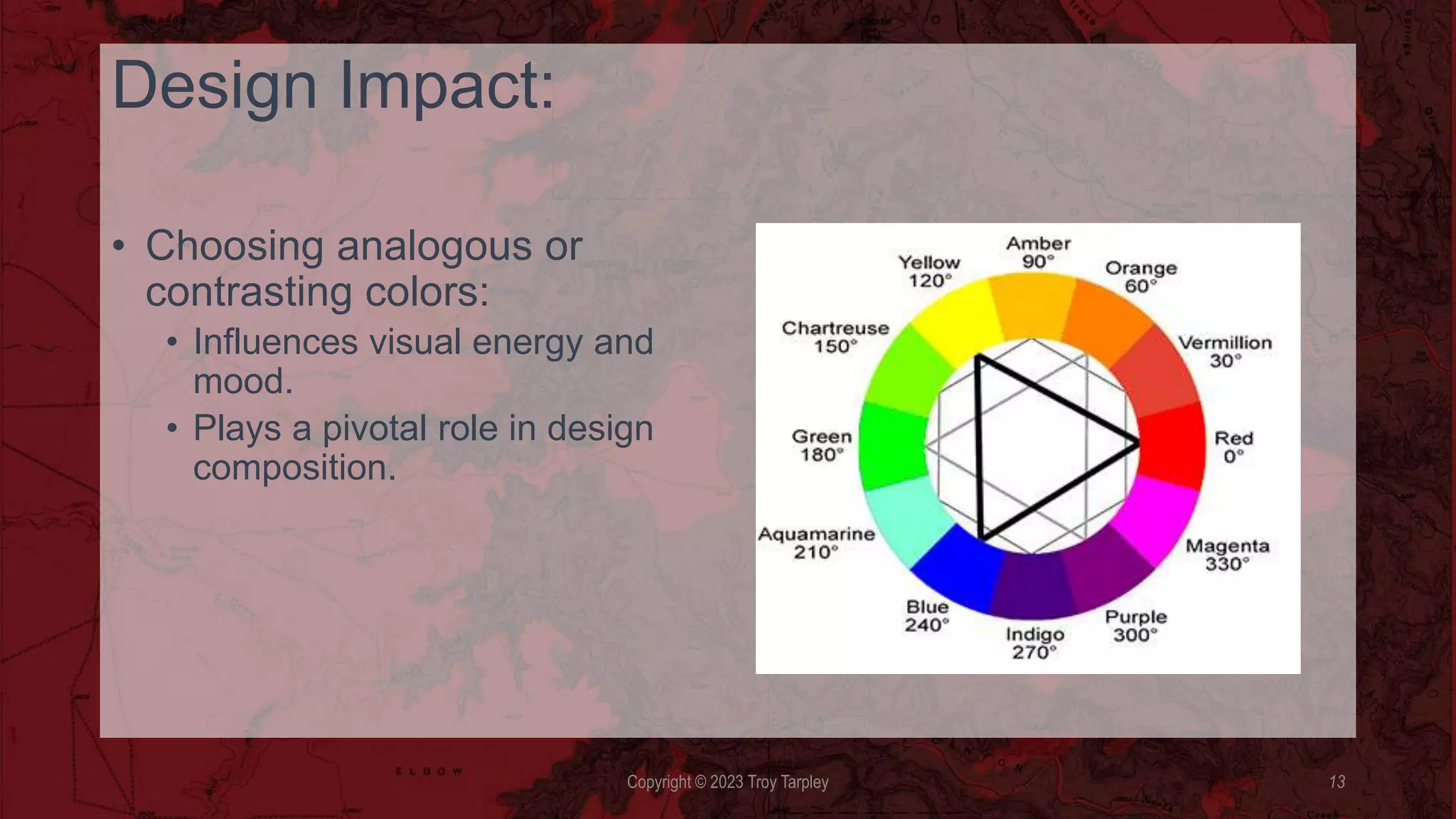
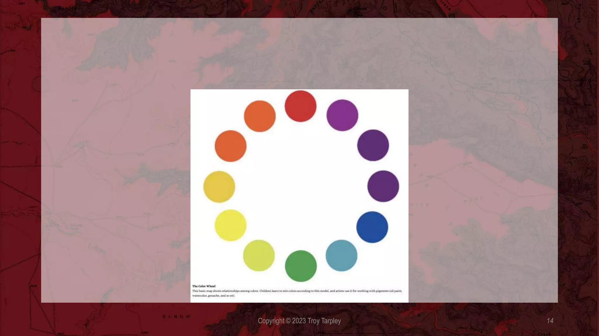
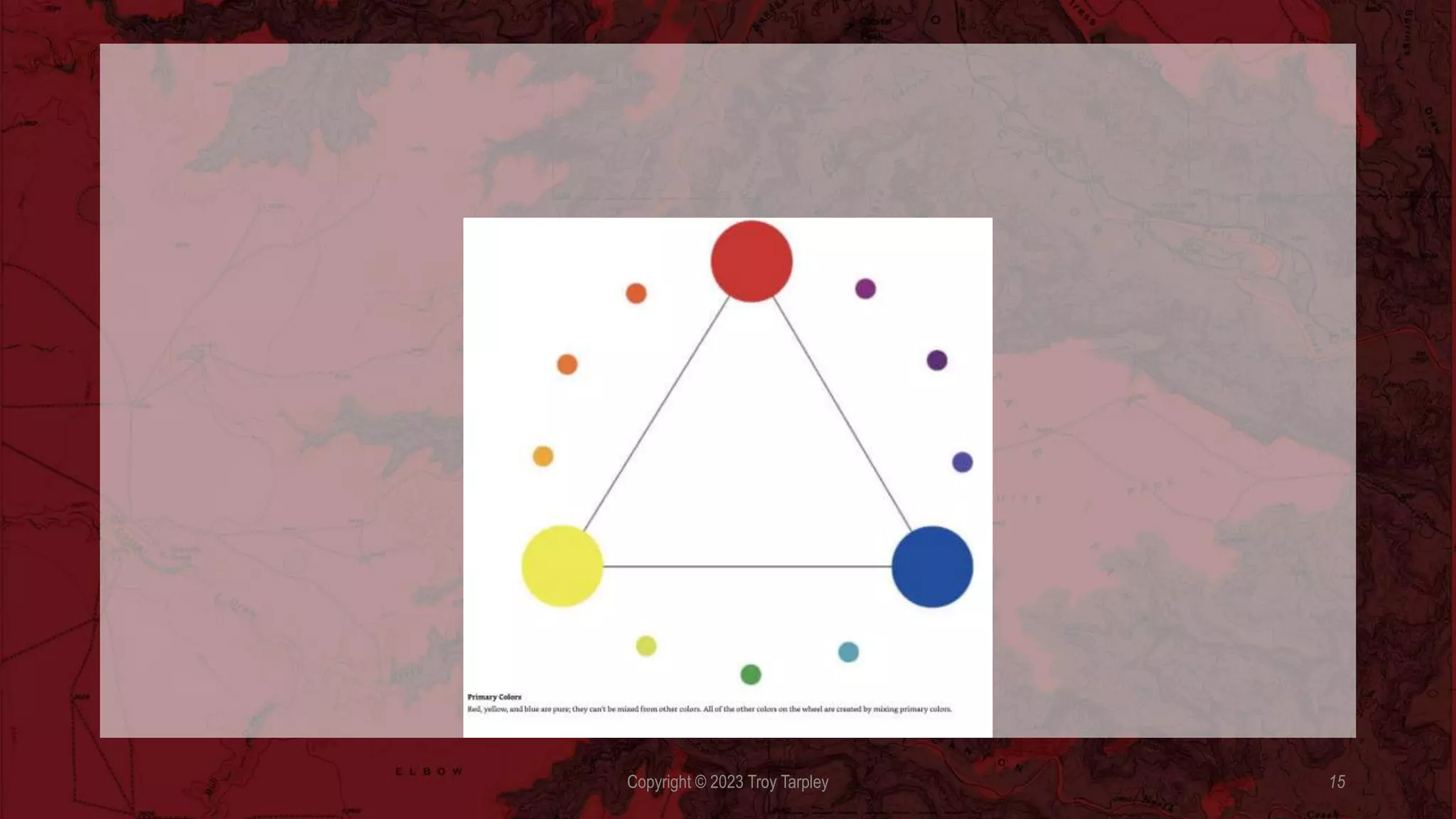
Color can convey a mood, describe reality, or codify information. Words like “gloomy”, drab” and glittering” each bring to mind a general climate of colors, a palette of relationships. Designers use color to make something stand out, for example light a yield sign or warning sign. Designers also use colors to make other things disappear, like camouflage. Color serves to differentiate and connect, to highlight and to hide.
Graphic design was once seen as fundamentally black-and-white enterprise. This is no longer the case. Color has become integral to the design process. Color printing, once a luxury, has become routine. An infinite range of hues and intensities bring modern media to life, energizing the page, the screen, and the built environment with sensuality and significance. Graphics and color had converged thank largely in part to digital technology.
Color has transformed graphic design, evolving from a black-and-white tradition to an essential element, thanks largely to digital technology. It energizes and adds significance to modern media, enhancing visual communication.
According to the classical tradition, the essence of design lies in linear structure and tonal relationships, not in the fleeting optical effects like hue, intensity, and luminosity. Design used to be understood as an abstract armature that underlies appearances. Color, in contrast, was seen as subjective and unstable.
Color exists, literally, in the eye of the beholder. We cannot perceive color until light bounces off an object or is emitted from a source and enters the eye. Our perception of color depends not solely on the pigmentation of physical surfaces, but on the brightness and character of ambient light. We also perceive a given color in relation to other colors around it. For example, a light tone looks lighter against a dark ground than against a pale one. Color changes meaning from culture to culture. Colors carry different connotations in different societies. White signals virginity and purity in the west, but it is the color of death is eastern culture. Red is worn by brides in Japan, but is considered racy and erotic in Europe and the United States. Colors go in and out of fashion, and an entire industry has emerged to guide and predict its course.
Rods are more numerous, located in the periphery of the eye, and good for detecting light in general. Cones are concentrated near the fovea, responsible for color vision, and able to adapt quickly to changes in light.
The trichromatic theory, which derives from the combined works of the 19th-century scientists Young and Helmholtz, says that there are three different cone systems in the eye that perceive three types of color: blue, green, and red
The trichromatic theory, which derives from the combined works of the 19th-century scientists Young and Helmholtz, says that there are three different cone systems in the eye that perceive three types of color: blue, green, and red. The opponent process is a color theory that states that the human visual system interprets information about color by processing signals from photoreceptor cells in an antagonistic manner. The opponent process theory explains how the cones connect to the ganglion cells and how opposing cells are excited or inhibited by certain wavelengths of light.
In 1665 Sir Isaac Newton discovered that a prism separates light into the spectrum of colors: red, orange, yellow, green, blue , indigo, and violet. He organized the color as around a wheel much like the one artists use today to describe the relationship among colors.
Why is the color wheel so useful design tool? Colors that sit near each other on the spectrum or close together on the color wheel are analogous. Using them together provides minimal color contrast and an innate harmony, because each color has some element in common with others in the sequence. Two colors sitting opposite each other on the wheel are compliments.
Each color contains no elements of the others, and they have opposing temperatures (warm versus cool). Deciding to use analogous or contrasting colors affects the visual energy and mood of any composition.
Every color can be described in relation to a range of attributes. Understanding these characteristics can help you make color choices and build color combinations. Using colors with contrasting values tends to bring forms into sharp focus, while combining colors that are close in value softens the distinction between elements.
Hue is the place of the color within the spectrum. A red hue can look brown at a low saturation, or pink at a pale value.
[Lecture Slide]
Title: Understanding Key Color Attributes
- Intensity:
- Refers to the brightness or dullness of a color.
- High intensity colors are vibrant and vivid.
- Low intensity colors are muted and subdued.
- Value:
- Describes the lightness or darkness of a color.
- A color's value is determined by its position on a grayscale.
- High value indicates a lighter color, while low value represents a darker color.
- Shade:
- Created by adding black to a color, making it darker.
- Shading adds depth and dimension to colors.
- Tint:
- Produced by adding white to a color, making it lighter.
- Tinting creates pastel or lighter versions of colors.
- Saturation:
- Reflects the purity or intensity of a color.
- Highly saturated colors are vibrant and pure.
- Desaturated colors appear muted or grayed.
[Slide Conclusion]
Understanding these key color attributes—intensity, value, shade, tint, and saturation—is fundamental for effective color selection and manipulation in design. They enable designers to create a wide range of visual effects and convey specific emotions or messages through color.
These colors are close in value and intensity, and just slightly different in hue. These colors are close in hue and value, but different in intensity.
Surfaces absorb certain light waves and reflect back others onto the color receptors (cones) in our eyes. The light reflected back is the light we see. The true primaries of visible light are red, green, and blue. The light system is called additive because the three primaries together create all the hues in the spectrum. In theory, combining red and green paint should produce yellow. In practice, however, these pigments combine into. Blackish brown. This is because pigments absorb more light than they reflect, making any mix of pigments darker than its source color. As more colors are mixed, less light is reflected. Thus pigment-based color system colors are called subtractive. CMYK.