Verified Love Spells in Little Rock, AR (310) 882-6330 Get My Ex-Lover Back
College magazine analysis 2
1. SECOND COLLEGE MAGAZINE ANALYSIS…..
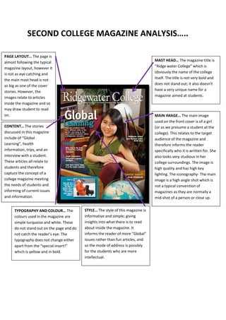
PAGE LAYOUT… The page is
almost following the typical MAST HEAD… The magazine title is
magazine layout, however it “Ridge water College” which is
is not as eye catching and obviously the name of the college
the main mast head is not itself. The title is not very bold and
as big as one of the cover does not stand out; it also doesn’t
stories. However, the have a very unique name for a
images relate to articles magazine aimed at students.
inside the magazine and so
may draw student to read
on. MAIN IMAGE… The main image
used on the front cover is of a girl
CONTENT… The stories (or as we presume a student at the
discussed in this magazine college). This relates to the target
include of “Global audience of the magazine and
Learning”, health therefore informs the reader
information, trips, and an specifically who it is written for. She
interview with a student. also looks very studious in her
These articles all relate to college surroundings. The image is
students and therefore high quality and has high key
capture the concept of a lighting. The iconography- The main
college magazine meeting image is a high angle shot which is
the needs of students and not a typical convention of
informing of current issues magazines as they are normally a
and information. mid-shot of a person or close up.
TYPOGRAPHY AND COLOUR… The STYLE… The style of this magazine is
colours used in the magazine are informative and simple; giving
simple turquoise and white. These insights into what there is to read
do not stand out on the page and do about inside the magazine. It
not catch the reader’s eye. The informs the reader of more “Global”
typography does not change either issues rather than fun articles, and
apart from the “special insert!” so the mode of address is possibly
which is yellow and in bold. for the students who are more
intellectual.