Measures of Central Tendency: Mean, Median and Mode
College detailedanalysis.docx
1. College
Detailed
Analysis:
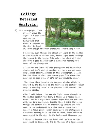
1.) This photograph I took
my-self shows the
light in a bold line
nearing the
background that
makes a contrast to
the deer in front
it, even though the deer themselves aren’t very clear.
I like how even though the streak of light in the middle
of the picture is rather thin, there light seems through
the leaves in the trees. This makes the blend of light
and dark a good balance with a dark area nearing the
front of the photograph.
I like how the lines of this photograph are relatively
simple and don’t really overlap, as there are not many
complicated objects/aspects in this photograph. I like
how the lines of the trees create gaps from where the
deer can be seen even if it’s not particularly clear.
The lines blend in with the texture nicely, which is
created by the bracken at the front at the picture, which
despite blending in with the picture still creates the
effects nicely.
Like I said before, the way the light seems through in
the middle against the deer, I think is a really nice
effect and in a way could present hope with the contrast
with the dark and light. Despite this I think that even
though the texture has an interesting texture and the
deer in the background is a nice touch, there isn’t
really a focus point, which could give the photograph a
different meaning with the loss of hope, which could be
represented by the deer in the background disappearing.
I think to improve this the focus and the zoom on the
deer could be increased. And in the way of a focus point
2. if the middle foreground was a bit more noticeable then I
think the picture would come together more as a whole.
2.) This picture I had taken myself, in the Orkney Islands up in
Scotland. In
the background
sea lions can
been seen lying
on the rocks,
unlike the
first
photograph that
I analysed the
background is a
lot more in
focus.
The colours are
all very earthy, which is greatly contributed by the lack
of sunlight due to the weather of the day when I took the
picture.
The space is I think of one the weakest aspects of this
photograph, where the middle of the foreground and the
background are interlinked in a way where the strip of
rock where the sea lions are, is ‘blended’ by the use of
colour and shape.
How ever where the space is the least strongest aspect I
think the texture balances it nicely. I think in talking
with of the context of the texture of this photograph,
the sea has some interesting strips of patterns created
by the angle of the little light that was available on
the day.
With the lines, from my view they look quite blurred yet
simple with them intertwining in the form of the rocks.
I think by the way the lack of light on the day and the
hint of different colours here in this photograph could
show the meaning of the loss of hope with represented by
the sea lions lounging about on the rocks with
emotionless expressions. Also the colour of the rocks
with the mixture of green, yellow and the hint of dark
purple, also the sudden fall from the cliff with the dark
3. dreary water meeting the end, also the little sky in the
sky that can be see not only implies but also contributes
to the feeling of the loss of hope.
3.) This photograph I took while on a camping trip. The light in
this photograph is rather absent, due to the time of day
that it was taken, which was around early evening.
The sun isn’t visible in the picture which I think is
good, that way there is more attention given on the
focus-point on
the rainbow.
However
despite the
fact that I
think the
angle that is
was shot
actually
suited the
landscape and
made the
photograph
more
interesting, I
don’t really
think the picture comes together as a whole, which is
contributed by the fact that the colours don’t blend very
well and clash a bit from the green straight to the light
blue.
The clouds aren’t very well placed in the photograph
either, which could confuse the eye of the viewer of the
photograph, along with the same shade of green that is in
the bottom layer of grass and the small strip of trees
which could also potentially confuse the eye of the
viewer.
By the angle of the photograph of which is was taken and
the dark colours creeping up, along with the clouds
disappearing downwards and the fact that rainbow is more
visible on one side than it is on the other, I think this
could show meanings of the classic struggle between good
and bad.
4. A good way to improve this photograph is to maybe
increase the light coming in from the bottom left hand
corner. Also I don’t really that the tilted angle that
the picture is taken from helps the anesthetic look of
the photograph as I think it confuses the eye.
4.) This photograph was another taken by me in a village near by
where I live.The angle is from the entrance of the village church
door.
Which I quite like as I think it gives a certain mystery feel to the
picture. I like how the lines a relatively simple in the foreground,
with the gates and archway ect. but with the tree branches and the
leaves over crossing the lines appear more complicated as they
overcross ect. which makes a nice contrasts.
I think that the fact that there isn’t much reputation suits the
theme of the photograph and
contributes to the anaesthetic
appeal of the photograph.
However one part aspect of the
photograph that I think is weaker
is the lighting which contributes
to the photograph loosing it’s
effect, with the picture being
mostly dark then with a little
corner or light at the top which I
think could confuse the eye.
I think a way that this photograph could be improved was if the
background was a bit more in focus as I think the way the light in
the corner bounces of the tree could confuse the eye. As well as
that I don’t really think that the picture comes together as a whole
with the foreground and the background seeming like two separate
pictures altogether, which is cut up even more by the bright light
in the corner taker the eye viewing the photograph off-guard and
confused. I think if the light was dimmed a bit and stretched out
evenly it would give the photograph an 50/50 light and dark balance.
Like I said before with the way the lighting is positioned and with
the gradual complication of the lines from foreground to background
it could represent a sanctuary as the doors that are visible in the
photograph belong to a church. The light could possibly represent
5. the harshness of life and with the doors open it gives the
photograph a sense of welcoming yet mystery to it due to the light
shadow over the inside of the church.
5.) This photograph was taken by myself in the Orkney Islands up in
the north of Scotland. This chapel was part of a prisoners of war
camp in the second world
war.
I like how the lines in the
photograph have a rather
large variation from thick
and thin to tessellating
each other, for example the
light and dark brown side
parts of the chapel along
with the two sides stones
that form the entrance to
the main part of the chapel.
I like how the light is
shown in the picture, vividly coming in from the two side windows of
the chapel which creates a nice balance between the light and dark
along with the dark shadow created by people behind me whilst I was
taking the picture in the foreground of the photograph.
Like I said before, I think because of the way the light is coming
through sideways and the way the shadow is shown in the picture and
because of chapels history, I think that this photograph could
represent hope and loss in the time of war as this chapel was built
during WWII by Italian POW. And I also think that the way the
colours co-ordinate with each other and the how the shadow almost
looks like it pulling contributes to this idea of what the
photograph could represent.
A way to improve the photograph I think is to maybe put a bit more
shadow in the background, because even though the photograph does
have a good balance between light and dark the picture doesn't
really come together as a whole and I think if there was a bit more
shadow in the background the photograph would come together more as
a whole. Also another way that the photo could be improved is by a
similar method, which is to dim the light coming in through the
window as it could put the eye of the person looking at the
photograph off.
6. 6.) This final photograph was taken
by myself, at the time I was trying
to practice taking natural animal
pictures and this picture is one of
the first that I took.
I like how there is actually a big
variation of colour especially in
the foreground despite the fact that
there isn’t much much colour or
focus in the background from the
ducks backwards. I think a way that
this could be improved is by
changing the angle of the photograph or change the timing of the day
due to the evening fog that’s in the background of the photograph.
However one aspect regarding the colour are the ducks in the
foreground focus point of the photograph where the colour is rather
vacant which could confuse the eye of the viewer.
I think the weakness of this photograph are the lines as they are
few and simplistic like the lines of the pathway. However I like the
lines that are created by the sun in the photograph, just above the
second duck to the left of the picture, which I think could
contribute to the fog-like background in the picture.
The shapes fit nicely in the photograph which I think is a strength
in this photograph, especially in the foreground where it
contributes the the clear-ness of the photograph. Also one other
thing that I’ve noticed to do with the shapes is that in the
background in the kind of foggy area there is an example of the
lines and shapes overlapping on the left side of the photograph.
I like how there is an equal amount of repetition in the photograph
regarding the colour and and the shape e.g. the grass and the colour
in the background.
I think one thing that this photograph could represent the
relationship between animal and human with the way the ducks are
running across the pathway in the common that the photograph that
was taken.