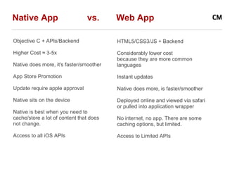
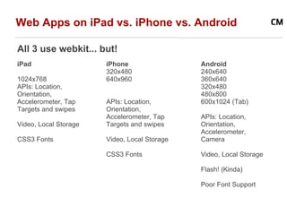
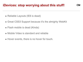
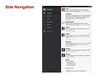
2. Native App vs. Web App
Objective C + APIs/Backend HTML5/CSS3/JS + Backend
Higher Cost ≈ 3-5x Considerably lower cost
because they are more common
Native does more, it's faster/smoother languages
App Store Promotion Instant updates
Update require apple approval Native does more, is faster/smoother
Native sits on the device Deployed online and viewed via safari
or pulled into application wrapper
Native is best when you need to
cache/store a lot of content that does No internet, no app. There are some
not change. caching options, but limited.
Access to all iOS APIs Access to Limited APIs
3. Web Apps on iPad vs. iPhone vs. Android
All 3 use webkit... but!
iPad iPhone Android
320x480 240x640
1024x768 640x960 360x640
APIs: Location, 320x480
Orientation, 480x800
Accelerometer, Tap APIs: Location, 600x1024 (Tab)
Targets and swipes Orientation,
Accelerometer, Tap APIs: Location,
Video, Local Storage Targets and swipes Orientation,
Accelerometer,
CSS3 Fonts Video, Local Storage Camera
CSS3 Fonts Video, Local Storage
Flash! (Kinda)
Poor Font Support
4. iDevices: stop worrying about this stuff!
Reliable Layouts (IE6 is dead)
Great CSS3 Support because it's the almighty WebKit
Flash mobile is dead (Kinda)
Mobile Video is standard and reliable
Hover events, there is no hover for touch.
5. Start worrying about this, though.
1. Animation/transition performance
Transitions are possible, but use wisely.
To many will cause poor performance
2. Slow Internet speed
Don't overload with high-res images or non-optimized video.
Use progressive downloading
3. No fixed positioning
No toolbars at top of pages, unless you use a library
4. Need to pay attention how content is being served
Web view and mobile safari do not fire the same events, for example.
6. Two screen orientations
Design for landscape and portrait
How will content re-flow based on position.
Headers shrink down, Sidebars become footers
6. Best Practices: Design
Your finger is 30 pixels wide! (60pixels on iPhone 4)
Give tappable elements in your app a target area of at
least 44 x 44 pixels.
Keep 12ish pixels between navigation elements (double
on iPhone 4).
Stick to native styles where ever possible
Keep it simple! What are the bare essentials?
Test both, in Simulator and load JPG on Device
7. Best Practices 3: UI
Keep in mind where users hands are going to be:
iPhone uses a bottom nav
iPad uses split view
10. Best Practices: Development
Keep requests down (5-10 per page)
No Faux CSS Elements :before or :after
Anything that causes dom redraws is bad
Use classes for everything
(Turn then on/off when you need them)
CSS3 is good, but go easy on it
Optimize all your images
Use CSS/Image sprites, wisely
Canvas and SVG elements are pretty good
11. HTML 5
Video tags are good.
Some of the new HTML form attributes will trigger the alternate screen
keyboards on mobile devices. This is really handy.
14. Font Support - Use it!
iosfonts.com list of native fonts on iPad and iPhone
Typekit works on everything
Google font directory now works on everything.
Use something like fontsquirrel.com to generate fonts in the
correct formats.
Check font licenses before including them.
Older iOS versions are at a (50%) risk of crashing when you
bind different @font-face weights to the same typeface.
15. Mobile Webkit vs. Webkit
Mobile webkit is a lot like desktop webkit, except it runs on slower
hardware, tries to scale everything to a tiny screen*, and does not
remember what position:fixed is.
*unless you tell it not to through the use of meta tags:
<meta name="viewport" content="width=device-width, initial-scale=1.0;
maximum-scale=1.0;">
16. Tricks
There are some undocumented features of webkit that produce
desired effects.
For example, translate3d can be exploited for smoother rendering:
-webkit-transform: translate3d(0,0,0)
Unfortunately, stuff like this is not a feature and could be "fixed" by
apple at any time.
17. CSS Media Queries
<link rel="stylesheet" media="all and (orientation:
portrait)" href="portrait.css">
<link rel="stylesheet" media="all and (orientation:
landscape)" href="landscape.css">
@media only screen and (max-device-width: 1024px) and
(orientation:portrait) {
}
@media only screen and (max-device-width: 1024px) and
(orientation:landscape) {
}
19. Javascript
Mobile browsers have device-specific javascript events that you are
able to hook into:
device rotation
touch (different from click)
Caveat: these are not consistent between mobile safari and webview
in iOS apps.
window.addEventListener('orientationchange' in window ?
'orientationchange' : 'resize', foo, false);
document.body.className =
orientation % 180 == 0 ? 'vertical' : 'horizontal';
20. Javascript
Don't use JS libraries, unless you really need to.
Standard JS is reliable.
iScroll JS if you have to to use custom scrolling
RapahelJS for SVG and graphics
Mobile browsers have device-specific JavaScript events that you are
able to hook into:
device rotation
touch (different from click)
21. Backend / AJAX
The back end is going to be pretty much identical.
All of the dynamic data, whether you have a web or native
app, is likely going to be piped over http.