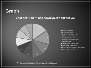
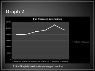
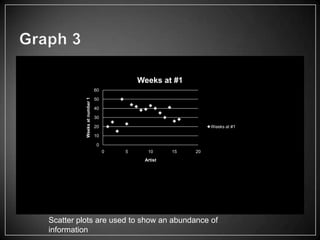
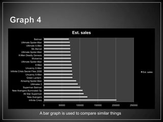
Excel graphs and their many uses
By Anfernee McMillian & Cris
Badillo
MOST POPULAR ITUNES DOWNLOADED FREQUENCY

                  7%
                             15%
           7%
                                           Hung Up ,Madonna
                                           Run It!, Chris Brown
 8%
                                           My Humps, Black Eyed Peas
                                           Photographs, Nickelback
                                     14%
                                           Stickwitu, The Pussycat Dolls

9%                                         Laffy Taffy, D4L
                                           Dance, Dance, Fall Out Boys
                                           Gold Digger, Kanye West
                                           Sugar , We're Going Down, Fall Out Boy
                                   11%
      9%                                   There it Go!, Juelz Santana


                10%    10%


A pie chart is used to show percentages
# of People in Attendance
300000


250000


200000


150000
                                                                                         # of People in Attendance


100000


50000


     0
         X Games One X Games Two X Games Three X Games Four X Games Five   X Games Six


         A Line Graph is used to show changes overtime
Weeks at #1
          Weeks at number 1   60

                              50

                              40

                              30

                              20                               Weeks at #1

                              10

                               0
                                   0   5     10      15   20
                                            Artist


Scatter plots are used to show an abundance of
information
Est. sales
                            Batman
            Ultimate Spider-Man
                  Ultimate X-Men
                        Ms Marvel
            Utlimate Spider-Man
         X-Men Deadly Genesis
                         Wolverine
            Ultimate Spider-Man
                             X-Men
                 Uncanny X-Men
Infinite Crisis Secret Files 2006                                                          Est. sales
                 Uncanny X-Men
                   Green Lantern
            Amazing Spider-Man
                       Utilmates 2
              Superman Batman
  New Avengers Illuminated Sp
               All Star Superman
                   New Avengers
                     Infinite Crisis

                                       0   50000     100000     150000   200000   250000


                                 A bar graph is used to compare similar things
• In Graph 1 we graphed the most popular I tunes songs
  and the artist who sang them
• In Graph 2 we Graphed the x Games the years they have
  been held and how many people were in attendance
• In Graph 3 We graphed the total number of weeks that
  certain videos were on a count down
• In Graph 4 we graphed the amount of comic books sold
  and the names of those comic books
• We choose a pie chart in graph 1 to show the total
  amount of ITunes downloads out of 100%
• In graph 2 we choose a line graph to show the Change in
  attendance for the x games in the last few years
• In Graph 3 we used a scatter plot to graph the large
  amount of requested videos and artist
• In Graph 4 we chose a bar graph because it was to the
  best way to compare all of the similar comic books and
  comic book sales

Choosing the right graphs

  • 1.
    Excel graphs andtheir many uses By Anfernee McMillian & Cris Badillo
  • 2.
    MOST POPULAR ITUNESDOWNLOADED FREQUENCY 7% 15% 7% Hung Up ,Madonna Run It!, Chris Brown 8% My Humps, Black Eyed Peas Photographs, Nickelback 14% Stickwitu, The Pussycat Dolls 9% Laffy Taffy, D4L Dance, Dance, Fall Out Boys Gold Digger, Kanye West Sugar , We're Going Down, Fall Out Boy 11% 9% There it Go!, Juelz Santana 10% 10% A pie chart is used to show percentages
  • 3.
    # of Peoplein Attendance 300000 250000 200000 150000 # of People in Attendance 100000 50000 0 X Games One X Games Two X Games Three X Games Four X Games Five X Games Six A Line Graph is used to show changes overtime
  • 4.
    Weeks at #1 Weeks at number 1 60 50 40 30 20 Weeks at #1 10 0 0 5 10 15 20 Artist Scatter plots are used to show an abundance of information
  • 5.
    Est. sales Batman Ultimate Spider-Man Ultimate X-Men Ms Marvel Utlimate Spider-Man X-Men Deadly Genesis Wolverine Ultimate Spider-Man X-Men Uncanny X-Men Infinite Crisis Secret Files 2006 Est. sales Uncanny X-Men Green Lantern Amazing Spider-Man Utilmates 2 Superman Batman New Avengers Illuminated Sp All Star Superman New Avengers Infinite Crisis 0 50000 100000 150000 200000 250000 A bar graph is used to compare similar things
  • 6.
    • In Graph1 we graphed the most popular I tunes songs and the artist who sang them • In Graph 2 we Graphed the x Games the years they have been held and how many people were in attendance • In Graph 3 We graphed the total number of weeks that certain videos were on a count down • In Graph 4 we graphed the amount of comic books sold and the names of those comic books
  • 7.
    • We choosea pie chart in graph 1 to show the total amount of ITunes downloads out of 100% • In graph 2 we choose a line graph to show the Change in attendance for the x games in the last few years • In Graph 3 we used a scatter plot to graph the large amount of requested videos and artist • In Graph 4 we chose a bar graph because it was to the best way to compare all of the similar comic books and comic book sales