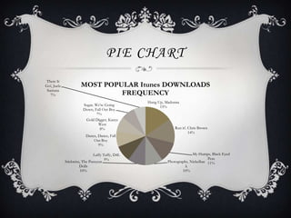
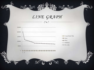
This document discusses choosing the right type of graph for different datasets. It provides examples of a pie chart showing iTunes download percentages, a bar graph of attendance numbers in different states, a scatter plot of weeks spent at number one for videos, and a line graph showing changing comic book sales over time. The analysis explains that a pie chart is best for percentage data, a bar graph for comparing amounts, a scatter plot for showing variation over time, and a line graph for trends over multiple data points.


![5G Explained! A High Level Overview [Introduction]](https://cdn.slidesharecdn.com/ss_thumbnails/5gexplainedahighleveloverview-260119165306-cc137a3e-thumbnail.jpg?width=640&height=640&fit=bounds)


