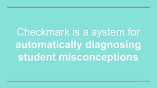
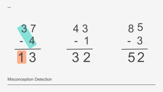
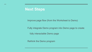
Checkmark
Bringing interaction to grading
Monica Ong
What is
Checkmark?
Checkmark is a system for
automatically diagnosing
student misconceptions
3 7
- 4
4 3
- 1
3 2
8
- 3
52
5
1 3
3 7
- 4
4 3
- 1
3 2
8
- 3
52
5
Misconception Detection
1 3
Checkmark’s goal is to
reverse engineer students’
thought process
What does
this look like?
Checkmark Demo in action
My Role
Set Up
Demo
Synthesis
Engine
Students
Worksheets
Students’ Work
Teacher Checkmark
Designs
Classroom
A clean interface for teachers to
match worksheets to specific
students
Classroom page
Classroom page
Classroom page
Classroom page in action
Worksheet
An interactive, easy to use
interface for teachers to type in
their problems
Worksheet page
Worksheet page in action
Demo
A simple interface that allows
teacher to gain an in-depth
understanding of their student’s
work
Demo page
Demo page
Demo page
Demo menu in action
Demo program in action
Next Steps
Improve page flow (from the Worksheet to Demo)
Fully integrate Demo program into Demo page to create
fully interactable Demo page
Rethink the Demo program
Acknowledgements
Professor Erik Andersen
Molly Feldman
Engineering Learning Initiatives

Checkmark LinkedIn

Editor's Notes

  • #2 Hi, my name is Monica Ong. In this presentation I’ll be going into what I worked on this summer: Checkmark. I worked with Professor Erik Andersen and grad student, Molly Feldman, on building the Checkmark system.
  • #4 Checkmark’s goal is to automatically diagnose misconceptions in K-12 mathematics. Now that’s a lot of fancy words, but what does this look like?
  • #5 To give you an idea, let’s take a look at a situation that many teachers find themselves in/that may be familiar to teachers. Your student has handed in a worksheet where he or she has made multiple mistakes. I’m going to focus on the first problem (37 - 4) In this case, the student has subtracted the ones digit correctly. 7 - 4 is 3. However, when we move to the 10s digit, you can see that the student has calculated the that digit incorrectly. In this case, the student has subtracted 4 - 3, ultimately subtracting the bottoms ones digit by the top tens digit and taking the absolute value, which turns out to be 1.
  • #6 The process you just went through is called misconception detection. Formally, misconceptions occur when a student incorrectly solves multiple problems in the same manner. (or “errors over time”). This simple example here may seem trivial, but if not corrected, can prove to be an obstacle to the student’s learning later. In all of education, misconceptions are incredibly common and important to identify. 100+ misconceptions have been identified just for subtraction Lots of work in math education which identifies misconceptions as key barriers to learning If a student is never corrected on his misconception that can follow him throughout the rest of his studies and prove an obstacle to learning The goal of our system, CheckMark, is to identify misconceptions AUTOMATICALLY/reverse engineer a student’s thought process
  • #7 But what does this look like?
  • #9 What we chose was a GUI interface for the user (in this case a teacher) to step through the misconception. Shows each point at which the student differs from the correct algorithm. Now this is all said and good, but what if we wanted to scale that for a classroom? Keep in mind that our user is a teacher, and a teacher has multiple students and several worksheets.
  • #11 Go through set up of information flow and Checkmark is designed with a synthesis engine which need certain information to output the demo, which you saw earlier These information include: In addition, to make Checkmark scalable, need to be able to take in students and be able to map students to worksheets and their own work. Input process easy for teachers to follow and also be tool teachers could organize their grading around So when I was designing the user interface I had to consider the overall flow of information. First, like with all design, I started with the user. In this case our user was a teacher. This teacher would have a classroom of students, many worksheets, and each student would presumely complete those worksheeets. The teacher would need to be able to somehow tell Checkmark’s engine all this information for it to properly calculate the students’ misconception Finally, Checkmark would need to display the demo in an interface easy for teachers to navigate and useful for grading. With the demo, the user interface, was partially complete. But it needed more tools to make it scalable for a teacher and their entire classroom. Wanted to go from real life and create a tool which teacher’s could easily understand & use for their classroom grading
  • #12 Now I’m going to go into the specific pages and my considerations for each page.
  • #13 One of the design challenges for this page was creating a layout that was both familiar and sensibly organized students, worksheets, and student’s work. Gird similar to gradebook Teachers familiar with Mapped students to specific problems Mapped students to worksheets About teachers understanding each student Each student produces unique work Initially I started with a grid similar to a gradebook, since that was something teachers were familiar with. And mapped students to specific problems. But that become cumbersome when considering a teacher would have multiple worksheets and sometimes not every student would complete each problem, creating holes in the grid. The layout in general was confusing with multiple buttons and different tables. So I went back to the drawing board, brainstormed different interfaces that would still be familiar to teachers, yet more efficiently organize students, worksheets, and problems. Eventually we decided mapping students to worksheets would be the most sensible organization order, since each student would produce unique work, and in the end, what our program would be providing teachers, is a new way of understanding each individual’s students misconceptions. So really, the emphasis was on the student and so I ordered the organization to emphasize the student and their work.
  • #14 And so I came up with this. Every student would take up a row and each student would have worksheets associated with them. We mapped students to worksheets, instead of the other way around, in consideration of the fact that not every student would complete every worksheet and what each student did on each worksheet would be unique. Finally there are your common features of add, delete, and editing a worksheet. Either by clicking on the add worksheet or edit worksheet the teacher would be brought to a worksheet page.
  • #15 In addition, I added the edit and delete features for the students. And if they clicked on the edit button, a rename box would show up. An exit button would be partially darkened to indicate to users that exiting is a possibility, but more likely they would want to save their renaming, so the done button was give more emphasis with a bold green color.
  • #16 Finally teachers would be able to add students with a simple add button at the bottom of the pages. I purposefully kept the two add buttons similar in terms of color and icon to convey the same function. However, to differentiate between the 2 buttons, I made sure each add button emulated in some way, in this case by their shape, what they would be adding. So as you can see, the add student button is shaped as a square like the student label above it. And the worksheet add button is rectangular shaped to imitate the worksheets.
  • #17 And finally you can see it all come together in this animation. In a push for usability/In keeping with the ease of use, with all the buttons, I tried to make convey their function in an as obvious way as possible through common colors and icons. WithIn addition, I tried to make each button as accessible as possible when the user required it. So you can see that I hide the delete and edit button until the teacher hovers over the student or worksheet because, presumably if they are hovering over it, they would like to modify the student or the worksheet in some way. Now once the teacher pressed on either the edit worksheet or add worksheet button that would lead them to this page...
  • #18 Once again, with the worksheet design, similar to the classroom page, I created interface that were familiar. In this case, the worksheet looked like a worksheet/page outline of a word doc! That way teachers would know exactly the function of this page immediately upon seeing it. It would list problems, much in the same way, a worksheet they might create lists the problems. That way the teachers would know exactly how to use it upon seeing it. Designed to look like a page, designed to be inutitvie and easy to use with commands, like and remove, that show up when needed/when interacting with problems. Outline
  • #19 Close up
  • #20 To convey interactability with the text boxes I made a faint outline show up when the user hovered over either the worksheet title or worksheet problems. Much in the same way as the classroom page, I made sure the buttons conveyed their functionality through the color and icon. I also made the buttons accessible only when they were needed to prevent page clutter and therefore confusion. So that’s why the add problem and delete problem buttons only shows up when the user hovers over the problem box. Because when the user is interacting with the problem bar then that means they would like to modify it, either by typing a problem, adding another problem, or deleting a problem. Finally, the checkmark button worked twofold way, both to indicate the exiting of the worksheet interface and entering into the demo. I repeated icons, like the add, delete, and done button from the classroom page in order to keep consistency and unite the pages from a design standpoint.
  • #21 Upon reaching the demo screen, the user would be greeted with a widescreen frame that encompasses the demo. Since the demo was the main emphasis of the page, other elements like the menu bar and problem header were placed to take up as least space as possible and give the demo the most width.
  • #22 The problem header indicates the problem number (1) as well the problem itself (37 - 4) to orient the user on where they are in the worksheet
  • #23 Click play to start demo
  • #24 Can scroll down to menu. The problems are organized by type and within each type, the user can click to expand or minimize each category. This was done in consideration of the fact that worksheets could be very long and sometimes the user may just want to focus on subset of problems. Within each category there would be buttons, colored based on whether the student answered correctly and ordered by their problem number.
  • #25 Putting it all together, when the user hovers over the menu icon it changes into a Problems label to tell users the contents of the menu.
  • #27 Rethink the demo program = smtg that fits more into the layout of a teacher’s gradebook and workflow. Fits more into users needs (i.e. teacher grading)
  • #28 Rethink the demo program = smtg that fits more into the layout of a teacher’s gradebook and workflow. Fits more into users needs (i.e. teacher grading)