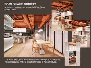
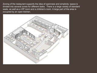
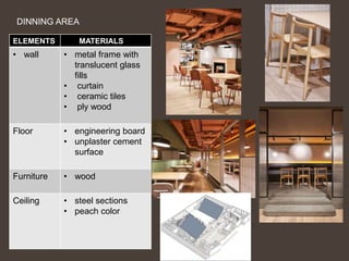
•Architects: architecture bureau MODGI Group
•Area:432 m²
The main idea of the restaurant interior concept is to make an
Asian restaurant without direct reference to Asian motives.
PANAM Pan Asian Restaurant
Zoning of the restaurant supports the idea of openness and simplicity: space is
divided into several zones for different tasks. There is a large variety of standard
seats, as well as a VIP room and a children's room. A large part of the area is
occupied by an open kitchen.
The main method of zoning is partitions
made of a metal frame with inserts of
translucent relief glass.
This spectacular and graphic technique is softened by flowing
curtains made of light milk cotton.
The zoning is shown through the colors
The light and vibrant colors are used for
common area
And the dark color is used to define the VIP
dinning area
And based on flooring the VIP area are left
with unplaster concrete to give gray color for
the composition.
Space Element
Floor Engineering
board
Wall plywood
color Green , peach
fixture Hanging
lights
Entrance lobby
Wall- Plywood partition with
Glass and tiles
Floor- Engineering board
bright peach and orange shades with gray
and pale green
ENTRANCE LOBBY
KITCHEN
Color: pale green
Texture: soft
Materials: ply wood , glass
Artificial peach plants, tiles
DINNING AREA
ELEMENTS MATERIALS
• wall • metal frame with
translucent glass
fills
• curtain
• ceramic tiles
• ply wood
Floor • engineering board
• unplaster cement
surface
Furniture • wood
Ceiling • steel sections
• peach color
WASHROOM
Wall – tiles, curtains.
solid plastic partitions
Floor- antiskid tiles
ELEMENTS
Vertical lines can make rooms seem more
spacious than they actually are and ceilings
appear higher.
The sense of verticality is given by the plywood
and metal partition wall and pattern of tiles
where verticality is preferred over horizontality,
because of the function of the space.
Line
Space
When space changes gradually, it is more
pleasing than when it changes abruptly
Objects grouped into large units will create a
more ordered space.
The spaces through out the area
follows same pattern with respect
to color material furniture lights
etc.
And some variations are done
with furniture.
Color
The combination of bright peach and orange
shades with gray and pale green. This
combination unites the entire composition.
Furniture are set up in such a way, that in
the color combination of space. If any color
is missing out in the particular space. Those
colors were completed in furniture.
Where each space look complete
PEACH
GRAY
PEACH
Color is the key element of interior
design. It is used to create aesthetically
pleasing combinations and also works
on a psychological level
Color schemes look best when one color
dominates. Dominate color should
cover about two-thirds of the room
area. Here peach is the dominating
color. Used for ceiling
This color combination gives the warm,
relax and soothing feeling
ORANGE
ARTIFICIAL
COLOURS
Form
Rectangular Geometric form.
A room is more pleasing if the form of the
dominate piece is repeated in minor pieces
and accessories in a room.
Here the tiles are repeated. In a uniform
pattern on the walls.
Texture
Smooth surfaces reflect more light than rough
surfaces, making them look lighter and
brighter
MATERIAL PALLET
The main method
of zoning is
partitions made of
a metal frame with
inserts of
translucent relief
glass.
This spectacular
and graphic
technique is
softened by
flowing curtains
made of light milk
cotton.
The plywood in
countertops
Engineering board
for flooring
Tiles
Panam pan asian restaurant interior design case study

Panam pan asian restaurant interior design case study

  • 1.
    •Architects: architecture bureauMODGI Group •Area:432 m² The main idea of the restaurant interior concept is to make an Asian restaurant without direct reference to Asian motives. PANAM Pan Asian Restaurant
  • 2.
    Zoning of therestaurant supports the idea of openness and simplicity: space is divided into several zones for different tasks. There is a large variety of standard seats, as well as a VIP room and a children's room. A large part of the area is occupied by an open kitchen.
  • 3.
    The main methodof zoning is partitions made of a metal frame with inserts of translucent relief glass. This spectacular and graphic technique is softened by flowing curtains made of light milk cotton.
  • 4.
    The zoning isshown through the colors The light and vibrant colors are used for common area And the dark color is used to define the VIP dinning area And based on flooring the VIP area are left with unplaster concrete to give gray color for the composition. Space Element Floor Engineering board Wall plywood color Green , peach fixture Hanging lights
  • 5.
    Entrance lobby Wall- Plywoodpartition with Glass and tiles Floor- Engineering board bright peach and orange shades with gray and pale green ENTRANCE LOBBY
  • 6.
    KITCHEN Color: pale green Texture:soft Materials: ply wood , glass Artificial peach plants, tiles
  • 7.
    DINNING AREA ELEMENTS MATERIALS •wall • metal frame with translucent glass fills • curtain • ceramic tiles • ply wood Floor • engineering board • unplaster cement surface Furniture • wood Ceiling • steel sections • peach color
  • 8.
    WASHROOM Wall – tiles,curtains. solid plastic partitions Floor- antiskid tiles
  • 9.
    ELEMENTS Vertical lines canmake rooms seem more spacious than they actually are and ceilings appear higher. The sense of verticality is given by the plywood and metal partition wall and pattern of tiles where verticality is preferred over horizontality, because of the function of the space. Line Space When space changes gradually, it is more pleasing than when it changes abruptly Objects grouped into large units will create a more ordered space. The spaces through out the area follows same pattern with respect to color material furniture lights etc. And some variations are done with furniture.
  • 10.
    Color The combination ofbright peach and orange shades with gray and pale green. This combination unites the entire composition. Furniture are set up in such a way, that in the color combination of space. If any color is missing out in the particular space. Those colors were completed in furniture. Where each space look complete PEACH GRAY PEACH Color is the key element of interior design. It is used to create aesthetically pleasing combinations and also works on a psychological level Color schemes look best when one color dominates. Dominate color should cover about two-thirds of the room area. Here peach is the dominating color. Used for ceiling This color combination gives the warm, relax and soothing feeling ORANGE ARTIFICIAL COLOURS
  • 11.
    Form Rectangular Geometric form. Aroom is more pleasing if the form of the dominate piece is repeated in minor pieces and accessories in a room. Here the tiles are repeated. In a uniform pattern on the walls.
  • 12.
    Texture Smooth surfaces reflectmore light than rough surfaces, making them look lighter and brighter
  • 13.
    MATERIAL PALLET The mainmethod of zoning is partitions made of a metal frame with inserts of translucent relief glass. This spectacular and graphic technique is softened by flowing curtains made of light milk cotton. The plywood in countertops Engineering board for flooring Tiles