Download to read offline
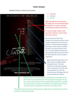


The document analyzes a movie poster for the film "Canine". It discusses several design elements of the poster including the low camera angle that makes the silhouetted figure appear powerful, the hidden light source that makes the audience feel unnerved, and the lack of visible face or gender of the character which leaves the audience guessing about the plot. It also notes the prominent black and red colors which represent darkness, danger, violence and blood. Different fonts are used to emphasize different text elements and draw attention of the target 18-25 year old audience. A comparison is made to another movie poster which uses lighter colors, has the tagline rather than title as the largest text, and includes a critic review and director information