FILM POSTER

 By Hayley gill
Stars/Main actors
      Tagline
                                                               Distorted
                                                               Image of
                                                               villain

Film title


   Production
                                                     Credits
   Company logo
                  Release Date
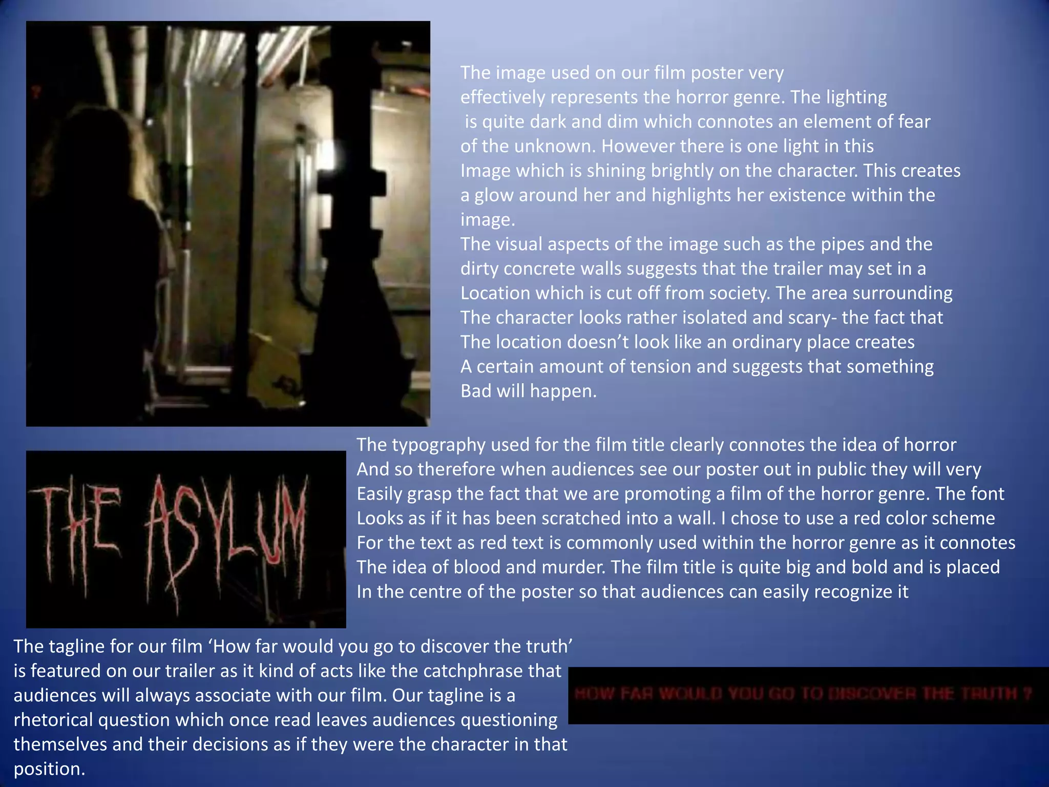
The image used on our film poster very
                                                        effectively represents the horror genre. The lighting
                                                         is quite dark and dim which connotes an element of fear
                                                        of the unknown. However there is one light in this
                                                        Image which is shining brightly on the character. This creates
                                                        a glow around her and highlights her existence within the
                                                        image.
                                                        The visual aspects of the image such as the pipes and the
                                                        dirty concrete walls suggests that the trailer may set in a
                                                        Location which is cut off from society. The area surrounding
                                                        The character looks rather isolated and scary- the fact that
                                                        The location doesn’t look like an ordinary place creates
                                                        A certain amount of tension and suggests that something
                                                        Bad will happen.

                                           The typography used for the film title clearly connotes the idea of horror
                                           And so therefore when audiences see our poster out in public they will very
                                           Easily grasp the fact that we are promoting a film of the horror genre. The font
                                           Looks as if it has been scratched into a wall. I chose to use a red color scheme
                                           For the text as red text is commonly used within the horror genre as it connotes
                                           The idea of blood and murder. The film title is quite big and bold and is placed
                                           In the centre of the poster so that audiences can easily recognize it

The tagline for our film ‘How far would you go to discover the truth’
is featured on our trailer as it kind of acts like the catchphrase that
audiences will always associate with our film. Our tagline is a
rhetorical question which once read leaves audiences questioning
themselves and their decisions as if they were the character in that
position.

Film poster pres

  • 1.
    FILM POSTER ByHayley gill
  • 3.
    Stars/Main actors Tagline Distorted Image of villain Film title Production Credits Company logo Release Date
  • 4.
    The image usedon our film poster very effectively represents the horror genre. The lighting is quite dark and dim which connotes an element of fear of the unknown. However there is one light in this Image which is shining brightly on the character. This creates a glow around her and highlights her existence within the image. The visual aspects of the image such as the pipes and the dirty concrete walls suggests that the trailer may set in a Location which is cut off from society. The area surrounding The character looks rather isolated and scary- the fact that The location doesn’t look like an ordinary place creates A certain amount of tension and suggests that something Bad will happen. The typography used for the film title clearly connotes the idea of horror And so therefore when audiences see our poster out in public they will very Easily grasp the fact that we are promoting a film of the horror genre. The font Looks as if it has been scratched into a wall. I chose to use a red color scheme For the text as red text is commonly used within the horror genre as it connotes The idea of blood and murder. The film title is quite big and bold and is placed In the centre of the poster so that audiences can easily recognize it The tagline for our film ‘How far would you go to discover the truth’ is featured on our trailer as it kind of acts like the catchphrase that audiences will always associate with our film. Our tagline is a rhetorical question which once read leaves audiences questioning themselves and their decisions as if they were the character in that position.