Downloaded 106 times


![Feature detection pattern
useLocalStorage = supports_local_storage();
function supports_local_storage() {
try {
return 'localStorage' in window &&
window['localStorage'] !== null;
}
catch( e ){
return false;
}
}
function doSomething() {
if(useLocalStorage == true){
//write to local storage
}
else {
//degrade gracefully
}
}](https://image.slidesharecdn.com/eudsbuildingmobileappswiththearcgisapiforjavascript-121204025305-phpapp01/75/Building-mobile-apps-with-the-ArcGIS-api-for-Javascript-Esri-Andy-Gup-and-Antoon-Uijtdehaag-48-2048.jpg)


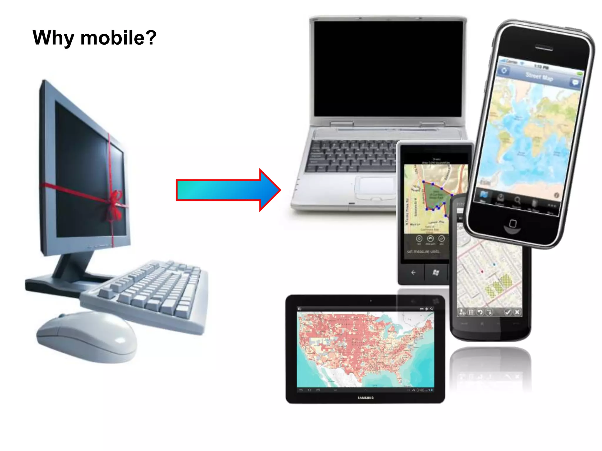
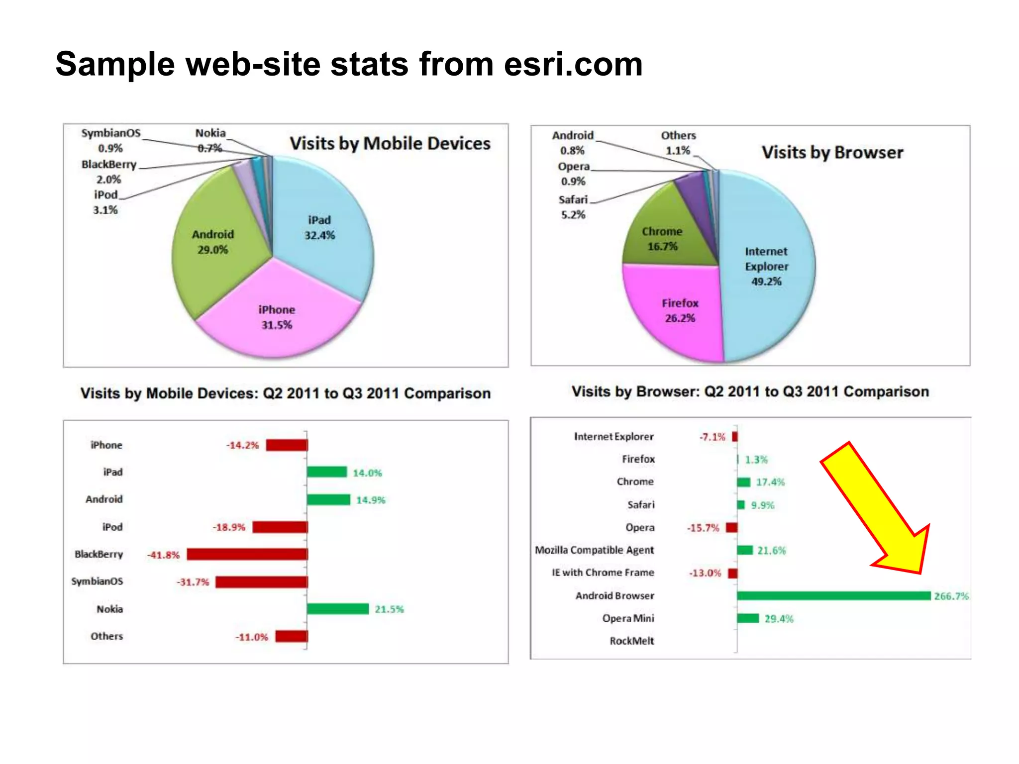
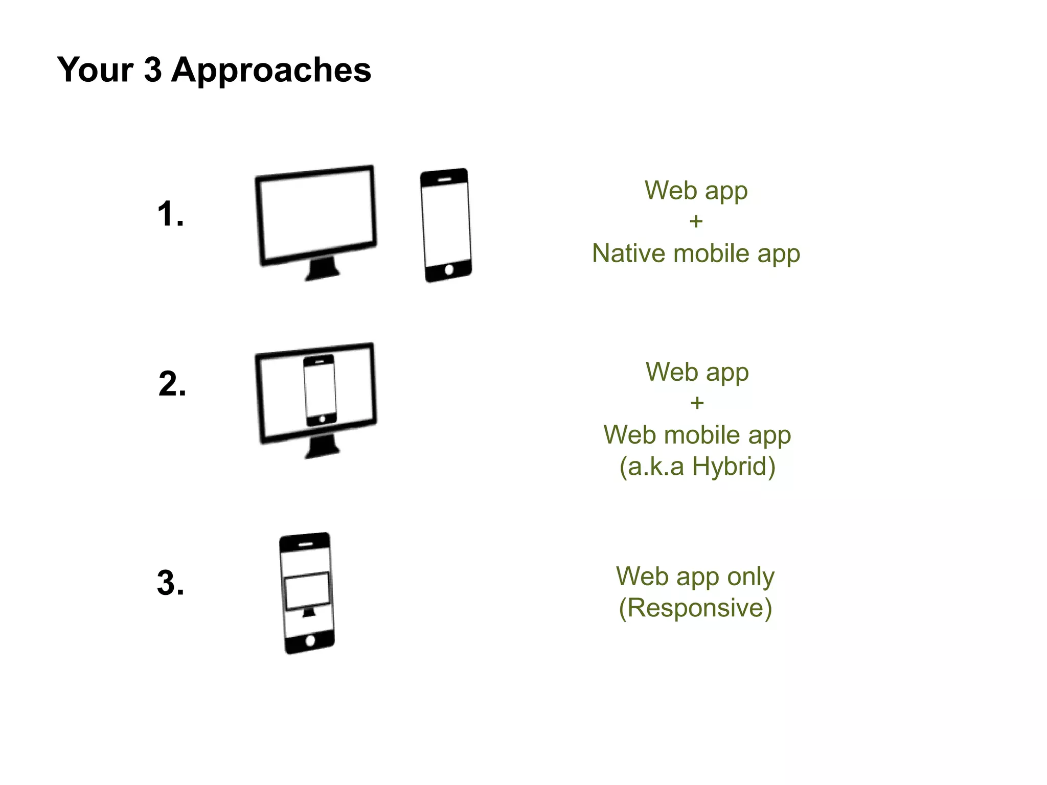
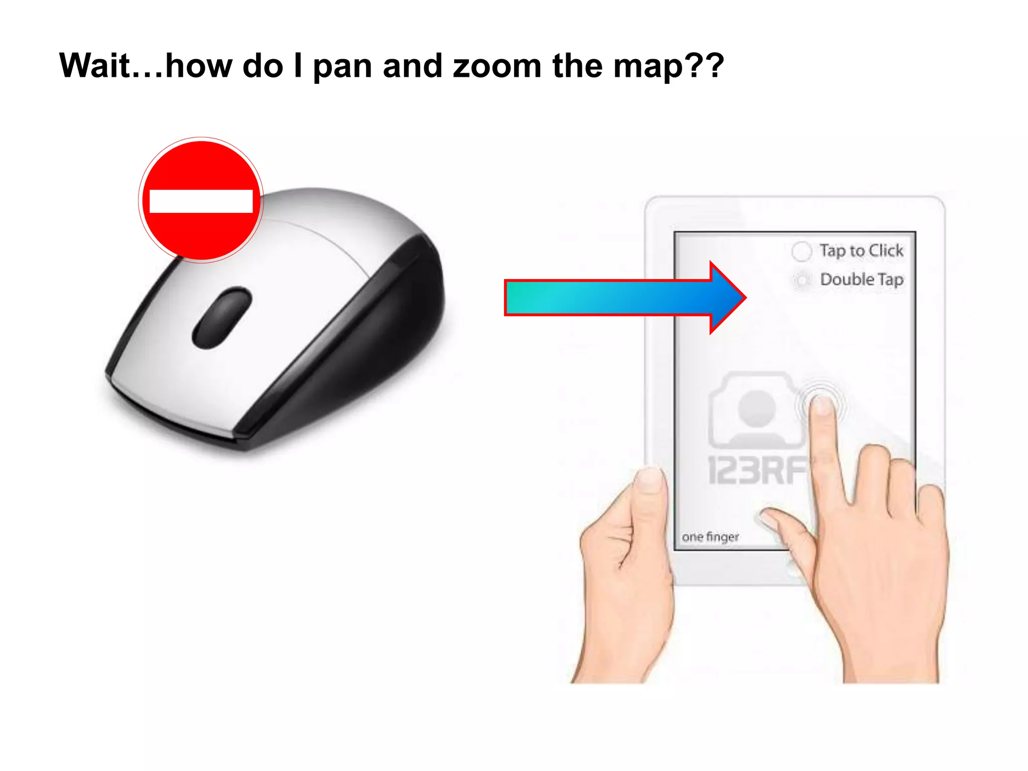
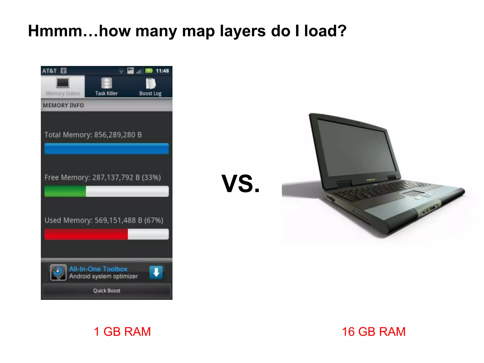
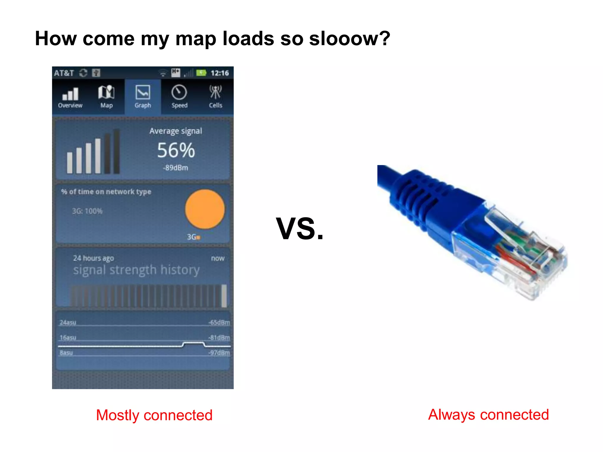
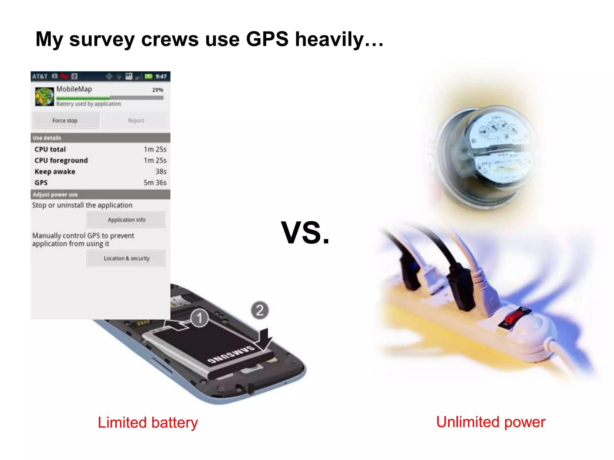
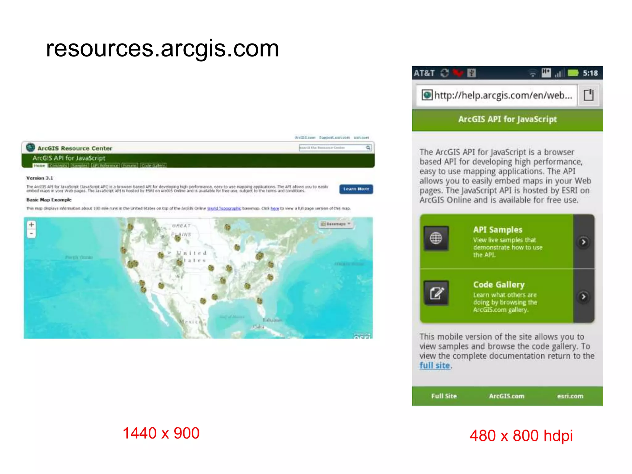
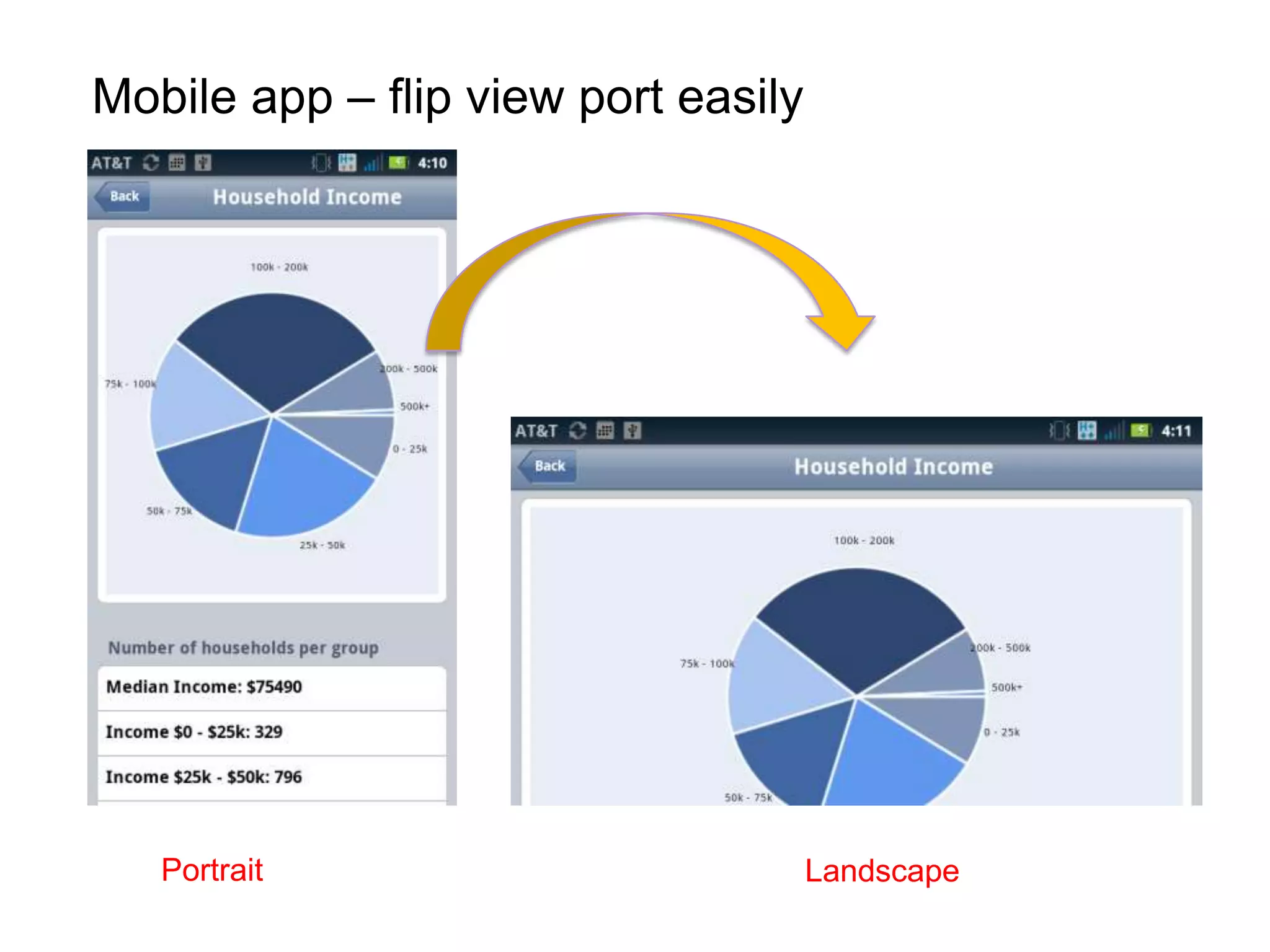
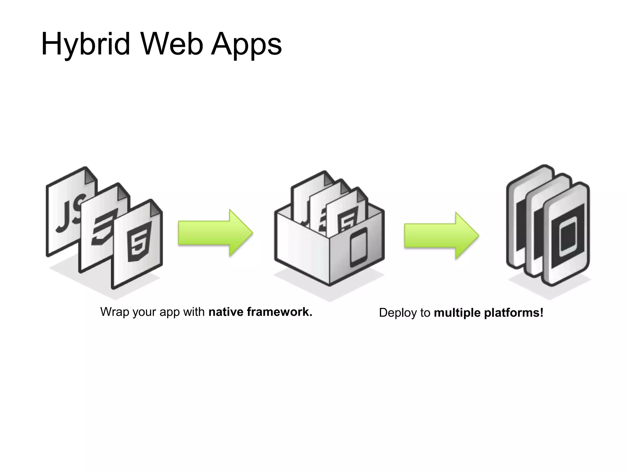
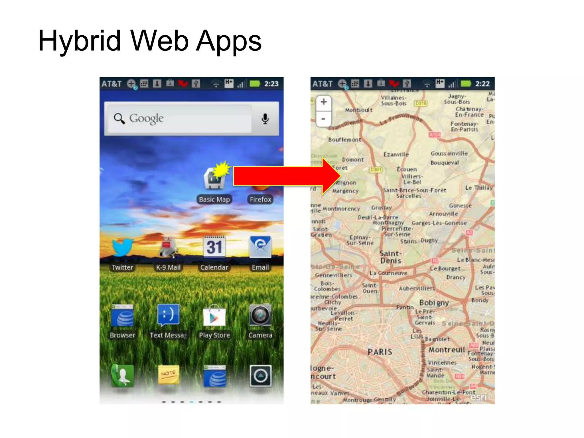
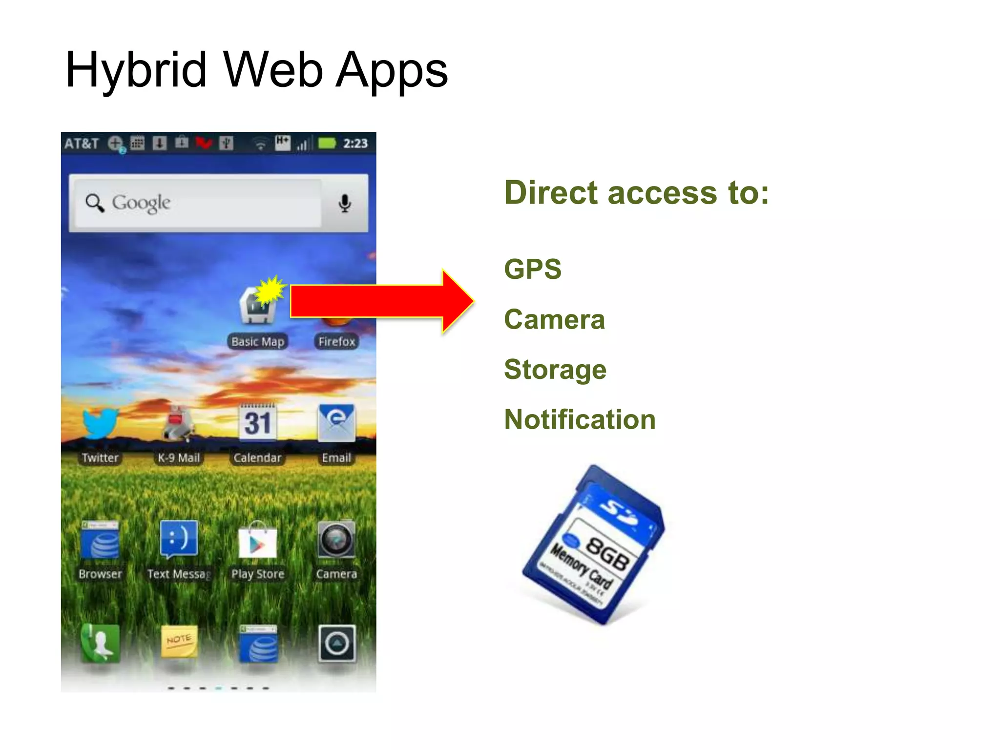
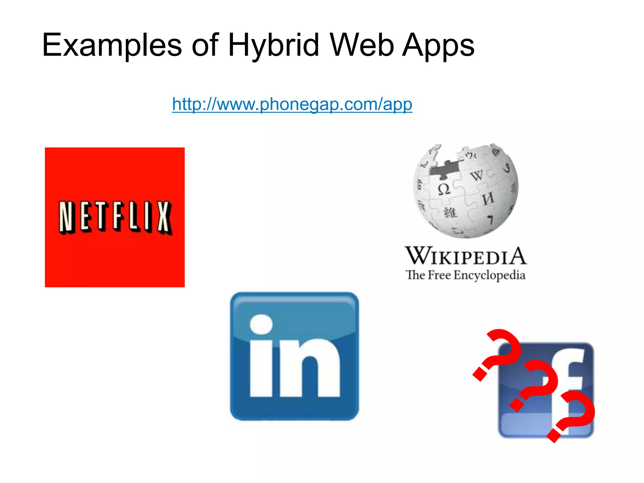
This document provides an agenda for a presentation on building mobile map applications. It will cover 3 approaches to mobile map apps, frameworks for building them like CSS3 and HTML5, and hybrid map apps. It introduces the two presenters, Antoon Uijtdehaag and Andy Gup, and covers topics like why build mobile apps, demos of mobile apps, usage statistics, approaches, frameworks, and hybrid apps. It also includes questions that may come up around topics like panning and zooming maps, loading map layers, performance, and using GPS in surveys.