Download to read offline


![Additional Reading
• Aung T, Niyeha D, Shagihilu S, Mpembeni R, Kaganda J, Sheffel A, Heidkamp R. Optimizing data
visualization for reproductive, maternal, newborn, child health, and nutrition (RMNCH&N) policymaking:
data visualization preferences and interpretation capacity among decision-makers in Tanzania. Global
health research and policy. 2019 Dec 1;4(1):4. [link]
• Aung T, Niyeha D, Heidkamp R. Leveraging data visualization to improve the use of data for global health
decision-making. Journal of Global Health. 2019 Dec;9(2). [link]
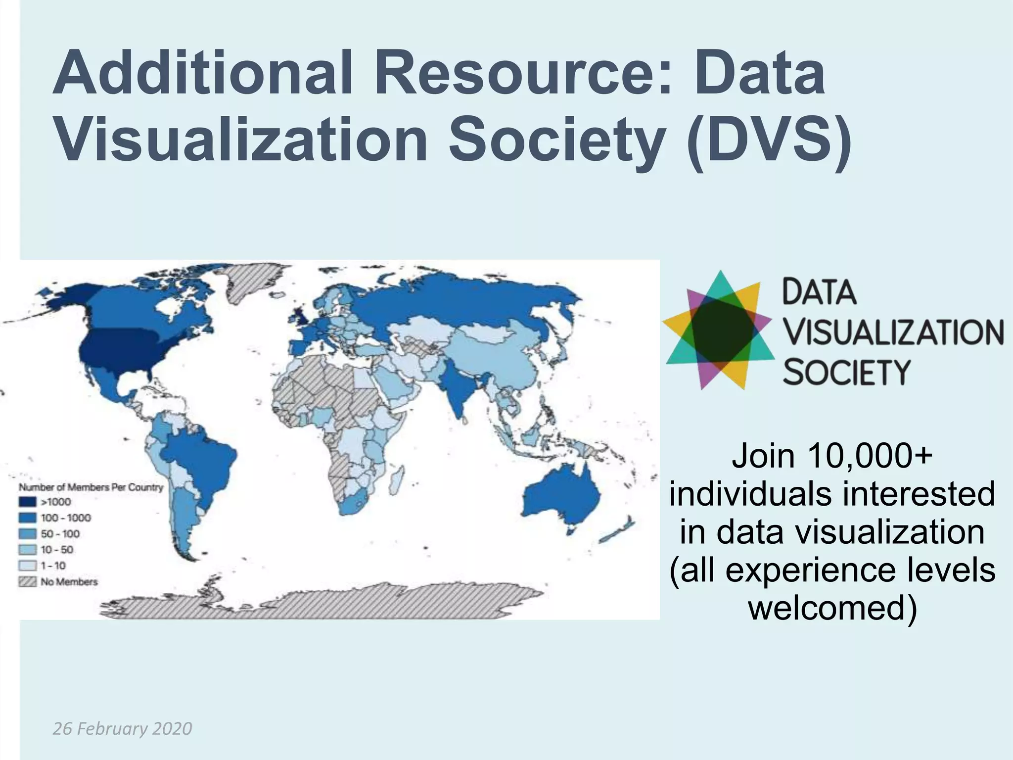
• Aung, T. Data Visualization for Audiences in Low & Middle-Income Countries. Data Visualization Society
Nightingale. 2019. [link]
• Evergreen, Stephanie DH. Effective Data Visualization: The Right Chart for the Right Data. SAGE
Publications, 2016.
• Global Health eLearning Center. Data Visualization - An Introduction [Internet]. 2015. Available from:
https://www.globalhealthlearning.org/course/data-visualization-brave-new-world
• Graybeal, Carolyn. “Exploring a Culture of Health: How Can We Visualize Health Data for Better
Communication?” PLOS CitizenSci Blog
• Pandey, Anshul Vikram, et al. "The persuasive power of data visualization." IEEE transactions on
visualization and computer graphics 20.12 (2014): 2211-2220.
26 February 2020](https://image.slidesharecdn.com/5-200226123032/75/T4N-Breakout-Session-3-Making-better-figures-visualising-data-for-different-audiences-41-2048.jpg)


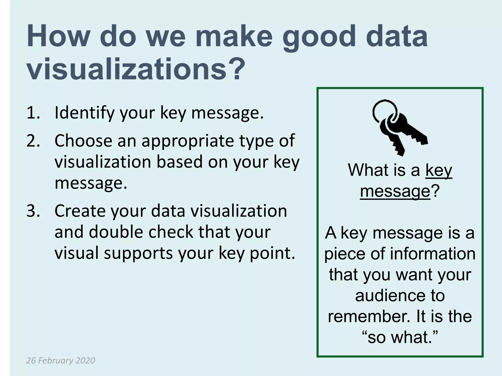
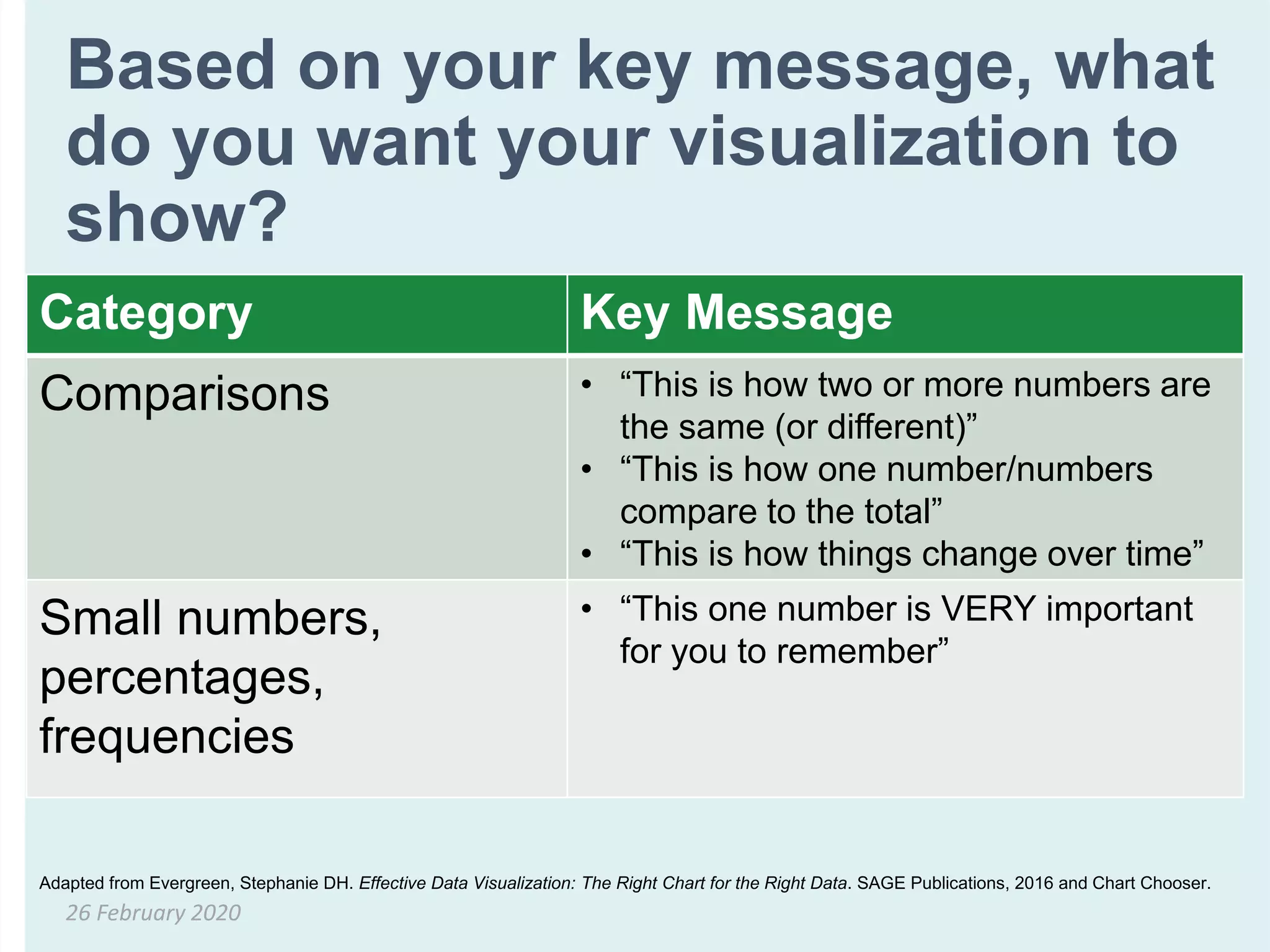
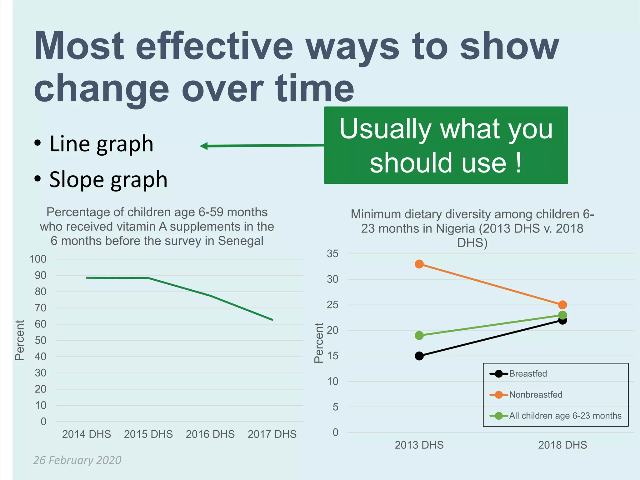
This document provides an overview of best practices for visualizing data for different audiences. It discusses choosing the most appropriate visualization based on the key message, such as comparing numbers, showing how numbers relate to a total, or how numbers change over time. Specific graph types are recommended, such as bar charts for comparisons, pie or stacked bar charts to show parts of a whole, and line graphs to illustrate changes. The document also covers principles like emphasizing important numbers, showing uncertainty, and formatting graphs clearly. Overall, it aims to teach how to effectively communicate data visually for non-technical audiences.


