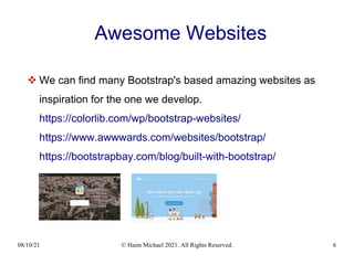
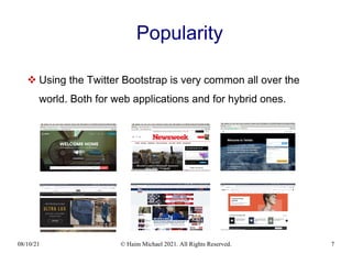
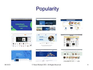
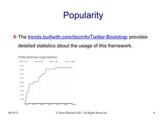
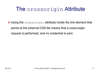
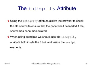
Download to read offline


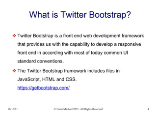
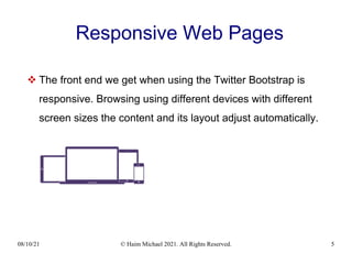

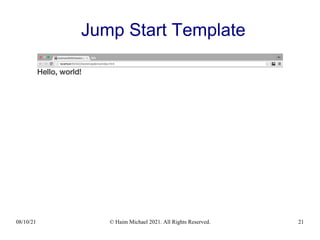

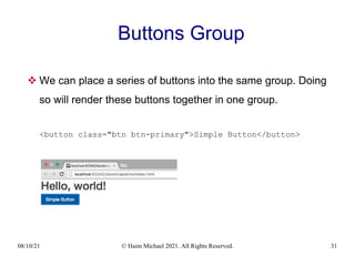

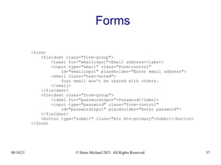
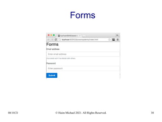
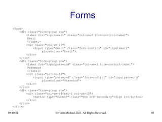
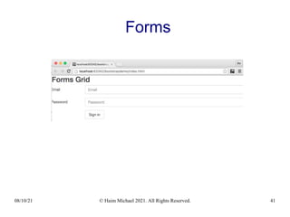
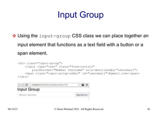
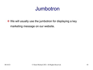
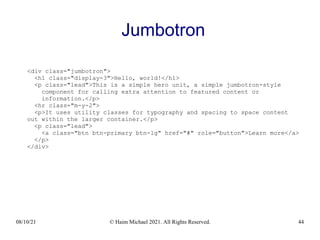
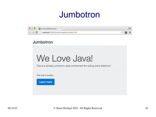
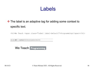
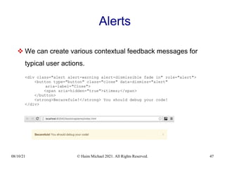
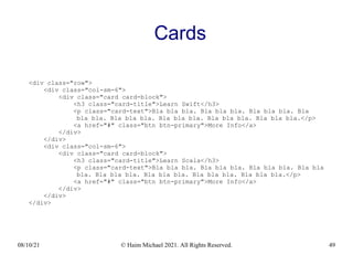
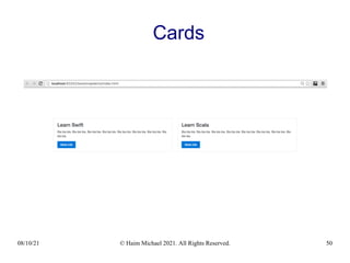
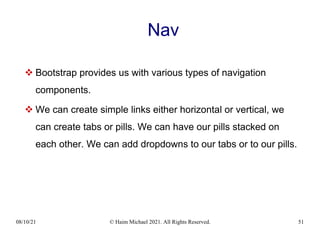
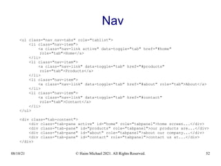
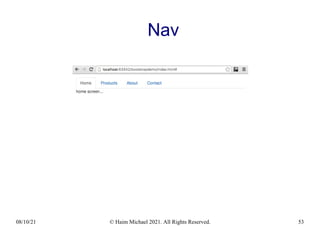
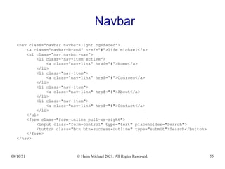
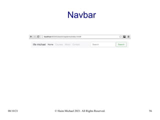
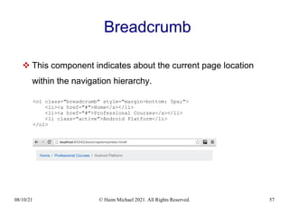
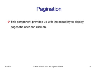
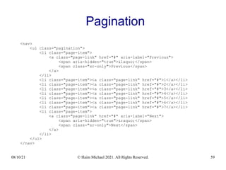
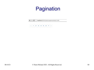
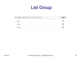
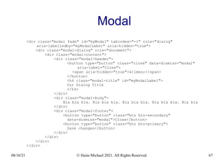
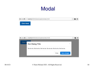
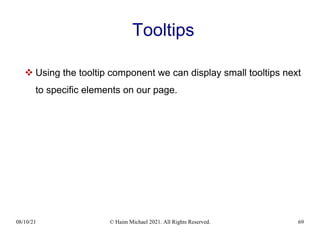
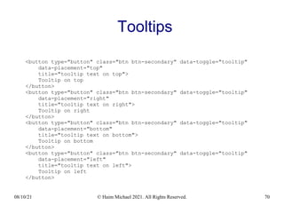

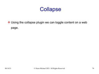
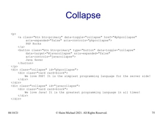
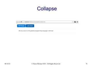


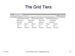
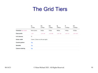
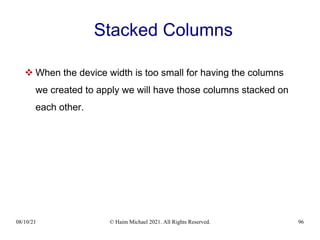
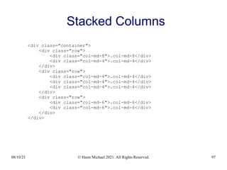
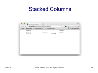
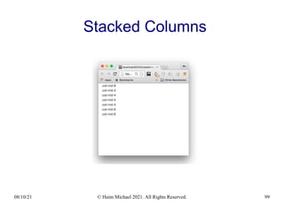
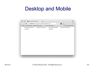
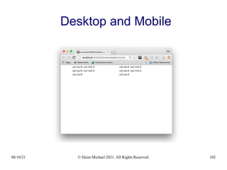

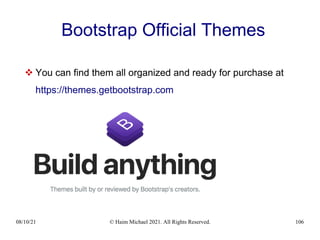


The document provides an overview of Twitter Bootstrap, a front-end web development framework that facilitates the creation of responsive web pages using JavaScript, HTML, and CSS. It discusses the framework's features, including the removal of jQuery in favor of vanilla JavaScript, the introduction of a new SVG icon library, and the dropping of Internet Explorer support in version 5.x. Additionally, it lists various alternative frameworks and illustrates the use of Bootstrap through examples of buttons, forms, and navigation components.


![Bootstrap [part 1]](https://cdn.slidesharecdn.com/ss_thumbnails/bootstrappart-11-170208154053-thumbnail.jpg?width=640&height=640&fit=bounds)


![CH-1[Introduction to web technology].pdf](https://cdn.slidesharecdn.com/ss_thumbnails/ch-1introductiontowebtechnology-250304052552-9237dd95-thumbnail.jpg?width=640&height=640&fit=bounds)

![Getting Started with Apache Spark: Big Data Made Simple [Free Meetup]](https://cdn.slidesharecdn.com/ss_thumbnails/apachesparkgettingstarted-260203175547-8361bcc3-thumbnail.jpg?width=640&height=640&fit=bounds)


![Vibe Coding vs. Spec-Driven Development [Free Meetup]](https://cdn.slidesharecdn.com/ss_thumbnails/vibecodingvsspecdrivendevelopment-251209105622-43f455e7-thumbnail.jpg?width=640&height=640&fit=bounds)

![Learning Programming with ChatGPT [Free Meetup]](https://cdn.slidesharecdn.com/ss_thumbnails/learningprogrammingwithchatgpt20250930-250930090922-6c25145f-thumbnail.jpg?width=640&height=640&fit=bounds)
![Getting Started with Typer: Building Modern CLIs in Python [Free Meetup]](https://cdn.slidesharecdn.com/ss_thumbnails/typer20250902-250902092143-083883db-thumbnail.jpg?width=640&height=640&fit=bounds)
![Prompt Engineering Jump Start [Free Meetup]](https://cdn.slidesharecdn.com/ss_thumbnails/promptengineeringbasics20250708-250807095210-d5891b09-thumbnail.jpg?width=640&height=640&fit=bounds)

![The Visitor Classic Design Pattern [Free Meetup]](https://cdn.slidesharecdn.com/ss_thumbnails/thevisitordesignpattern20250603-250603091504-a29cefc7-thumbnail.jpg?width=640&height=640&fit=bounds)
![Typing in Python: Bringing Clarity, Safety and Speed to Your Code [Free Meetup]](https://cdn.slidesharecdn.com/ss_thumbnails/haimpythontypes20250401-250401101822-2acdbf8f-thumbnail.jpg?width=640&height=640&fit=bounds)
![Introduction to Pattern Matching in Java [Free Meetup]](https://cdn.slidesharecdn.com/ss_thumbnails/javapatternmatchingmeetup20250304-250304131144-9588cdc2-thumbnail.jpg?width=640&height=640&fit=bounds)
![Mastering The Collections in JavaScript [Free Meetup]](https://cdn.slidesharecdn.com/ss_thumbnails/javascriptcollections20250204-250205161759-5a1365e2-thumbnail.jpg?width=640&height=640&fit=bounds)

![JavaScript Promises Simplified [Free Meetup]](https://cdn.slidesharecdn.com/ss_thumbnails/promises20241001-241001092110-ceaab0a2-thumbnail.jpg?width=640&height=640&fit=bounds)
![Scala Jump Start [Free Online Meetup in English]](https://cdn.slidesharecdn.com/ss_thumbnails/scalajumpstart202407-240806123226-086f5431-thumbnail.jpg?width=640&height=640&fit=bounds)
![The MVVM Architecture in Java [Free Meetup]](https://cdn.slidesharecdn.com/ss_thumbnails/themvvmarchitecture20230702-240709115838-c4912ba1-thumbnail.jpg?width=640&height=640&fit=bounds)


