Download to read offline


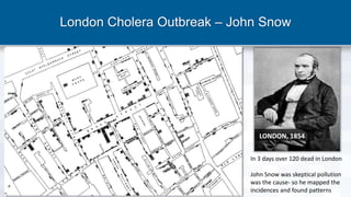

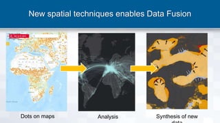
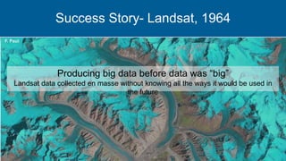


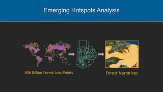
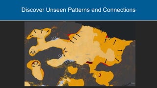
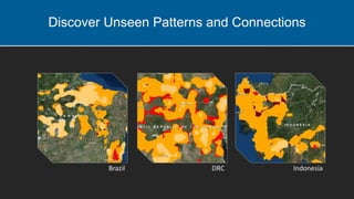

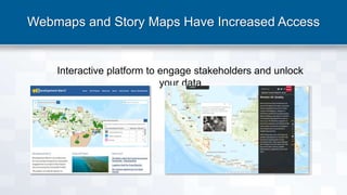
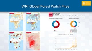
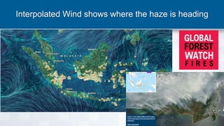
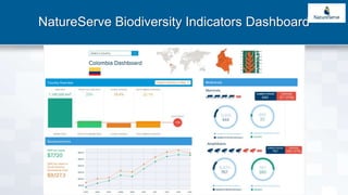


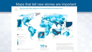


Blue Raster, founded in 2002, specializes in GIS and web application development, focusing on interactive mapping and advanced data analytics. The document highlights the historical importance of spatial analysis, from John Snow's cholera mapping to modern applications like tree cover loss analysis and biodiversity indicators. It emphasizes the transformational power of open data access and advanced mapping tools in addressing environmental challenges.


