Downloaded 27 times


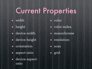


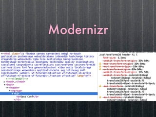


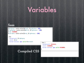
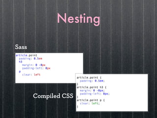


The document discusses mobile and responsive design using Sass, a CSS preprocessor that enhances the power of writing CSS through features like variables, nesting, and mixins. It emphasizes the importance of mobile-first approaches and responsive design techniques such as fluid grids and media queries to create adaptable web experiences. Additionally, it mentions resources and tools for optimizing web design, particularly in the context of Drupal, and the need for custom, future-friendly designs.