Downloaded 18 times


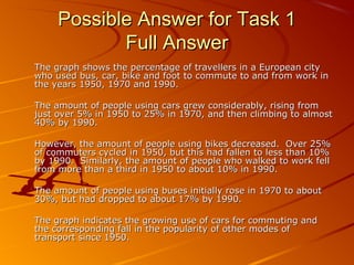
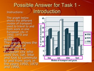
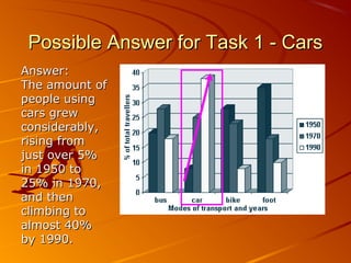
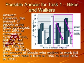
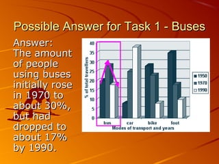

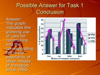

The document provides an example of an academic writing task that asks the student to write a report describing the information shown in a graph. The graph shows the percentage of commuters using different modes of transportation in a European city in 1950, 1970, and 1990. It then provides a sample answer that analyzes the trends for each mode of transportation, such as cars increasing from 5% to 40% of commuters while biking and walking decreased. The summary concludes that the graph illustrates the growing use of cars for commuting and declining popularity of other transportation methods since 1950.


