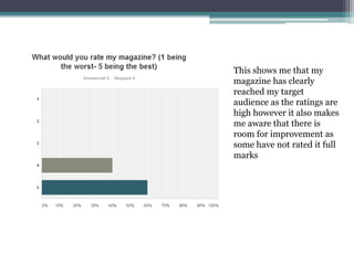
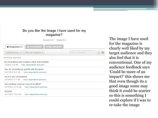
Audience Research Summary
Magazine
By Amy-Jane Wilson
This shows me that my
magazine has clearly
reached my target
audience as the ratings are
high however it also makes
me aware that there is
room for improvement as
some have not rated it full
marks
The image I have used
for the magazine is
clearly well liked by my
target audience and they
also feel that it is
conventional. One of my
audience feedback says
‘Could be more of an
impact?’ this shows me
that even though its a
good image some may
think it could be scarier
so this is something I
could explore if I was to
re-take the image
There is a clear colour
scheme within my
magazine and from my
audience research it is
clear that they follow
the colour scheme and
also that they think
that it is ‘appealing’
and ‘conventional’
From the feedback I have
received from my layout it
is clear to me that even
though I have got a good
layout and the audience
have noticed the use of
‘route of the eye’ and how
clear it is some things need
to be edited. It is seen that
I could reword some of the
cover lines and also add in
a price for the magazine
which is something I
shouldn’t have missed out
as it is one of the key
conventions
The fonts I have used
clearly appeal to the
audience as they all feel
that they are
conventional to the
genre and the form and
also they have used
terms like ‘stands out’
and ‘work well
together’ which helps
me establish that they
are correct for this type
of product

Audience research- Magazine

  • 1.
  • 2.
    This shows methat my magazine has clearly reached my target audience as the ratings are high however it also makes me aware that there is room for improvement as some have not rated it full marks
  • 3.
    The image Ihave used for the magazine is clearly well liked by my target audience and they also feel that it is conventional. One of my audience feedback says ‘Could be more of an impact?’ this shows me that even though its a good image some may think it could be scarier so this is something I could explore if I was to re-take the image
  • 4.
    There is aclear colour scheme within my magazine and from my audience research it is clear that they follow the colour scheme and also that they think that it is ‘appealing’ and ‘conventional’
  • 5.
    From the feedbackI have received from my layout it is clear to me that even though I have got a good layout and the audience have noticed the use of ‘route of the eye’ and how clear it is some things need to be edited. It is seen that I could reword some of the cover lines and also add in a price for the magazine which is something I shouldn’t have missed out as it is one of the key conventions
  • 6.
    The fonts Ihave used clearly appeal to the audience as they all feel that they are conventional to the genre and the form and also they have used terms like ‘stands out’ and ‘work well together’ which helps me establish that they are correct for this type of product