GCSE Media Studies
Unit 2: Understanding the Media
Assignment 1: Packaging of DVDs
Exemplar Folder
version 1.0
Teacher Resource Bank / GCSE Media Studies / Packaging of DVDs Exemplar / Version 1.0
1 Copyright © 2010 AQA and its licensors. All rights reserved. klm
Unit 2: Understanding the Media
Assignment 1 – Introduction to the Media
Topic: Packaging of DVDs
Analytical Task
Analyse the covers of two film DVDs. How does each cover appeal to its target
audience?
Research and Planning Task
Design task – Design a DVD cover for a film targeted at a specific audience.
Explanation
Explain your choices with particular reference to your use of media language and
how your DVD cover appeals to its target audience.
DVD Cover Analysis
I have chosen two contrasting genres. DVD1, ’30 Days of Night’ is horror, DVD2,
Never Been Kissed’ is a romantic comedy ‘. The covers are contradicting; however
both have stereotypical conventions of each genre.
‘30 Days of Night’ is a very effective name for a horror film. ‘30 Days’ indicates a
long period of time, ‘Night’ symbolises dark and evil. The phrase is an oxymoron that
connotes jeopardy and fantasy elements, a form of escapism for the audience. ‘T’s’
in the title look like crucifixes representing death. The title for cover 2 has been
written in bright pink, using a very symmetric font on a white note stuck with a
lipstick mark. This indicates romance. The title informs the audience of the romance
genre. It seems to be a hyperbole which connotes the exaggeration of events in high
school and constant adolescent drama.
The tagline for ‘30 Days’ ‘They’re coming….’ indicates a threat. It refers to the
people lurking in the background and builds up the tension. The tagline for ‘Never
Been Kissed’ relates to the storyline and grips the audience’s attention. ‘…..until
now.’ connotes a change of attitude. It is possibly aimed at the audience of soul
searchers. Both taglines entice the audience by referring to the narrative and use of
ellipsis (…).
The facial expressions of the protagonists on DVD1 are anxious and awaiting. This
indicates action and danger. A man is wearing a sheriff’s badge to represent that
he’s the protector and leader emphasising his responsibilities. In the background
people are approaching. They’re not very visible which connotes their mystery and
wild nature. The image for DVD2 shows the isolation of the heroine. However, she
seems happy, like she didn’t mind being alone. Teenagers often concern themselves
with popularity therefore will easily identify with various characters. Both images
consist of the main character(s) and a group in the background. The audience can
straightaway see who the plot is going to revolve around.
In DVD1 shades of grey and black symbolise fear, isolation and hopelessness. Red is
splashing like blood; alarming the viewer, bringing their attention to the gore
content of the film, a warning to some appealing to others. ’30 Days’ is an
adaptation of a graphic novel. The colours are similar to ones used in a comic book
where characters have a cult following. Most colours on DVD2 are bright and
relaxing, a connotation of comedic elements. It is aimed at young women they’re
likely to enjoy the theme of love that pink represents, but it could compel males and
audiences that attended high school in the 90s as this is the fashion reflected on the
cover.
DVD1 is produced by Icon, an independent film company. It is ambitious and
targeted at a specific audience. Icon is known for ‘The Passion of the Christ’ and
‘Braveheart’ both films contain disturbing scenes and can be difficult to watch.
Viewers entertained by these, are likely to enjoy ’30 Days’. DVD2 is produced by 20th
Century Fox. It is more commercial because of the influence of the major company
and includes typical conventions for a romantic comedy to attract a bigger,
mainstream audience. Fox is one of the six major American film studios and
recognized as a symbol of good quality and entertainment.
The two DVDs are aimed at different audiences. DVD1 is mainly for people over 18
however some teenagers may be tempted to watch it attracted by the violence and
horror. DVD2 is targeted at young adults, mostly females.
Teacher Resource Bank / GCSE Media Studies / Packaging of DVDs Exemplar / Version 1.0
klm Copyright © 2010 AQA and its licensors. All rights reserved. 2
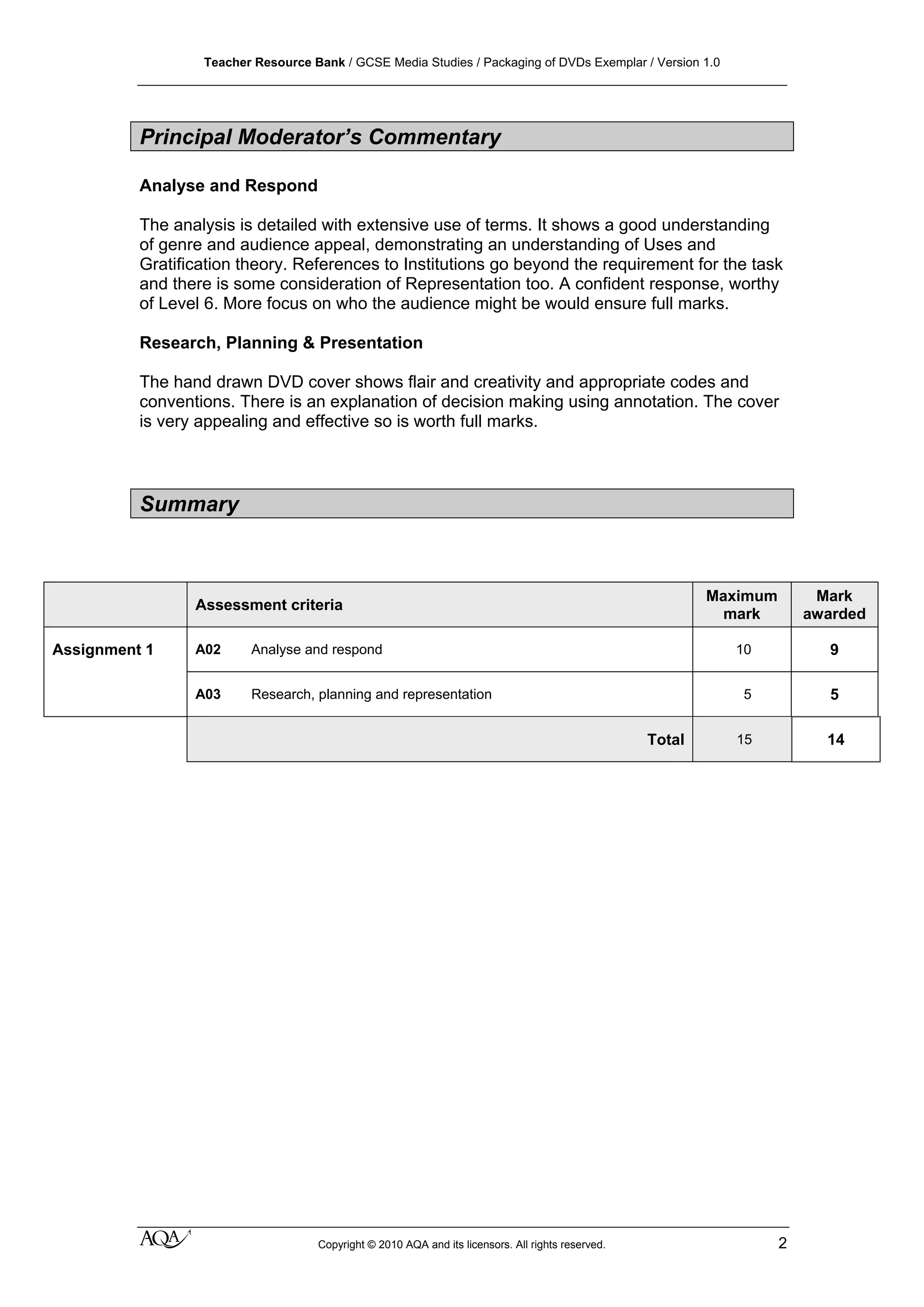
Principal Moderator’s Commentary
Analyse and Respond
The analysis is detailed with extensive use of terms. It shows a good understanding
of genre and audience appeal, demonstrating an understanding of Uses and
Gratification theory. References to Institutions go beyond the requirement for the task
and there is some consideration of Representation too. A confident response, worthy
of Level 6. More focus on who the audience might be would ensure full marks.
Research, Planning & Presentation
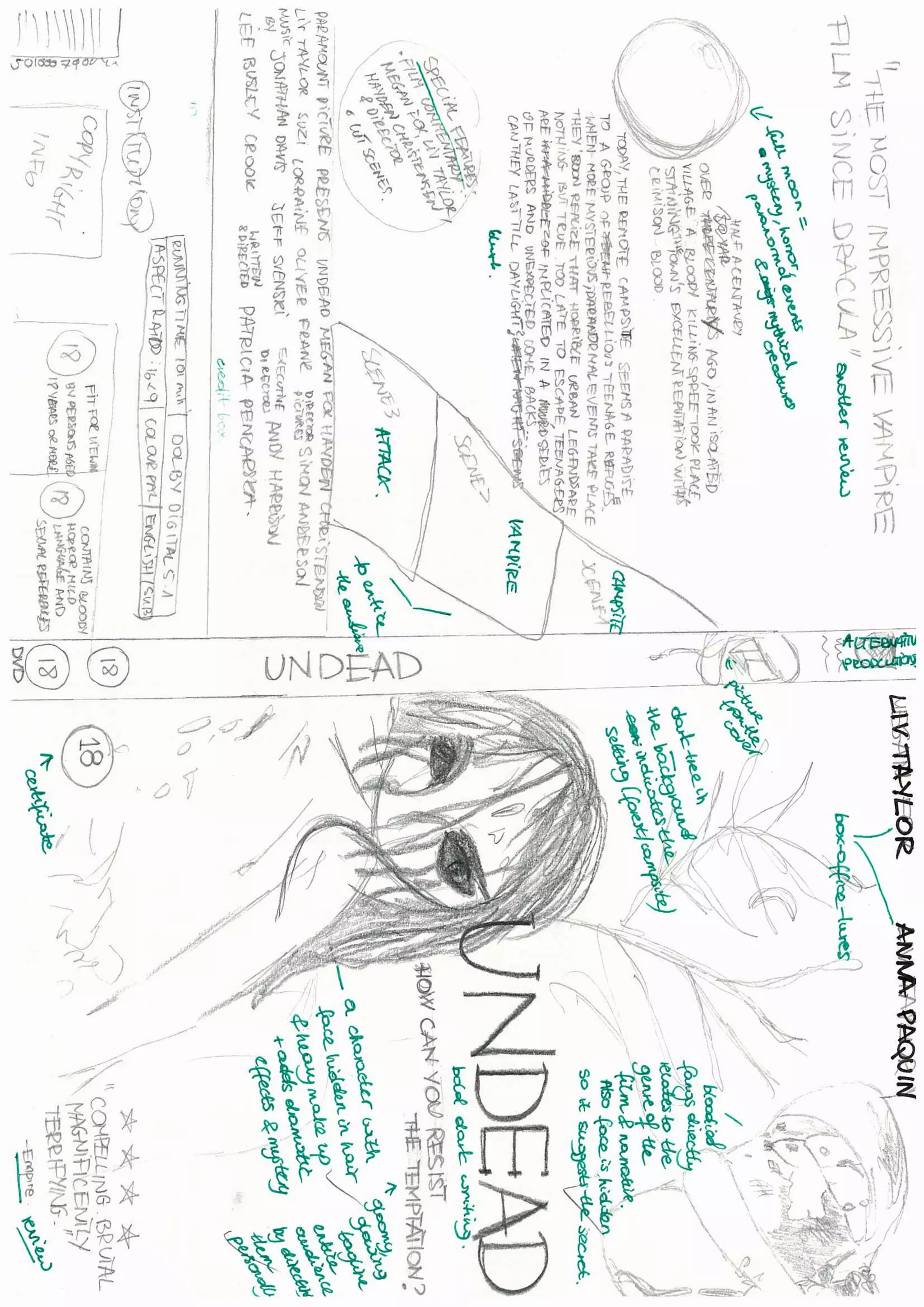
The hand drawn DVD cover shows flair and creativity and appropriate codes and
conventions. There is an explanation of decision making using annotation. The cover
is very appealing and effective so is worth full marks.
Summary
Assessment criteria
Maximum
mark
Mark
awarded
Assignment 1 A02 Analyse and respond 10 9
A03 Research, planning and representation 5 5
Total 15 14

Assignment 1 a star

  • 1.
    GCSE Media Studies Unit2: Understanding the Media Assignment 1: Packaging of DVDs Exemplar Folder version 1.0
  • 2.
    Teacher Resource Bank/ GCSE Media Studies / Packaging of DVDs Exemplar / Version 1.0 1 Copyright © 2010 AQA and its licensors. All rights reserved. klm Unit 2: Understanding the Media Assignment 1 – Introduction to the Media Topic: Packaging of DVDs Analytical Task Analyse the covers of two film DVDs. How does each cover appeal to its target audience? Research and Planning Task Design task – Design a DVD cover for a film targeted at a specific audience. Explanation Explain your choices with particular reference to your use of media language and how your DVD cover appeals to its target audience.
  • 3.
    DVD Cover Analysis Ihave chosen two contrasting genres. DVD1, ’30 Days of Night’ is horror, DVD2, Never Been Kissed’ is a romantic comedy ‘. The covers are contradicting; however both have stereotypical conventions of each genre. ‘30 Days of Night’ is a very effective name for a horror film. ‘30 Days’ indicates a long period of time, ‘Night’ symbolises dark and evil. The phrase is an oxymoron that connotes jeopardy and fantasy elements, a form of escapism for the audience. ‘T’s’ in the title look like crucifixes representing death. The title for cover 2 has been written in bright pink, using a very symmetric font on a white note stuck with a lipstick mark. This indicates romance. The title informs the audience of the romance genre. It seems to be a hyperbole which connotes the exaggeration of events in high school and constant adolescent drama. The tagline for ‘30 Days’ ‘They’re coming….’ indicates a threat. It refers to the people lurking in the background and builds up the tension. The tagline for ‘Never Been Kissed’ relates to the storyline and grips the audience’s attention. ‘…..until now.’ connotes a change of attitude. It is possibly aimed at the audience of soul searchers. Both taglines entice the audience by referring to the narrative and use of ellipsis (…). The facial expressions of the protagonists on DVD1 are anxious and awaiting. This indicates action and danger. A man is wearing a sheriff’s badge to represent that he’s the protector and leader emphasising his responsibilities. In the background people are approaching. They’re not very visible which connotes their mystery and wild nature. The image for DVD2 shows the isolation of the heroine. However, she seems happy, like she didn’t mind being alone. Teenagers often concern themselves with popularity therefore will easily identify with various characters. Both images consist of the main character(s) and a group in the background. The audience can straightaway see who the plot is going to revolve around. In DVD1 shades of grey and black symbolise fear, isolation and hopelessness. Red is splashing like blood; alarming the viewer, bringing their attention to the gore content of the film, a warning to some appealing to others. ’30 Days’ is an adaptation of a graphic novel. The colours are similar to ones used in a comic book where characters have a cult following. Most colours on DVD2 are bright and relaxing, a connotation of comedic elements. It is aimed at young women they’re likely to enjoy the theme of love that pink represents, but it could compel males and audiences that attended high school in the 90s as this is the fashion reflected on the cover. DVD1 is produced by Icon, an independent film company. It is ambitious and targeted at a specific audience. Icon is known for ‘The Passion of the Christ’ and ‘Braveheart’ both films contain disturbing scenes and can be difficult to watch. Viewers entertained by these, are likely to enjoy ’30 Days’. DVD2 is produced by 20th Century Fox. It is more commercial because of the influence of the major company
  • 4.
    and includes typicalconventions for a romantic comedy to attract a bigger, mainstream audience. Fox is one of the six major American film studios and recognized as a symbol of good quality and entertainment. The two DVDs are aimed at different audiences. DVD1 is mainly for people over 18 however some teenagers may be tempted to watch it attracted by the violence and horror. DVD2 is targeted at young adults, mostly females.
  • 6.
    Teacher Resource Bank/ GCSE Media Studies / Packaging of DVDs Exemplar / Version 1.0 klm Copyright © 2010 AQA and its licensors. All rights reserved. 2 Principal Moderator’s Commentary Analyse and Respond The analysis is detailed with extensive use of terms. It shows a good understanding of genre and audience appeal, demonstrating an understanding of Uses and Gratification theory. References to Institutions go beyond the requirement for the task and there is some consideration of Representation too. A confident response, worthy of Level 6. More focus on who the audience might be would ensure full marks. Research, Planning & Presentation The hand drawn DVD cover shows flair and creativity and appropriate codes and conventions. There is an explanation of decision making using annotation. The cover is very appealing and effective so is worth full marks. Summary Assessment criteria Maximum mark Mark awarded Assignment 1 A02 Analyse and respond 10 9 A03 Research, planning and representation 5 5 Total 15 14