Art 21 Project: 
Paige McGinty
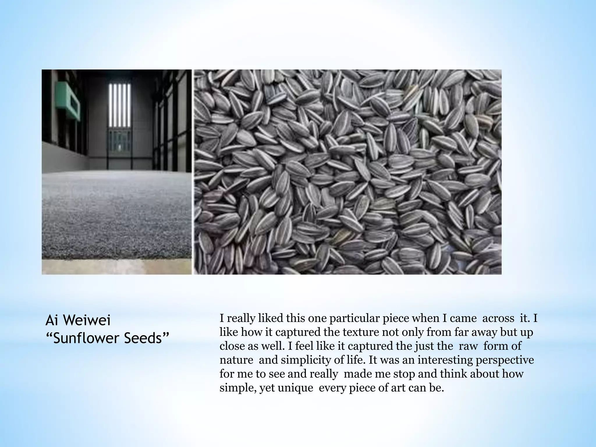
Ai Weiwei 
“Sunflower Seeds” 
I really liked this one particular piece when I came across it. I 
like how it captured the texture not only from far away but up 
close as well. I feel like it captured the just the raw form of 
nature and simplicity of life. It was an interesting perspective 
for me to see and really made me stop and think about how 
simple, yet unique every piece of art can be.
Paige 
McGinty 
Photography 
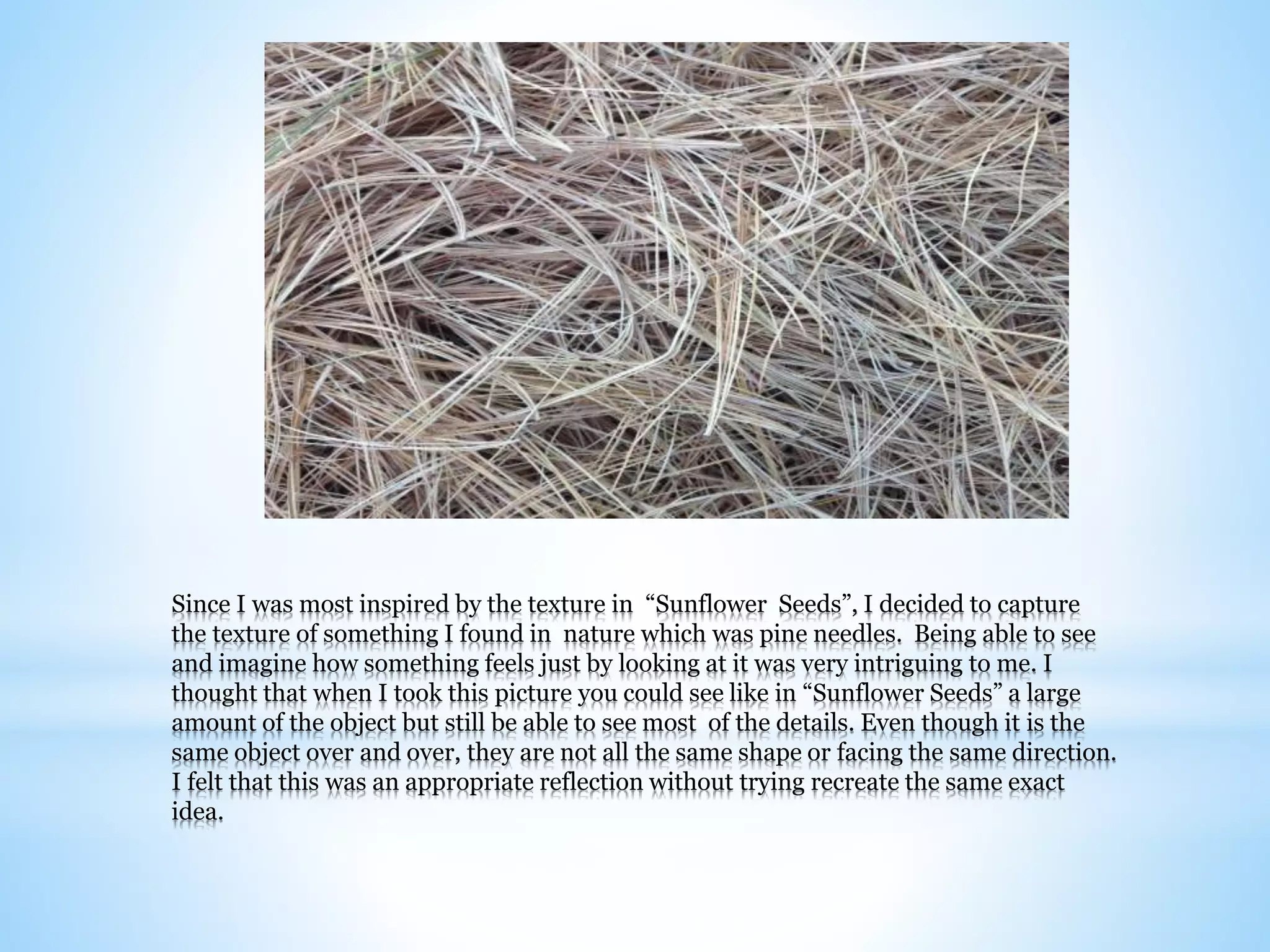
Since I was most inspired by the texture in “Sunflower Seeds”, I decided to capture 
the texture of something I found in nature which was pine needles. Being able to see 
and imagine how something feels just by looking at it was very intriguing to me. I 
thought that when I took this picture you could see like in “Sunflower Seeds” a large 
amount of the object but still be able to see most of the details. Even though it is the 
same object over and over, they are not all the same shape or facing the same direction. 
I felt that this was an appropriate reflection without trying recreate the same exact 
idea.
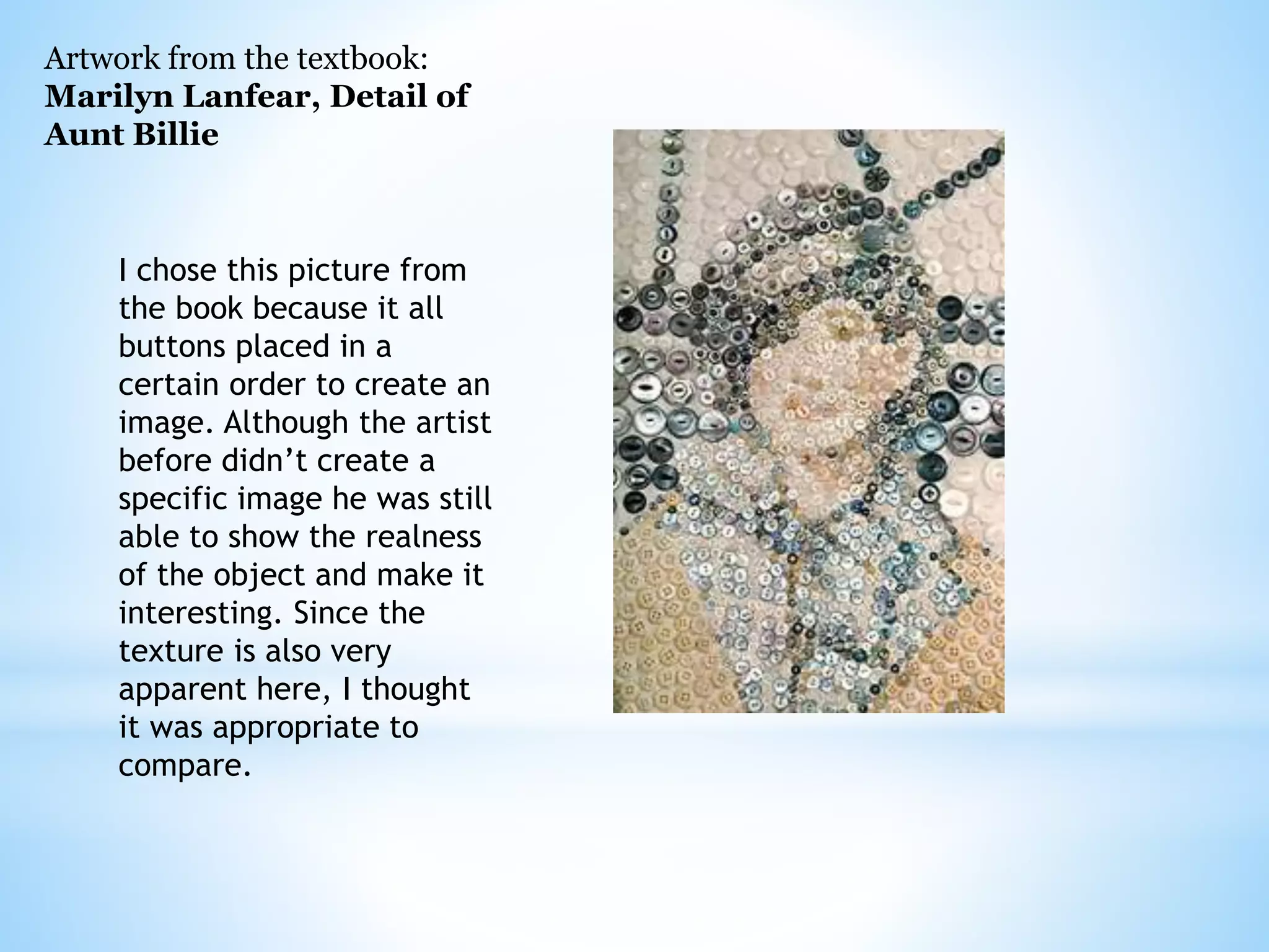
Artwork from the textbook: 
Marilyn Lanfear, Detail of 
Aunt Billie 
I chose this picture from 
the book because it all 
buttons placed in a 
certain order to create an 
image. Although the artist 
before didn’t create a 
specific image he was still 
able to show the realness 
of the object and make it 
interesting. Since the 
texture is also very 
apparent here, I thought 
it was appropriate to 
compare.
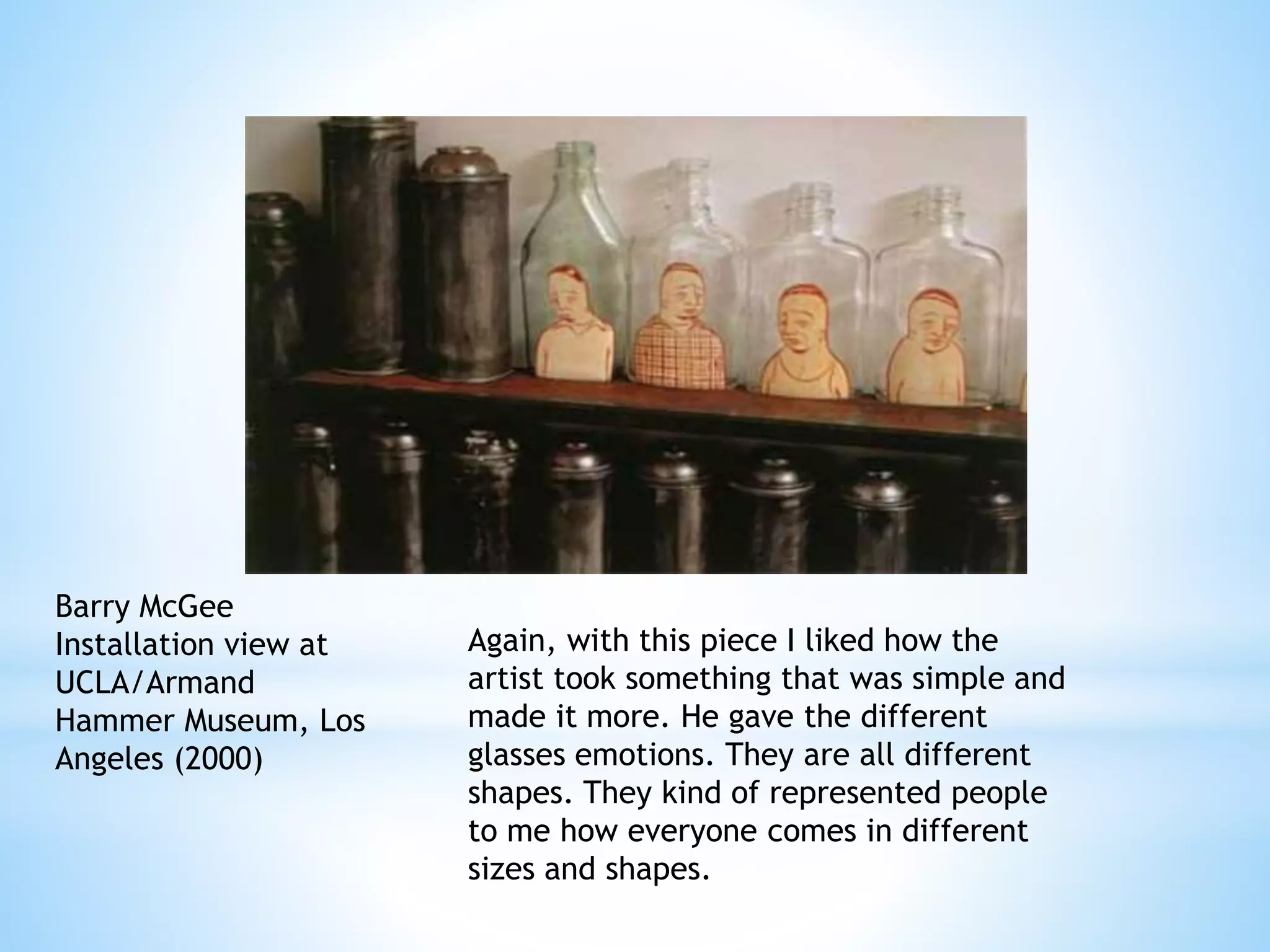
Barry McGee 
Installation view at 
UCLA/Armand 
Hammer Museum, Los 
Angeles (2000) 
Again, with this piece I liked how the 
artist took something that was simple and 
made it more. He gave the different 
glasses emotions. They are all different 
shapes. They kind of represented people 
to me how everyone comes in different 
sizes and shapes.
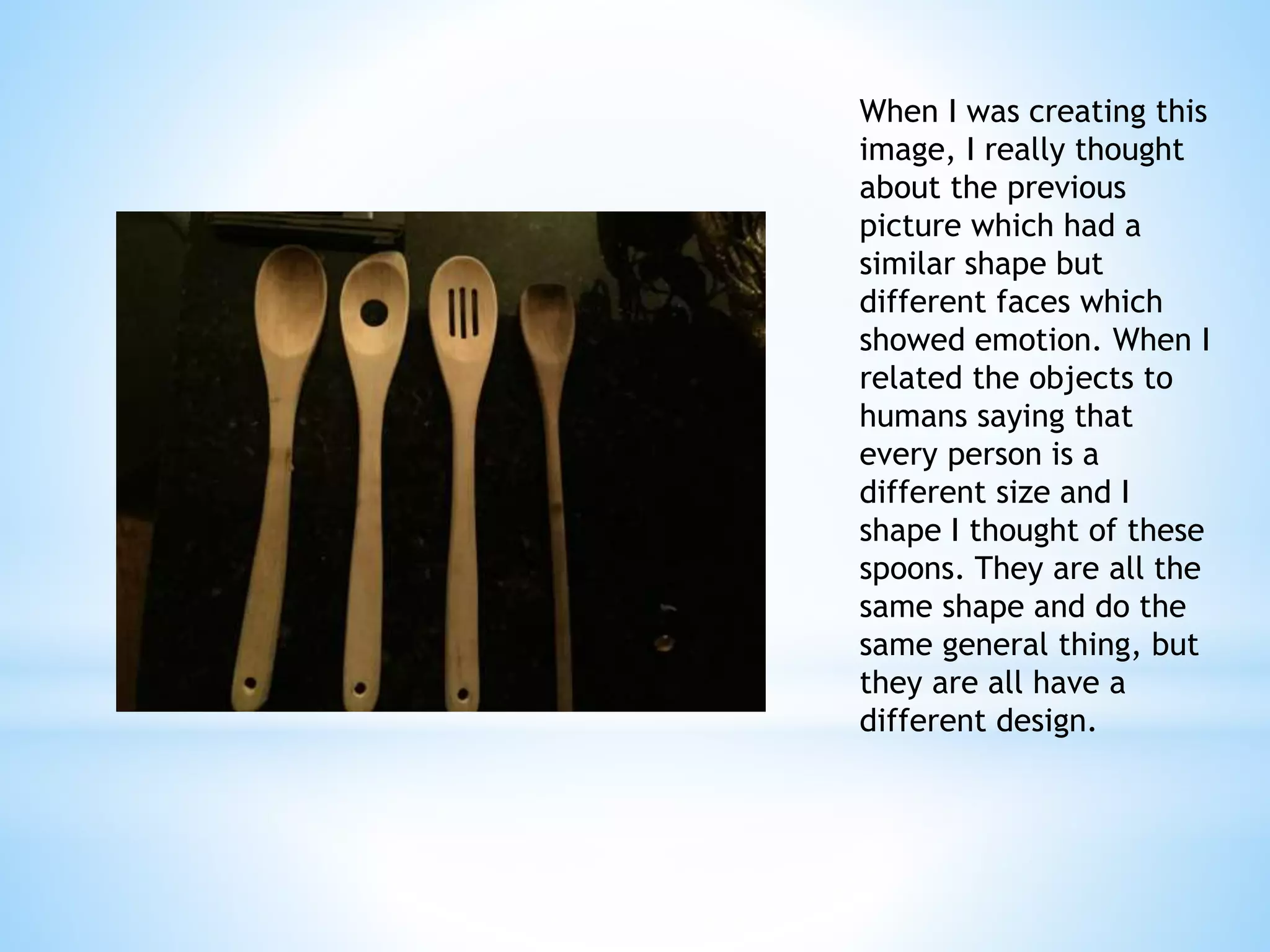
When I was creating this 
image, I really thought 
about the previous 
picture which had a 
similar shape but 
different faces which 
showed emotion. When I 
related the objects to 
humans saying that 
every person is a 
different size and I 
shape I thought of these 
spoons. They are all the 
same shape and do the 
same general thing, but 
they are all have a 
different design. 
Paige McGinty 
Photography
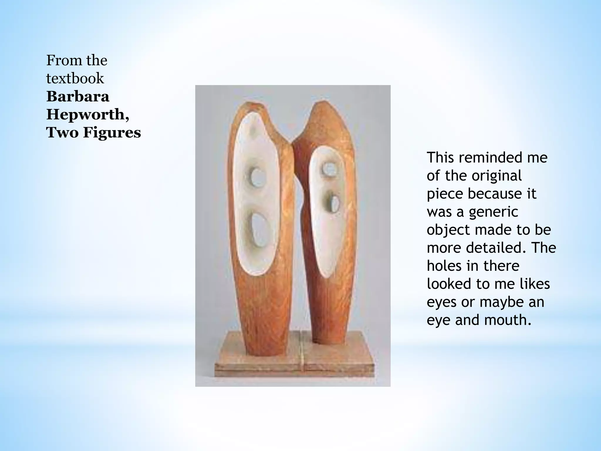
From the 
textbook 
Barbara 
Hepworth, 
Two Figures 
This reminded me 
of the original 
piece because it 
was a generic 
object made to be 
more detailed. The 
holes in there 
looked to me likes 
eyes or maybe an 
eye and mouth.
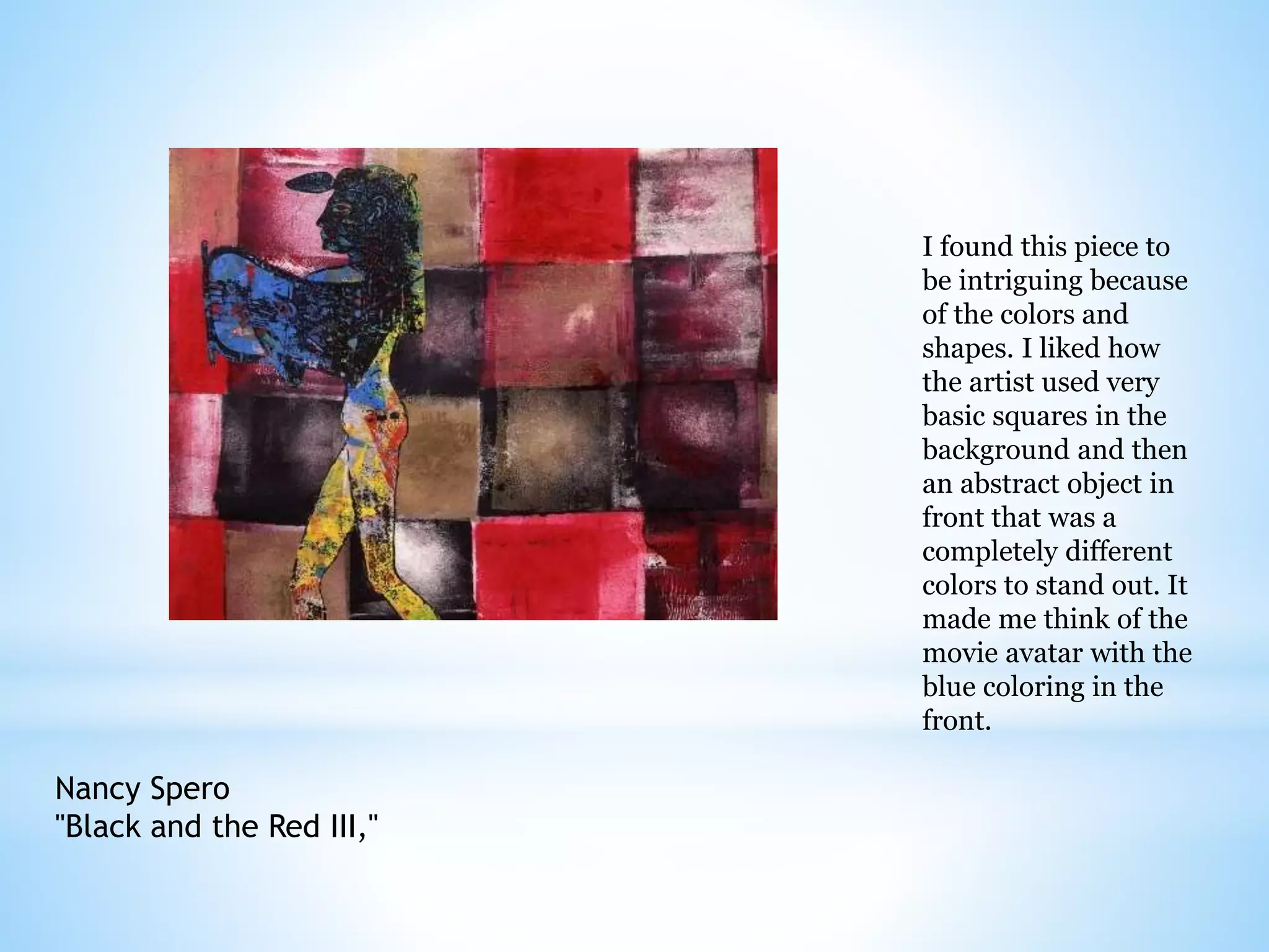
Nancy Spero 
"Black and the Red III," 
I found this piece to 
be intriguing because 
of the colors and 
shapes. I liked how 
the artist used very 
basic squares in the 
background and then 
an abstract object in 
front that was a 
completely different 
colors to stand out. It 
made me think of the 
movie avatar with the 
blue coloring in the 
front.
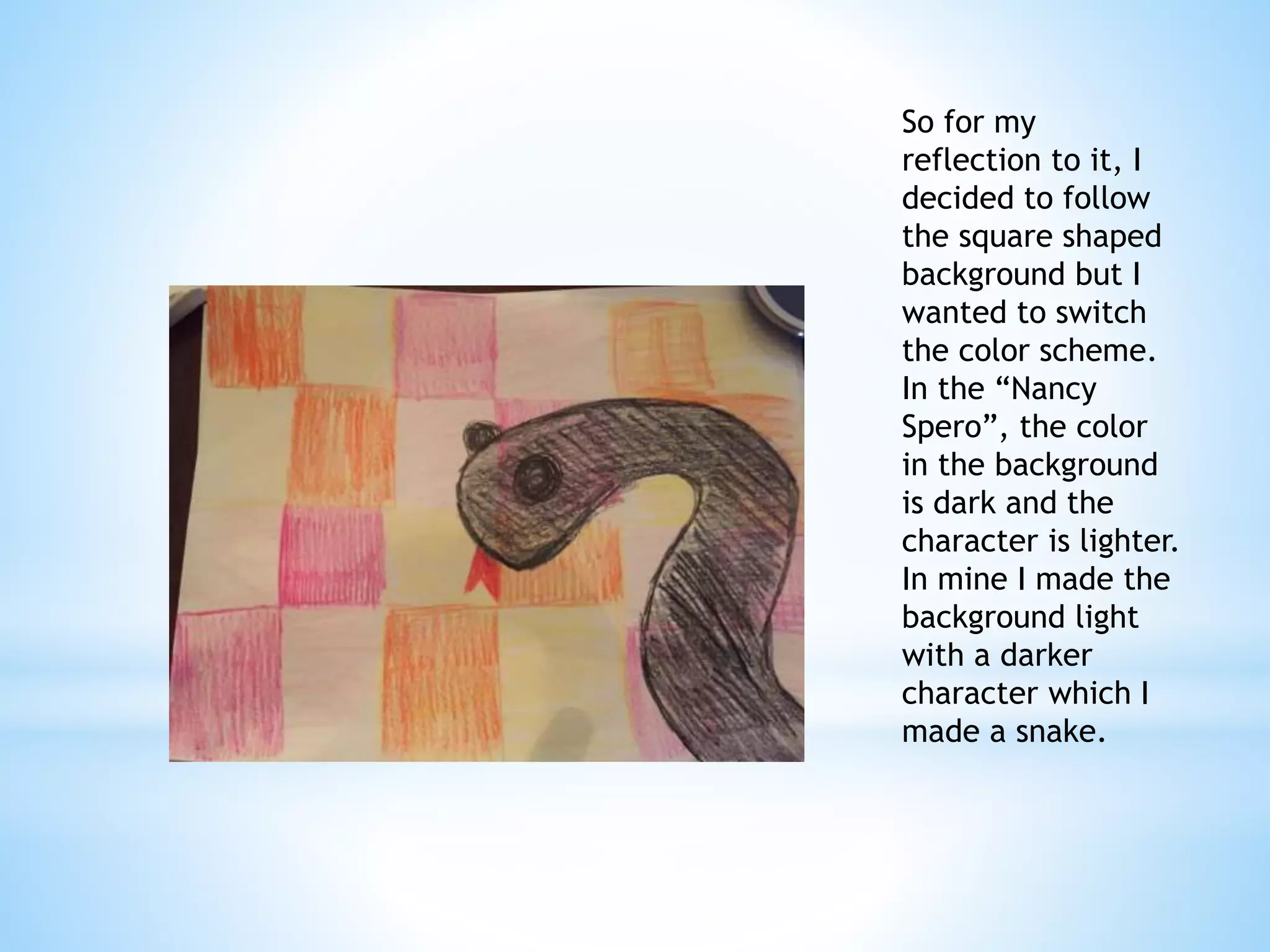
So for my 
reflection to it, I 
decided to follow 
the square shaped 
background but I 
wanted to switch 
the color scheme. 
In the “Nancy 
Spero”, the color 
in the background 
is dark and the 
character is lighter. 
In mine I made the 
background light 
with a darker 
character which I 
made a snake. 
Paige McGinty 
Colored Pencil
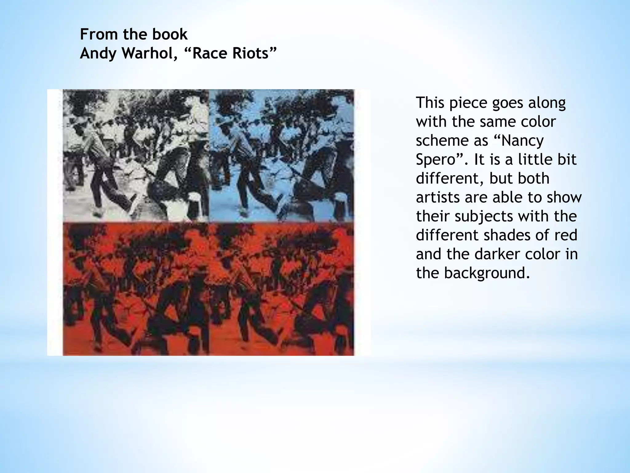
This piece goes along 
with the same color 
scheme as “Nancy 
Spero”. It is a little bit 
different, but both 
artists are able to show 
their subjects with the 
different shades of red 
and the darker color in 
the background. 
From the book 
Andy Warhol, “Race Riots”

Art 21 project

  • 1.
    Art 21 Project: Paige McGinty
  • 2.
    Ai Weiwei “SunflowerSeeds” I really liked this one particular piece when I came across it. I like how it captured the texture not only from far away but up close as well. I feel like it captured the just the raw form of nature and simplicity of life. It was an interesting perspective for me to see and really made me stop and think about how simple, yet unique every piece of art can be.
  • 3.
    Paige McGinty Photography Since I was most inspired by the texture in “Sunflower Seeds”, I decided to capture the texture of something I found in nature which was pine needles. Being able to see and imagine how something feels just by looking at it was very intriguing to me. I thought that when I took this picture you could see like in “Sunflower Seeds” a large amount of the object but still be able to see most of the details. Even though it is the same object over and over, they are not all the same shape or facing the same direction. I felt that this was an appropriate reflection without trying recreate the same exact idea.
  • 4.
    Artwork from thetextbook: Marilyn Lanfear, Detail of Aunt Billie I chose this picture from the book because it all buttons placed in a certain order to create an image. Although the artist before didn’t create a specific image he was still able to show the realness of the object and make it interesting. Since the texture is also very apparent here, I thought it was appropriate to compare.
  • 5.
    Barry McGee Installationview at UCLA/Armand Hammer Museum, Los Angeles (2000) Again, with this piece I liked how the artist took something that was simple and made it more. He gave the different glasses emotions. They are all different shapes. They kind of represented people to me how everyone comes in different sizes and shapes.
  • 6.
    When I wascreating this image, I really thought about the previous picture which had a similar shape but different faces which showed emotion. When I related the objects to humans saying that every person is a different size and I shape I thought of these spoons. They are all the same shape and do the same general thing, but they are all have a different design. Paige McGinty Photography
  • 7.
    From the textbook Barbara Hepworth, Two Figures This reminded me of the original piece because it was a generic object made to be more detailed. The holes in there looked to me likes eyes or maybe an eye and mouth.
  • 8.
    Nancy Spero "Blackand the Red III," I found this piece to be intriguing because of the colors and shapes. I liked how the artist used very basic squares in the background and then an abstract object in front that was a completely different colors to stand out. It made me think of the movie avatar with the blue coloring in the front.
  • 9.
    So for my reflection to it, I decided to follow the square shaped background but I wanted to switch the color scheme. In the “Nancy Spero”, the color in the background is dark and the character is lighter. In mine I made the background light with a darker character which I made a snake. Paige McGinty Colored Pencil
  • 10.
    This piece goesalong with the same color scheme as “Nancy Spero”. It is a little bit different, but both artists are able to show their subjects with the different shades of red and the darker color in the background. From the book Andy Warhol, “Race Riots”