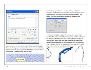
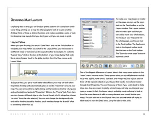
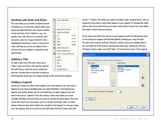
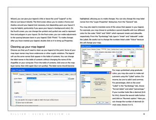
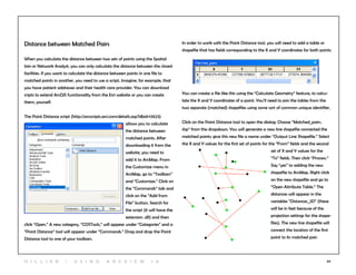
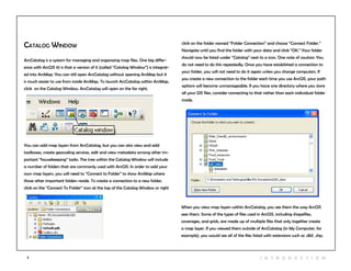
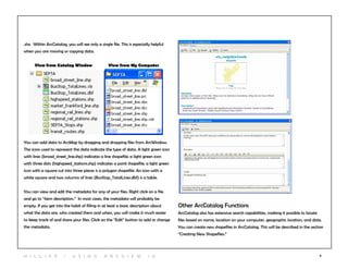
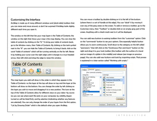
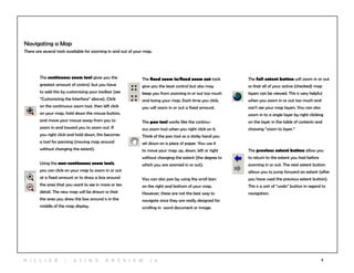
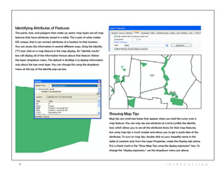
This manual introduces ArcGIS 10 and is intended to teach undergraduate and graduate students how to use its basic functions. It provides step-by-step instructions for tasks like symbolizing data, making maps, editing attributes, and more. Each section introduces a set of tools with screenshots and videos. The goal is to help new users feel comfortable matching tasks to tools and troubleshooting issues.
![31
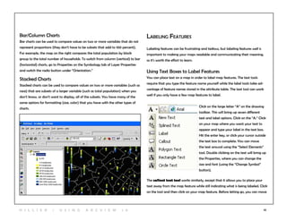
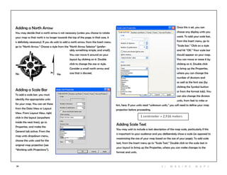
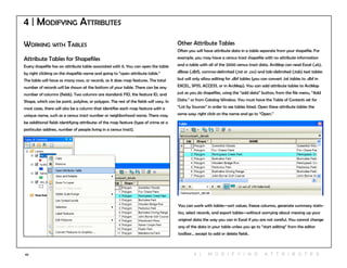
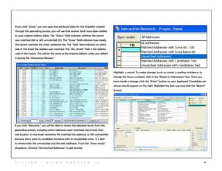
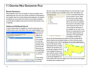
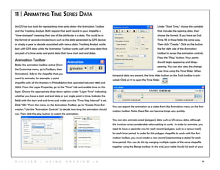
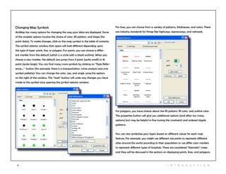
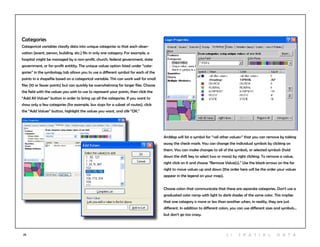
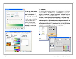
Pie Charts
Charts are good for showing multiple values and the relationship between
values on different variables. Pie charts are especially good for showing propor-
tions. For example, individual pie pieces can be used to show the breakdown in
race for the population in a census tract. For the pies to work, you must be able
to put every person into a racial group, or you must use an “other” category.
Pies contain a lot of information, so it can be difficult to display them clearly. To
create pie charts, click on “Charts” and “Pie” from the Symbology tab. Holding
down the shift key, select the fields that you want to include. Make sure that
together, they add up to 100 percent (you may need to create and calculate
a new “other” field in your attribute table before using charts). Click on the
“Background” button to change the color or fill (“Hollow” or white backgrounds
might be best, so that you don’t have too many colors in your map). If you check
“Prevent Chart Overlap,” ArcView will use “leader lines” to indicate where the
pie charts belong if there is no room to display them within the map feature.
Click on the Properties button to make adjustments to the look of the pie (3D,
rotation, height).
Click on the Size button if you want to have different size pie charts depend-
ing upon the total (such as total population). If you choose to “Vary size using
a field,” you may need to exclude records with a zero value. To do this, click on
the Exclusion button and, using the appropriate field name, create an expression
such as “[TotalPop] = 0.” You may need to play with the minimum size on the
previous screen to make the maximum size pie chart a reasonable size.
3 | M aki n g maps](https://image.slidesharecdn.com/argismanualgratuito-170331165944/85/Argis-manual-gratuito-33-320.jpg)