Download as PDF, PPTX
![Animation in ArcMap Tutorial
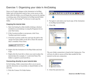
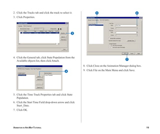
IN THIS TUTORIAL Animations can be created in ArcMap™, ArcScene™ or ArcGlobe™. With
an animation, you can visualize changes to the properties of objects (such as
• Exercise 1: Organizing your data
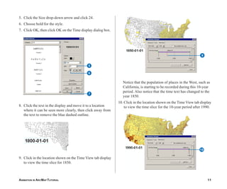
layers, the camera, or the map extent). By altering layer properties, such as
in ArcCatalog
the time stamp that is displayed or layer visibility and transparency, you can
• Exercise 2: Viewing an animation create interesting animations that can be used to analyze data through time or
to view information in various layers. By altering the extent (ArcMap) or the
• Exercise 3: Creating a temporal camera position (ArcScene or ArcGlobe), you can create an animation that
animation moves around a map, scene or globe. Examples of applications that would
benefit from being viewed as an animation include:
• Exercise 4: Animating data in a
graph through time • The occurrence of events through time, such as hurricanes or precipitation,
the spread of a disease, or population change
• The navigation of an object (such as a car) through a landscape
• A visualization of information in multiple layers by applying transparency
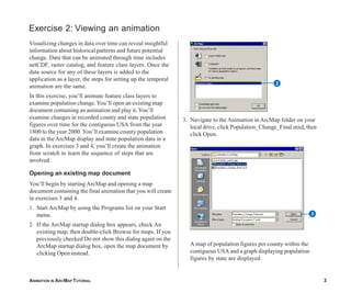
In this tutorial, in the ArcMap display and in a graph, you’ll create an
animation using feature class layers to examine population change for the
contiguous USA for the period 1800 to 2000. The steps used in setting up the
animation can be applied to raster catalog layers, network Common Data
Form [netCDF] layers, and tables, and are also applicable in ArcScene and
ArcGlobe (except the creation of graphs).
To use this tutorial, ArcGIS® must be installed and you must have the
Animation in ArcMap tutorial data installed on a local or shared network drive
on your system. Ask your system administrator for the correct path if you do
not find it at the default installation path specified in the tutorial.
1](https://image.slidesharecdn.com/animationinarcmaptutorial-121006133303-phpapp02/85/Animation-in-arc_map_tutorial-3-320.jpg)
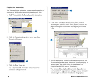
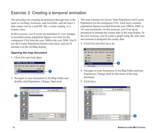
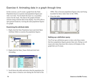
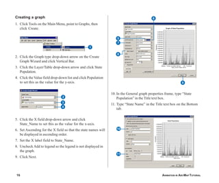
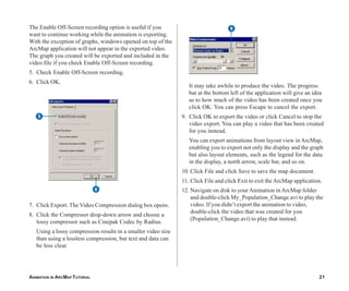
![Creating the time layer track 2. Click the Type drop-down list and click Time Layer as
the type of track you’ll create to store the keyframes.
Animations consist of tracks. Tracks are bound to objects
(such as layers, the map view [ArcMap], the camera 3. Click the Source object drop-down list and click County
[ArcScene and ArcGlobe], or the scene [ArcScene]) Population.
whose properties can be animated. You can create an 4. Click New to create a new time layer track with a
animation that navigates through a scene or globe or pans default name. You’ll rename the track later.
and zooms around a map by creating a camera or a map
All that is required to create an animation through time is a
view track, respectively. You can create an animation that
start and an end keyframe (though multiple keyframes can
alters layer properties, such as transparency or visibility, by
be created if you want to animate, for example, hourly time
creating a layer track. Scene properties, such as the
stamps for the first half of an animation and daily time
background, can be animated by creating a scene track.
stamps for the second half). Later in this exercise, you’ll
Data (in the form of feature class, netCDF, or raster
learn how to set the time for each keyframe, between
catalog layers) can be animated through time in ArcMap,
which time stamps will display based on the interval and
ArcScene, or ArcGlobe by creating a time layer track. All
units that you’ll specify.
that is required is a time field in the attribute table, or a time
dimension for netCDF layers. The ‘Building animations’ 5. Type “Start Time” for the name of the first keyframe
section of the ArcGIS Desktop Help explains how to create you’ll create within the time layer track.
the various track types for use in an animation. 6. Click Create once to create this keyframe. Be careful to
Tracks are composed of keyframes, which are a snapshot only click Create once. It is easy to unintentionally
of the object’s properties at a certain time during the create multiple keyframes. If you clicked Create more
animation. For time layer tracks, each keyframe stores a than once, close this dialog box, click Animation, and
time, and the interval (such as 10) and units (such as years) click Clear Animation. Then start again from step 1 of
that will be applied between that keyframe and the next this section.
one. To create a time layer track, you’ll first create an
empty track and create the keyframes that it will store.
1. Click Animation and click Create Keyframe.
2
3
4
1 5
6
ANIMATION IN ARCMAP TUTORIAL 7](https://image.slidesharecdn.com/animationinarcmaptutorial-121006133303-phpapp02/85/Animation-in-arc_map_tutorial-9-320.jpg)

This document provides instructions for creating an animation in ArcMap to visualize population changes in the contiguous United States from 1800 to 2000 using county-level feature class layers. It describes organizing data in ArcCatalog, viewing an existing animation, and creating a new animation to examine population changes in the ArcMap display and through a graph over time. The steps can be applied to other data types and programs besides ArcMap.