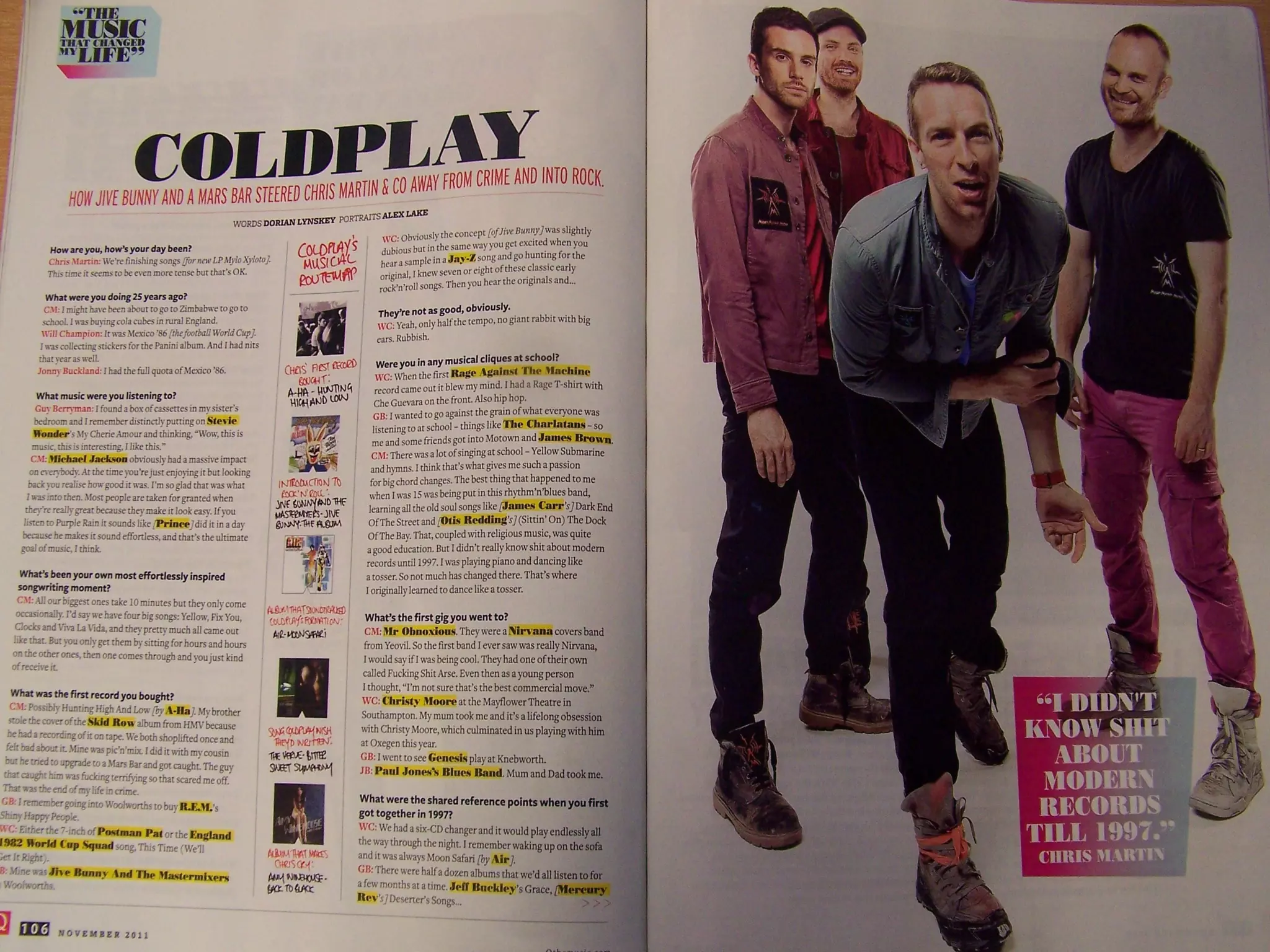
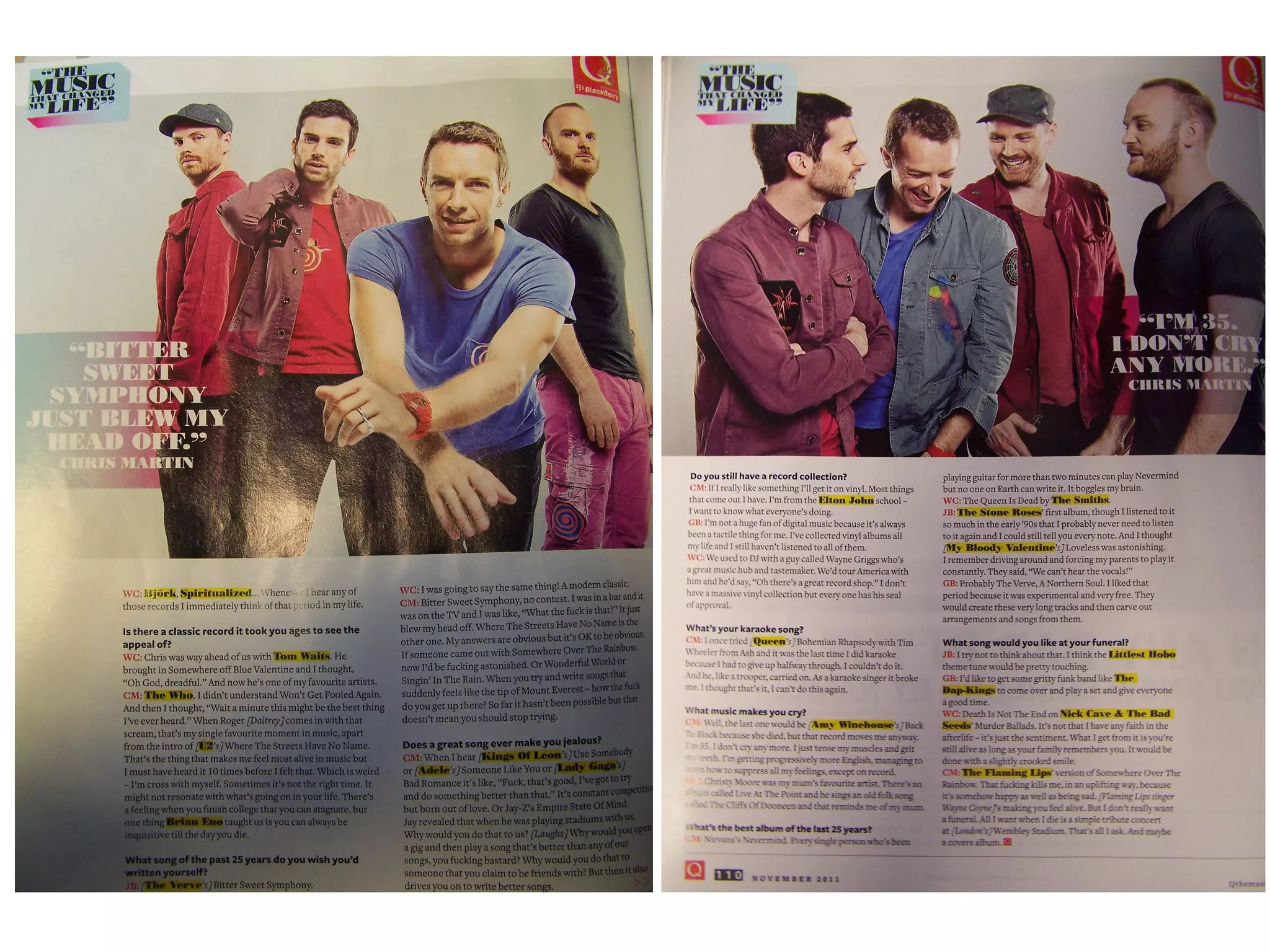
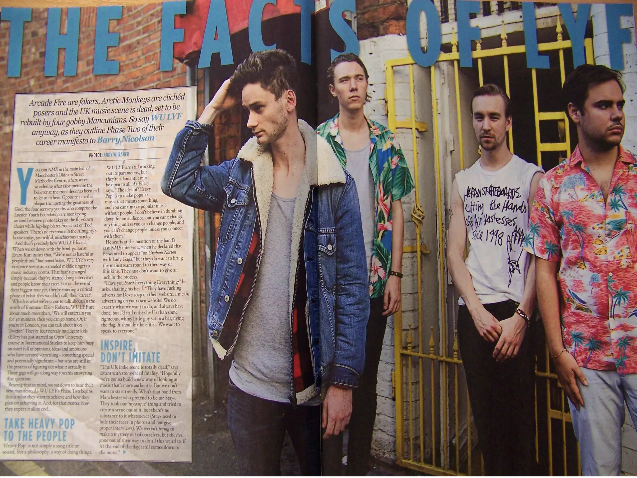
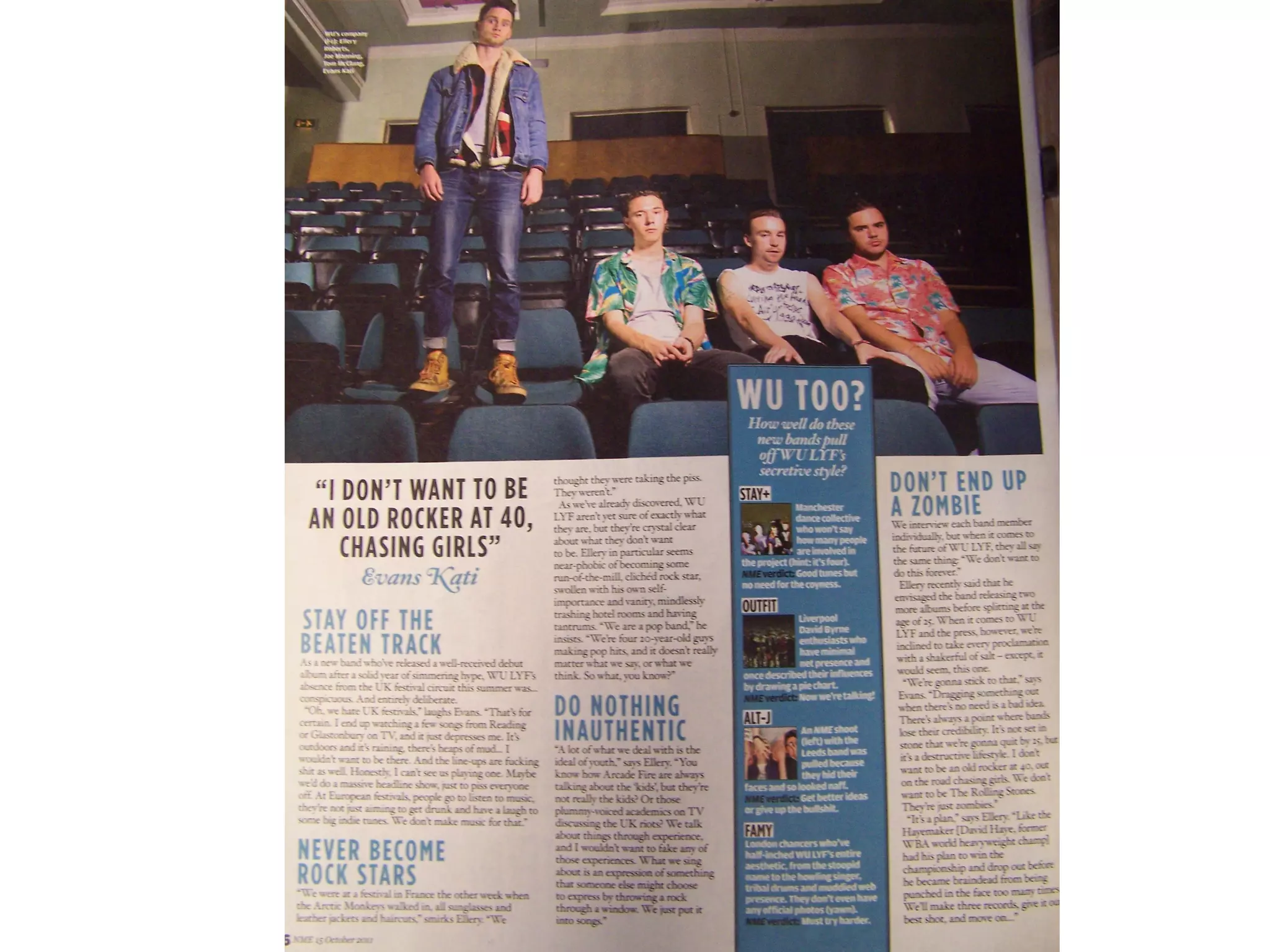
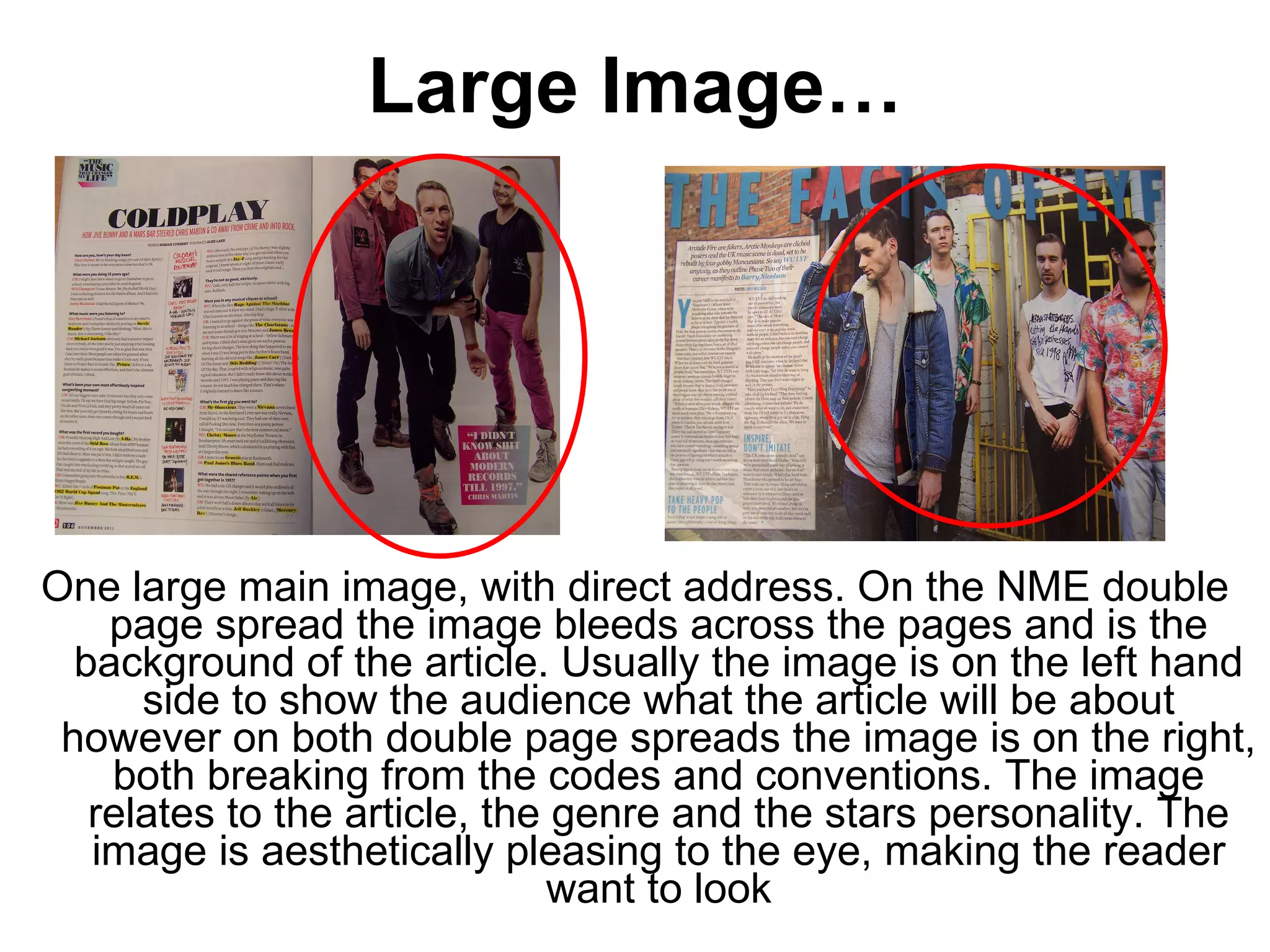
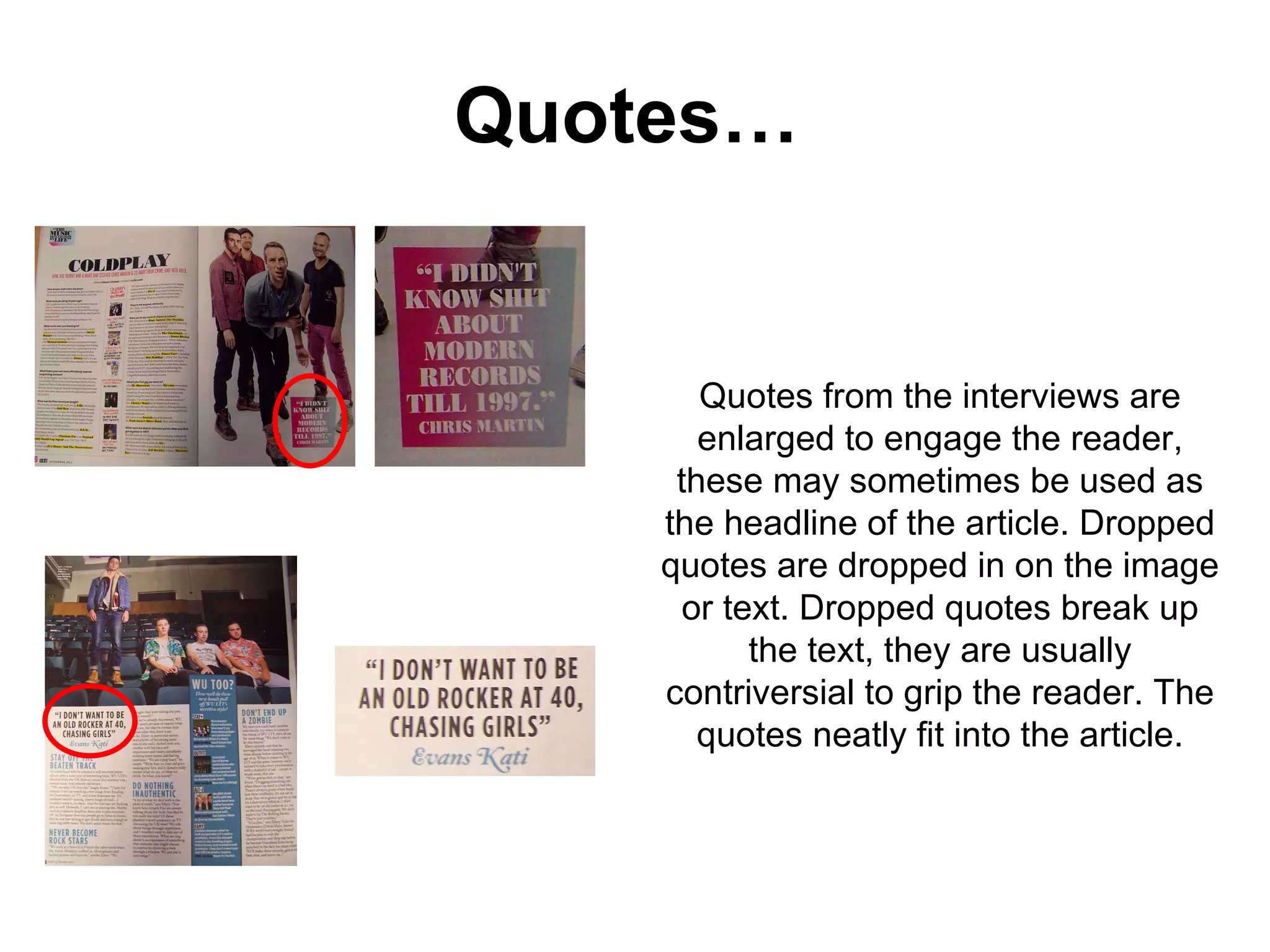
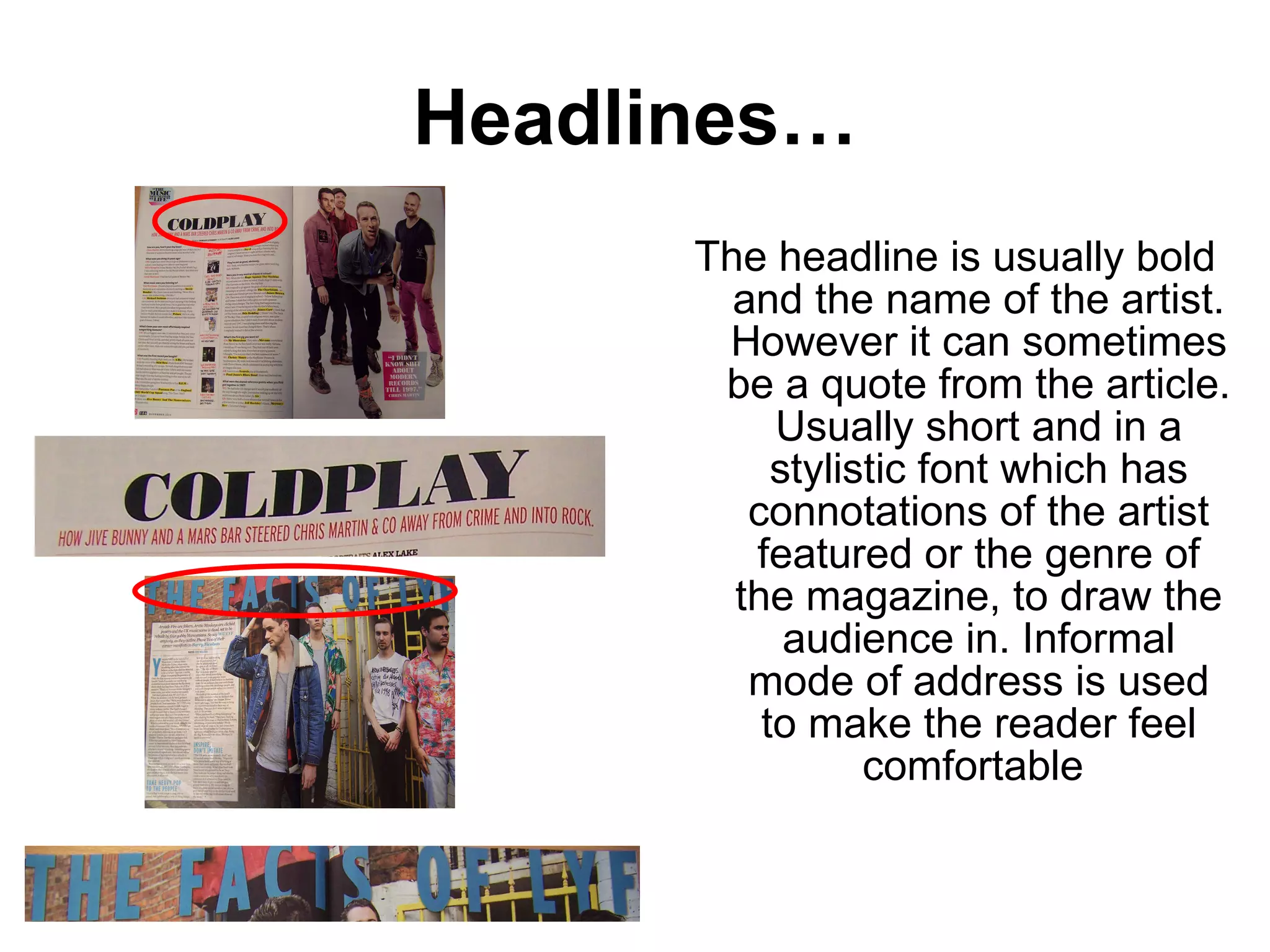
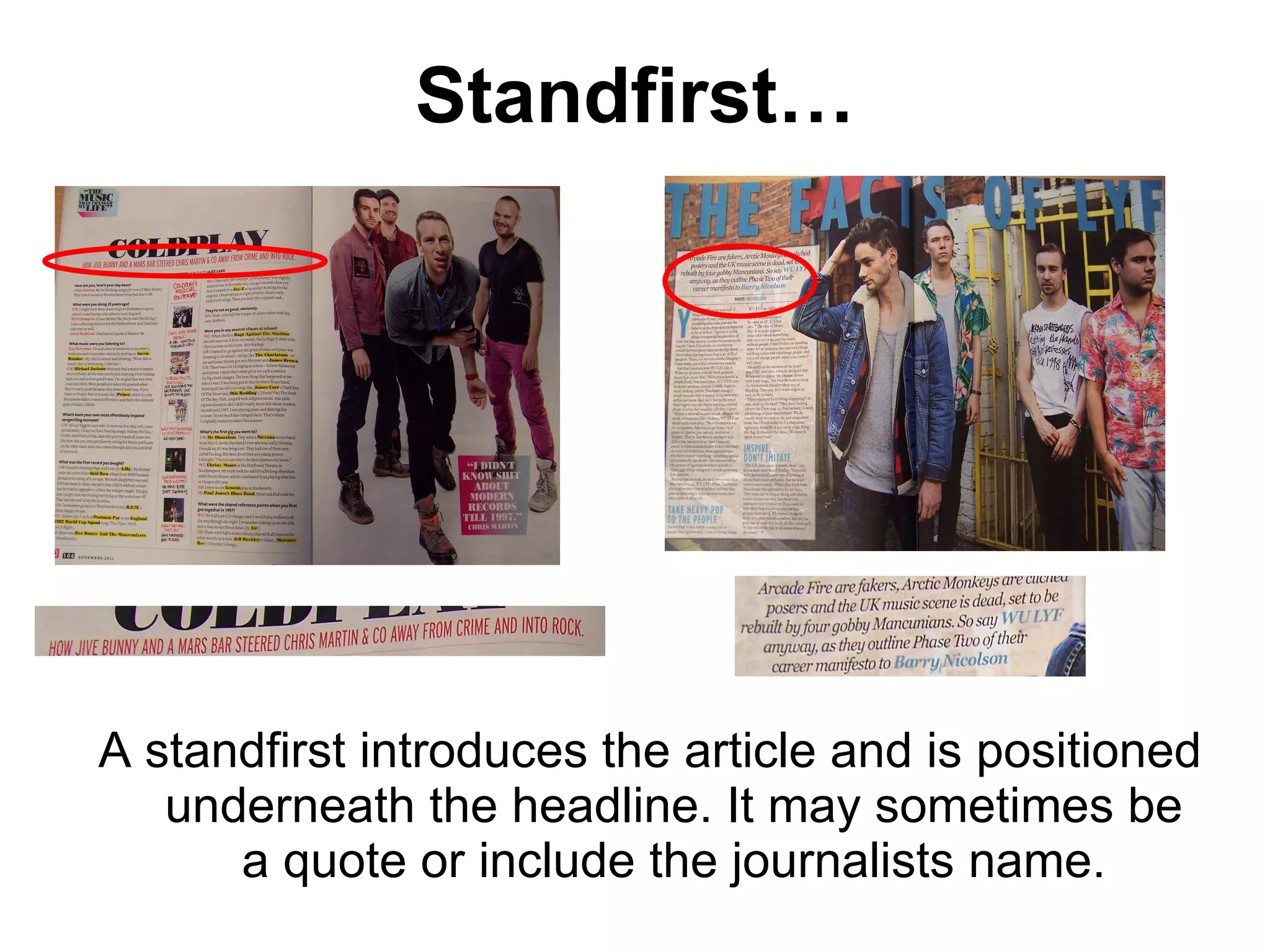
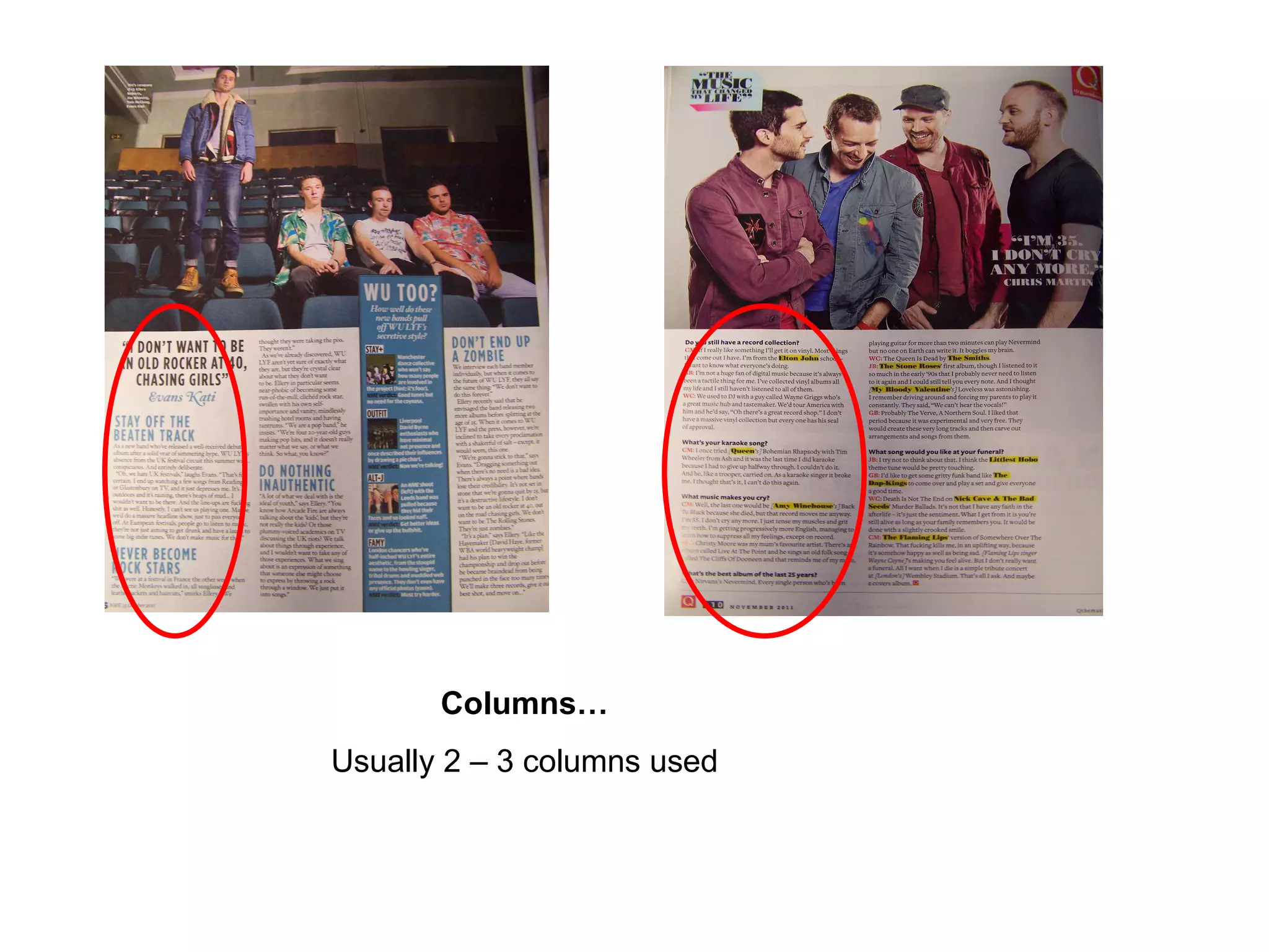
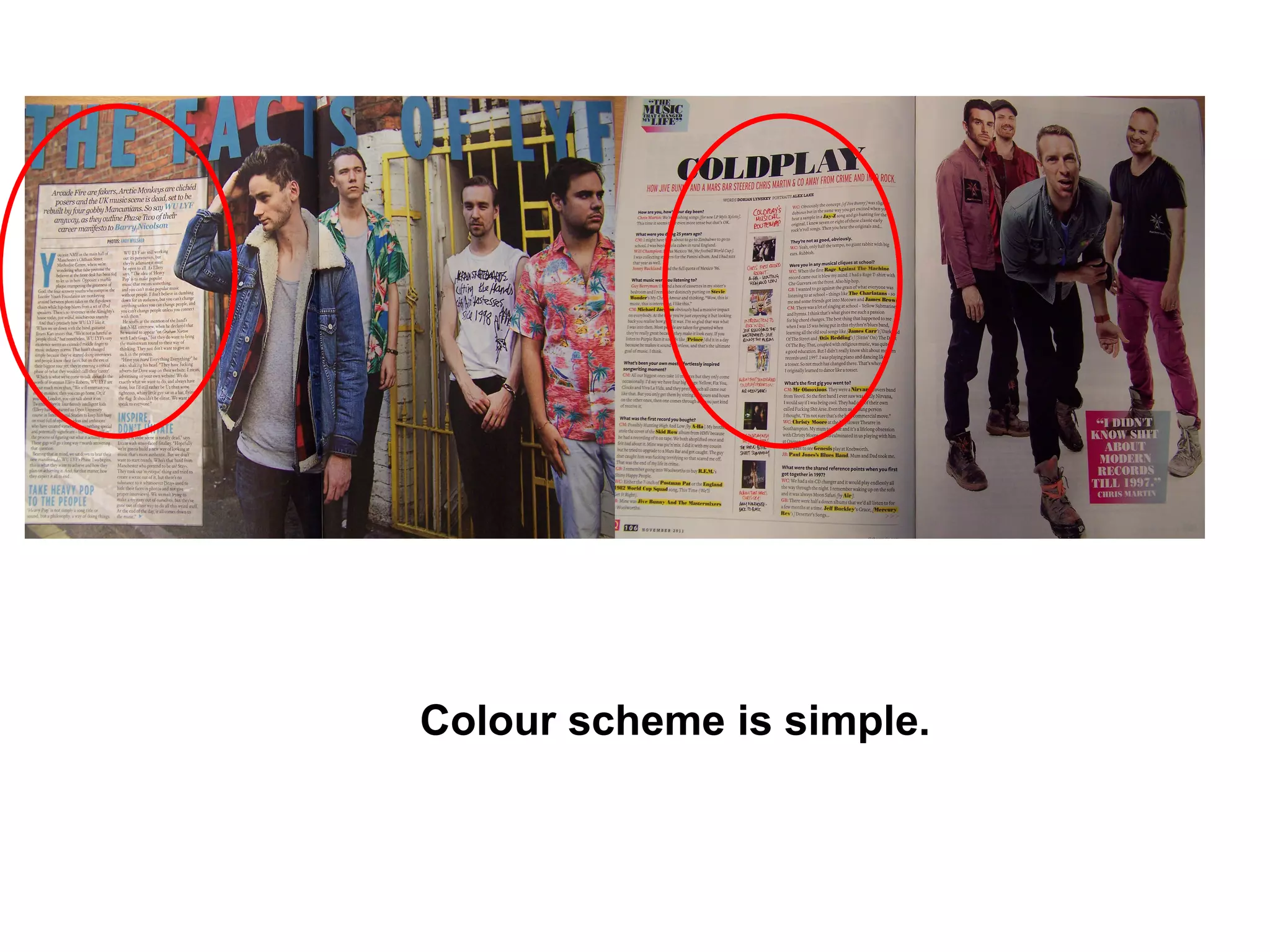
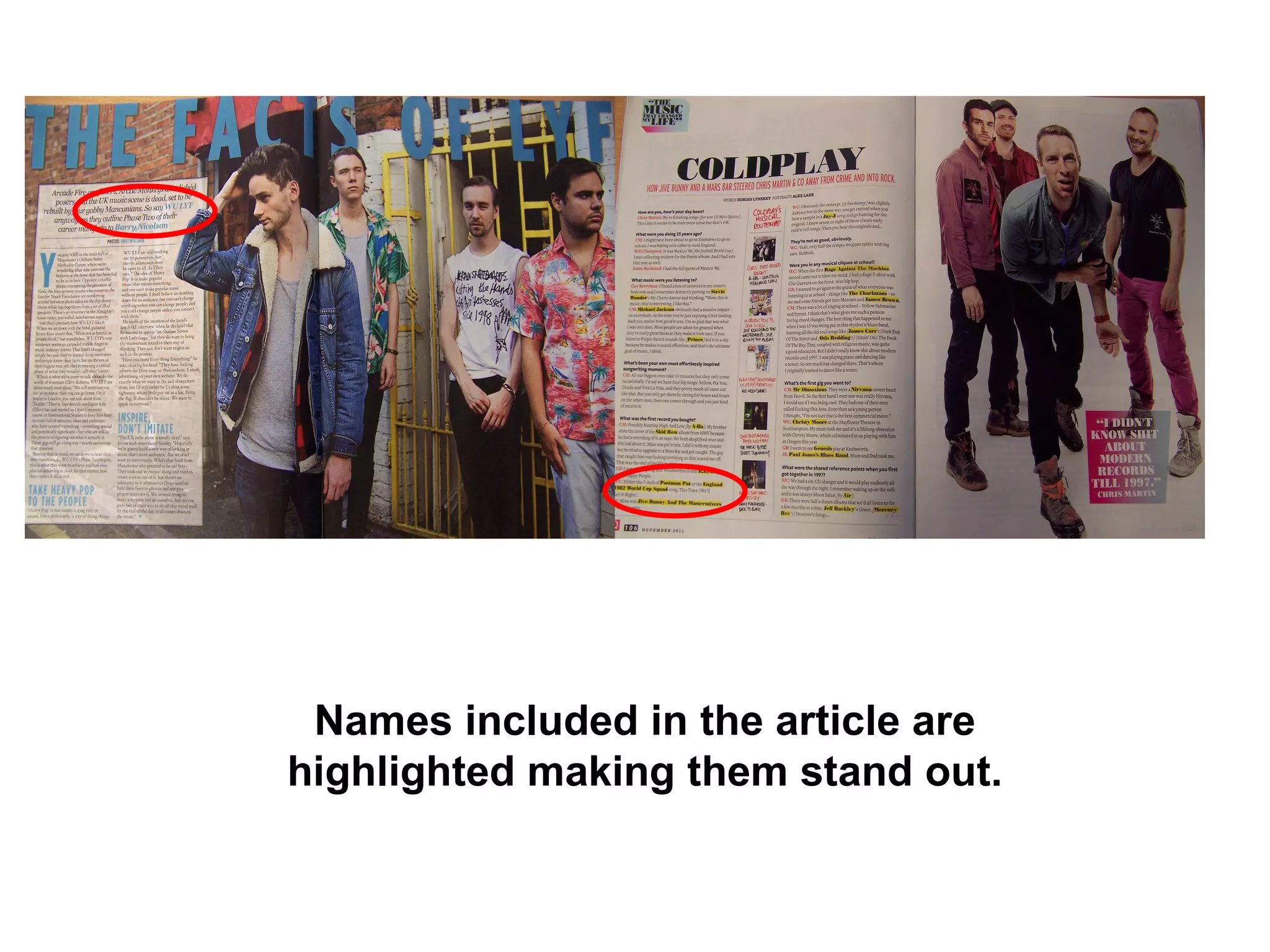
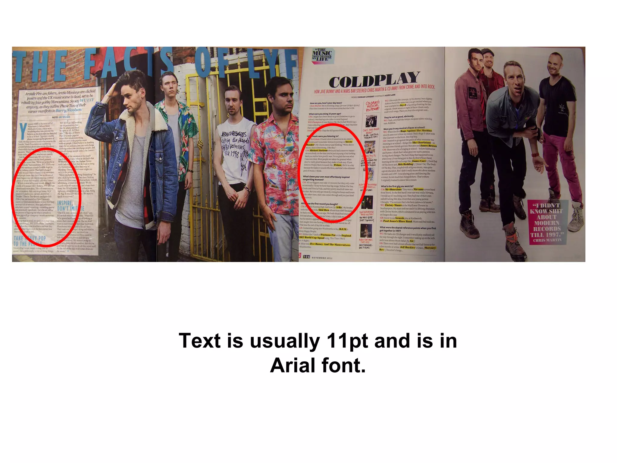
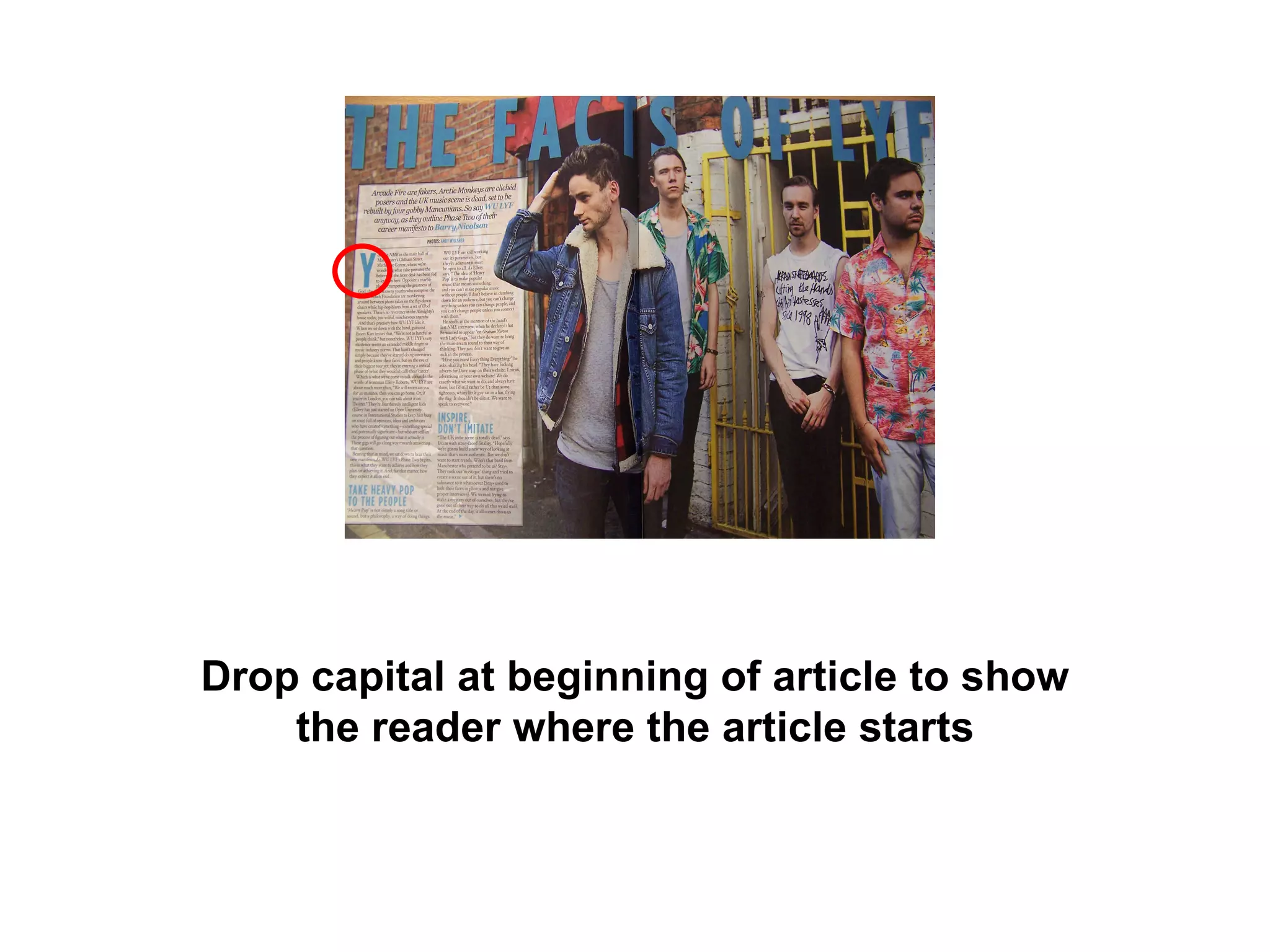
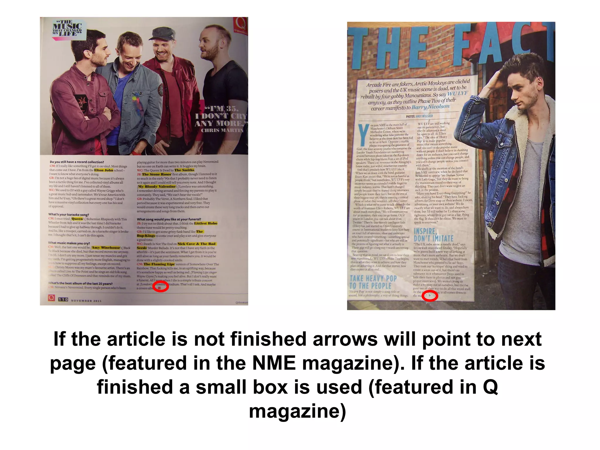
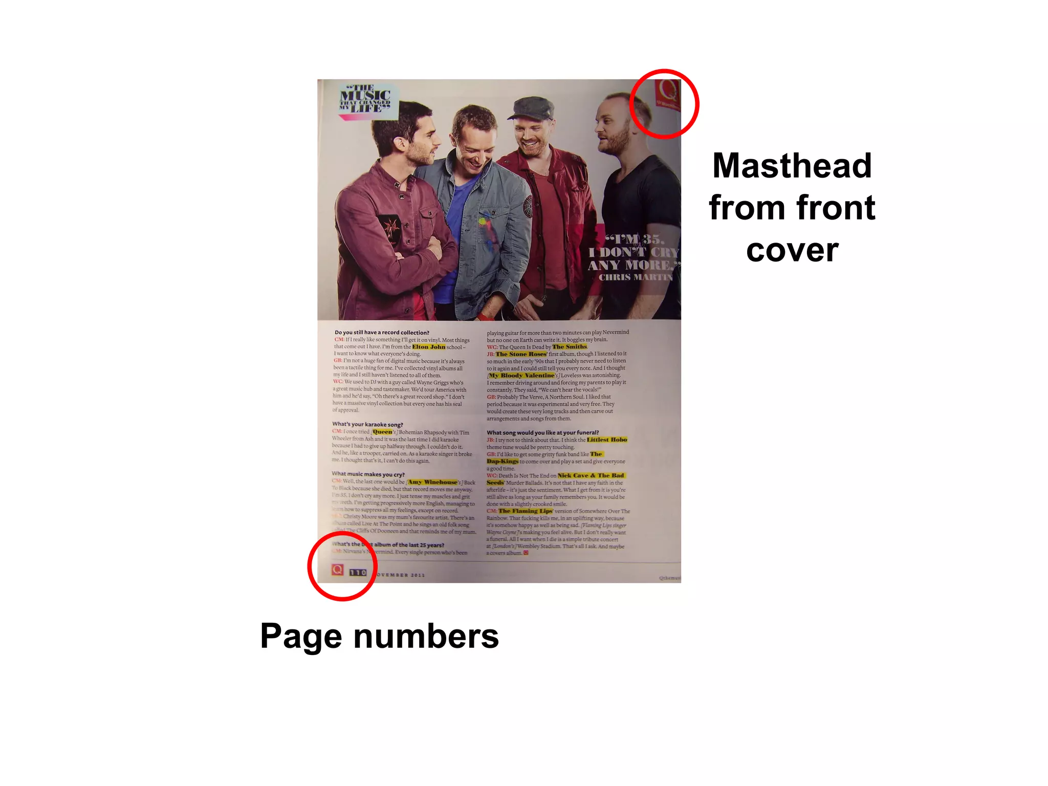
Analysis Of Professional Double Page Spreads
Q Magazine…
 
 
NME Magazine…
 
 
Large Image… One large main image, with direct address. On the NME double page spread the image bleeds across the pages and is the background of the article. Usually the image is on the left hand side to show the audience what the article will be about however on both double page spreads the image is on the right, both breaking from the codes and conventions. The image relates to the article, the genre and the stars personality. The image is aesthetically pleasing to the eye, making the reader want to look
Quotes… Quotes from the interviews are enlarged to engage the reader, these may sometimes be used as the headline of the article. Dropped quotes are dropped in on the image or text. Dropped quotes break up the text, they are usually contriversial to grip the reader. The quotes neatly fit into the article.
Headlines… The headline is usually bold and the name of the artist. However it can sometimes be a quote from the article. Usually short and in a stylistic font which has connotations of the artist featured or the genre of the magazine, to draw the audience in. Informal mode of address is used to make the reader feel comfortable
Standfirst… A standfirst introduces the article and is positioned underneath the headline. It may sometimes be a quote or include the journalists name.
Columns… Usually 2 – 3 columns used
Colour scheme is simple.
Names included in the article are highlighted making them stand out.
Text is usually 11pt and is in Arial font.
Drop capital at beginning of article to show the reader where the article starts
If the article is not finished arrows will point to next page (featured in the NME magazine). If the article is finished a small box is used (featured in Q magazine)
Page numbers Masthead from front cover

Analysis Of Professional Double Page Spreads

  • 1.
    Analysis Of ProfessionalDouble Page Spreads
  • 2.
  • 3.
  • 4.
  • 5.
  • 6.
  • 7.
  • 8.
    Large Image… Onelarge main image, with direct address. On the NME double page spread the image bleeds across the pages and is the background of the article. Usually the image is on the left hand side to show the audience what the article will be about however on both double page spreads the image is on the right, both breaking from the codes and conventions. The image relates to the article, the genre and the stars personality. The image is aesthetically pleasing to the eye, making the reader want to look
  • 9.
    Quotes… Quotes fromthe interviews are enlarged to engage the reader, these may sometimes be used as the headline of the article. Dropped quotes are dropped in on the image or text. Dropped quotes break up the text, they are usually contriversial to grip the reader. The quotes neatly fit into the article.
  • 10.
    Headlines… The headlineis usually bold and the name of the artist. However it can sometimes be a quote from the article. Usually short and in a stylistic font which has connotations of the artist featured or the genre of the magazine, to draw the audience in. Informal mode of address is used to make the reader feel comfortable
  • 11.
    Standfirst… A standfirstintroduces the article and is positioned underneath the headline. It may sometimes be a quote or include the journalists name.
  • 12.
    Columns… Usually 2– 3 columns used
  • 13.
  • 14.
    Names included inthe article are highlighted making them stand out.
  • 15.
    Text is usually11pt and is in Arial font.
  • 16.
    Drop capital atbeginning of article to show the reader where the article starts
  • 17.
    If the articleis not finished arrows will point to next page (featured in the NME magazine). If the article is finished a small box is used (featured in Q magazine)
  • 18.
    Page numbers Mastheadfrom front cover