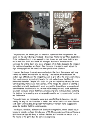
1. The poster and the album grab our attention by the odd font that presents the
name for the album being advertised – the single ‘Wake Me Up When September
Ends’ by Green Day. It is an unusual font as it does not look like a font that you
would see on a Word document, for example. It looks as if someone has
scribbled the writing down on a piece of paper, which helps to depict the image of
the rock/punk band that are Green Day therefore, it is able to easily attract the
right demographic for the music that this specific band produce.
However, the image does not necessarily depict the band themselves as it only
shows the band’s vocalist from the neck up. This means you cannot see the
certain style of the band, the image they want to give off or the impression of how
their music sounds according to how to the look as the image itself is not
particularly detailed. Despite this, it can still give an insight into the way the band
want to portray themselves. For example, in the image, the vocalist is wearing a
plain black shirt with lapels which would suggest he doesn’t have a conventional
fashion sense. In addition to this, he has black messy hair and black eye make-
up which obviously shows that the band are going for a rock/punk look, including
the fact that he is wearing what some would consider as ‘non-conformist’ as it is
not fashionable.
The poster does not necessarily show us a specific lifestyle however, you can
see by the way the band member is shown, that he is a rock/punk artist of some
sort; so by knowing this, the person viewing the poster can make suggestions
about the lifestyle that the poster depicts.
The images, however, do represent a certain demographic. In this case it would
be young people, perhaps from the age of 16-25 who enjoy partying and having a
good time and typically living a laidback lifestyle with a rebellious nature, due to
the nature of the genre that the person is depicting.
2. The font relates to rock/punk style as it looks very punky and messy as it looks
almost like it’s been hand written and scribbled down on a piece of paper.
Therefore, this messy look connotes a rock look, appealing to the young and
rebellious target audience that the band, Green Day, are targeting. On the
inside cover of the CD for the full album, the lyrics for the song are written in a
scribbled, messy, hand written font much like Pink Floyd did for their album,
The Wall.
The poster and album of this particular artist immediately grabs our attention with
the image’s focal point being of artist himself. We can clearly see by his style that
the artist, Olly Murs, is clearly a pop artist. This is inferred by the fact that he is
young male, perhaps in his early 20s, he has well-kept hair and is dressed
perfectly, as you would expect a popstar to be, in contrast to a rock star who
make look messy and untidy.
He is wear a plain white shirt, tucked into suit trousers and braces over his
shoulders, which shows that he dresses in a casually smart manner and the
image is plain and simple with him looking at the camera with his hands in his
pockets, which tells you a lot about this artist’s music. This would be that he is, as
stated before, a male popstar.
The demographic targeted, in this case would most likely consist of teenage girls
and middle-age women/mums – he can be likened to other male popstars such
as Michael Buble as they are very similar; he is also usually depicted in a suit.
The font that the poster and album cover share is very pop-like and looks very
casual, nothing to serious or over the top. It is similar to the font Green Day use
as it looks handwritten, however it looks neater and less grungy in order to fit with
the popstar look of the poster and album cover.
The images do not necessarily show much about the lifestyle of the artist as it is
just so plain and simple, there u not much to be depicted from the images other
than that he is a pop artist