
More Related Content
What's hot
What's hot (18)
Viewers also liked
Similar to Ancillary 4 - Magazine article - The Kooks
Similar to Ancillary 4 - Magazine article - The Kooks (20)
More from BHollis95
More from BHollis95 (20)
Ancillary 4 - Magazine article - The Kooks
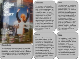
- 1. Typography Layout The layout follows the ‘Route of the The font styles that are used on eye theory’. The audience’s eyes are the front cover are conventionally drawn to the album title and the indie, they are bold and stand out band who created it and then to the on the page, especially ‘The Kooks band artwork on the right. – Junk of the Heart’. The fonts Finally, they look at when the album used are the same throughout the is out at the bottom of that page advertisement and are all san and where they can get it from. The serif fonts. The font colours are article is fairly spaced out and isn’t white which contrast with the to concentrated with lots of information on the album just the background (blue) so it stands out basic. The main part of the image is on the page. The font style which to the left of the writing so it isn’t is used is much like the kasabian blocked by the text on the right font style which is very basic and hand side. It is quite a conventional bold. The font style relates to the layout for an indie magazine article genre because of this as its as it is fairly basic, much like the conventional album covers too. Colours Image The colours that are used are The image which is used is taken quite pale for example the pale at a mid shot of the girl (waist blue sky and the pale orangey red up). Different shot types on indie around the girl. The colours used artwork aren't really aren't too bright and vibrant as conventional but long shots Mise-en-Scene the article could be mistaken for a aren't really used much. The pop genre album. The colours that composition of the shot is so that The colours of the girls costume, white and black, are are used in the artwork sort of conventional indie colours. Her hair that is long and the girl is positioned to the right symbolize what the image is of the image so that the writing swept across her face is also very indie-like. The setting trying to say. The girl with her which is used (with the hills in the background) is very and information can be placed hands in the air is sort of symbolic over the backdrop of the image. symbolic of the freedom theme they are trying to to freedom and the pale blue sky create. emphasises that.