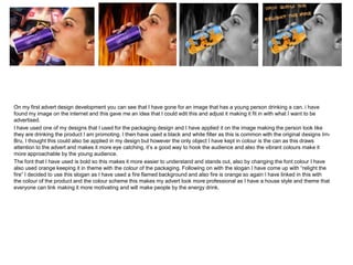
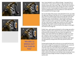
The document describes two advertising designs for an energy drink. The first design features an edited image of a young person drinking from a can of the product with the brand's packaging design applied. Orange and black colors are used to mimic the original brand's style. The second design features an image of a roaring tiger with the can in its jaws, representing the energy and power provided by the drink. Orange is again used throughout to match the brand's colors. Both designs aim to motivate and persuade young people to purchase the product by relating its energizing effects to the powerful images used.


![Task 6 lo4%20pro%20forma[1]](https://cdn.slidesharecdn.com/ss_thumbnails/task6lo420pro20forma1-140225083640-phpapp02-thumbnail.jpg?width=640&height=640&fit=bounds)


