Adapting Content for Mobile Devices - tcworld 2017, Scott DeLoach, ClickStart
•
0 likes•134 views

The best practice for responsive design is to design the mobile version first and progressively enhance the content for tablet and desktop screens. In reality, we usually have thousands of pages of documentation that has already been designed for desktop or even print display. So, we can't follow a "mobile first" approach. In this workshop, I present best practices and real-world examples for redesigning tables, images, lists, and other types on content for mobile display. I also share best practices for rewriting content for mobile devices. http://www.clickstart.net

Recommended
More Related Content
What's hot
Similar to Adapting Content for Mobile Devices - tcworld 2017, Scott DeLoach, ClickStart
Similar to Adapting Content for Mobile Devices - tcworld 2017, Scott DeLoach, ClickStart (20)
More from Scott DeLoach
More from Scott DeLoach (20)
Recently uploaded
Recently uploaded (16)
Adapting Content for Mobile Devices - tcworld 2017, Scott DeLoach, ClickStart
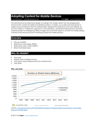
- 1. © 2017 ClickStart – www.clickstart.net Adapting Content for Mobile Devices Scott DeLoach – scott@clickstart.net ClickStart – www.clickstart.net The best practice for responsive design is to design the mobile version first and progressively enhance the content for tablet and desktop screens. In reality, we usually have thousands of pages of documentation that has already been designed for desktop or even print display. So, we can't follow a "mobile first" approach. In this workshop, I will present best practices and real- world examples for redesigning tables, images, lists, and other types on content for mobile display. I will also share best practices for rewriting content for mobile devices. Overview ▪ Why go mobile? ▪ Responsive web design (RWD) ▪ Responsive web content (RWC) ▪ Reocmmended books Why Go Mobile? ▪ User base ▪ Mobile share of digital minutes ▪ Time spent using mobile phones for entertainment ▪ User goals Why: user base source: www.techcrunch.com/2014/08/21/majority-of-digital-media-consumption-now-takes- place-in-mobile-apps
- 2. © 2017 ClickStart – www.clickstart.net Why: mobile share of digital minutes source: www.smartinsights.com/mobile-marketing/mobile-marketing-analytics/mobile-marketing- statistics/attachment/mobile-share-of-online-time-percent-2017 Why: time spent using mobile phones for entertainment 125,000,000 hours - Approximate time Americans spend watching Netflix on their phones per month source: www.comscore.com/Insights/Presentations-and-Whitepapers/2017/State-of-OTT Why: user goals source: www.slideshare.net/smobile/the-new-multiscreen-world-by-google-14128722
- 3. © 2017 ClickStart – www.clickstart.net Responsive web design (RWD) Everything needs to respond to the screen size ▪ Proportion: margins and text size ▪ Tables ▪ Images ▪ Navigation Best practice for going mobile Use media queries for phones, tablets, desktops, and print RWD – margins and text size ▪ rems ▪ line-height ▪ www.simplefocus.com/flowtype RWD – tables Non-scrolling columns zurb.com/playground/projects/responsive-tables/index.html Filter rows codepen.io/pixelchar/full/rfuqK Show/hide jsbin.com/apane6/14 Separate tables css-tricks.com/examples/ResponsiveTables/responsive.php www.filamentgroup.com/examples/rwd-table-patterns gergeo.se/RWD-Table-Patterns/#demo Table to paragraphs codepen.io/aarongustafson/full/ucJGv Horizontal to vertical codepen.io/JasonAGross/full/rjmyx RWD – images Fluid Images demosthenes.info/blog/586/CSS-Fluid-Image-Techniques-for-Responsive-Site-Design Image Maps mattstow.com/experiment/responsive-image-maps/rwd-image-maps.html
- 4. © 2017 ClickStart – www.clickstart.net Future <picture> <srcset> RWD – navigation Breadcrumbs codepen.io/bradfrost/full/dKulf codepen.io/bradfrost/full/DCgax Footnotes codepen.io/johndjameson/full/owstE Grouped rutgerkooijman.nl/navigation/html Overlay tympanus.net/Development/FullscreenOverlayStyles Sticky ethercycle.com/stickymenu Responsive web content (RWC) ▪ Mobile first vs going mobile ▪ Writing style Going mobile ▪ Media queries ▪ Style classes Media queries phone @media (max-width: 767px) { ... } tablet @media (min-width: 768px) and (max-width: 1279px) { ... } desktop @media (min-width: 1280px) { ... }
- 5. © 2017 ClickStart – www.clickstart.net RWC Code /* phone */ @media (max-width: 767px) { body .phone { display: block; } body span.phone { display: inline; } body img.phone { display: inline; } body li.phone { display: list-item; height: auto; visibility: visible; } body table.phone { position: relative; visibility: visible; height: auto; width: auto; } body tr.phone { display: table-row; } } /* tablet */ @media (min-width: 768px) and (max-width: 1279px) { body .tablet { display: block; } body span.tablet { display: inline; } body img.tablet { display: inline; } body li.tablet { display: list-item; height: auto; visibility: visible; } body table.tablet { position: relative; visibility: visible; height: auto; width: auto; } body tr.tablet { display: table-row; } } /* desktop */ @media (min-width: 1280px) { body .desktop { display: block; } body span.desktop { display: inline; } body img.desktop { display: inline; } body li.desktop { display: list-item; height: auto; visibility: visible; } body table.desktop { position: relative; visibility: visible; height: auto; width: auto; } body tr.desktop { display: table-row; } } .phone, .tablet, .desktop { display: none; } table.desktop, table.tablet, table.phone { display: table; position: absolute; visibility: hidden; height: 0; width: 0; } li.phone, li.tablet, li.desktop { display: block; height: 0; visibility: hidden; } For the latest version of the code, see www.clickstart.net. Writing style - example 1. Insert>Image 2. Select General 3. Click 4. Select the image and click Open 5. Click OK
- 6. © 2017 ClickStart – www.clickstart.net Recommended books Developing User Assistance for Mobile Apps - Joe Welinske Implementing Responsive Design - Tim Kadlec Letting Go of the Words - Ginny Redish Mobile First - Luke Wroblewski Responsive Web Design - Ethan Marcotte About the presenter Scott DeLoach is the Founder of ClickStart, where he provides training and consulting for MadCap Flare, embedded user assistance, JavaScript/jQuery, CSS, and HTML5. He has been developing browser-based help systems for 20+ years, and he has received four Best in Show awards for his work from STC. Scott is a certified Flare and Doc-to-Help instructor, and he is the author of MadCap Flare 2017: The Book, CSS to the Point, HTML5 to the Point, and Word 2013 to the Point. For more information about Scott's books see www.lulu.com/clickstart. You can reach Scott at www.clickstart.net or by email at scott@clickstart.net.