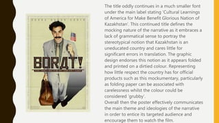
The poster for Borat emphasizes the title character through striking layout and use of props/makeup to mock Kazakh culture. The continued title is grammatically incorrect, representing Kazakhstan as uneducated.
The Life of Brian poster encourages audience interaction and emphasizes the title ironically, suggesting Brian's insignificance. It reflects the film's setting through consistent animation style.
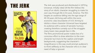
The Jerk poster draws less attention to the main character, suggesting his insignificance, while using mise-en-scene to portray him as a fool. The caption mocks the character, provoking questioning thoughts in the audience.
Instructions for Submissions thorugh G- Classroom.pptx
Poster analysis
1. POSTER
ANALYSIS
W I T H P O S T E R S F R O M B O R A T , L I F E O F B R I A N A N D
T H E J E R K
2. BORAT
Borat is a satirical comedy that is rated 18 by its
regulating institution. It targets a mature audience
falling roughly into the age range of 30-40 years old.
It targets the socio economic group A-B in its
comedic references as it mocks the diplomatic
relations and contrasts between America and smaller
Eastern states such as Kazakhstan.
The film’s promotional poster has a striking layout
that attracts its audience’s attention to the main
character in the centre. By doing this the mocking
aspects of Mise En Scene such as make-up and
props are emphasized to reflect the ways in which
the narrative will mock Kazakhstan’s morals and
culture. The layout also emphasizes the title which
carries weight in terms of meaning and
representation within the narrative. The title has
taken the form of a traditional Kazakhstani name to
emphasize again the mocking nature the
Kazakhstani culture will be represented by. In making
the title stand out Fox have ensured that their
targeted audience recognise the use of tradition and
culture and compare it to their own. Maybe even
encouraging the mocking of the character and his
name before being exposed to any sort of
developed character profiling.
3. The title oddly continues in a much smaller font
under the main label stating ‘Cultural Learnings
of America for Make Benefit Glorious Nation of
Kazakhstan’. This continued title defines the
mocking nature of the narrative as it embraces a
lack of grammatical sense to portray the
stereotypical notion that Kazakhstan is an
uneducated country and cares little for
significant errors in translation. The graphic
design endorses this notion as it appears folded
and printed on a dirtied colour. Representing
how little respect the country has for official
products such as this mockumentary, particularly
as folding paper can be associated with
carelessness whilst the colour could be
considered ‘grubby’.
Overall then the poster effectively communicates
the main theme and ideologies of the narrative
in order to entice its targeted audience and
encourage them to watch the film.
4. LIFE OF BRIAN The life of Brian is a satirical comedy that targets an
older audience who are un-associated with religion in
any form. Their targeted audience fall into a more
mature age range of 30-40 years old who are targeted
through the use and context of the comedy. Whilst
Python Pictures have targeted a socio economic group
of A-B as these are the classes most likely to have a
deeper understanding of the contextual debates
surrounding religion and its use of symbolism.
Python Pictures encourage audience interaction in
their use of layout. Having a tab in the bottom right
corner that reads ‘Honk if you love Brian.’ Encourages
audiences to get involved with the films narrative and
therefore encourages them to want to see the film.
Again the title is made to stand out in an overly
dramatic manner to emphasize the mocking of the
main character and his lifestyle. Suggesting ironically
in its significance how insignificant the character would
be in contrast to the rest of the world.
5. Python Pictures have also ensured their reputation
as a producer and distributor of films is recognised.
The producing credits are displayed in an attractive
font that convinces audiences of the films quality
and loyalty to the rest of its series.
The style of animation also represents the style of
cinematography in which the film is shot. By
keeping a consistent style Python Pictures have
reflected the setting of their narrative and
represented the nature of life during the Roman
Era in a mocking way. The chaotic environment of
the image would suggest a lack of sense amongst
the characters represented and therefore a lack of
significance also. Finally then this poster effectively
appeals to its targeted audience as it engages
involvement and interest so that the audience are
encouraged to see the film.
6. THE JERK The Jerk was produced and distributed in 1979 by
Universal, initially rated 18 the film follows the
story of an idiotic character struggling to make his
own way through life in St Louis, America. The film
targets an audience falling into the age range of
40-50 years old living well within the socio
economic class boundaries of A-B. Aiming to
idolize a clown character Universal have targeted
its audience with a sense of sarcastic humour,
creating therefore comedy out of the struggles
many lower class people face in life.
The films promotional poster makes less of a
conscious effort to draw attention to the main
character but more to the caption and bright
backgrounds, suggesting the character’s
insignificance in this way could prompt audience’s
to think selflessly as the character who is in clear
need of help is ignored.
7. Mise En Scene is used efficiently to represent the
character as a fool and nothing more. With his
trousers by his ankles and useless props the man
is made to look helpless however not to demand
the audiences sympathies, more in fact to
provoke a sense of mocking from its audience.
The caption reads ‘He was a poor black
sharecropper’s son who never dreamed he was
adopted’. The use of sarcasm within the caption
represents a sense of ridicule as the poster
portrays the complete opposite character to what
is being described. The audience therefore are
bound to recognise a sense of stupidity or idiocy
when reading the caption that could truly be
considered to mock the narrative alone.
Questioning thoughts are therefore provoked
amongst an audience who may feel much more
intrigued to see the film after consuming this
form of promotion.