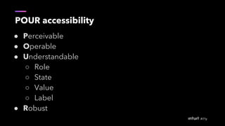
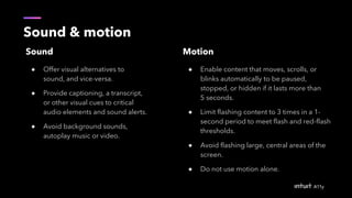
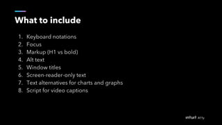
2. Meet the team
Ace Vu
QuickBooks Design System
Intuit Accessibility Design Lead
Yvonne So
Platform Ecosystem
Accessibility Advocate
3. Form groups of 4
Sit with people you don’t know (make new friends :D). Try to include
a content, visual, and interaction designer. You’ll work as a team and
will rely everyone’s expertise.
Mingle!
4. Disclaimer
All materials in this presentation are for educational purposes. A few
may be taken from:
● W3.org
● Accessibility.digital.gov
● Microsoft.com/design/inclusive
● Intopia.digital
● Apple.com/accessibility
● Google.com/accessibility
7. Your shoelace is untied (4 mins)
Write down all the steps to tie a single shoe.
8. Roleplay (4 mins)
1 person reads the instructions out loud.
1 person follows the instructions using 1 hand.
1 person closes their eyes and does it with 2 hands.
1 person observes.
14. Disability, n.
“...is a complex phenomenon, reflecting an
interaction between feature of a person’s
body and features of the society in which he
or she lives.”
- ADA: “Mental, physical, emotional impairment that can substantially limit one or
more major life activity.” In the context of ADA, “disability” is a legal term rather than
a medical one.
16. Invisible disabilities
“Physical, mental, or neurological condition that
limits a person’s movements, senses, or activities
invisible to the onlooker.”
Examples
● Sensitivities to motion or light
● Color blindness
● Chronic pain
● Brain injuries
● Temporary situations (tinnitus, pregnancy, migraines)
17. So, what’s accessibility, anyway?
Accessibility, n.
“...the degree to which a product, service, or environment is
available to as many people as possible.”
20. “Solve for one, extend to many”
Microsoft Inclusive Design Kit
21. Benefits for all
A solution that works for a
blind person could also
benefit car drivers
22. Persona spectrum
“As designers, it’s our responsibility
to understand the power of the
interactions we design for people.
We design to embrace the things
that make us human. It’s what
drives us to create a world that
makes lives better. The result is
technology that’s inclusive.”
26. What makes a product accessible?
The basic 3 areas
● Visual (vision)
● Interaction and content (vision, hearing, motor, cognition)
● Implementation (vision, hearing, motor, cognition, etc.)
29. Text contrast
What is small text and large text?
Large text = 18 point text (regular) or 14
point text bold
However:
“The ratio between sizes in points and CSS pixels
is 1pt = 1.333px, therefore 14pt and 18pt are
equivalent to approximately 18.5px and 24px”
Abc
Abc Abc
Abc
Abc Abc
33. Content
Visible text
(Includes Titles, paragraphs, labels
for UI elements, text on buttons,
links, and forms)
Non-visible text
(Includes alternative text for images,
buttons with icons, and captions)
Both visible and nonvisible text should be descriptive and meaningful
because some users navigate with headings or links.
34. Sound & motion
Sound
● Offer visual alternatives to
sound, and vice-versa.
● Provide captioning, a transcript,
or other visual cues to critical
audio elements and sound alerts.
● Avoid background sounds,
autoplay music or video.
Motion
● Enable content that moves, scrolls, or
blinks automatically to be paused,
stopped, or hidden if it lasts more than
5 seconds.
● Limit flashing content to 3 times in a 1-
second period to meet flash and red-flash
thresholds.
● Avoid flashing large, central areas of the
screen.
● Do not use motion alone.
36. Group discovery (5 mins)
1. Using the printed design handout, find as many problems as
possible.
2. Mark them down.
Need help? Visit https://accessibility.digital.gov
42. What to include
1. Keyboard notations
2. Focus
3. Markup (H1 vs bold)
4. Alt text
5. Window titles
6. Screen-reader-only text
7. Text alternatives for charts and graphs
8. Script for video captions
45. Let’s practice
1. Use the same Sketch file
2. Create your own write up along with the
design you just fixed to include important
information for your engineers.
47. Things to remember for testing
1. Keyboard accessibility
2. Hidden text (descriptive labels for form fields, alternative
text for images, buttons with icons, and captions)
3. Zoom (200%, 400%)
4. High contrast and dark mode
5. Screen reader
49. Thank you. Let’s chat more
Ace Vu
linkedin.com/in/acevu
ace_vu@intuit.com
Yvonne So
linkedin.com/in/yvonneyso
yvonne_so@intuit.com
Slideshare: http://bit.ly/intuita11y
50. Resources
- Our favorite guidelines on https://accessibility.digital.gov
- Check color contrast with http://www.getstark.co
- Sketch contrast plugin
https://github.com/romannurik/Sketch-Contrast
- Volunteer on your own time through your mobile phone
with Be My Eyes app
- Wave chrome plugin to inspect the site build
- Get more design tools, cheat sheet and resources at
QuickBooks Design System
Editor's Notes
9:10
Title, welcome
Introduce the current team and guests
Set expectation right, we are here to learn together. There are so much to learn in accessibility. Our goal is that you will learn as much of the basic knowledge and share it will your team. After today, you will be able to identify accessibility issues, fix design accessibility issues, reports, and communicate your design to engineers. All the materials we mentioned today will be shared out. Please also feel free to take your own notes.
Group of 4 each row, please make sure each of your group have a diverse role, contents, visual, and interaction. If you have too many of the same, please switch some out. We will work as a team in this workshop because in reality we will need each other support to advocate and make the right things happen.
This is stripped down version of our full 3 hours training. We have taken out some exercise for time saving purposes. However, we still want to show a full format framework so you can take this back to your team.
Agenda
Join the slack channel, download stark sketch plugin. The best way to learn something is to learn a little each day and practice as we go
Ted drake will do a quick recap intro i
1 out of 7 equals 1.3 billion people
Roughly 10,000 Baby Boomers will turn 65 today, and about 10,000 more will cross that threshold every day for the next 19 years. (2010 Pew Research)
http://www.pewresearch.org/fact-tank/2010/12/29/baby-boomers-retire/
According to WHO
For example, You are in a noisy bar and your friend has gone to the bartender to get you a drink. You change your mind, but want a water instead. Your friend cannot hear you, your conversation is blocked. This wouldn’t be a problem if your communication method wasn’t dependent on sound, such as American Sign Language.
When we think about “as many people as possible,” let’s take a look at just how many MORE people we could reach…
AODA’s goal was to make Ontario accessible by 2025 with a staged rollout of requirements. Intuit has been compliant with these requirements, but we will need to consider the 2021 requirement for accessible color contrast in our products. This act is more than design, it is the full spectrum of customer support, from building design to event management.
We are gonna get old, and our situation can change in the future. As Yvonne So, an active accessibility avocator said we are actually designing for our future self. For example, if our design is usable for a person that has one arm, also work with an arm injured veteran, or a new parent, or a lyft driver.
A video caption work well for people with hearing disabilities, or reading airport caption in a noisy terminal, or teaching a child to read through a cartoon show.
We use the Persona Spectrum to understand related mismatches and motivations across a spectrum of permanent, temporary, and situational scenarios. It’s a quick tool to help foster empathy and to show how a solution scales to a broader audience.Similarly, high-contrast screen settings were initially made to benefit people with vision impairments. But today, many people benefit from high-contrast settings when they use a device in bright sunlight. The same is true for remote controls, automatic door openers, audiobooks, email, and much more. Designing with constraints in mind is simply designing well.
Sagar, what to inspect, report
Turbo tax product comparison page:
https://turbotax.intuit.com/personal-taxes/online/
Video link:
https://drive.google.com/file/d/1y_R7XNVzX8cyZ4JRwTcrOatcHPWiuvs_/view?usp=sharing
Talk about the hand out sheet, today we mostly focus on the first 2 parts, Visual, Interaction and Contents
Essentially, we want everything on the page to be discoverable and understandable. If it’s interactive, it should be focusable and actionable without a mouse.
https://theblog.adobe.com/design-with-accessibility-in-mind-the-pour-methodology/
http://webaim.org/articles/pour/
A line height less than 1.5x of the font size is acceptable when there is a way to increase the line height by the user.
https://www.w3.org/WAI/WCAG21/quickref/?versions=2.0#contrast-minimum
https://www.w3.org/WAI/WCAG21/quickref/#non-text-contrast
How to use stark
https://www.w3.org/WAI/WCAG21/quickref/?versions=2.0#contrast-minimum
https://www.w3.org/WAI/WCAG21/quickref/#non-text-contrast
How to use stark
Google: Touch targets
Touch targets are the parts of the screen that respond to user input. They extend beyond the visual bounds of an element. For example, an icon may appear to be 24 x 24 dp, but the padding surrounding it comprises the full 48 x 48 dp touch target.
Touch targets should be at least 48 x 48 dp. A touch target of this size results in a physical size of about 9mm, regardless of screen size. The recommended target size for touchscreen elements is 7-10mm. It may be appropriate to use larger touch targets to accommodate a larger spectrum of users.
Pointer targets
Pointer targets are similar to touch targets, but apply to the use of motion-tracking pointer devices such as a mouse or a stylus. Pointer targets should be at least 44 x 44 dp.
Microsoft: Pointer shape
https://docs.microsoft.com/en-us/windows/desktop/uxguide/inter-mouse
Visible and nonvisible text
Accessibility text includes both visible text (including labels for UI elements, text on buttons, links, and forms) and nonvisible descriptions that don’t appear on screen (such as alternative text for buttons with icons). Sometimes, an on-screen label may be overridden with accessibility text to provide more information to the user.
Both visible and nonvisible text should be descriptive and meaningful, as some users navigate by using all headings or links on a screen. Test your app with a screen reader to identify areas that are missing or need better accessibility text.
https://material.io/design/usability/accessibility.html#writing
Visible and nonvisible text
Accessibility text includes both visible text (including labels for UI elements, text on buttons, links, and forms) and nonvisible descriptions that don’t appear on screen (such as alternative text for buttons with icons). Sometimes, an on-screen label may be overridden with accessibility text to provide more information to the user.
Both visible and nonvisible text should be descriptive and meaningful, as some users navigate by using all headings or links on a screen. Test your app with a screen reader to identify areas that are missing or need better accessibility text.
Join the slack channel, download stark sketch plugin. The best way to learn something is to learn a little each day and practice as we go
Send a sketch file to slack.
Install stark, sketch plugin
Ask each group to spot the visual flaws. Base on the guideline, how many different types of issues can each group find
Note for ace: open ended, there’s no wrong answer, we just want to
Each group quickly share 1 highlight
Join the slack channel, download stark sketch plugin. The best way to learn something is to learn a little each day and practice as we go
Color swatches should attached to sketch file
[11:30am] Join the slack channel, download stark sketch plugin. The best way to learn something is to learn a little each day and practice as we go
My tax history, turbo tax home, pro portal, Turbo (credit history), Mobile
[11:40] Sagar shows tools what to inspect, chrome lense and light house
Use the TAB, ENTER, SPACE, and UP and DOWN ARROW keys to navigate.
TAB through the page to see if the order is logical.
[11:45] encourage : https://jira.intuit.com/secure/Dashboard.jspa?selectPageId=37352
Commitment
Meet up once a quarter, lunch and learn. A Quick share out
Hero team,
Regular bug bash