Download as PDF, PPTX


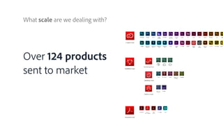


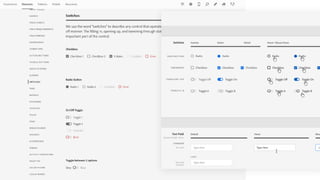


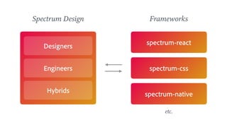


The document discusses the evolution and importance of design systems in scaling design practices across organizations, emphasizing that a design system functions as an organizational tool that minimizes duplication of efforts. It highlights benefits such as stronger brand identity and improved user experiences while outlining challenges and strategies for collaboration among designers and engineers. Additionally, it details the design system implementation at Adobe, including the operational aspects, measurement of success, and the necessity for inclusive and accessible documentation.


![[Kapič] Why You Should (Not) Probably Care about Machine Learning](https://cdn.slidesharecdn.com/ss_thumbnails/cyuwq2woqxsw7ntf2bie-signature-d4523b3bf020616e67040d2a940ba8bf9aeab187b20da49956548f98de22ea12-poli-180606121949-thumbnail.jpg?width=640&height=640&fit=bounds)


