Collateral Redesign
•
0 likes•263 views
Clockwork Marketing Services updated their branding materials to appeal to a younger demographic in Jacksonville. They commissioned a new logo that more clearly communicated that their stylized image represented a clock. The new logo was set against bright white paper with a deep green color. For the business cards, the logo was rotated 35 degrees so the text could flow from the new angles created. This dynamic design matched the company's innovative approach more effectively.
Report
Share
Report
Share

Recommended
Why does a logo matter in a business?
Logos play a vital role in influencing our decisions, communicating and representing company's values. Get your logo designed and promote your business .
How to create a strong brand profile digitoly
The document discusses the importance of branding and creating a strong brand profile. It states that branding is as important as other business functions like marketing, sales, and operations. It explains that an unattended brand will lose its power over time. The document then lists several elements that are important to include in creating a strong brand profile, such as having a clear logo, impactful tagline, strong web presence, and consistent marketing collateral. It emphasizes maintaining brand consistency and updating the brand periodically to stay aligned with the company's mission.
RFP Logo Rebranding Proposal Report
The document discusses a proposal from JABIT Digital Designs & Ideas to rebrand the logo for HopeStreet. It outlines the benefits of rebranding, provides examples of successful rebrands, and proposes a timeline and process for HopeStreet's logo rebrand that includes gathering requirements, providing initial concepts, incorporating client feedback through revisions, and delivering the final files.
Meraki Marketing Services
Meraki means doing something with total love, and pure soul. It is leaving a little piece of yourself in your creative work.
We endeavour to put in our passion and soul into all our work - leaving behind a part of ourselves in every project we undertake.
Meraki was born out of a passionate space to bring creative concepts and ideas to different industries. We bring together 2 decades of strategy and marketing experience to the emerging markets.
Funk & Co
We believe everyone deserves to look amazing. Let us handle the heavy lifting of your marketing efforts so that you can do your job.
Logo Making Tips
Simplicity, recognition, and purpose are key principles for an effective logo. Simple logos that are unique and meaningful are easier for people to remember and identify the brand. Logos like Coca Cola and Nike are easily recognized worldwide because their designs are simple yet distinctive. An effective logo clearly communicates a company's core message and allows customers to identify with the brand through graphical elements and color. Choosing colors for the logo should correlate to the company's profile. A logo plays an important role in marketing, advertising, and building a company's brand image.
Legacy Insurance
The document discusses the conceptualization and design of a new logo for Legacy Insurance Group. It describes incorporating the company name inside a solid box to represent security and protection, and selecting a bold Optima font that balances well with the box. Color tests led to recommending a golden box with the name in black text, representing protection and security as important values for an insurance company. The logo and brand identity elements were designed to maintain consistency across digital and print materials.
Creative Graphic Logo Design
Creative and eye-catching logo and graphic designs are helpful in communicating with clients. Imagine, believe and achieve are three golden words that give favorable results.
New Regulations In Cs Profession(2)
The document summarizes new regulations affecting the company secretaries profession, including the Limited Liability Partnership Act, 2008 and SEBI (Issue of Capital and Disclosure Requirements) Regulations, 2009. It also discusses forthcoming regulations like the Goods and Services Tax and Direct Tax Code. The LLP Act provides a new business structure combining limited liability and partnership taxation. Key points of the ICDR Regulations and its replacement of older guidelines are noted. An overview of the proposed GST framework and goals of the upcoming Direct Tax Code is also provided.
Secretarial Standards
This document discusses secretarial standards and their importance in promoting good corporate governance practices in India. It provides an overview of the secretarial standards board and the standards it has developed regarding board meetings, shareholder meetings, dividends, share transfers, and other company secretarial functions. Complying with these standards helps improve transparency, compliance and investor confidence while also increasing recognition for company secretaries. Many large Indian companies have begun voluntarily adopting and reporting compliance with the secretarial standards.
Secretarial Standards
The document discusses secretarial standards in India and their importance for corporate governance. Secretarial Standards were introduced by the Institute of Company Secretaries of India to standardize and harmonize diverse secretarial practices and improve compliance. Adopting these standards leads to more transparency, higher investor confidence, and increased recognition for complying companies. The standards cover areas like board meetings, shareholder meetings, maintaining registers and records, and other secretarial functions.
New Regulations In Cs Profession
The document summarizes new regulations affecting the company secretaries profession, including the Limited Liability Partnership Act, 2008 and SEBI (Issue of Capital and Disclosure Requirements) Regulations, 2009. It also discusses forthcoming regulations like the Goods and Services Tax and Direct Tax Code. The LLP Act provides a new business structure combining limited liability and partnership taxation. Key points of the ICDR Regulations and changes made are noted. Details on GST thresholds and its proposed implementation by 2010 are provided. The Direct Tax Code aims to replace and simplify income tax laws.
Blue Sky Studio - Ice Age_
Blue Sky Studio is an animation studio known for high quality CGI animated films that combine photorealistic animation with comedy genres. Some of its most famous films are the Ice Age series and Robots. The Ice Age films tend to address global issues like climate change in a comedic way. A recurring character, Scrat, is featured chasing after acorns in humorous subplot scenes and has become symbolic of the Ice Age franchise. Scrat's antics also subtly address environmental issues. Blue Sky Studios' films aim to entertain younger audiences while conveying common social themes and issues through their storylines.
Pat Haire Illustration And Graphic Design
A poster was created for a client's holiday gift that took text and images from a 1950s Betty Crocker cookbook and focused on design through typography. This design went on to win a national competition to create the official logo for the 1999 "Meeting of the Minds" Jimmy Buffett fan convention, where it was featured on merchandise and reprinted in newspaper coverage of the event.
Collateral Approval Instructions V4 1 11 10
In order to maintain consistent branding, we have to have a process that enables easy understanding of the guidelines and also provides for review of collateral when there is more than simple customization. The brand guidelines will provide specific examples of what we can and can’t do.
We will also have a template system that should facilitate ease of development and the ability to stay within brand guidelines, but there will be occasions that something new is requested or a template must be modified to fit a particular situation. The following rules of approval are provided to help determine when something in development must be approved.
How To Ensure Your Website Redesign Is Inbound Ready - Part 1
Is your website redesign inbound marketing ready? Read Part 1 of our series on how to ensure your redesign will attract visitors, convert leads and retain your current organic ranking collateral.
presentatie leonard atex
Kees Kuijlman en Peter van Teeseling presenteren de transformatie van 1.0 naar 2.0 en de essentie van creatief ondernemen om hierin succesvol te kunnen zijn.
Twittercursus Voor Beginners
Twittercursus voor beginners. Nooitmeeropdieet begeleidt deelnemers met behulp van twitter.
Relationship building 101
This document provides networking tips in 3 main areas: 1) Be prepared by knowing your interests and background, having an elevator pitch ready, and researching places to network. 2) Be genuinely curious by finding common ground, asking questions, and making conversation a two-way street. 3) Put yourself out there by attending events, introducing yourself with confidence, following up appropriately, and growing your network over time. The overall message is that effective networking takes some planning but can be enjoyable and help you build new relationships.
Realising The Mobile Opportunity Aug 09
The document discusses mobile opportunities and the company Indigo102's services in developing mobile strategies and applications. Indigo102 specializes in business and commercial strategy, proposition development, marketing and communications strategy, and go-to-market planning for digital agencies, publishers, and online service providers. It also discusses trends in the mobile environment, such as growing mobile internet usage, the types of mobile devices used, and the UK mobile ad market.
L. ruidera 2016
Este documento presenta los resultados de una encuesta sobre las actitudes hacia la inteligencia artificial realizada a personas de diferentes países. La mayoría de los encuestados creen que la IA traerá más oportunidades que problemas en el futuro, aunque también expresan algunas preocupaciones sobre su impacto en los empleos y la privacidad de los datos.
K Point Overview
kPoint is a cloud-based solution for multimedia learning and sharing in fast moving organizations. kPoint enables easy capture of expert knowledge into multimedia kapsules, which provide searchable video and flexible navigation of content for informal learning. kPoint effectively overcomes the barrier for creating and sharing content.
Join us for the Shaklee opportunity
The document promotes joining Shaklee, a multi-level marketing company selling health and wellness products. It outlines benefits like financial independence, flexible work, and helping others. It describes Shaklee's history, products, and compensation plan including bonuses on product sales and multiple levels of distributors. The plan offers opportunities to earn trips and recognition while building a home-based business with training and support from Shaklee.
Effective Change Management
The document discusses change management and an approach called People-Centred Implementation (PCI) for effectively implementing change. PCI provides workshops, tools, and processes to create commitment to change initiatives and drive behavior change. It involves developing strong change leadership, building understanding across the organization, and engaging people in the change. Many major organizations use PCI to successfully implement changes facing their businesses.
Albert's paintings
This document lists titles, dates, materials, and dimensions for 20 paintings by Albert Van Loon. It also provides information about copyright and includes URLs for the artist's website and online gallery. Reproduction of the works is prohibited without permission from the artist.
Expected Labor Law Changes Under Obama
This presentation highlights many of the anticipated labor law changes that will be passed by the filibuster-proof Democratic Congress and Obama
SalesFUSION webinar - recycle your marketing collateral for b2b lead gen
SalesFUSION discusses the concept of green marketing and how to recycle digital marketing collateral to drive b2b lead generation initiatives.
Who-I-Am[02]
The document is a resume and portfolio for Michael A. McCann, a graphic designer with over 20 years of experience in creative direction, branding, logo design, and marketing communications. It provides examples of logo designs and branding projects completed for various clients across different industries. The designs showcase McCann's emphasis on simplicity, memorability, timelessness, flexibility, and relevance for the intended audience.
¿Who Am I?
The document describes the skills and experience of a graphic designer. Over 20 years of experience includes creative direction, branding, logo design, and illustration for both corporate and agency clients. Areas of expertise include typography, communicating through visual design, and collaborating in design teams. The designer aims to create memorable and timeless designs through simplicity, memorability, and relevance for the target audience.
More Related Content
Viewers also liked
New Regulations In Cs Profession(2)
The document summarizes new regulations affecting the company secretaries profession, including the Limited Liability Partnership Act, 2008 and SEBI (Issue of Capital and Disclosure Requirements) Regulations, 2009. It also discusses forthcoming regulations like the Goods and Services Tax and Direct Tax Code. The LLP Act provides a new business structure combining limited liability and partnership taxation. Key points of the ICDR Regulations and its replacement of older guidelines are noted. An overview of the proposed GST framework and goals of the upcoming Direct Tax Code is also provided.
Secretarial Standards
This document discusses secretarial standards and their importance in promoting good corporate governance practices in India. It provides an overview of the secretarial standards board and the standards it has developed regarding board meetings, shareholder meetings, dividends, share transfers, and other company secretarial functions. Complying with these standards helps improve transparency, compliance and investor confidence while also increasing recognition for company secretaries. Many large Indian companies have begun voluntarily adopting and reporting compliance with the secretarial standards.
Secretarial Standards
The document discusses secretarial standards in India and their importance for corporate governance. Secretarial Standards were introduced by the Institute of Company Secretaries of India to standardize and harmonize diverse secretarial practices and improve compliance. Adopting these standards leads to more transparency, higher investor confidence, and increased recognition for complying companies. The standards cover areas like board meetings, shareholder meetings, maintaining registers and records, and other secretarial functions.
New Regulations In Cs Profession
The document summarizes new regulations affecting the company secretaries profession, including the Limited Liability Partnership Act, 2008 and SEBI (Issue of Capital and Disclosure Requirements) Regulations, 2009. It also discusses forthcoming regulations like the Goods and Services Tax and Direct Tax Code. The LLP Act provides a new business structure combining limited liability and partnership taxation. Key points of the ICDR Regulations and changes made are noted. Details on GST thresholds and its proposed implementation by 2010 are provided. The Direct Tax Code aims to replace and simplify income tax laws.
Blue Sky Studio - Ice Age_
Blue Sky Studio is an animation studio known for high quality CGI animated films that combine photorealistic animation with comedy genres. Some of its most famous films are the Ice Age series and Robots. The Ice Age films tend to address global issues like climate change in a comedic way. A recurring character, Scrat, is featured chasing after acorns in humorous subplot scenes and has become symbolic of the Ice Age franchise. Scrat's antics also subtly address environmental issues. Blue Sky Studios' films aim to entertain younger audiences while conveying common social themes and issues through their storylines.
Pat Haire Illustration And Graphic Design
A poster was created for a client's holiday gift that took text and images from a 1950s Betty Crocker cookbook and focused on design through typography. This design went on to win a national competition to create the official logo for the 1999 "Meeting of the Minds" Jimmy Buffett fan convention, where it was featured on merchandise and reprinted in newspaper coverage of the event.
Collateral Approval Instructions V4 1 11 10
In order to maintain consistent branding, we have to have a process that enables easy understanding of the guidelines and also provides for review of collateral when there is more than simple customization. The brand guidelines will provide specific examples of what we can and can’t do.
We will also have a template system that should facilitate ease of development and the ability to stay within brand guidelines, but there will be occasions that something new is requested or a template must be modified to fit a particular situation. The following rules of approval are provided to help determine when something in development must be approved.
How To Ensure Your Website Redesign Is Inbound Ready - Part 1
Is your website redesign inbound marketing ready? Read Part 1 of our series on how to ensure your redesign will attract visitors, convert leads and retain your current organic ranking collateral.
presentatie leonard atex
Kees Kuijlman en Peter van Teeseling presenteren de transformatie van 1.0 naar 2.0 en de essentie van creatief ondernemen om hierin succesvol te kunnen zijn.
Twittercursus Voor Beginners
Twittercursus voor beginners. Nooitmeeropdieet begeleidt deelnemers met behulp van twitter.
Relationship building 101
This document provides networking tips in 3 main areas: 1) Be prepared by knowing your interests and background, having an elevator pitch ready, and researching places to network. 2) Be genuinely curious by finding common ground, asking questions, and making conversation a two-way street. 3) Put yourself out there by attending events, introducing yourself with confidence, following up appropriately, and growing your network over time. The overall message is that effective networking takes some planning but can be enjoyable and help you build new relationships.
Realising The Mobile Opportunity Aug 09
The document discusses mobile opportunities and the company Indigo102's services in developing mobile strategies and applications. Indigo102 specializes in business and commercial strategy, proposition development, marketing and communications strategy, and go-to-market planning for digital agencies, publishers, and online service providers. It also discusses trends in the mobile environment, such as growing mobile internet usage, the types of mobile devices used, and the UK mobile ad market.
L. ruidera 2016
Este documento presenta los resultados de una encuesta sobre las actitudes hacia la inteligencia artificial realizada a personas de diferentes países. La mayoría de los encuestados creen que la IA traerá más oportunidades que problemas en el futuro, aunque también expresan algunas preocupaciones sobre su impacto en los empleos y la privacidad de los datos.
K Point Overview
kPoint is a cloud-based solution for multimedia learning and sharing in fast moving organizations. kPoint enables easy capture of expert knowledge into multimedia kapsules, which provide searchable video and flexible navigation of content for informal learning. kPoint effectively overcomes the barrier for creating and sharing content.
Join us for the Shaklee opportunity
The document promotes joining Shaklee, a multi-level marketing company selling health and wellness products. It outlines benefits like financial independence, flexible work, and helping others. It describes Shaklee's history, products, and compensation plan including bonuses on product sales and multiple levels of distributors. The plan offers opportunities to earn trips and recognition while building a home-based business with training and support from Shaklee.
Effective Change Management
The document discusses change management and an approach called People-Centred Implementation (PCI) for effectively implementing change. PCI provides workshops, tools, and processes to create commitment to change initiatives and drive behavior change. It involves developing strong change leadership, building understanding across the organization, and engaging people in the change. Many major organizations use PCI to successfully implement changes facing their businesses.
Albert's paintings
This document lists titles, dates, materials, and dimensions for 20 paintings by Albert Van Loon. It also provides information about copyright and includes URLs for the artist's website and online gallery. Reproduction of the works is prohibited without permission from the artist.
Expected Labor Law Changes Under Obama
This presentation highlights many of the anticipated labor law changes that will be passed by the filibuster-proof Democratic Congress and Obama
SalesFUSION webinar - recycle your marketing collateral for b2b lead gen
SalesFUSION discusses the concept of green marketing and how to recycle digital marketing collateral to drive b2b lead generation initiatives.
Viewers also liked (20)
How To Ensure Your Website Redesign Is Inbound Ready - Part 1
How To Ensure Your Website Redesign Is Inbound Ready - Part 1
SalesFUSION webinar - recycle your marketing collateral for b2b lead gen
SalesFUSION webinar - recycle your marketing collateral for b2b lead gen
Similar to Collateral Redesign
Who-I-Am[02]
The document is a resume and portfolio for Michael A. McCann, a graphic designer with over 20 years of experience in creative direction, branding, logo design, and marketing communications. It provides examples of logo designs and branding projects completed for various clients across different industries. The designs showcase McCann's emphasis on simplicity, memorability, timelessness, flexibility, and relevance for the intended audience.
¿Who Am I?
The document describes the skills and experience of a graphic designer. Over 20 years of experience includes creative direction, branding, logo design, and illustration for both corporate and agency clients. Areas of expertise include typography, communicating through visual design, and collaborating in design teams. The designer aims to create memorable and timeless designs through simplicity, memorability, and relevance for the target audience.
Daniel becker portfolio 2017
Here's my updated portfolio of design work with some new branding, print and web projects. Thanks for taking a look.
Sunshine
Haworth decided to build a new green headquarters called One Haworth Center (OHC) because its previous 30-year-old workspace lacked natural light, meeting spaces, adaptability, and alignment with sustainability goals. OHC was designed with sustainability in mind, featuring moveable walls to reduce construction waste, efforts to recycle materials, lighting and plants to reduce energy usage, and a green roof providing bird habitat. Haworth can measure the success of these environmental activities by tracking metrics like the amount of waste diverted from landfills, materials recycled, and reductions in energy consumption from lighting and cooling.
DataEndure Case Study
DataEndure, formerly CMT, was looking to reposition and rebrand their company in a way that would bring their security portfolio and key differentiators to the forefront. Find out how we helped them do that, all while refreshing their messaging, website, and sales collateral to reflect the new company story.
Croft, Leonard (Brand Identity Project)
The document provides an overview of the brand identity project for Nu Breed Entertainment Media Group, including sections on the brand name, logo, corporate culture, mission statement, and tagline. The brand name "Nu Breed" represents the company's new business model embracing social media. The logo features the company name in bold with a crown and microphone symbols representing dominance and voice. The corporate culture focuses on innovation, creativity, and client participation. The mission is to exceed client expectations through creative impact. The tagline is "Be Apart Of A New Birth Of Excellence".
Creating a Logo
Your company logo is a visual representation that customers associate with your brand. It should convey what your company stands for at a glance. There are three main types of logos: those based on fonts, those that illustrate the company's business, and abstract graphic symbols. When designing a logo, identify the message you want to convey, look at competitors, focus on your unique qualities, and make sure it is clean, functional and scalable in black and white as well as color. Avoid trendy designs that may date quickly and clip art that can be easily copied.
BEEA PROFILE
Brand Effects E.A Limited is a branding and advertising agency based in Kenya that offers naming, brand strategy, creative advertising, digital marketing, brand guidelines, stationery design, and publishing services. They have designed over 100 brands for corporate clients in the past 5 years. Their in-house team of designers create visual identities, websites, print materials, and three magazines covering different industry sectors. Their goal is to help companies build brands that connect with their target markets through inspiring and engaging design.
tSG Brochure Samples Lo-Res
The Studio Group (TSG) is a marketing and communications agency located in Edmonton, Alberta. They provide individualized service by having clients meet directly with the company owners who do the work, rather than communicating through multiple intermediaries. TSG aims to achieve excellence for clients in a cost-effective manner without unnecessary fees. Their services include marketing research, strategies, public relations, design, and more.
Tsg Brochure Samples Lo Res
The Studio Group is a boutique marketing agency located in Suite 301, 10722 - 103 Avenue in Edmonton, Alberta. The Studio Group offers various marketing and communications services, including marketing research, strategies, public relations, copywriting, graphic design, audio/video production, and more. Rather than using multiple people and playing "telephone" between clients and different departments, The Studio Group arranges project meetings with clients to directly communicate and ensure projects are completed on time and on budget.
Godwin Austen presentation
Godwin-Austen Advertising & Marketing Services is a new-age all purpose creative communication organisation
Ska Vision Presentation Eng2010 Bg Market April
SKA Vision is a marketing and communications agency based in Sofia, Bulgaria that employs experts in marketing, advertising, and public relations. The agency believes in creating strong brands that attract and retain customer loyalty. SKA Vision was founded in 1999 and has since helped brands like Danone, Kraft, and Carlsberg with branding, graphic design, web design, printing, and other services. The agency prides itself on offering cost-effective solutions while maintaining high professional standards.
Case Study - Doncasters Group
Find out more about the new brand identity we created for global organisation Doncaster's Group, manufacturers of precision metal components and assemblies.
RonMarcusCV2016
Ron Marcus is a 27-year branding and marketing expert with experience leading branding, marketing, and demand generation efforts for various B2B SMB companies. He has consulted for companies helping them rebrand and launch new marketing programs, and has held marketing leadership roles developing branding, websites, collateral, and campaigns. Ron has an MBA and bachelor's degree in marketing and is proficient in various design, video, and marketing automation tools.
Brand Harvest Credentials 2013
Brand Harvest is a strategy led branding and design company with specialization in brand strategy, holistic identity systems, communication, packaging, graphic and digital design. Besides, the company also offers its services in internal branding and cultural change. Over the past six years, the company has delivered numerous projects for various multinational, large and mid-size companies spanning sectors. Brand Harvest is an eclectic team of 20 professionals coming from diverse disciplines across advertising, design, marketing and digital space.
romeo+co_2017
Romeo + Co. is an award-winning design firm that has worked with Fortune 500 companies and startups for over 30 years. Headed by creative director Vincent Romeo, Romeo + Co. provides full-spectrum branding, graphic design, digital, and print services. Some of their clients and projects mentioned include designing brands and websites for GIGGO, a staffing platform, Sagaponack Builders, and creating themes for Major League Baseball's 2017 Spring Training.
Ove_Portfolio_print_LR_151120
This document summarizes the services provided by branding and marketing firm Ove to help organizations build strong brands. Ove helps clients achieve competitive advantage through branding strategy, design, and stewardship. Case studies describe projects Ove has worked on with various clients, such as developing new branding for BMO Financial Group, Grand & Toy, and Air Miles to update their images, as well as creating branding for new initiatives like Toronto Eaton Centre's Urban Eatery food court.
Db Brochure
The document discusses a branding and marketing agency called Designbull. It highlights how Designbull helps businesses develop powerful brands to stand out from competitors and increase loyalty. Designbull works with small and medium businesses to achieve their goals through targeted marketing strategies. It provides examples of clients it has successfully worked with and the variety of branding and marketing services it offers.
E2b profile logos
e2B Solutions provides a range of online marketing, design, and development services to businesses. They have successfully completed numerous projects over the last 3 years with a 90% client satisfaction rate. The document highlights some of e2B's work through case studies and positive client testimonials, showing their ability to meet clients' needs and expectations.
Importantance of special & unique brand logo for any business
A good web design company is not the one that who designs practical ones too. A neat web page with enough information to make the client curious will surely improve your business.
Similar to Collateral Redesign (20)
Importantance of special & unique brand logo for any business
Importantance of special & unique brand logo for any business
Recently uploaded
The Most Inspiring Entrepreneurs to Follow in 2024.pdf
In a world where the potential of youth innovation remains vastly untouched, there emerges a guiding light in the form of Norm Goldstein, the Founder and CEO of EduNetwork Partners. His dedication to this cause has earned him recognition as a Congressional Leadership Award recipient.
Prescriptive analytics BA4206 Anna University PPT
Business analysis - Prescriptive analytics Introduction to Prescriptive analytics
Prescriptive Modeling
Non Linear Optimization
Demonstrating Business Performance Improvement
Dpboss Matka Guessing Satta Matta Matka Kalyan panel Chart Indian Matka Dpbos...
Dpboss Matka Guessing Satta Matta Matka Kalyan panel Chart Indian Matka Dpbos...➒➌➎➏➑➐➋➑➐➐Dpboss Matka Guessing Satta Matka Kalyan Chart Indian Matka
Sattamatka.satta.matka.satta matka.kalyan weekly chart.kalyan chart.kalyan jodi chart.kalyan penal chart.kalyan today.kalyan open.fix satta.fix fix fix Satta matka nambarHow are Lilac French Bulldogs Beauty Charming the World and Capturing Hearts....
“After being the most listed dog breed in the United States for 31
years in a row, the Labrador Retriever has dropped to second place
in the American Kennel Club's annual survey of the country's most
popular canines. The French Bulldog is the new top dog in the
United States as of 2022. The stylish puppy has ascended the
rankings in rapid time despite having health concerns and limited
color choices.”
Dpboss Matka Guessing Satta Matta Matka Kalyan Chart Indian Matka
Dpboss Matka Guessing Satta Matta Matka Kalyan Chart Indian Matka
Best Competitive Marble Pricing in Dubai - ☎ 9928909666
Stone Art Hub offers the best competitive Marble Pricing in Dubai, ensuring affordability without compromising quality. With a wide range of exquisite marble options to choose from, you can enhance your spaces with elegance and sophistication. For inquiries or orders, contact us at ☎ 9928909666. Experience luxury at unbeatable prices.
Dpboss Matka Guessing Satta Matta Matka Kalyan Chart Indian Matka
Dpboss Matka Guessing Satta Matta Matka Kalyan Chart Indian Matka➒➌➎➏➑➐➋➑➐➐Dpboss Matka Guessing Satta Matka Kalyan Chart Indian Matka
9356872877Sattamatka.satta.matka.satta matka.kalyan weekly chart.kalyan chart.kalyan jodi chart.kalyan penal chart.kalyan today.kalyan open.fix satta.fix fix fix Satta matka nambar.AI Transformation Playbook: Thinking AI-First for Your Business
I dive into how businesses can stay competitive by integrating AI into their core processes. From identifying the right approach to building collaborative teams and recognizing common pitfalls, this guide has got you covered. AI transformation is a journey, and this playbook is here to help you navigate it successfully.
The latest Heat Pump Manual from Newentide
𝐔𝐧𝐯𝐞𝐢𝐥 𝐭𝐡𝐞 𝐅𝐮𝐭𝐮𝐫𝐞 𝐨𝐟 𝐄𝐧𝐞𝐫𝐠𝐲 𝐄𝐟𝐟𝐢𝐜𝐢𝐞𝐧𝐜𝐲 𝐰𝐢𝐭𝐡 𝐍𝐄𝐖𝐍𝐓𝐈𝐃𝐄’𝐬 𝐋𝐚𝐭𝐞𝐬𝐭 𝐎𝐟𝐟𝐞𝐫𝐢𝐧𝐠𝐬
Explore the details in our newly released product manual, which showcases NEWNTIDE's advanced heat pump technologies. Delve into our energy-efficient and eco-friendly solutions tailored for diverse global markets.
IMG_20240615_091110.pdf dpboss guessing
Satta matka fixx jodi panna all market dpboss matka guessing fixx panna jodi kalyan and all market game liss cover now 420 matka office mumbai maharashtra india fixx jodi panna
Call me 9040963354
WhatsApp 9040963354
Part 2 Deep Dive: Navigating the 2024 Slowdown
Introduction
The global retail industry has weathered numerous storms, with the financial crisis of 2008 serving as a poignant reminder of the sector's resilience and adaptability. However, as we navigate the complex landscape of 2024, retailers face a unique set of challenges that demand innovative strategies and a fundamental shift in mindset. This white paper contrasts the impact of the 2008 recession on the retail sector with the current headwinds retailers are grappling with, while offering a comprehensive roadmap for success in this new paradigm.
Call8328958814 satta matka Kalyan result satta guessing
Satta Matka Kalyan Main Mumbai Fastest Results
Satta Matka ❋ Sattamatka ❋ New Mumbai Ratan Satta Matka ❋ Fast Matka ❋ Milan Market ❋ Kalyan Matka Results ❋ Satta Game ❋ Matka Game ❋ Satta Matka ❋ Kalyan Satta Matka ❋ Mumbai Main ❋ Online Matka Results ❋ Satta Matka Tips ❋ Milan Chart ❋ Satta Matka Boss❋ New Star Day ❋ Satta King ❋ Live Satta Matka Results ❋ Satta Matka Company ❋ Indian Matka ❋ Satta Matka 143❋ Kalyan Night Matka..
Ellen Burstyn: From Detroit Dreamer to Hollywood Legend | CIO Women Magazine
In this article, we will dive into the extraordinary life of Ellen Burstyn, where the curtains rise on a story that's far more attractive than any script.
The Genesis of BriansClub.cm Famous Dark WEb Platform
BriansClub.cm, a famous platform on the dark web, has become one of the most infamous carding marketplaces, specializing in the sale of stolen credit card data.
The APCO Geopolitical Radar - Q3 2024 The Global Operating Environment for Bu...
The Radar reflects input from APCO’s teams located around the world. It distils a host of interconnected events and trends into insights to inform operational and strategic decisions. Issues covered in this edition include:
Zodiac Signs and Food Preferences_ What Your Sign Says About Your Taste
Know what your zodiac sign says about your taste in food! Explore how the 12 zodiac signs influence your culinary preferences with insights from MyPandit. Dive into astrology and flavors!
Recently uploaded (20)
The Most Inspiring Entrepreneurs to Follow in 2024.pdf
The Most Inspiring Entrepreneurs to Follow in 2024.pdf
Dpboss Matka Guessing Satta Matta Matka Kalyan panel Chart Indian Matka Dpbos...
Dpboss Matka Guessing Satta Matta Matka Kalyan panel Chart Indian Matka Dpbos...
How are Lilac French Bulldogs Beauty Charming the World and Capturing Hearts....
How are Lilac French Bulldogs Beauty Charming the World and Capturing Hearts....
Dpboss Matka Guessing Satta Matta Matka Kalyan Chart Indian Matka
Dpboss Matka Guessing Satta Matta Matka Kalyan Chart Indian Matka
Best Competitive Marble Pricing in Dubai - ☎ 9928909666
Best Competitive Marble Pricing in Dubai - ☎ 9928909666
Dpboss Matka Guessing Satta Matta Matka Kalyan Chart Indian Matka
Dpboss Matka Guessing Satta Matta Matka Kalyan Chart Indian Matka
AI Transformation Playbook: Thinking AI-First for Your Business
AI Transformation Playbook: Thinking AI-First for Your Business
Registered-Establishment-List-in-Uttarakhand-pdf.pdf
Registered-Establishment-List-in-Uttarakhand-pdf.pdf
Call8328958814 satta matka Kalyan result satta guessing
Call8328958814 satta matka Kalyan result satta guessing
Ellen Burstyn: From Detroit Dreamer to Hollywood Legend | CIO Women Magazine
Ellen Burstyn: From Detroit Dreamer to Hollywood Legend | CIO Women Magazine
The Genesis of BriansClub.cm Famous Dark WEb Platform
The Genesis of BriansClub.cm Famous Dark WEb Platform
The APCO Geopolitical Radar - Q3 2024 The Global Operating Environment for Bu...
The APCO Geopolitical Radar - Q3 2024 The Global Operating Environment for Bu...
Zodiac Signs and Food Preferences_ What Your Sign Says About Your Taste
Zodiac Signs and Food Preferences_ What Your Sign Says About Your Taste
Collateral Redesign
- 1. Proverb
- 2. Clockwork Marketing Services provides specialized marketing, public relations and special events for the building and development industry. In the summer of 1999, the company relocated from Sarasota to Jacksonville.
- 3. In order to take advantage of Jacksonville’s younger and more technologically advanced atmosphere, company principals determined that all collateral materials required updating.
- 4. What follows is the result of my efforts to create a look that would more effectively reflect the company’s dynamic and innovative approach to its business. I encourage you to view each selection in the order presented below. A) Logo B) Business Card C) Stationary D) Envelope E) Complete Materials
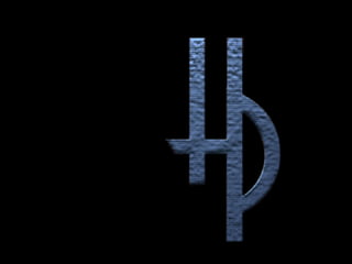
- 5. Recreating Clockwork Marketing’s logo was a major decision. Although the company’s previous logo hints at the hands of a timepiece, when used in conjunction with the company name, viewers were sometimes unable to determine that the stylized graph was indeed a clock.
- 6. A firm was commissioned to create a new logo…
- 7. Which I subsequently adjusted to the final logo seen here. The company’s previous materials consisted of a bronze logo set against tan stock. Color became an immediate consideration when trying to decide how best to communicate with a decidedly younger demographic. I persuaded the principals to choose a deep, rich green set against bright white paper. The message was clear…this is a fresh, vital and growing company, conservative enough to handle corporate clients, but also innovative and in tune to the changing face of technology.
- 8. Because the business card is often the company’s first impression to clients, it should be as dynamic as possible. previous version
- 9. In order to take full advantage of the movement that the new logo presented, I turned it on a 35-degree axis and allowed the text to flow from the resulting angles. new version
- 11. previous version
- 12. new version
- 14. previous version
- 15. new version