212.747.0016 | www.romeoco.com
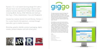
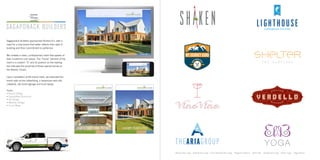
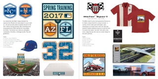
Romeo + Co. is an award-winning design firm with a
30-year track record creating design solutions that
advance business objectives for Fortune 500 companies
including MLB, Disney, AT&T Mobility and startups
like Faye + Florie, Downstream, Foco and Ringbearer.
Headed by creative director Vincent Romeo, Romeo +
Co. is your brand’s full-spectrum, concept through
execution, go-to creative resource.
Branding, graphic identity, product packaging, digital,
mobile, product ideation and old school print.
This award-winning brand captures the energy of the
food service professional’s busy lifestyle. The blue
within the brand represents the client side “gigs” being
posted while the green represents the “go” for freelance
food service staff. Once naming and branding were
complete we created their interactive website to allow
“gigs” on the “go”.
Orchestrating a successful event requires planning
with variables that are not always in your direct control
– especially when planning the availability of your
freelance workforce. GIGGO offers a complete on-line
solution for organizing all your staffing and scheduling
challenges. GIGGO maintains a database of freelanc-
ers’ qualifications, preferences and availability to be
efficiently matched to your schedules and needs. No
looking for resumes, no time consuming phone calls –
you simply plan and let GIGGO go and book the gigs.
Tasks:
• Naming
• Brand Design
• Core Values
• Information Architecture
• Wire Frames
• Website Design
• Content Management System
Sagaponack Builders approached Romeo+Co. with a
need for a new brand that better reflects their style of
building and their commitment to perfection.
We created a clean, contemporary mark that speaks of
their modernist core values. The “home” element of the
mark is a modern “S” and its position on the holding
bar indicates the proximity of these special homes to
the Atlantic Ocean.
Upon completion of the brand mark, we extended the
brand style across advertising, a responsive web site,
collateral, site build signage and truck wraps.
Tasks:
• Brand Design
• Capabilities Brochure
• Ad Design
• Website Design
• Truck Wrap
Martini Bar Logo Restaurant Logo Food Nutritionist’s Logo Magazine Brand Wine Bar Restaurant Logo HVAC Logo Yoga Brand
The Malmo product concept offers the consumer a
multitude of watch faces to choose from. Utilizing
CSTN (color super-twist nematic) technology, we were
able to create a watch that allows personalization via the
watch face and interchangeable bands. The packaging
doubles as a charging station when needed - about
every 7 days. This type of thinking is what we live to do.
Tasks:
• Brand Design
• Product Ideation
• Product Design
• Package Design
• Interface Design
With The Original Homemade Highball brand
development and beverage package design we want
the consumer to be taken back to an iconic New York
soda shop. A shop that still serves egg creams. The
apothecary style label with an authentic tin ceiling
background and classic typography accompanied by
a subtle, elegant palette, mix to deliver a truly unique
shelf identity.
Tasks:
• Brand Design
• Package Design
• Marketing Materials
• Recipe Book Design
20 17
PORT ST. LUCIE
The Motor Sport Country Club approached Romeo+Co.
to create a unique brand for a unique concept - a
country club for motor sport enthusiasts. Upon
developing a successful brand mark, the client was
excited to explore additional avenues to build the brand.
For events, we created “pit crew” shirts with a retro
iconic image that was also used as a poster design for
the event premises.
Tasks:
• Brand Design
• Teaser Brochure
• Poster Design
• Trade Booth
• Merchandise Design
• Website Design
Our relationship with Major League Baseball has
spanned over 28 years and every project is a joy to work
on. This year we were asked to develop themes for the
2017 Spring Training branding. After presenting three
strong approaches, MLB selected the Camp Batter-
ton theme. The theme’s key criteria are anticipation,
camaraderie, friendship, challenges & skills. Play well
gentlemen!
Tasks:
• Theme: Camp Batterton
• Spring Training Primary Mark
• Cactus & Grapefruit League Marks
• Ball Club City Tags
• Uniform Patches
• Base Mark
• On Field Marks
Three successful money managers were leaving their
lengthy posts at large firms to create their own wealth
management company. Romeo+Co. was approached to
name the company and build a vibrant brand strategy.
After many iterations through our brand name
generator technique, all the partners agreed on
Prosperian. Our strategy included the tag line
“plan + prosper” which supports the brand name
beautifully.
The visual strategy for web and collateral usage
included a selection of hedge mazes. The mazes
illustrate the intricacies of money management and
the beauty of successful planning.
Tasks:
• Naming
• Brand Design
• Capabilities Brochure
• Website Design
• Corporate Materials
3D Television Network Brand & Mascot
Shorty’s approached Romeo+Co. when they were
opening their second location. They initially only wanted
production to build out their menus and such. We saw
this as an opportunity to pitch a new look for the brand.
We presented five unique approaches and the one you
see here was selected. The authentic look paired with
a strong icon helped launch Shorty’s into a new place
altogether. Upon completing the signage, menus
(printed on butcher paper), merchandise line, coasters,
website and social media platforms, we were asked to
design their food truck wrap.
Since the launch of the new brand, Shorty’s has opened
three additional locations and is shopping for a second
truck.
Tasks:
• Brand Design
• Menu Design
• Merchandise Design
• Truck Wrap
• Website Concept Design
Men’s Salon Sportswear Brand Clothing Manufacturer Event Mark Photographer’s Logo 8th Annual Lizard Classic Restaurant Brand Event Mark
The first yacht club built on Nantucket in over 100
years, Great Harbor Yacht Club was a tremendous
undertaking. Having only the land, architectural plans
and a vision, the group set out to sell memberships
prior to breaking ground.
Romeo+Co. was tasked to design a member invitation
package. Having little but the new logo we created to
work with, we brought in our renderer to work from the
site plans to build out awe inspiring images of the soon
to be club.
We packaged this invitation with a 12 page brochure,
renderings and floor plans. We manufactured the
unique envelope from actual sail cloth with an
embroidered logo at the closing point. The sales team
sold out all memberships prior to the clubhouse being
built.
Note: The nautical flags revealed through the cover die
cuts on the brochure spell NANTUCKET.
Tasks:
• Brand Design
• Member Invitation Packet
• Merchandise Design
• Art Direction (renderings)
• Signage
Federation Mark Association Mark Beverage Logo Podcast Logo Corporate Mark Event Mark Corporate Logo Medical Practice
Ansell North America approached Romeo+Co. to
create a system of icons for their Showpad marketing
efforts. This system was designed to allow their global
sales team to easily access the exact product to fill their
client’s needs.
Our information architect designed a system of
categorization that allows the sales team to filter by
multiple criteria depending on the clients’ particular
needs.
With over 80 visual icons, this system speeds sales
times and can be updated globally via Ansell’s
corporate office.
Tasks:
• Information Architecture
• Wire Frames
• Iconography
Rock ‘n’ Roll Marathon Series Brand Mark, Event Marks & Tote BagCoffee & Tea Company Takeaway Food Packaging Weather App & Iconography Language Mobile Device Accessories Packaging
“There is no design without discipline.
There is no discipline without intelligence.”
– Massimo Vignelli
212.747.0016 | www.romeoco.com

romeo+co_2017

  • 1.
  • 2.
    Romeo + Co.is an award-winning design firm with a 30-year track record creating design solutions that advance business objectives for Fortune 500 companies including MLB, Disney, AT&T Mobility and startups like Faye + Florie, Downstream, Foco and Ringbearer. Headed by creative director Vincent Romeo, Romeo + Co. is your brand’s full-spectrum, concept through execution, go-to creative resource. Branding, graphic identity, product packaging, digital, mobile, product ideation and old school print. This award-winning brand captures the energy of the food service professional’s busy lifestyle. The blue within the brand represents the client side “gigs” being posted while the green represents the “go” for freelance food service staff. Once naming and branding were complete we created their interactive website to allow “gigs” on the “go”. Orchestrating a successful event requires planning with variables that are not always in your direct control – especially when planning the availability of your freelance workforce. GIGGO offers a complete on-line solution for organizing all your staffing and scheduling challenges. GIGGO maintains a database of freelanc- ers’ qualifications, preferences and availability to be efficiently matched to your schedules and needs. No looking for resumes, no time consuming phone calls – you simply plan and let GIGGO go and book the gigs. Tasks: • Naming • Brand Design • Core Values • Information Architecture • Wire Frames • Website Design • Content Management System
  • 3.
    Sagaponack Builders approachedRomeo+Co. with a need for a new brand that better reflects their style of building and their commitment to perfection. We created a clean, contemporary mark that speaks of their modernist core values. The “home” element of the mark is a modern “S” and its position on the holding bar indicates the proximity of these special homes to the Atlantic Ocean. Upon completion of the brand mark, we extended the brand style across advertising, a responsive web site, collateral, site build signage and truck wraps. Tasks: • Brand Design • Capabilities Brochure • Ad Design • Website Design • Truck Wrap Martini Bar Logo Restaurant Logo Food Nutritionist’s Logo Magazine Brand Wine Bar Restaurant Logo HVAC Logo Yoga Brand
  • 4.
    The Malmo productconcept offers the consumer a multitude of watch faces to choose from. Utilizing CSTN (color super-twist nematic) technology, we were able to create a watch that allows personalization via the watch face and interchangeable bands. The packaging doubles as a charging station when needed - about every 7 days. This type of thinking is what we live to do. Tasks: • Brand Design • Product Ideation • Product Design • Package Design • Interface Design With The Original Homemade Highball brand development and beverage package design we want the consumer to be taken back to an iconic New York soda shop. A shop that still serves egg creams. The apothecary style label with an authentic tin ceiling background and classic typography accompanied by a subtle, elegant palette, mix to deliver a truly unique shelf identity. Tasks: • Brand Design • Package Design • Marketing Materials • Recipe Book Design
  • 5.
    20 17 PORT ST.LUCIE The Motor Sport Country Club approached Romeo+Co. to create a unique brand for a unique concept - a country club for motor sport enthusiasts. Upon developing a successful brand mark, the client was excited to explore additional avenues to build the brand. For events, we created “pit crew” shirts with a retro iconic image that was also used as a poster design for the event premises. Tasks: • Brand Design • Teaser Brochure • Poster Design • Trade Booth • Merchandise Design • Website Design Our relationship with Major League Baseball has spanned over 28 years and every project is a joy to work on. This year we were asked to develop themes for the 2017 Spring Training branding. After presenting three strong approaches, MLB selected the Camp Batter- ton theme. The theme’s key criteria are anticipation, camaraderie, friendship, challenges & skills. Play well gentlemen! Tasks: • Theme: Camp Batterton • Spring Training Primary Mark • Cactus & Grapefruit League Marks • Ball Club City Tags • Uniform Patches • Base Mark • On Field Marks
  • 6.
    Three successful moneymanagers were leaving their lengthy posts at large firms to create their own wealth management company. Romeo+Co. was approached to name the company and build a vibrant brand strategy. After many iterations through our brand name generator technique, all the partners agreed on Prosperian. Our strategy included the tag line “plan + prosper” which supports the brand name beautifully. The visual strategy for web and collateral usage included a selection of hedge mazes. The mazes illustrate the intricacies of money management and the beauty of successful planning. Tasks: • Naming • Brand Design • Capabilities Brochure • Website Design • Corporate Materials 3D Television Network Brand & Mascot
  • 7.
    Shorty’s approached Romeo+Co.when they were opening their second location. They initially only wanted production to build out their menus and such. We saw this as an opportunity to pitch a new look for the brand. We presented five unique approaches and the one you see here was selected. The authentic look paired with a strong icon helped launch Shorty’s into a new place altogether. Upon completing the signage, menus (printed on butcher paper), merchandise line, coasters, website and social media platforms, we were asked to design their food truck wrap. Since the launch of the new brand, Shorty’s has opened three additional locations and is shopping for a second truck. Tasks: • Brand Design • Menu Design • Merchandise Design • Truck Wrap • Website Concept Design
  • 8.
    Men’s Salon SportswearBrand Clothing Manufacturer Event Mark Photographer’s Logo 8th Annual Lizard Classic Restaurant Brand Event Mark The first yacht club built on Nantucket in over 100 years, Great Harbor Yacht Club was a tremendous undertaking. Having only the land, architectural plans and a vision, the group set out to sell memberships prior to breaking ground. Romeo+Co. was tasked to design a member invitation package. Having little but the new logo we created to work with, we brought in our renderer to work from the site plans to build out awe inspiring images of the soon to be club. We packaged this invitation with a 12 page brochure, renderings and floor plans. We manufactured the unique envelope from actual sail cloth with an embroidered logo at the closing point. The sales team sold out all memberships prior to the clubhouse being built. Note: The nautical flags revealed through the cover die cuts on the brochure spell NANTUCKET. Tasks: • Brand Design • Member Invitation Packet • Merchandise Design • Art Direction (renderings) • Signage
  • 9.
    Federation Mark AssociationMark Beverage Logo Podcast Logo Corporate Mark Event Mark Corporate Logo Medical Practice Ansell North America approached Romeo+Co. to create a system of icons for their Showpad marketing efforts. This system was designed to allow their global sales team to easily access the exact product to fill their client’s needs. Our information architect designed a system of categorization that allows the sales team to filter by multiple criteria depending on the clients’ particular needs. With over 80 visual icons, this system speeds sales times and can be updated globally via Ansell’s corporate office. Tasks: • Information Architecture • Wire Frames • Iconography
  • 10.
    Rock ‘n’ RollMarathon Series Brand Mark, Event Marks & Tote BagCoffee & Tea Company Takeaway Food Packaging Weather App & Iconography Language Mobile Device Accessories Packaging
  • 11.
    “There is nodesign without discipline. There is no discipline without intelligence.” – Massimo Vignelli 212.747.0016 | www.romeoco.com