Evaluation
TOM HAASE
Research
 For research I conducted, I evaluated a video game called ‘Far Cry Primal’, researched four games similar to my idea and
created an interview where three people answered some questions to help me produce my game.
 I believe I analysed ’Far Cry Primal’ well and in detail, however I don’t think it helped me in making my product due to the
fact that this game is very modern, more advanced and not very similar to my game, although it did give me a sense of
what a video game had to include to be successful, therefore it wasn’t a complete waste of time to work on. If I was to
evaluate a game to this detail again I would choose a game that was more similar to my game idea, therefore I could use
the ideas in my game production to make it look more professional, for example if I evaluated the use of narrative and
perspective that was in a game similar to my idea I could have used the points I evaluated in my production.
 For the next part of my research I looked at four similar games to mine and this was quite helpful as they gave me ideas
for the perspectives I could use and the props/settings/colours I could use in the background to give my game a
mood/feel of my choice and it showed my which aspects of each game were more popular so I could include the most
popular aspects from each game into mine to make my game more appealing to people, for example a side perspective
was the most popular view so I used a side perspective and collecting coins and other collectables were also very popular
in these games, so I included an aspect of coin and boost collections within my game. If I was to do this research again,
however, I would choose games that appealed to people within my target audience (16-19 years), however I am still
pleased with the help this bit of research provided.
 For my final bit of research I asked three people three questions to get their idea of what I was thinking to include in my
game and again I believe this was helpful as these people were also within my target audience, which gave me ideas about
what they liked about the ideas for my game what they think should be included. For example one person said to include
an aspect of levelling up a certain boost or weapon, however I did not have time to include this in my game. The problem
with this interview research was I could only ask three people, which was helpful in some circumstances, as one person
said I should include more levels and another said I should make my game endless, therefore if I was to conduct this
research again I would ask more people more questions, to get a better overall view of what people would want to see in
my game, as the three people I asked could have had different views to everyone else in my target audience. To do this I
would ask more questions in my interviews/questionnaires and use Survey Monkey to ask random people a set of
questions, as this website is also helpful with reflecting on the answers to my questions as it provides graphs and charts to
display the answers.
Planning
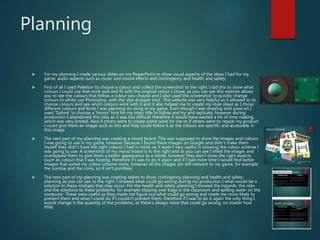
 For my planning I made various slides on my PowerPoint to show visual aspects of the ideas I had for my
game, audio aspects such as music and sound effects and contingency and health and safety.
 First of all I used Paletton to choose a colour and collect the screenshot to the right. I did this to show what
colours I could use that work well and fit with the original colour I chose, as you can see this website allows
you to see the colours that follow a colour you choose and I also used this screenshot to quickly change
colours to whilst use Photoshop, with the ’eye dropper tool’. This website was very helpful as it allowed to to
choose colours and see which colours work with it and it also helped me to create my style sheet as I chose
different colours and fonts I was planning on using in my game. Even though I was drawing with pixel art I
used ‘Dafont’ to choose a ‘horror’ font for my main title to follow and try and replicate, however during
production I abandoned this idea as it was too difficult therefore it would have wasted a lot of time making,
which was very limited. Also if others were to create some work for me or if others were to repeat my product
I could give them an image such as this and they could follow it as the colours are specific and accessible in
this image.
 The next part of my planning was creating a mood board. This was supposed to show the images and colours
I was going to use in my game, however because I found these images on Google and didn’t make them
myself they didn’t have the right colours I had in mind, so it wasn’t very useful in showing the colour scheme I
was going to use. A screenshot of my mood board is to the right and as you can see I titled the images and
overlapped them to give them a better appearance as a whole, however they don’t show the right aspects
(such as colour) that I was hoping, therefore if I was to do it again and if I had more time I would find better
images that suited my colour scheme more, however all the images are still relevant to my game, for example
the zombie and the coins, so it isn't pointless.
 The next part of my planning was creating tables to show contingency planning and health and safety
planning as you can see to the right. I showed what could go wrong during my production I what would be a
solution to these mishaps that may occur. For the health and safety planning I showed the hazards, the risks
and the solutions to these problems, for example tripping over bags in the classroom and spilling water on the
computer. These were useful as they made me figure out what could go wrong and made me more likely to
prevent them and what I could do if I couldn’t prevent them, therefore if I was to do it again the only thing I
would change is the quantity of the problems, as there’s always more that could go wrong, no matter how
little.
Planning
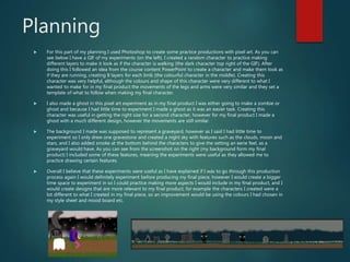
 For this part of my planning I used Photoshop to create some practice productions with pixel art. As you can
see below I have a GIF of my experiments (on the left). I created a random character to practice making
different layers to make it look as if the character is walking (the dark character top right of the GIF). After
doing this I followed an idea from the course content PowerPoint to create a character and make them look as
if they are running, creating 8 layers for each limb (the colourful character in the middle). Creating this
character was very helpful, although the colours and shape of this character were very different to what I
wanted to make for in my final product the movements of the legs and arms were very similar and they set a
template of what to follow when making my final character.
 I also made a ghost in this pixel art experiment as in my final product I was either going to make a zombie or
ghost and because I had little time to experiment I made a ghost as it was an easier task. Creating this
character was useful in getting the right size for a second character, however for my final product I made a
ghost with a much different design, however the movements are still similar.
 The background I made was supposed to represent a graveyard, however as I said I had little time to
experiment so I only drew one gravestone and created a night sky with features such as the clouds, moon and
stars, and I also added smoke at the bottom behind the characters to give the setting an eerie feel, as a
graveyard would have. As you can see from the screenshot on the right (my background form my final
product) I included some of these features, meaning the experiments were useful as they allowed me to
practice drawing certain features.
 Overall I believe that these experiments were useful as I have explained if I was to go through this production
process again I would definitely experiment before producing my final piece, however I would create a bigger
time space to experiment in so I could practice making more aspects I would include in my final product, and I
would create designs that are more relevant to my final product, for example the characters I created were a
lot different to what I created in my final piece, so an improvement would be using the colours I had chosen in
my style sheet and mood board etc.
Time Management
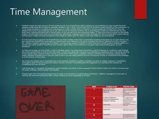
 I believe I spent the right amount of time producing all of my PowerPoints before starting on my production to give myself the time I
needed to add detail and images for example. However I don’t think I had enough time to produce a good amount on my production, as
I only made one level in my game and I was hoping to make multiple levels as I stated in my pre-production PowerPoints. I am still
pleased with what I have produced and it still lasts around 45 seconds, however this is only because I made my character fail the first
level twice, meaning the level had to restart twice, as you can see from the screenshots below. If I had more time to overall on this whole
project I would spend more time on my production, specifically creating a second level, although this may not have been a good idea as
well because I might not have included as much detail as I didn’t plan for what I could have made for my second level.
 If I had more time to spend on my PowerPoints (not that I needed more time) I would have included more detail on my style sheet in my
pre—production PowerPoint and made my mood board more relevant to my game, included the colours I planned to use in my game
etc. I believe I added a good amount of detail in my case study research, however if I had more time I would research another game in a
second case study research PowerPoint and choose a game that is more relevant to my game idea (side scrolling game, 2D and
pixelated).
 To help me manage my time briefly I made a schedule table in my initial plans PowerPoint, which I followed as I worked on and finished
the correct productions in time for the next week. I could have made this schedule more detailed by scheduling what I should be working
on for specific days, however I didn’t do this as at the time I didn’t think I needed to follow a schedule, but it is always a good idea to
make a detailed schedule just in case you need to see if you are falling behind and are running out of time. A screenshot of my schedule
is at the bottom of the screen.
 For 4 days the college wasn’t accessible due to the weather, therefore I couldn’t complete my work at college, however I completed a
contingency plan in my pre-production where I found a solution if something like this happened, so I overcame this obstacle by
completing my work at home.
 I left three days to complete my evaluation which I believe I can finish in time, however if I don’t finish in time I can finish it at home over
the Easter holidays, which shouldn’t be needed.
 Overall, apart from not having enough time to create a second level in my final game production, I believe I managed my time well, as
nothing was late and nothing has been rushed, making my work supposedly at its best.
Technical Qualities
-Comparing To Sonic The Hedgehog
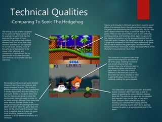
The collectibles on my game are coins and ability
boosts, however I didn’t have time to add an
aspect of spending the coins collected, whereas
Sonic did. The coins on my game are less detailed
and they don’t spin on the spot as they do in
Sonic, however when collected they burst,
showing you collected them (along with the
sound of collecting a coin) which Sonic also has,
showing my game is at a professional level in this
aspect.
The character in my game is very large
against the background and covers a
lot of the page, meaning if someone
was actually playing then they
wouldn’t have a lot of time to react to
the obstacles (spikes and blocks to
jump over). On Sonic this is much
different as the character is small on
the screen but still as detailed as mine
is, giving the player time to react to
obstacles making the game playable.
My background features are quite detailed
however I don’t have many features and
props compared to Sonic. This is only a
problem aesthetically, as I have gravestones
in the background to show the setting is a
graveyard. Similar to my game Sonic only
has few features and props to show the
setting (palm trees and water to show it’s
an island setting), although Sonic does have
more features (bushes) further in the
background to give the setting/scene more
depth and detail which my game does not
have. On the other hand this doesn’t have
to be a negative view as it gives my game
more simplicity, however my target
audience is 16-19 therefore simplicity isn't
necessary.
The writing is a lot smaller compared
to my game and there is more of it,
for example my game only has the
level and the amount of coins
collected in big writing and symbols,
whereas Sonic has: score, time, rings
and lives and these are all displayed
on a small scale, allowing more of
the setting and background to be
shown. After reflecting and
comparing an improvement for my
game would be to make the coins,
score level etc. to be smaller and less
stand-out.
There is a lot of audio in the Sonic game from music to sound
effects. For example there is background music which makes
the game more entertaining which my game also has (as I also
have a feature where the music is turned off and on in my
game). There are also sound effects, such as coin collecting,
running, jumping, and boosting, which again my game also
has, meaning my game is on the same professional level as
Sonic with audio, however the background music in my game
is quite loud compared to Sonic and other professional game
and if I was to produce my game again I would make the
background music more quiet, making the sound effects of the
character’s movements etc. more clear.
Aesthetic Qualities
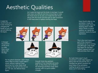
As I made the head and the body in one layer it would
have been too difficult and time consuming to make
the head move on its own, so I made the hair move
along with the mouth and the eyes to add movement
in the head area to replace moving the head.
This is the most important
part of the character’s
movement as he is running,
and although I only made
four layers for the legs I
believe I spaced them out
well and drew them well.
I changed
the position
of the arms
to make
them move
along with
the legs
For my ghost character I didn’t have
many ideas on how I could make it
move, without making it look
abnormal. So I only made small
changes to the tail and the arm as
you can see, and altered these
layers.
As I said, there wasn’t much
movement I could make happen so
along with the tail and the arm, I
changed the ghost’s position for
every slide of my animation,
making the ghost move up and
down, as if it were flying.
Every fourth slide on my
animation I made the
character’s eyes close by
drawing them smaller,
which I think is a good
addition as it gives the
character more of a facial
expression.
I made the
mouth look as if
it was moving, by
changing the
length as you can
see and altering
the layers.
Overall I think the aesthetic
qualities of my characters are quite
high, as they have a lot of detail in
the drawings and flow nicely when
moving, with no quick sudden
changes.
Aesthetic Qualities
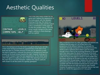
This is the main menu screen for my
game and I believe the appearance of
this looks good, with the detailed
drawing at the top, the stand out
buttons on the screen and the overall
colour coordination of the page (to
fit with the zombie colour). The only
thing I would change on this menu
page is adding in more drawings,
such as a ghost.
This is the background for the level in my game and as you can see
I have more background features (gravestones) at the start of my
level and due to a limited amount of time and an attempt to stop
the look of repetition I reduced the amount of background features
present as the level moves towards the right, however looking at it
as a whole it doesn’t have the best appearance. On the other hand
when the game is in play you don’t notice this spacing as much as
the main focus is on the character. I believe the colours used are
well chosen to set the scene of a spooky graveyard
This a screenshot from my video gameplay and aesthetically
I believe that this piece isn’t at its best due to the
proportions of the different features. For example the
characters are large compared to the background and the
whole screen in general which doesn’t give the player
enough time to react to the incoming obstacles on the path
and it also takes away the detail and features of the level
(the background) for example the gravestones. The “level 1”
is also too big on the page as I think if it were smaller then
the player would be as focused on the text, as this text isn’t
important within the gameplay. I believe the colours and/or
the positioning of the “jump” and “boost” button does not
correlate well with the background because at some points
of the level they are not clear and hard to read. Overall,
however the appearance of each individual feature may look
good, as a whole the appearance isn’t very good.
Audience Appeal
I conducted interviews asking three people from my class three questions each. So this specific research wasn’t very useful in
giving an overall view of people’s opinions on my questions and my ideas for my game, as only three people portray the views
of everyone within my target audience, however I could still get a view of their thoughts. For example two of the interviewee
said the reward system should include an upgrade of skills/weapons etc., however the other said they would prefer a reward
that would make them feel happy rather than upgrades of skills/weapons and my game doesn’t include rewards with an
upgrade of skills/weapons, therefore I don’t appeal to some of my audience. On the other hand I do include a reward where
you can change the character, which appeals to some of my audience, so this isn’t too much of a problem.
One person out of the three I interviewed preferred multiplayer rather than single player, meaning the other two prefer single
player, which edged me to making my game single player, as it would please more of my target audience making my game
more of a success.
My final question was if my target audience enjoyed playing side-scrolling games (because from the start my idea for my
game was always going to be a side-scrolling game) and this worked out well for me because all of my interviewees said that
they enjoy playing side-scrollers and would choose this type of game over others, such as first person games, as side-scrolling
games are much more simple and more relaxing to play.
After reflecting on my work I have realised that the features of my game (such as the ‘level 1’ at the top of the screen) are
quite large and the proportion of these features don’t fit very well with the background and the features are made too clear
which they don’t need to be, as my target audience are16-19, therefore they can read well and don’t need simplicity, however
on the other hand simplicity makes a relaxing game which doesn’t need concentration to play, which many people of all ages
enjoy, which obviously fits into my target audience, therefore this isn’t much of an issue.

8. Evaluation

  • 1.
  • 2.
    Research  For researchI conducted, I evaluated a video game called ‘Far Cry Primal’, researched four games similar to my idea and created an interview where three people answered some questions to help me produce my game.  I believe I analysed ’Far Cry Primal’ well and in detail, however I don’t think it helped me in making my product due to the fact that this game is very modern, more advanced and not very similar to my game, although it did give me a sense of what a video game had to include to be successful, therefore it wasn’t a complete waste of time to work on. If I was to evaluate a game to this detail again I would choose a game that was more similar to my game idea, therefore I could use the ideas in my game production to make it look more professional, for example if I evaluated the use of narrative and perspective that was in a game similar to my idea I could have used the points I evaluated in my production.  For the next part of my research I looked at four similar games to mine and this was quite helpful as they gave me ideas for the perspectives I could use and the props/settings/colours I could use in the background to give my game a mood/feel of my choice and it showed my which aspects of each game were more popular so I could include the most popular aspects from each game into mine to make my game more appealing to people, for example a side perspective was the most popular view so I used a side perspective and collecting coins and other collectables were also very popular in these games, so I included an aspect of coin and boost collections within my game. If I was to do this research again, however, I would choose games that appealed to people within my target audience (16-19 years), however I am still pleased with the help this bit of research provided.  For my final bit of research I asked three people three questions to get their idea of what I was thinking to include in my game and again I believe this was helpful as these people were also within my target audience, which gave me ideas about what they liked about the ideas for my game what they think should be included. For example one person said to include an aspect of levelling up a certain boost or weapon, however I did not have time to include this in my game. The problem with this interview research was I could only ask three people, which was helpful in some circumstances, as one person said I should include more levels and another said I should make my game endless, therefore if I was to conduct this research again I would ask more people more questions, to get a better overall view of what people would want to see in my game, as the three people I asked could have had different views to everyone else in my target audience. To do this I would ask more questions in my interviews/questionnaires and use Survey Monkey to ask random people a set of questions, as this website is also helpful with reflecting on the answers to my questions as it provides graphs and charts to display the answers.
  • 3.
    Planning  For myplanning I made various slides on my PowerPoint to show visual aspects of the ideas I had for my game, audio aspects such as music and sound effects and contingency and health and safety.  First of all I used Paletton to choose a colour and collect the screenshot to the right. I did this to show what colours I could use that work well and fit with the original colour I chose, as you can see this website allows you to see the colours that follow a colour you choose and I also used this screenshot to quickly change colours to whilst use Photoshop, with the ’eye dropper tool’. This website was very helpful as it allowed to to choose colours and see which colours work with it and it also helped me to create my style sheet as I chose different colours and fonts I was planning on using in my game. Even though I was drawing with pixel art I used ‘Dafont’ to choose a ‘horror’ font for my main title to follow and try and replicate, however during production I abandoned this idea as it was too difficult therefore it would have wasted a lot of time making, which was very limited. Also if others were to create some work for me or if others were to repeat my product I could give them an image such as this and they could follow it as the colours are specific and accessible in this image.  The next part of my planning was creating a mood board. This was supposed to show the images and colours I was going to use in my game, however because I found these images on Google and didn’t make them myself they didn’t have the right colours I had in mind, so it wasn’t very useful in showing the colour scheme I was going to use. A screenshot of my mood board is to the right and as you can see I titled the images and overlapped them to give them a better appearance as a whole, however they don’t show the right aspects (such as colour) that I was hoping, therefore if I was to do it again and if I had more time I would find better images that suited my colour scheme more, however all the images are still relevant to my game, for example the zombie and the coins, so it isn't pointless.  The next part of my planning was creating tables to show contingency planning and health and safety planning as you can see to the right. I showed what could go wrong during my production I what would be a solution to these mishaps that may occur. For the health and safety planning I showed the hazards, the risks and the solutions to these problems, for example tripping over bags in the classroom and spilling water on the computer. These were useful as they made me figure out what could go wrong and made me more likely to prevent them and what I could do if I couldn’t prevent them, therefore if I was to do it again the only thing I would change is the quantity of the problems, as there’s always more that could go wrong, no matter how little.
  • 4.
    Planning  For thispart of my planning I used Photoshop to create some practice productions with pixel art. As you can see below I have a GIF of my experiments (on the left). I created a random character to practice making different layers to make it look as if the character is walking (the dark character top right of the GIF). After doing this I followed an idea from the course content PowerPoint to create a character and make them look as if they are running, creating 8 layers for each limb (the colourful character in the middle). Creating this character was very helpful, although the colours and shape of this character were very different to what I wanted to make for in my final product the movements of the legs and arms were very similar and they set a template of what to follow when making my final character.  I also made a ghost in this pixel art experiment as in my final product I was either going to make a zombie or ghost and because I had little time to experiment I made a ghost as it was an easier task. Creating this character was useful in getting the right size for a second character, however for my final product I made a ghost with a much different design, however the movements are still similar.  The background I made was supposed to represent a graveyard, however as I said I had little time to experiment so I only drew one gravestone and created a night sky with features such as the clouds, moon and stars, and I also added smoke at the bottom behind the characters to give the setting an eerie feel, as a graveyard would have. As you can see from the screenshot on the right (my background form my final product) I included some of these features, meaning the experiments were useful as they allowed me to practice drawing certain features.  Overall I believe that these experiments were useful as I have explained if I was to go through this production process again I would definitely experiment before producing my final piece, however I would create a bigger time space to experiment in so I could practice making more aspects I would include in my final product, and I would create designs that are more relevant to my final product, for example the characters I created were a lot different to what I created in my final piece, so an improvement would be using the colours I had chosen in my style sheet and mood board etc.
  • 5.
    Time Management  Ibelieve I spent the right amount of time producing all of my PowerPoints before starting on my production to give myself the time I needed to add detail and images for example. However I don’t think I had enough time to produce a good amount on my production, as I only made one level in my game and I was hoping to make multiple levels as I stated in my pre-production PowerPoints. I am still pleased with what I have produced and it still lasts around 45 seconds, however this is only because I made my character fail the first level twice, meaning the level had to restart twice, as you can see from the screenshots below. If I had more time to overall on this whole project I would spend more time on my production, specifically creating a second level, although this may not have been a good idea as well because I might not have included as much detail as I didn’t plan for what I could have made for my second level.  If I had more time to spend on my PowerPoints (not that I needed more time) I would have included more detail on my style sheet in my pre—production PowerPoint and made my mood board more relevant to my game, included the colours I planned to use in my game etc. I believe I added a good amount of detail in my case study research, however if I had more time I would research another game in a second case study research PowerPoint and choose a game that is more relevant to my game idea (side scrolling game, 2D and pixelated).  To help me manage my time briefly I made a schedule table in my initial plans PowerPoint, which I followed as I worked on and finished the correct productions in time for the next week. I could have made this schedule more detailed by scheduling what I should be working on for specific days, however I didn’t do this as at the time I didn’t think I needed to follow a schedule, but it is always a good idea to make a detailed schedule just in case you need to see if you are falling behind and are running out of time. A screenshot of my schedule is at the bottom of the screen.  For 4 days the college wasn’t accessible due to the weather, therefore I couldn’t complete my work at college, however I completed a contingency plan in my pre-production where I found a solution if something like this happened, so I overcame this obstacle by completing my work at home.  I left three days to complete my evaluation which I believe I can finish in time, however if I don’t finish in time I can finish it at home over the Easter holidays, which shouldn’t be needed.  Overall, apart from not having enough time to create a second level in my final game production, I believe I managed my time well, as nothing was late and nothing has been rushed, making my work supposedly at its best.
  • 6.
    Technical Qualities -Comparing ToSonic The Hedgehog The collectibles on my game are coins and ability boosts, however I didn’t have time to add an aspect of spending the coins collected, whereas Sonic did. The coins on my game are less detailed and they don’t spin on the spot as they do in Sonic, however when collected they burst, showing you collected them (along with the sound of collecting a coin) which Sonic also has, showing my game is at a professional level in this aspect. The character in my game is very large against the background and covers a lot of the page, meaning if someone was actually playing then they wouldn’t have a lot of time to react to the obstacles (spikes and blocks to jump over). On Sonic this is much different as the character is small on the screen but still as detailed as mine is, giving the player time to react to obstacles making the game playable. My background features are quite detailed however I don’t have many features and props compared to Sonic. This is only a problem aesthetically, as I have gravestones in the background to show the setting is a graveyard. Similar to my game Sonic only has few features and props to show the setting (palm trees and water to show it’s an island setting), although Sonic does have more features (bushes) further in the background to give the setting/scene more depth and detail which my game does not have. On the other hand this doesn’t have to be a negative view as it gives my game more simplicity, however my target audience is 16-19 therefore simplicity isn't necessary. The writing is a lot smaller compared to my game and there is more of it, for example my game only has the level and the amount of coins collected in big writing and symbols, whereas Sonic has: score, time, rings and lives and these are all displayed on a small scale, allowing more of the setting and background to be shown. After reflecting and comparing an improvement for my game would be to make the coins, score level etc. to be smaller and less stand-out. There is a lot of audio in the Sonic game from music to sound effects. For example there is background music which makes the game more entertaining which my game also has (as I also have a feature where the music is turned off and on in my game). There are also sound effects, such as coin collecting, running, jumping, and boosting, which again my game also has, meaning my game is on the same professional level as Sonic with audio, however the background music in my game is quite loud compared to Sonic and other professional game and if I was to produce my game again I would make the background music more quiet, making the sound effects of the character’s movements etc. more clear.
  • 7.
    Aesthetic Qualities As Imade the head and the body in one layer it would have been too difficult and time consuming to make the head move on its own, so I made the hair move along with the mouth and the eyes to add movement in the head area to replace moving the head. This is the most important part of the character’s movement as he is running, and although I only made four layers for the legs I believe I spaced them out well and drew them well. I changed the position of the arms to make them move along with the legs For my ghost character I didn’t have many ideas on how I could make it move, without making it look abnormal. So I only made small changes to the tail and the arm as you can see, and altered these layers. As I said, there wasn’t much movement I could make happen so along with the tail and the arm, I changed the ghost’s position for every slide of my animation, making the ghost move up and down, as if it were flying. Every fourth slide on my animation I made the character’s eyes close by drawing them smaller, which I think is a good addition as it gives the character more of a facial expression. I made the mouth look as if it was moving, by changing the length as you can see and altering the layers. Overall I think the aesthetic qualities of my characters are quite high, as they have a lot of detail in the drawings and flow nicely when moving, with no quick sudden changes.
  • 8.
    Aesthetic Qualities This isthe main menu screen for my game and I believe the appearance of this looks good, with the detailed drawing at the top, the stand out buttons on the screen and the overall colour coordination of the page (to fit with the zombie colour). The only thing I would change on this menu page is adding in more drawings, such as a ghost. This is the background for the level in my game and as you can see I have more background features (gravestones) at the start of my level and due to a limited amount of time and an attempt to stop the look of repetition I reduced the amount of background features present as the level moves towards the right, however looking at it as a whole it doesn’t have the best appearance. On the other hand when the game is in play you don’t notice this spacing as much as the main focus is on the character. I believe the colours used are well chosen to set the scene of a spooky graveyard This a screenshot from my video gameplay and aesthetically I believe that this piece isn’t at its best due to the proportions of the different features. For example the characters are large compared to the background and the whole screen in general which doesn’t give the player enough time to react to the incoming obstacles on the path and it also takes away the detail and features of the level (the background) for example the gravestones. The “level 1” is also too big on the page as I think if it were smaller then the player would be as focused on the text, as this text isn’t important within the gameplay. I believe the colours and/or the positioning of the “jump” and “boost” button does not correlate well with the background because at some points of the level they are not clear and hard to read. Overall, however the appearance of each individual feature may look good, as a whole the appearance isn’t very good.
  • 9.
    Audience Appeal I conductedinterviews asking three people from my class three questions each. So this specific research wasn’t very useful in giving an overall view of people’s opinions on my questions and my ideas for my game, as only three people portray the views of everyone within my target audience, however I could still get a view of their thoughts. For example two of the interviewee said the reward system should include an upgrade of skills/weapons etc., however the other said they would prefer a reward that would make them feel happy rather than upgrades of skills/weapons and my game doesn’t include rewards with an upgrade of skills/weapons, therefore I don’t appeal to some of my audience. On the other hand I do include a reward where you can change the character, which appeals to some of my audience, so this isn’t too much of a problem. One person out of the three I interviewed preferred multiplayer rather than single player, meaning the other two prefer single player, which edged me to making my game single player, as it would please more of my target audience making my game more of a success. My final question was if my target audience enjoyed playing side-scrolling games (because from the start my idea for my game was always going to be a side-scrolling game) and this worked out well for me because all of my interviewees said that they enjoy playing side-scrollers and would choose this type of game over others, such as first person games, as side-scrolling games are much more simple and more relaxing to play. After reflecting on my work I have realised that the features of my game (such as the ‘level 1’ at the top of the screen) are quite large and the proportion of these features don’t fit very well with the background and the features are made too clear which they don’t need to be, as my target audience are16-19, therefore they can read well and don’t need simplicity, however on the other hand simplicity makes a relaxing game which doesn’t need concentration to play, which many people of all ages enjoy, which obviously fits into my target audience, therefore this isn’t much of an issue.

Editor's Notes

  • #3 What were the strengths of your research? How did your research help your product? What were the weaknesses of your research? What could you have done better/improve? What effect would this have had on your product?
  • #4 What were the strengths of your research? How did your research help your product? What were the weaknesses of your research? What could you have done better/improve? What effect would this have had on your product?
  • #5 What were the strengths of your planning? How did your planning help your product? What were the weaknesses of your planning? What could you have done better/improve? What effect would this have had on your product?
  • #6 Did you manage your time well? Did you complete your project on time or would your products have improved with additional time? What would you have done if you had more time to produce your work?
  • #7 Did you manage your time well? Did you complete your project on time or would your products have improved with additional time? What would you have done if you had more time to produce your work?
  • #8 Does your work look good? Was it creative? What aspects of your game’s visuals do you like? What would you improve? How would you improve it? Discuss the strengths and weaknesses Put your final piece(s) in the centre of a page and analyse them Use text boxes and arrows
  • #9 Does your work look good? Was it creative? What aspects of your game’s visuals do you like? What would you improve? How would you improve it? Discuss the strengths and weaknesses Put your final piece(s) in the centre of a page and analyse them Use text boxes and arrows
  • #10 How have you appealed to your target audience? What specific bits of content would appeal to your target audience. Refer to your findings from your questionnaire. Put your final piece(s) in the centre of a page and analyse them Use text boxes and arrows