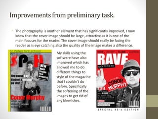
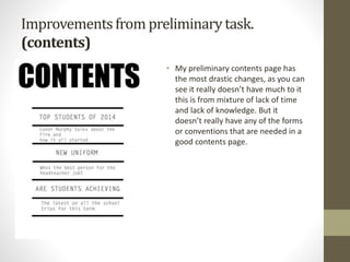
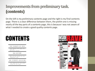
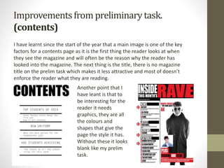
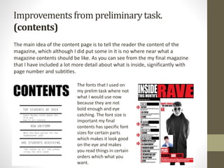
Q7 Lookingbackat yourpreliminarytask,
what do youfeel youhavelearnt in the
progressionfrom it to the full product?
Improvementsfrom preliminarytask.
(contents)
• I have made several improvements in my work since my preliminary task, as
I would expect because I have learnt a lot about the forms, conventions, and
have done lots of research since then.
Improvementsfrom preliminarytask.
• On the left is my preliminary task magazine front cover and on the right the
right is my final one. I can see from this that I am missing many of the
necessary forms and conventions in the first trail one. It is clear that I wasn’t
aware of what is needed at the start.
Improvementsfrom preliminarytask.
• Firstly I have recognised that my title of my trail mag is not bold enough, I
have faded it as an effect but actually this is a flaw as it makes it less eye
catching and memorable. Another major point is the lack content, its
missing a strap line and information.
I would also say that
from a graphics
perspective that it
lacks a lot of things.
The fonts are
inconsistent and the
colours are not eye
catching enough. Mt
final magazine is
much better in terms
of that looks
attractive and inviting
to the eye.
Improvementsfrom preliminarytask.
• The photography is another element that has significantly improved, I now
know that the cover image should be large, attractive as it is one of the
main focuses for the reader. The cover image should really be facing the
reader as is eye catching also the quality of the image makes a difference.
My skills using the
software have also
improved which has
allowed me to do
different things to
style of the magazine
that I couldn’t do
before. Specifically
the softening of the
images to get rid of
any blemishes.
Improvementsfrom preliminarytask.
(contents)
• My preliminary contents page has
the most drastic changes, as you can
see it really doesn’t have much to it
this is from mixture of lack of time
and lack of knowledge. But it
doesn’t really have any of the forms
or conventions that are needed in a
good contents page.
Improvementsfrom preliminarytask.
(contents)
On the left is my preliminary contents page and the right is my final contents
page. There is a clear difference between them, the prelim one is missing
nearly all the key parts of a contents page, this is because I was not aware of
what I needed to create a good quality contents page.
Improvementsfrom preliminarytask.
(contents)
I have learnt since the start of the year that a main image is one of the key
factors for a contents page as it is the first thing the reader looks at when
they see the magazine and will often be the reason why the reader has
looked into the magazine. The next thing is the title, there is no magazine
title on the prelim task which makes it less attractive and most of doesn’t
enforce the reader what they are reading.
Another point that I
have leant is that to
be interesting for the
reader it needs
graphics, they are all
the colours and
shapes that give the
page the style it has.
Without these it looks
blank like my prelim
task.
Improvementsfrom preliminarytask.
(contents)
The main idea of the content page is to tell the reader the content of the
magazine, which although I did put some in it is no where near what a
magazine contents should be like. As you can see from the my final magazine
that I have included a lot more detail about what is inside, significantly with
page number and subtitles.
The fonts that I used on
my prelim task where not
what I would use now
because they are not
bold enough and eye
catching. The font size is
important my final
contents has specific font
sizes for certain parts
which makes it look good
on the eye and makes
you read things in certain
orders which what you
want.
Conclusion
• To conclude I would say that I have nearly learnt everything about forms
and conventions of magazines that are needed to create a good quality
magazine since I made my preliminary task. This is evident in my
comparisons between the two, I have identified all the things that were
missing in the prelim to the final ones and there is a lot of significant
elements missing. Particularly with my contents as it far from magazine
standard but I think that my final one shows how much how I have
improved.

7yQuestion 7

  • 1.
    Q7 Lookingbackat yourpreliminarytask, whatdo youfeel youhavelearnt in the progressionfrom it to the full product?
  • 2.
    Improvementsfrom preliminarytask. (contents) • Ihave made several improvements in my work since my preliminary task, as I would expect because I have learnt a lot about the forms, conventions, and have done lots of research since then.
  • 3.
    Improvementsfrom preliminarytask. • Onthe left is my preliminary task magazine front cover and on the right the right is my final one. I can see from this that I am missing many of the necessary forms and conventions in the first trail one. It is clear that I wasn’t aware of what is needed at the start.
  • 4.
    Improvementsfrom preliminarytask. • FirstlyI have recognised that my title of my trail mag is not bold enough, I have faded it as an effect but actually this is a flaw as it makes it less eye catching and memorable. Another major point is the lack content, its missing a strap line and information. I would also say that from a graphics perspective that it lacks a lot of things. The fonts are inconsistent and the colours are not eye catching enough. Mt final magazine is much better in terms of that looks attractive and inviting to the eye.
  • 5.
    Improvementsfrom preliminarytask. • Thephotography is another element that has significantly improved, I now know that the cover image should be large, attractive as it is one of the main focuses for the reader. The cover image should really be facing the reader as is eye catching also the quality of the image makes a difference. My skills using the software have also improved which has allowed me to do different things to style of the magazine that I couldn’t do before. Specifically the softening of the images to get rid of any blemishes.
  • 6.
    Improvementsfrom preliminarytask. (contents) • Mypreliminary contents page has the most drastic changes, as you can see it really doesn’t have much to it this is from mixture of lack of time and lack of knowledge. But it doesn’t really have any of the forms or conventions that are needed in a good contents page.
  • 7.
    Improvementsfrom preliminarytask. (contents) On theleft is my preliminary contents page and the right is my final contents page. There is a clear difference between them, the prelim one is missing nearly all the key parts of a contents page, this is because I was not aware of what I needed to create a good quality contents page.
  • 8.
    Improvementsfrom preliminarytask. (contents) I havelearnt since the start of the year that a main image is one of the key factors for a contents page as it is the first thing the reader looks at when they see the magazine and will often be the reason why the reader has looked into the magazine. The next thing is the title, there is no magazine title on the prelim task which makes it less attractive and most of doesn’t enforce the reader what they are reading. Another point that I have leant is that to be interesting for the reader it needs graphics, they are all the colours and shapes that give the page the style it has. Without these it looks blank like my prelim task.
  • 9.
    Improvementsfrom preliminarytask. (contents) The mainidea of the content page is to tell the reader the content of the magazine, which although I did put some in it is no where near what a magazine contents should be like. As you can see from the my final magazine that I have included a lot more detail about what is inside, significantly with page number and subtitles. The fonts that I used on my prelim task where not what I would use now because they are not bold enough and eye catching. The font size is important my final contents has specific font sizes for certain parts which makes it look good on the eye and makes you read things in certain orders which what you want.
  • 10.
    Conclusion • To concludeI would say that I have nearly learnt everything about forms and conventions of magazines that are needed to create a good quality magazine since I made my preliminary task. This is evident in my comparisons between the two, I have identified all the things that were missing in the prelim to the final ones and there is a lot of significant elements missing. Particularly with my contents as it far from magazine standard but I think that my final one shows how much how I have improved.